
Various SaaS pricing page examples can help you understand how to balance clarity and appeal while the visitor is on the verge of converting into a paying customer.
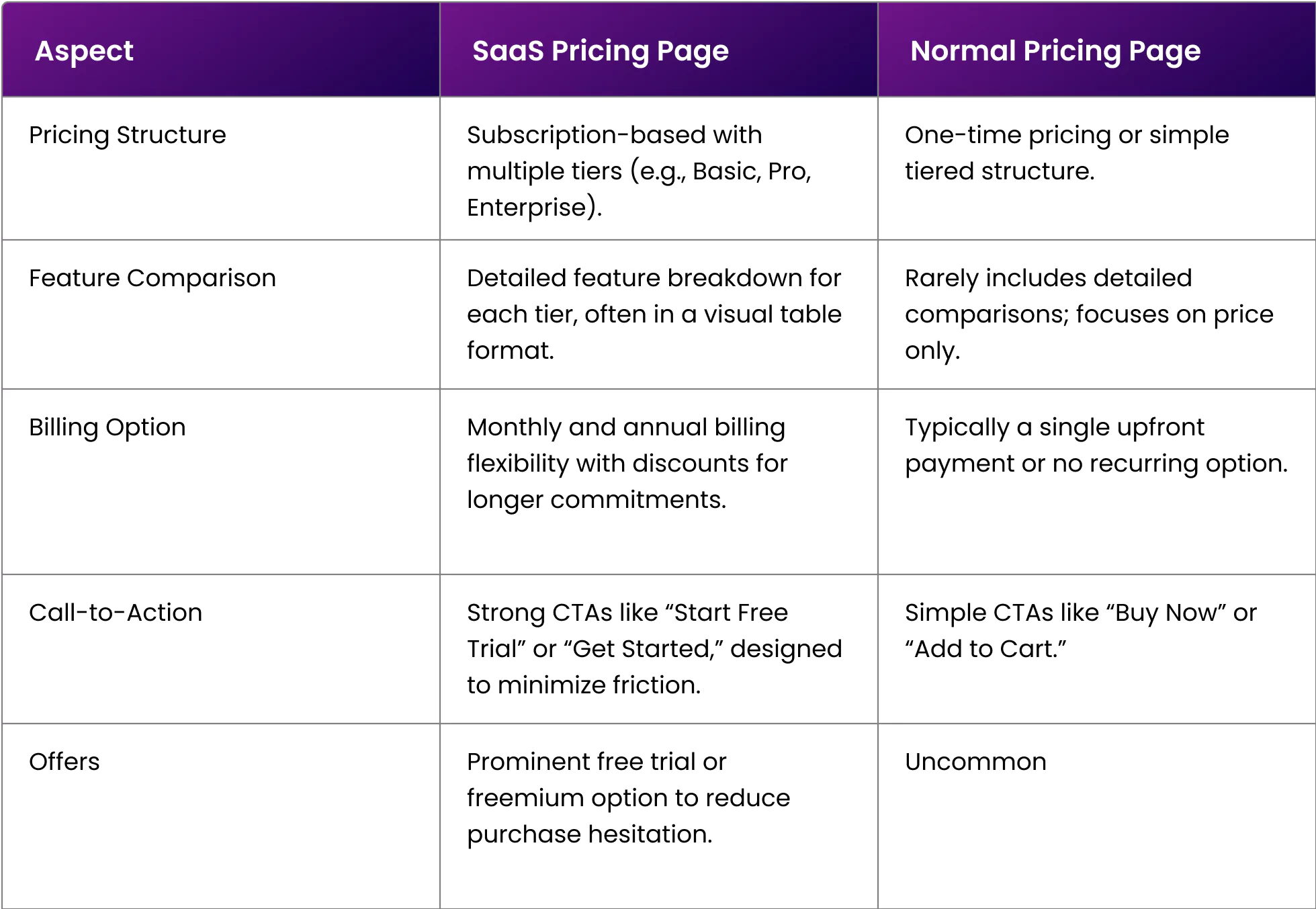
Pricing pages are crucial for every brand. However, unlike others, SaaS companies have a rather complicated pricing system that needs to be transparently communicated. Be it various tier pricing, feature comparison, freemium offers, all must be on your SaaS pricing page. Such a level of information becomes easier to convey with a focus on proper UI/UX design.
By studying various SaaS pricing page examples, it becomes easier for brand owners like you to start with a template instead from scratch.
Here’s a blog post that covers 8 SaaS pricing page examples and how they can share a lot of information effectively. We will examine different pricing page design elements that various SaaS brands use and how they work for them.

Before exploring some of the top SaaS landing page designs, we must understand what makes SaaS pricing pages different from regular ones.
Now, let’s analyze the best SaaS pricing page examples and what they are doing right.
Trello is a project management SaaS tool that helps busy companies keep track of their work collaboratively. Trello is a simple-to-understand tool, which is evident on its SaaS pricing page.
Without wasting time, the pricing page directly introduces all the tiers and their features. Every tier has a dedicated CTA. For example, the Free Tier has a “Get Started” CTA, while the Premium Tier has a “Try For Free” CTA, which indicates their 14-day free trial.
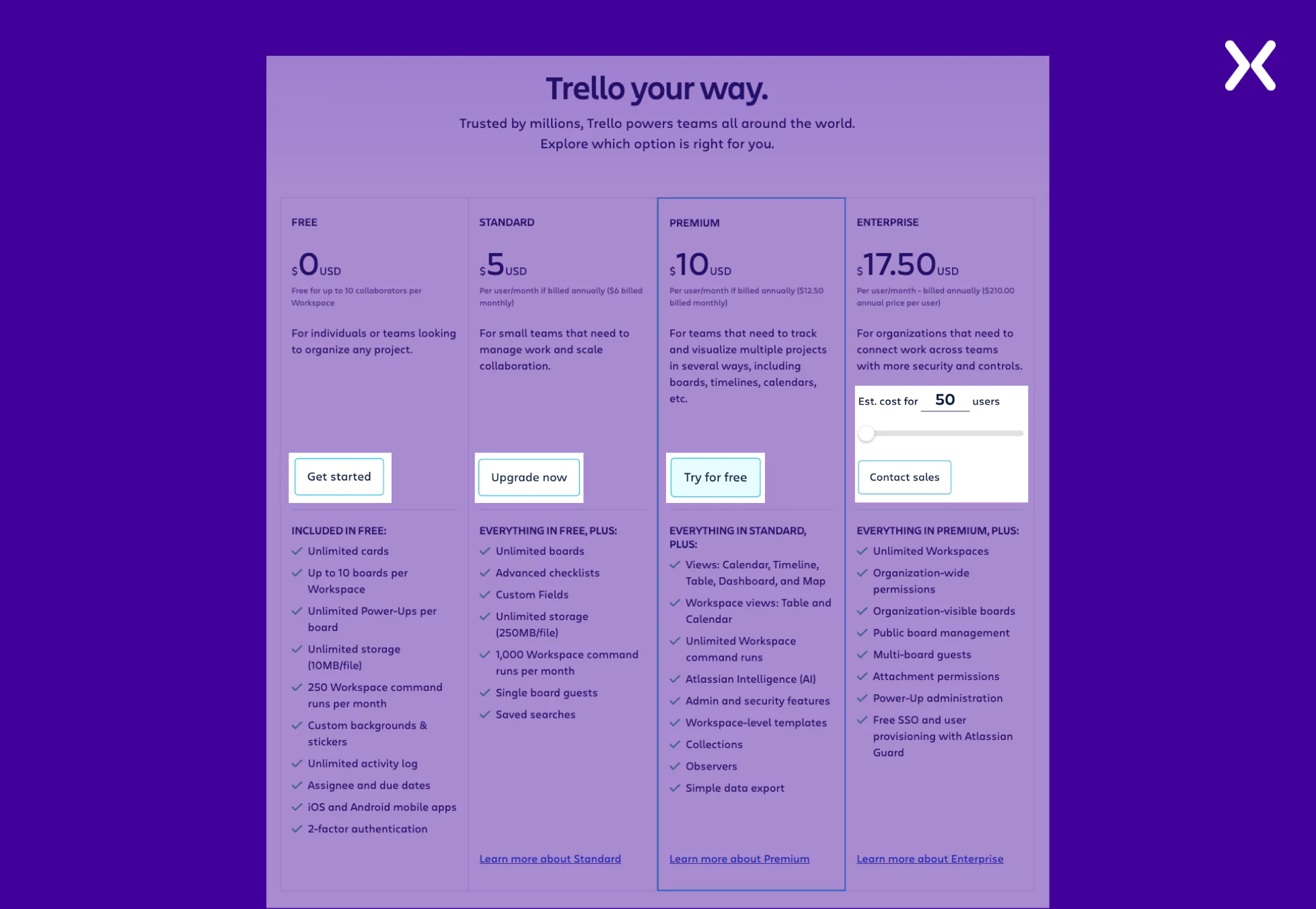
Their Enterprise Tier has a slider that lets you adjust the number of users and determine the price fluctuations for different company sizes. This is a great way to reduce unnecessary meetings discussing company size and offered features. But if you’re still unsatisfied, they have the CTA “Contact Sales” waiting for you right after the slider.
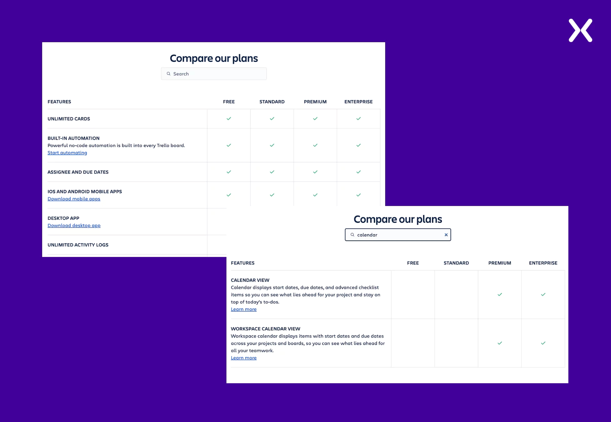
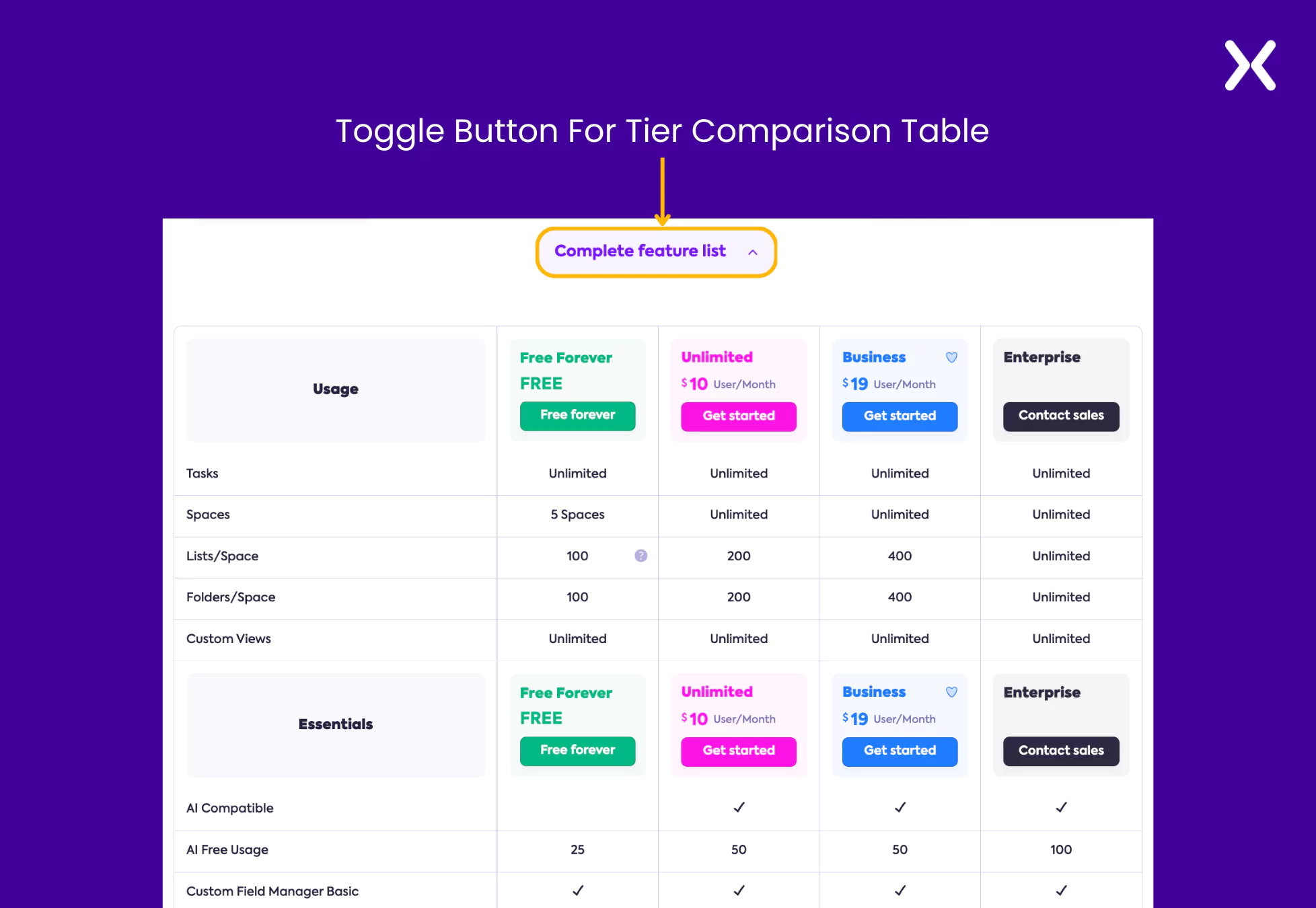
Trello’s SaaS pricing page example has a long tier comparison section. One thing makes it better.
They have a small search bar above the comparison table wherein you can write down a specific feature and find the tiers it is available in. This is a smart way to ensure that high-potential leads can easily find and match the tier and features together before skimming through the entire comparison.
The SaaS pricing page ends with an impactful FAQ section with questions about the billing process, security, discounts, free trials, etc. It’s a great way to end the page.
ClickUp, just like Trello, is a project management tool. So, it would be interesting to break down its pricing page and analyze how it differs from Trello’s pricing page example.
The SaaS pricing page of ClickUp starts with a catchy headline. Then, instead of jumping into the tier section, ClickUp first shares some social proof in the form of a trust bar, including logos of some well-known companies that use ClickUp. It is a great way to win visitor trust from the page’s start.
The four-tier breakdown is well-represented on ClickUp’s pricing page. They have used the brand colors skillfully to ensure the section looks engaging. Small cues like the “Popular” tag right next to the Business tier or the “100% Money Back Guarantee” right above the tiers make all the difference when giving subtle nudges toward conversion.
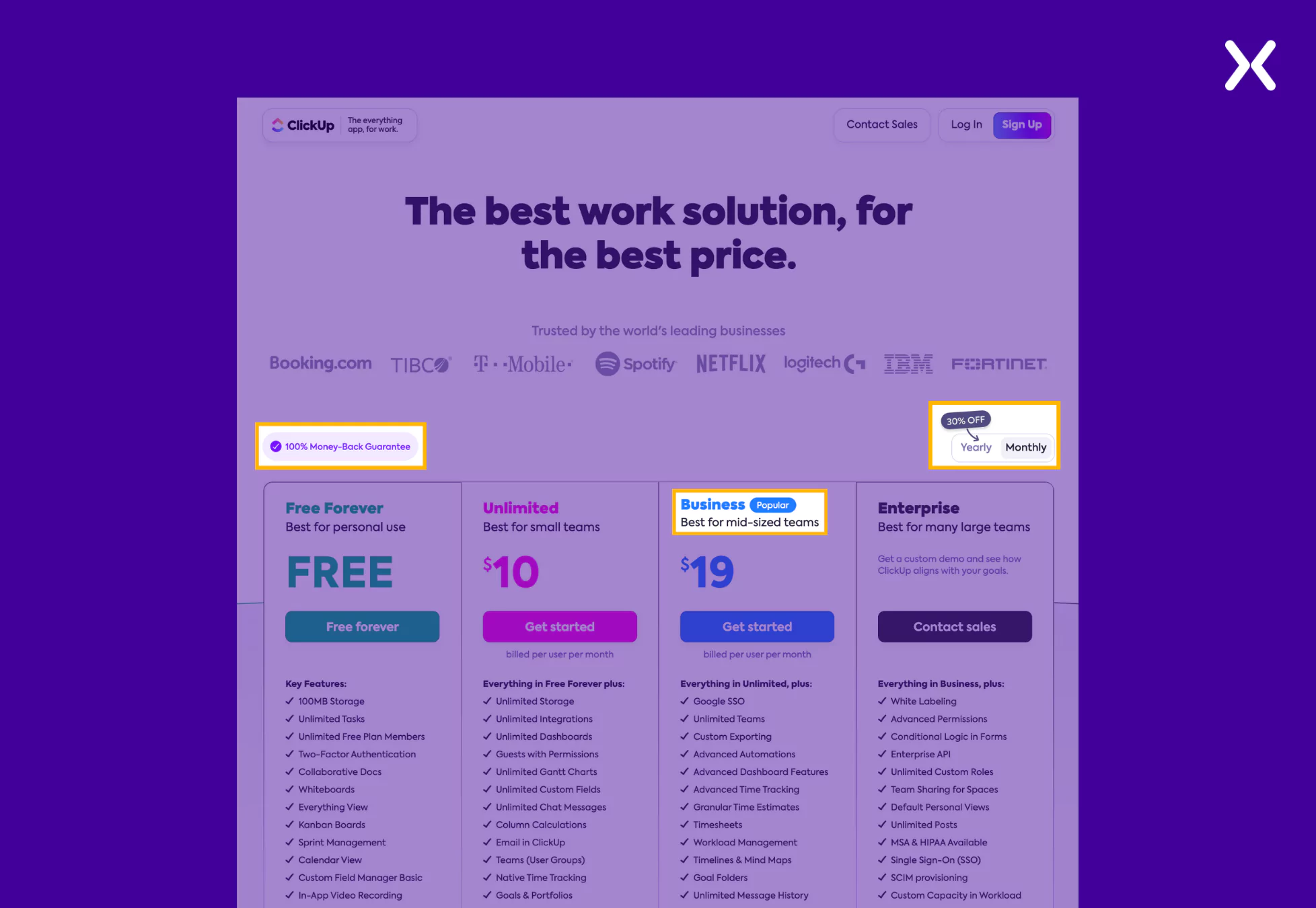
The yearly and monthly toggle switch is another tiny but crucial detail in the tier section. When shifted from yearly to monthly, not only do you see a significant change in the pricing, but you also see a call-out badge of “30% OFF” on the switch pointing towards yearly. It is an impressive approach highlighting incentives through a visual indicator to influence user choice.
ClickUp has cleverly put its tier comparison section under a toggle button to keep the pricing page clutter-free. With one click, you can see an exhaustive pricing comparison of all ClickUp’s tiers.
ClickUp’s page, along with pricing and features, has another crucial element: social proof. Their app replacement cost estimator is one of the best social proofs you can have on your pricing page. It compares how much money you will save after switching from a bunch of apps to ClickUp.
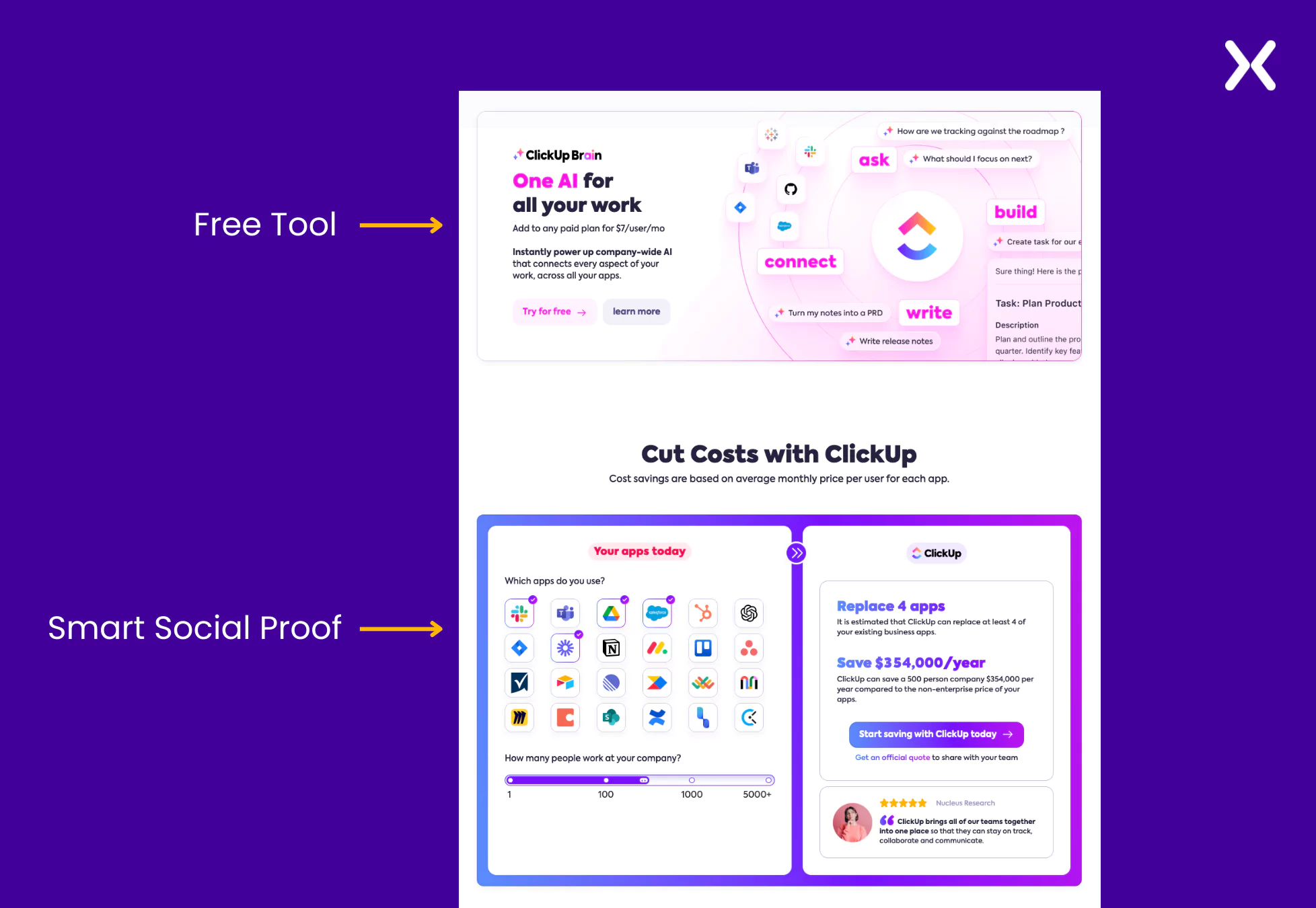
This SaaS pricing page example also includes a banner informing you of a new AI feature you can use with the tool and try it for free, which means you have to eventually sign up for the free trial, another clever move to secure high-potential leads. The page ends with a classic FAQ section. ClickUp’s landing page also has a unique URL (https://clickup.com/lp/pricing) that makes it easier to recognize the campaign and track it.
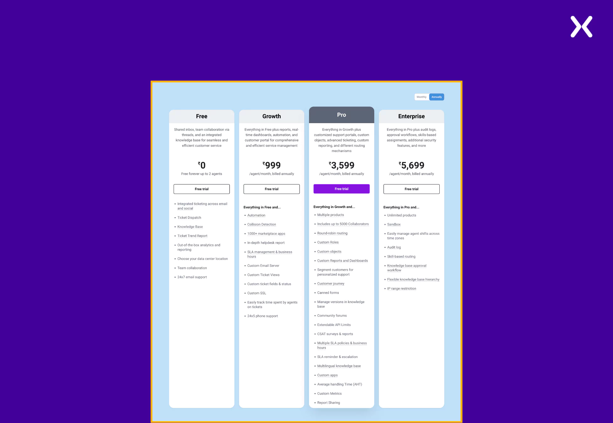
Gusto is an HR management tool for small businesses to manage payroll, benefits, etc. As the SaaS tool deals with a highly technical industry where time-off reports, tax inclusion, reimbursements, and much more need to be mentioned clearly in the features section, the Gusto SaaS pricing page example can be an inspiration. Let’s break down their pricing page.
Starting by appreciating the headline “Flexible plans and features. Honest pricing. No hidden fees.” This headline directly answers the three most essential questions Gusto’s target audience (small business) might have. It is then complemented with a subheadline.
The tier section has been kept as simple as possible. The use of jargon in the features is inevitable on Gusto’s SaaS pricing page. However, they have handled it professionally by providing more details about the feature with the help of an information icon that offers additional details.
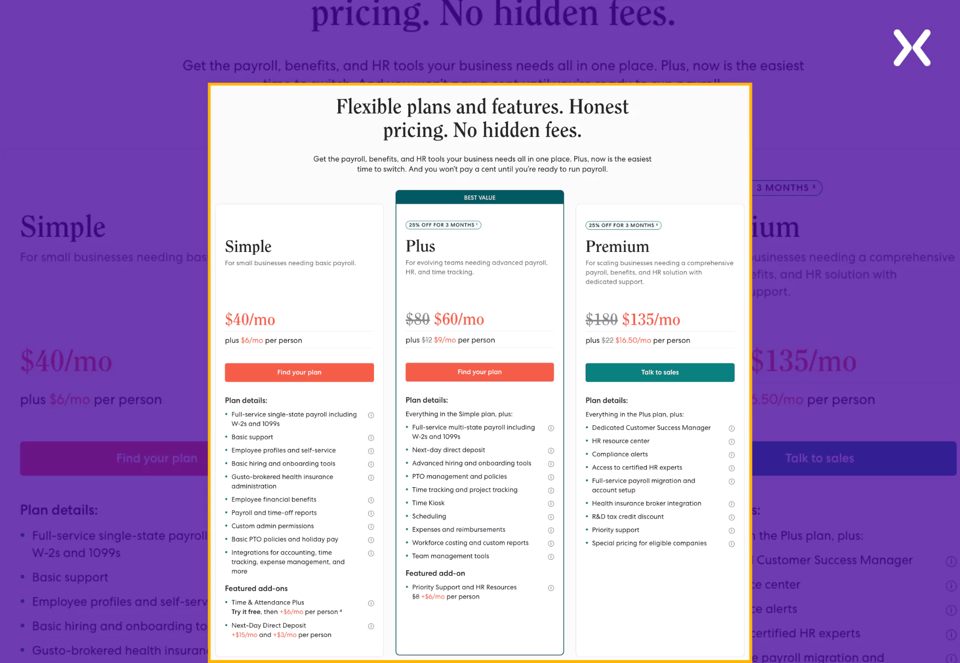
Here also, just like ClickUp had a “Popular” tier, Gusto has also highlighted one of their tiers likewise but with a better copy. Instead of using “most popular,” they have used “Best Value” to point out a tier that feels more personal and messages towards the brand, helping us decide the best offer.
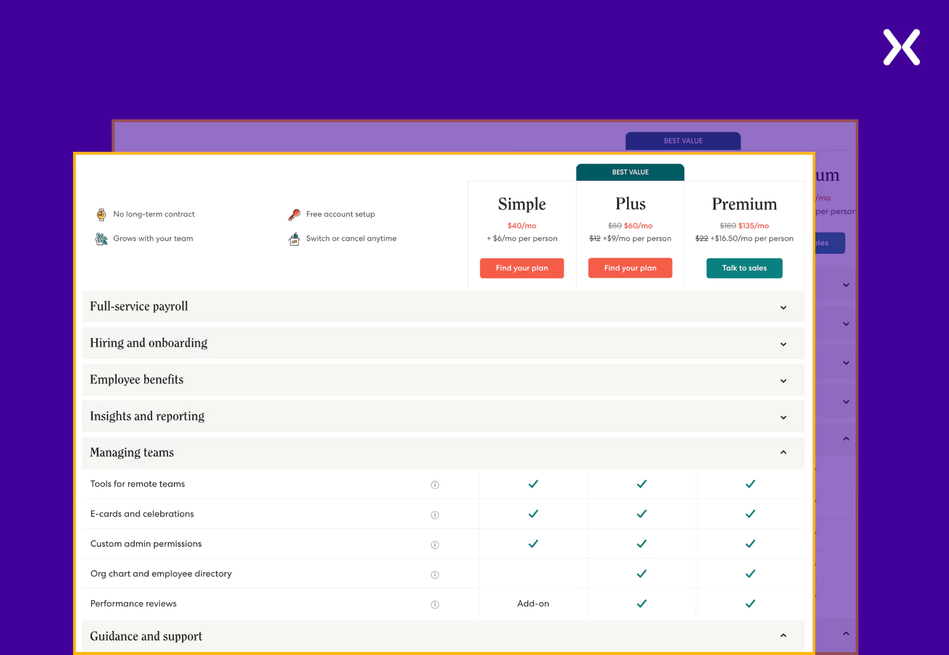
The tier comparison dedicates a small section to share the USPs of Gusto, which stick throughout the table. It repeatedly reminds users what all Gusto has to offer.
The comparison is divided into segments with various feature categories, like full-service payroll, hiring and onboarding, etc. Further, it goes on to showcase the features dedicated to those categories. It helps visitors easily understand and connect the features with their utilization, serving a great user experience.
The SaaS pricing page example also flaunts social proof in quantified form, which is easy to digest. It also has a unique section that helps visitors understand what to consider when choosing a payroll provider, reiterating their USPs.
Monarch Money is a management tool that helps users track finances and achieve savings goals. Though it is a SaaS tool, its pricing is as simple as possible. It offers just a single tier of yearly or monthly billing. Such pricing gives their page a lot of room to share other elements like USPs and social proof, which they have done.
Starting with a strong headline and subhead copy that shares offers and benefits through meaningful sentences like “Your first week is on us” and “All for less than two cups of coffee per month.” Together, they showcase how budget-friendly Monarch Money is.
The tier section of this SaaS pricing page example has filled out the tier features section with all the benefits offered.
As Monarch Money only provides a single tier, there is a lot of space to list all the features and share an image of the SaaS in action. They have provided a toggle switch to help you understand the yearly and monthly billing.
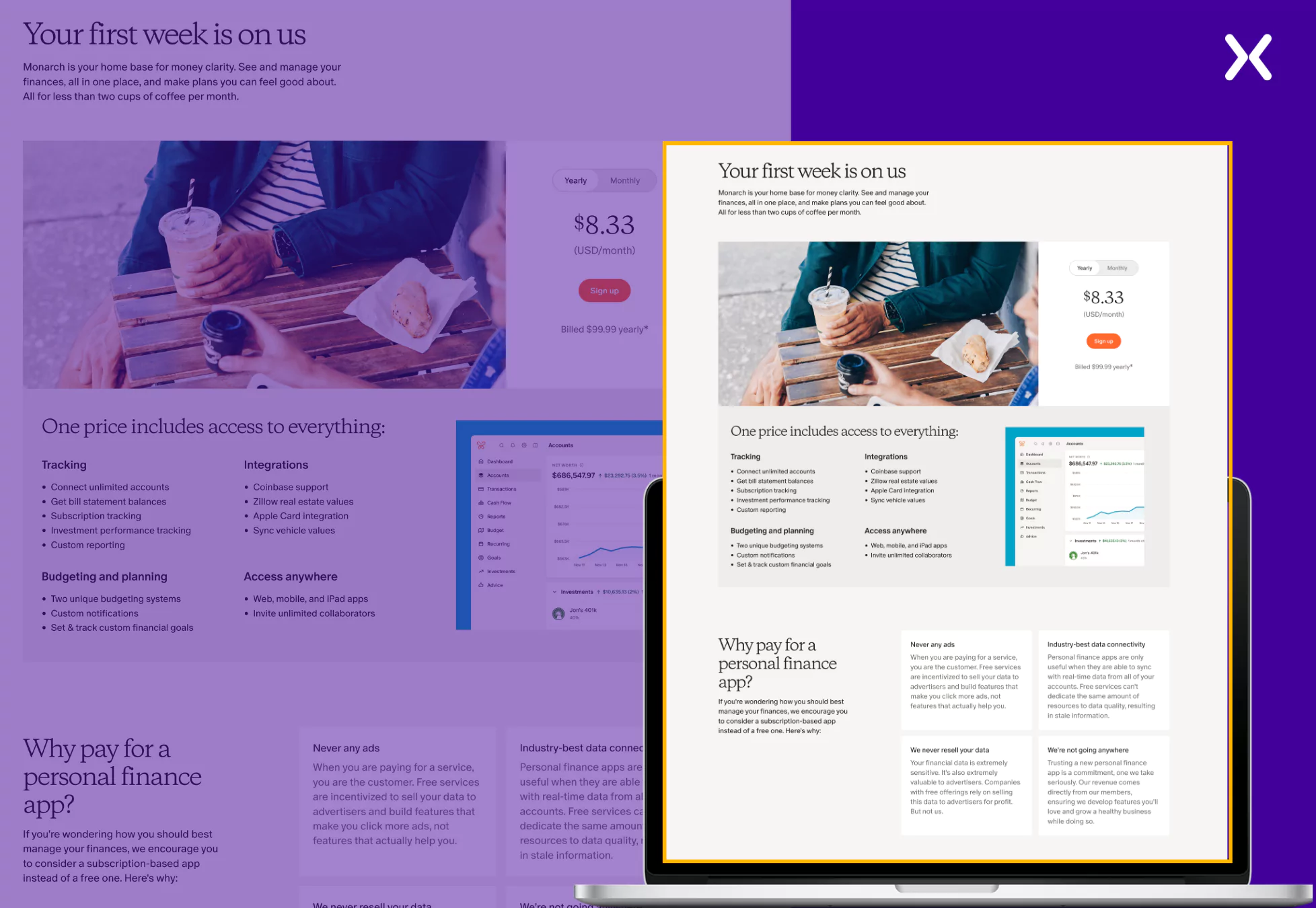
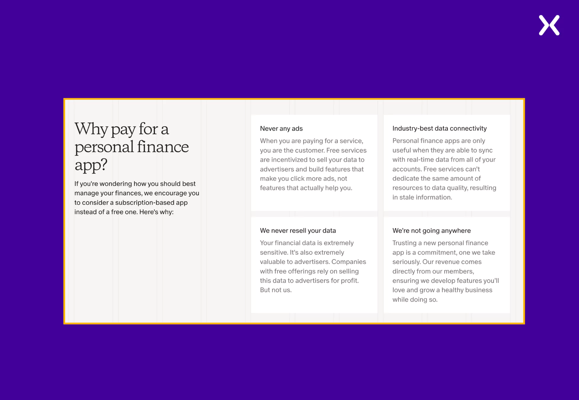
Moving on, we have a whole section on why you should pay for a personal finance app. It underlines the importance of Monarch Money and strengthens the chances of conversion.
The page ends with a wall of testimonials, FAQs, and a final CTA banner.
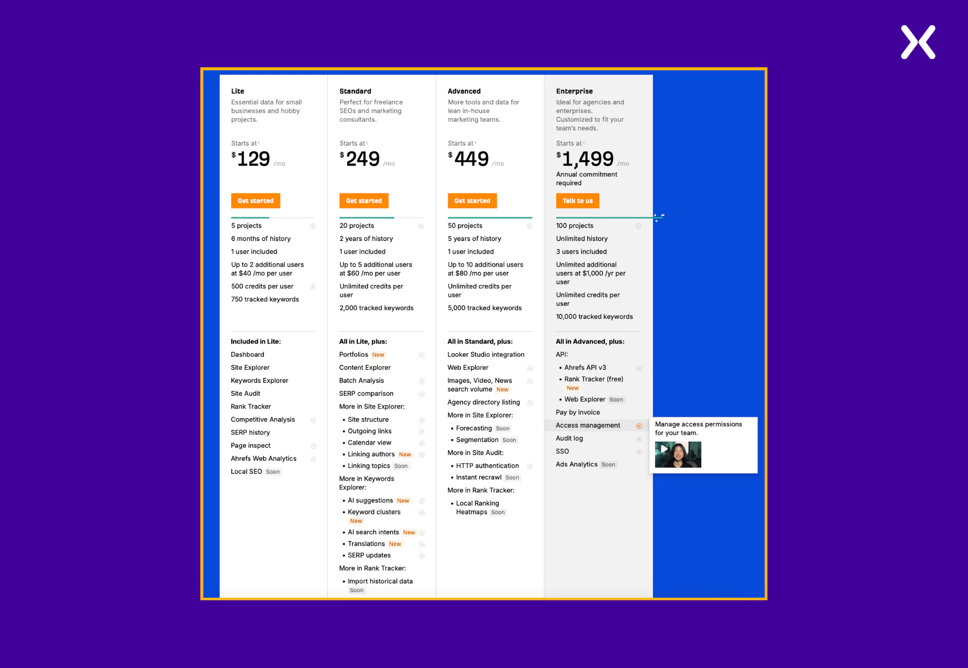
Ahrefs is one of the most popular SEO tools among marketers. As SEO has many parameters to measure, assess, and navigate through, the features provided by various Ahrefs tiers must be clearly disclosed, and they have done so.
With so many features and tiers to share, Ahrefs still manages to keep its SaaS pricing page short with clever toggles. Though all their sections are self-sufficient, one can always click a button and know more about specific features. Ahrefs ensures that not a single visitor is left confused regarding any feature and its application by including short explanation videos right next to the features.
Ahrefs keeps it simple in their tier breakdown section, where plan restrictions are shared in the first half, followed by features in the second. They have also included tags like “New” and “Soon” to various features to display that the SaaS has added new features and is working on adding new ones to multiple tiers, which might intrigue users into conversion.
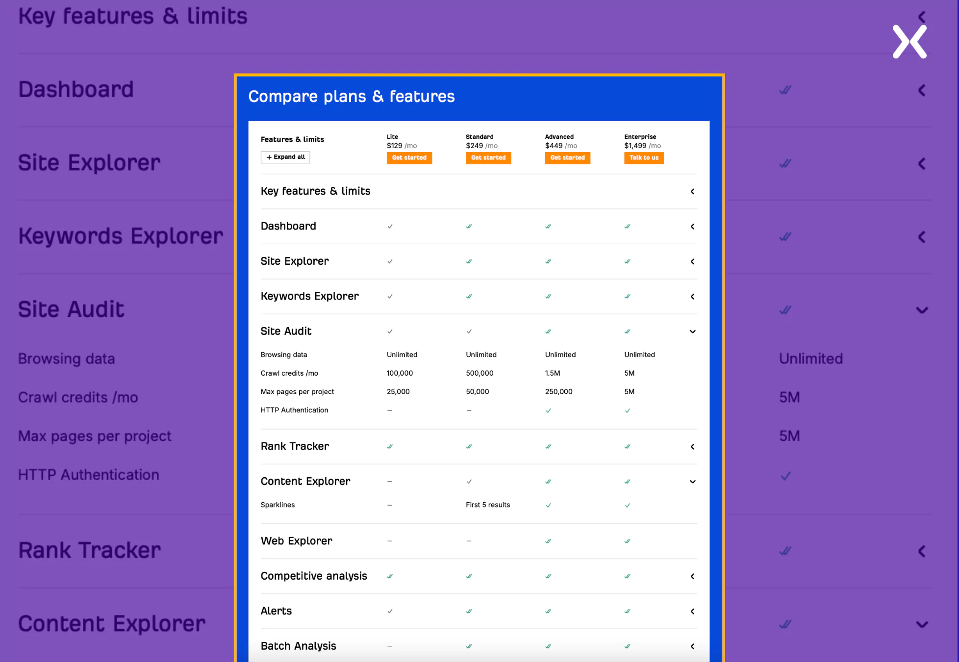
As discussed earlier, Ahrefs cleverly uses toggles to ensure their page looks clean. Their tier comparison section is a prime example of it. They have divided their features into various categories. While only the categories appear on the surface, one can continually expand the category to see multiple features under it and in which tier they exist, delivering superb design usability.
After the add-on and FAQ section, we have a social proof section to end the page, which stands out.
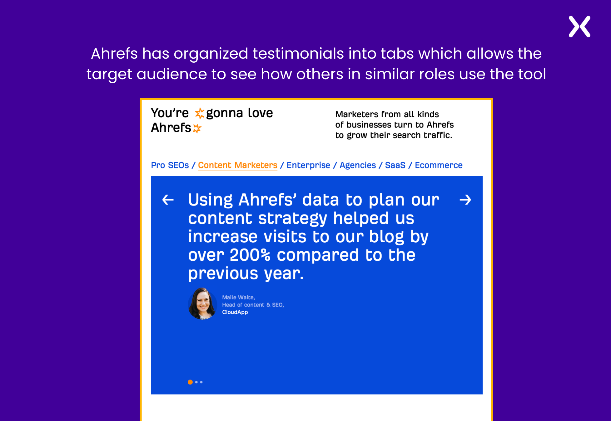
The social proof section is filled with testimonials but with a twist. Ahrefs has ensured that specific testimonials from their SaaS users, content marketers, pro SEOs, etc., are combined into tab navigation so their target audience can easily find similar people who love Ahrefs. This is one of the best ways to showcase your social proof impactfully.
ChatGPT is an AI chatbot that generates human-like responses without further introduction. Its minimalist SaaS pricing page uses a neutral background theme, which adds to a distraction-free user experience.
Features like security, history, latest model updates, etc., have been shared throughout the page. A strong emphasis has been made through the copy to ensure all policies and tier limitations get shared with absolute transparency with the visitors.
With five tiers to share, ChatGPT’s pricing page only has crucial tier features in this section. Unlike many other SaaS brands, ChatGPT takes a streamlined approach by offering yearly billing only for the Team tier, eliminating the need for toggle. This thoughtful design reflects their commitment to minimalism while effectively ensuring clarity and presenting essential information.
The comparison section is long and exhaustive, designed to cover every feature under every plan of the SaaS. But nowhere, for a second, you will feel like the design is cluttered. Enough whitespace is present among all rows and columns to ensure the table is understandable.
The tier breakdown and comparison section have been divided with the help of a trust bar with renowned company’s logos on it. The page ends with an FAQ that covers crucial queries visitors might have.
Survey Monkey is a popular online platform that helps businesses create and distribute surveys across the globe. As a SaaS company expanding worldwide, they get a critical element right on their SaaS pricing page: pricing.
When you target audiences from different countries, it is essential to ensure that the pricing appears in their local currency, which SurveyMonkey has done on their pricing page.
The tier section is intentionally long, and for good reason. This SaaS pricing page example takes a straightforward approach. Instead of simply stating that everything in the Advantage tier is also included in the Premier tier, they list all the features again under each successive tier. This makes it significantly easier for users to compare the additional features offered in different tiers without needing to scroll back and forth to understand what’s included and what’s not.
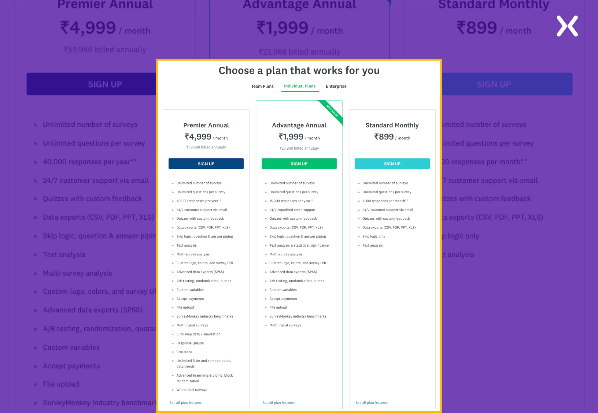
The page doesn’t have a tier comparison table, but it can be accessed by one of the links provided at the end of the tier section. The page ends with a bullet list of the SaaS’s USPs and simple FAQs, making the page short yet compelling.
Freshdesk is a help desk software that helps the services team resolve customer issues. They have created a dedicated SaaS pricing landing page to go with their PPC ads. Following essential landing page rules like no external links and a great hero section, Freshdesk makes its SaaS pricing page attract attention.
The start of the pricing page boosts an impressive hero section with CTAs like “Book a Demo” and “Start a Free Trial,” ensuring visitors know about the free options. The page then breaks into a trust bar and a section highlighting USPs. The social proof followed by USPs is a great way to win visitor trust and prepare them for the upcoming tier pricing section, where they might convert.
The section incorporates some complex industry-specific jargon that users might struggle to grasp. However, it addresses this potential barrier by providing helpful informational pop-ups alongside the terms.
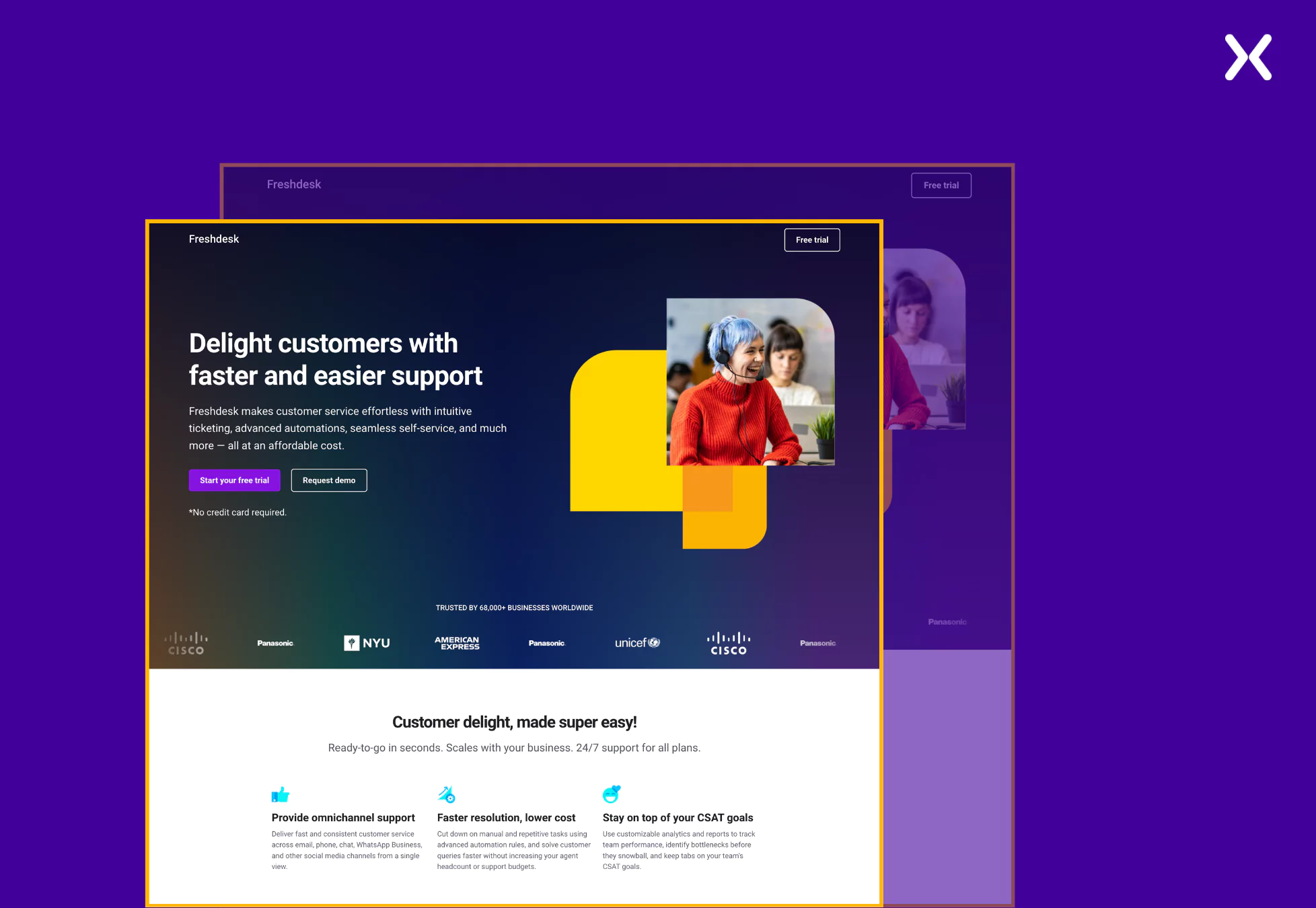
These pop-ups offer concise explanations or additional context, ensuring users can quickly understand the terminology without feeling overwhelmed. This approach enhances clarity and improves the overall user experience by making the information more accessible and reducing friction in the decision-making process.
The page ends with some trust badges and a final CTA. Though FAQs are missing, the page still packs a punch.
Pro tip: Every strong landing page is always complemented with a good thank you page. Such pages work great to redirect your new leads towards your social media or blog posts and help them understand mor about your SaaS.
Crafting an effective SaaS pricing page requires a balance of clarity, transparency, and user-focused design. The examples shared in this blog demonstrate how brands successfully communicate complex pricing structures, highlight unique value propositions, and build trust with their audiences.
From detailed feature comparisons to social proof and intuitive navigation, these pages offer valuable insights for creating a pricing page that converts visitors into customers. Use these examples to design a pricing page that informs, engages, and drives conversions for your SaaS business.
Did you know that Apexure has 100+ blog posts on landing pages? We have shared everything, from creation to testing, analysis to optimization. Check it out before you build your SaaS pricing landing page.
Making a SaaS pricing landing page on your own can be overwhelming. Get the help you need from our experts. Book a call and one of our experts will contact you soon.
Check out our landing page portfolio to discover conversion-friendly landing page elements that might. Filter your industry and check which landing page design is trending.
Interactive elements can enhance user engagement by offering features such as pricing sliders to adjust based on team size, toggle switches to compare monthly vs. yearly billing, and search bars for filtering features across plans. Additionally, expandable comparison tables and interactive demos can help visitors better understand offerings without cluttering the page.
Related Articles:
As CEO and Founder of Apexure, Waseem Bashir's decade-old experience in building high-converting landing pages extends to collaborations with Fortune 500 leaders. From free to paid he has tried his hands on all landing page builder tools and knows just the right fit for every business. Read more


Drive More Sales or Leads With Conversion Focused Websites and Landing Pages
Get Started


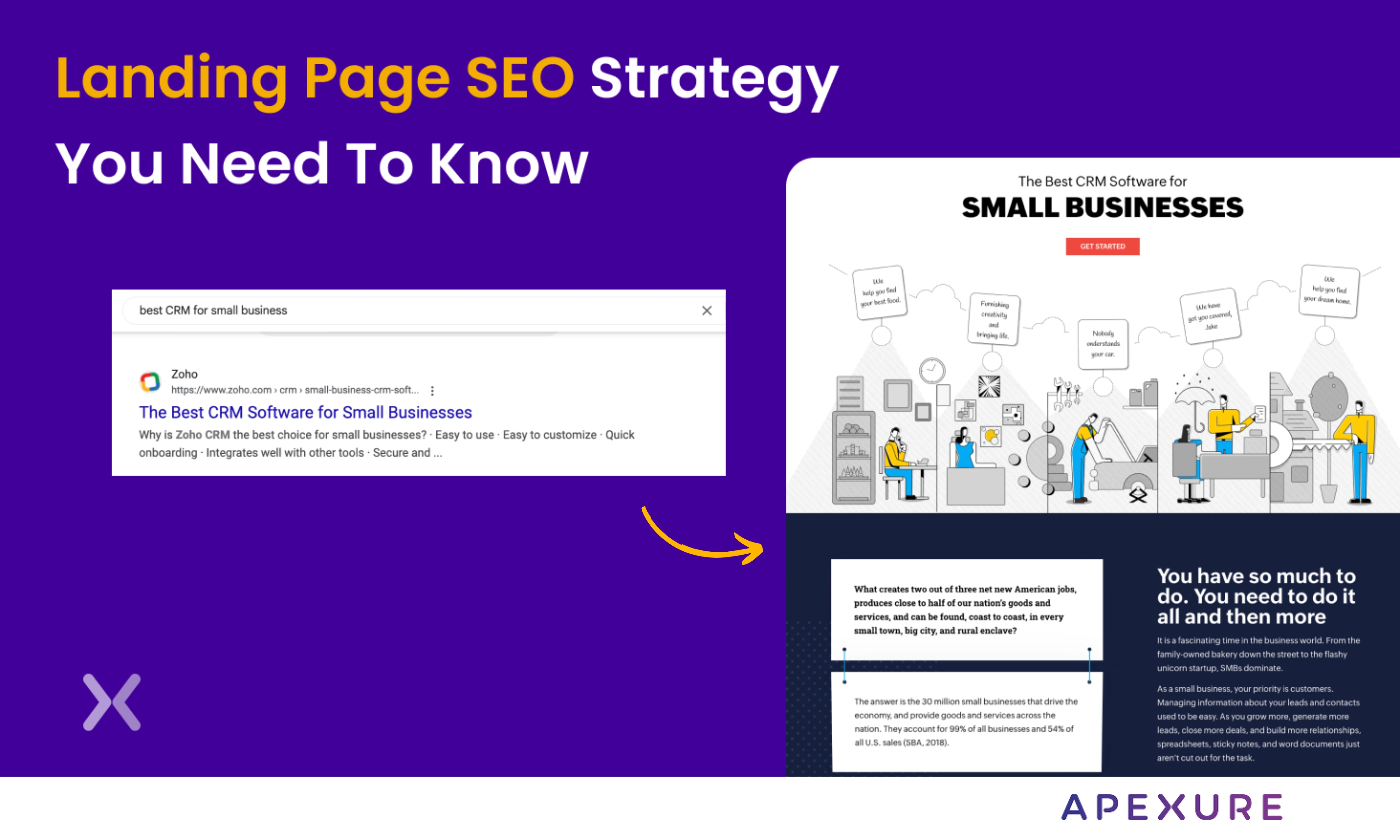
Landing page SEO is for companies still figuring out whether they want to do PPC. We know, PPC...
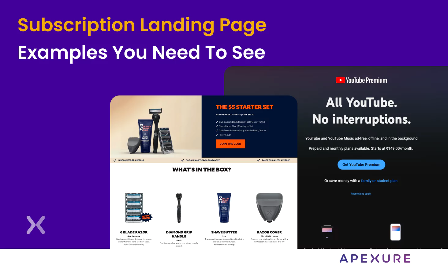
A subscription landing page is crucial to any marketing campaign, whether for a newsletter or a paid SaaS...
Get quality posts covering insights into Conversion Rate Optimisation, Landing Pages and great design
