
SaaS demo landing pages are a gold mine for capturing high-quality leads.
Most book a demo page visitors have already done their research and want to get specific insights into the tool before making a final decision. It would be a lost opportunity if an almost-converted lead didn’t book the demo just because your page wasn’t impactful enough.
SaaS demo pages target bottom-of-the-funnel prospects. Hence, building persona-specific demo pages and adding elements that communicate product value is crucial.
As growth and product managers, having detailed analysis of successful request demo page examples helps build SaaS demo landing pages with tried-and-tested components.
Here’s a list of compelling “request a demo” page examples with in-depth analysis to help you create a high-converting SaaS demo page.

Here are 15 “request a demo” page examples with critical elements highlighted that make them stand out.
WebEngage is an omnichannel campaign management platform that helps businesses improve their conversion rates through targeted marketing. Their SaaS demo landing page is a great example to start with, as it focuses on the two most crucial components of a demo page: social proof and product value.
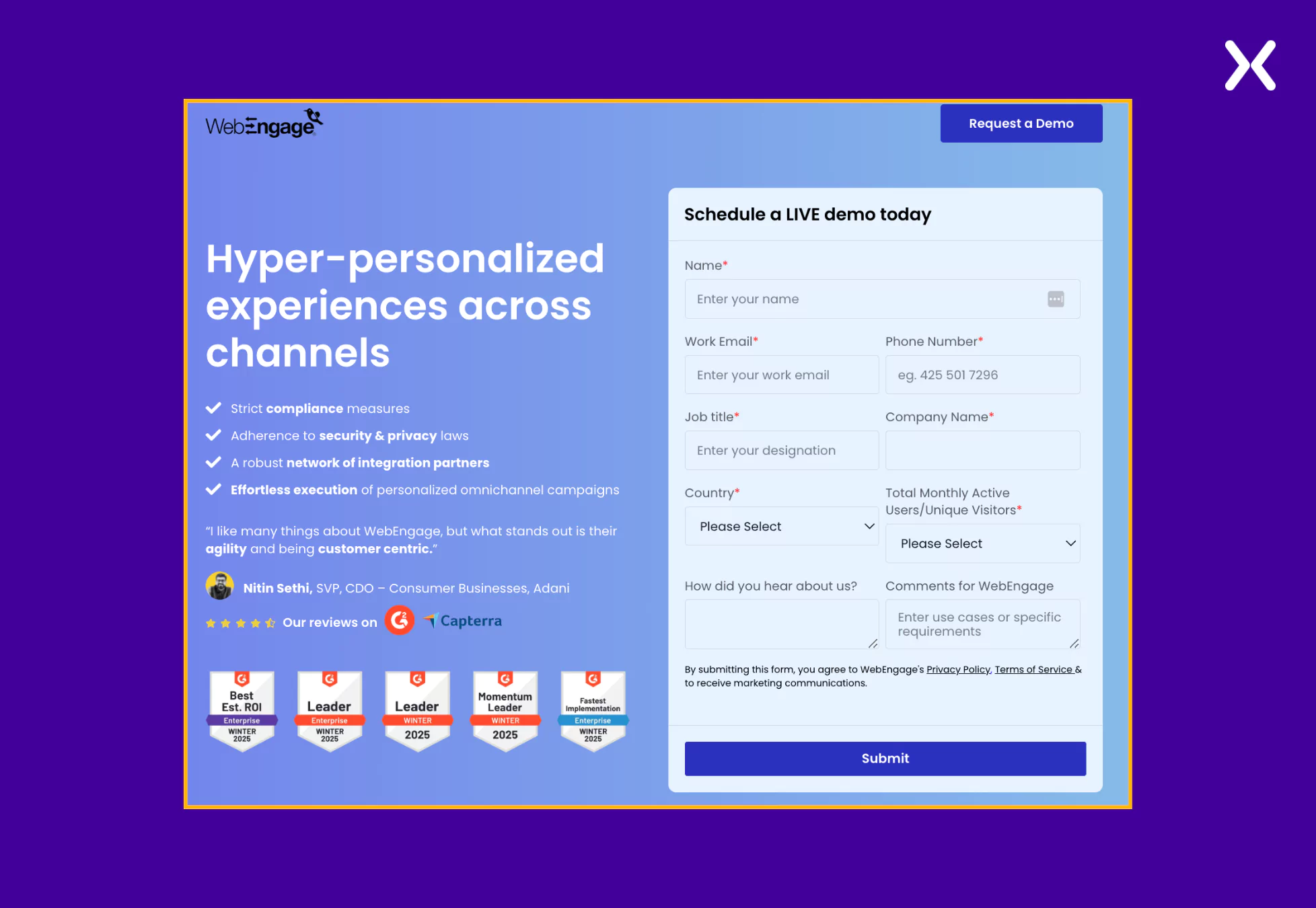
The SaaS demo page goes back and forth between sections of various social proofs and discusses USPs. It ensures that product value is communicated not only through copy but word of mouth as well.
Let’s explore how WebEngage has created a value-driven SaaS demo landing page with just two segments.
- Social Proof
We have four dedicated social proof sections on WebEngage’s book a demo page covering testimonials, trust badges, ratings, etc. Not only is the social proof spread all over the page, but it has also been done to reiterate the various product benefits and features shared in the previously mentioned sections.
A particular testimonials segment shares customer feedback segregated based on industry, showcasing the flexibility of the tool and its utilization across diverse sectors.
- Product Value
Instead of confusing readers with jargon-overloaded text and heavy parts of USPs, WebEngage shares its USPs in various cleanly designed sections. All the features and benefits are shared through pointers and complemented with images.
Overall, WebEnagage’s book a demo landing page does a great job convincing you to sign up. Another thing to notice on WebEngage’s page is their URL (https://talk.webengage.com/campaign-lp/omnichannel-engagement) which is cleanly organized, making it easier to track in the long run.
As marketers, we all have heard that a landing page form must have as few fields as possible.

But WebEngage breaks that norm with their “request a demo” page. This is because demo pages belong to the bottom of the sales funnel, where visitors are typically ready to become paid customers.
Hence, it becomes essential to qualify leads rather than simply maximize form submissions. At this stage, WebEngage prioritizes gathering key information on its book a demo landing page. It ensures that WebEngage’s sales team speaks with high-intent prospects who are genuinely interested in its solution.
Craver is a SaaS tool that helps restaurants create custom ordering experiences. They have made sure that their perceived benefits are shared not only through the copy but also through visuals.
Unlike WebEngage, Craver has created a single section where most of its social proof is present, but they have ensured that visitors don’t miss it with the help of a sticky navbar.
- Sticky Navigation Bar A sticky navbar is a fixed navigation menu that stays visible as users scroll, ensuring easy access to key sections. The SaaS demo page is divided into distinct segments, but not all visitors follow the same path. Enter the sticky navbar. It lets users jump to relevant sections instantly, improving navigation and engagement.
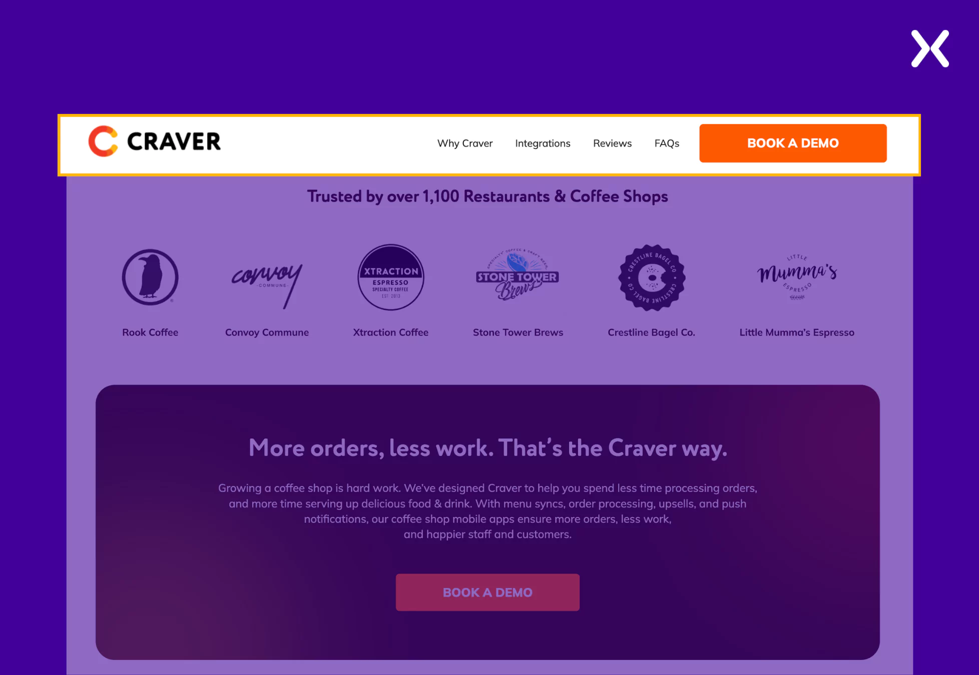
Plus, with the CTA always visible, visitors can convert when ready—without searching for the button. This reduces friction and boosts conversions effortlessly.
- Relevant Visuals Craver’s landing page visuals effortlessly share the features of the SaaS. The tool is shown in action throughout the page on devices it will be used on, highlighting its user interface effectively. The SaaS demo page enhances relevance by featuring images of people in settings that reflect the buyer persona’s environment, making the experience more relatable and engaging.
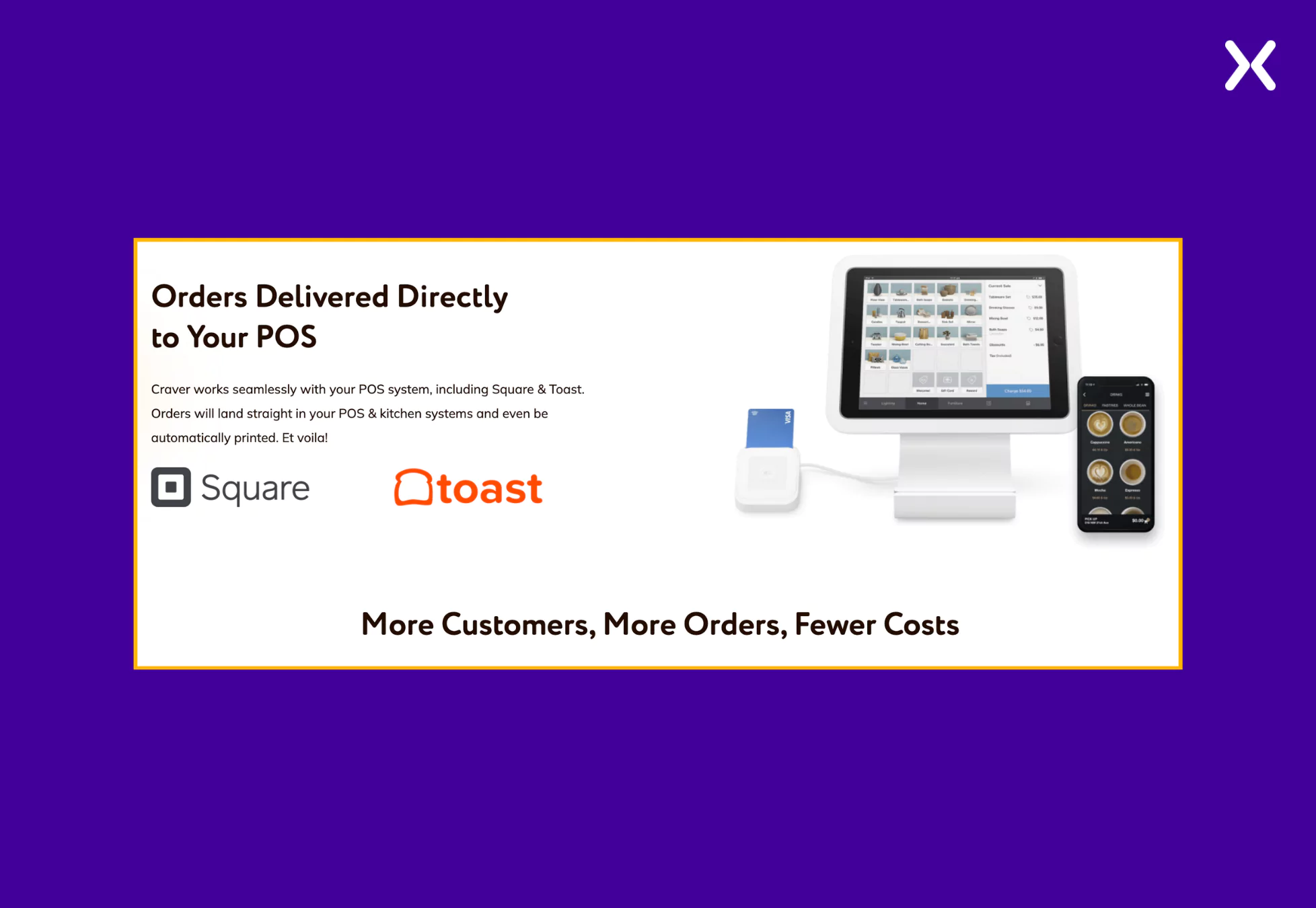
These two elements on Craver’s SaaS demo landing page ensure that the page engages visitors and nudges them toward conversion.
During previous demo calls or lead interactions, your sales team might have encountered repetitive questions. There is no better way to address these as FAQs on your demo page to accelerate the conversion process.
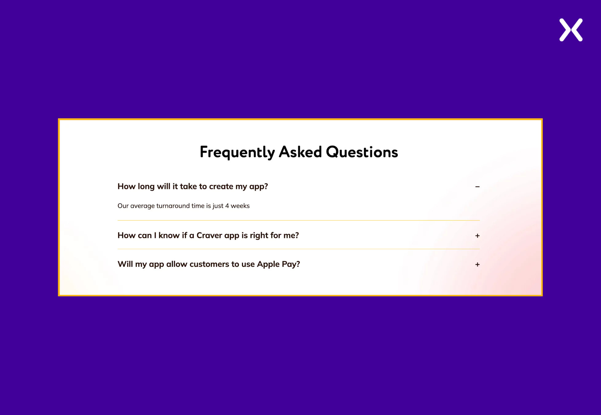
Craver takes a thoughtful approach by addressing common yet essential concerns, such as “How long will it take to create my app?” in their FAQ, ensuring that potential customers get quick answers to repetitive questions. This is an excellent strategy for optimizing the book a demo landing page and enhancing the user experience.

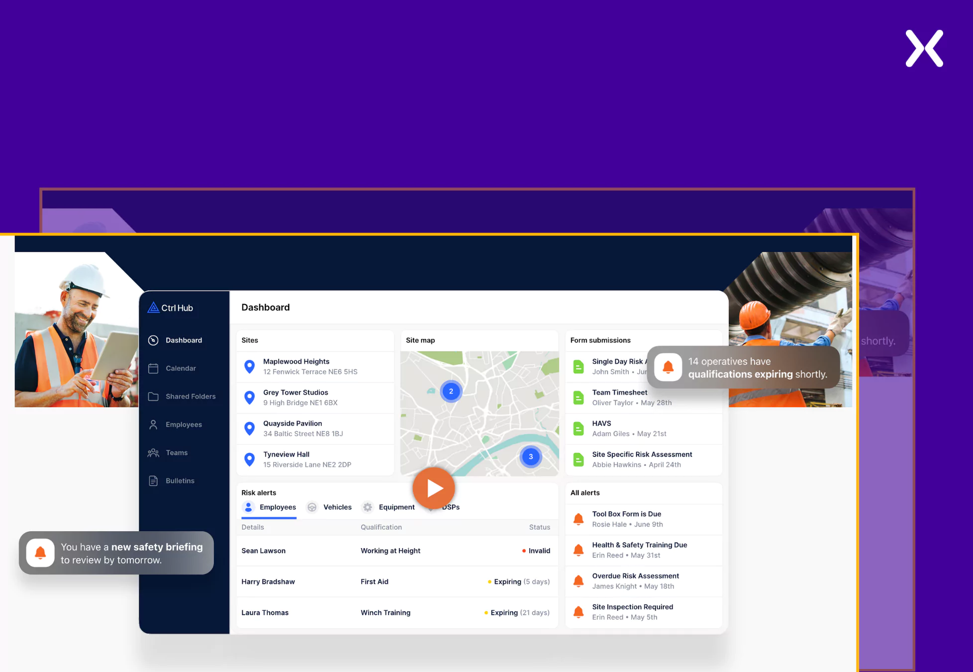
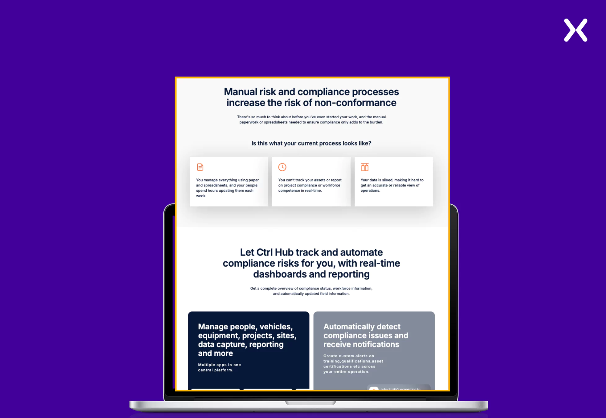
Ctrl Hub is a safety compliance management platform focusing on efficient business performance. The SaaS tool targets a complex industry, making it essential to ensure that their user benefits are communicated effectively.
This has been persuasively done on Ctrl Hub’s SaaS demo landing page with the help of a video and copy. The SaaS demo page has many images of the tool’s action, intriguing visitors with the tool’s interface.
- Video Impact Ctrl Hub features a video that discusses various industry pain points and how the tool addresses them, all through an engaging and informative format. Positioned right at the top fold, the video lasts about a minute, quickly capturing the visitor’s attention while demonstrating the product’s value.
This concise yet impactful approach ensures users immediately understand how the tool can help solve their challenges, increasing the likelihood of conversion.
- Addressing Pain Points If the video is not enough, Ctrl Hub ensures that a section clearly states the primary pain points its target audience might be facing. This section is followed by a part that directly addresses user pain points, linking the tool’s features to each challenge and demonstrating how it effectively solves them.
Ctrl Hub’s SaaS demo landing page effectively highlights user pain points and connects them to the product’s features, allowing visitors to understand the tool’s value clearly.
The page also has a pop-up highlighting a free consultation offer with the company’s managing director. It provides potential clients with an opportunity to discuss their needs, ask questions, and gain expert insights before committing.
Ctrl Hub SaaS demo landing page utilizes a 60-second interactive demo, which makes it easier for users to experience the interface of the SaaS tool quickly.
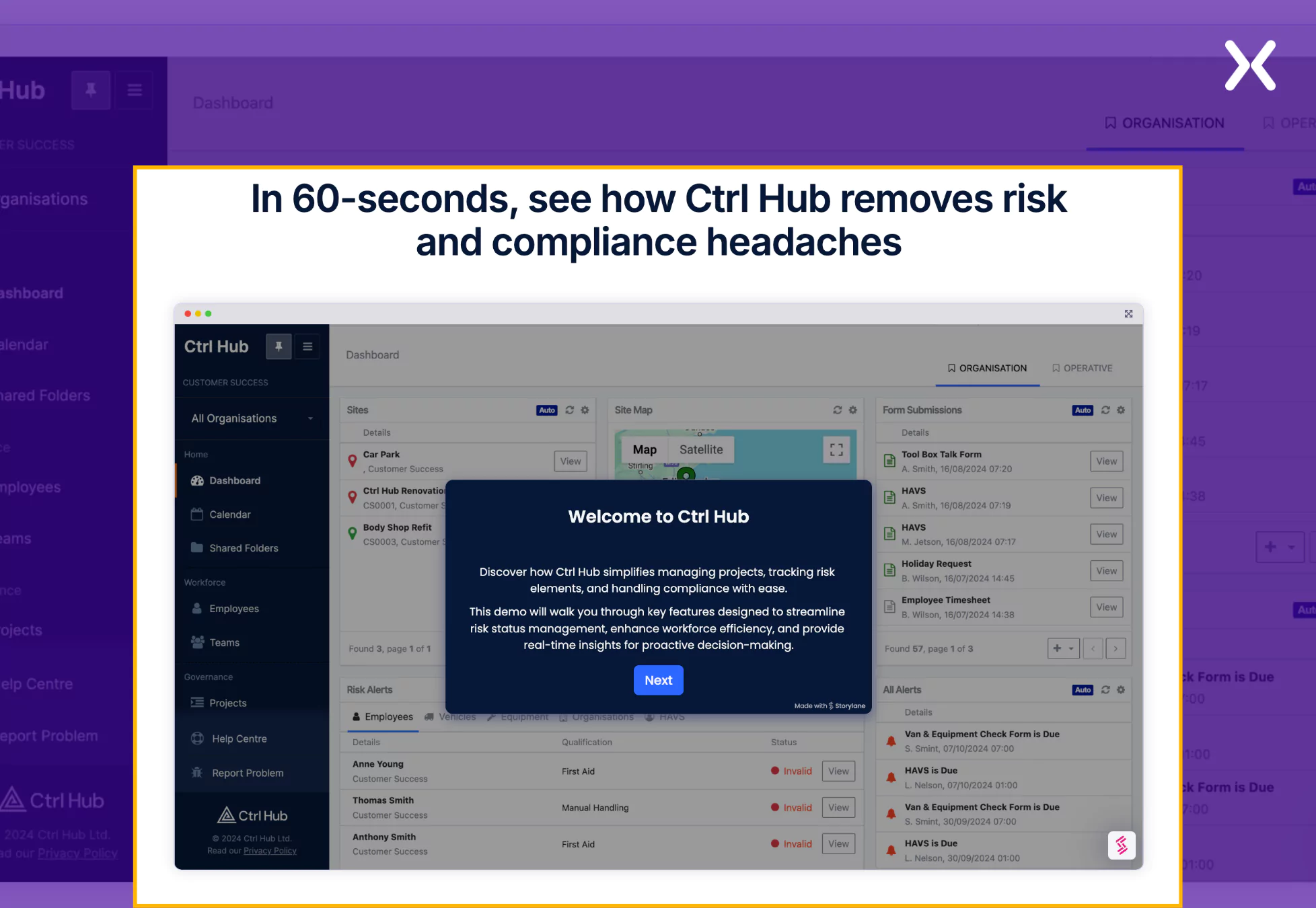
This is a step forward from just having a traditional booking form on your SaaS demo landing page. It delivers a more insightful user experience while intriguing visitors to book the demo.

"An interactive demo clicks when it stays clear, fast, and zeroes in on the prospect's pain points. Long, feature-packed walkthroughs lose attention before making an impact. I lean toward shorter demos that reveal value quickly. Show what moves the needle, not every button on the screen. If prospects need to sit through five minutes before seeing why this tool helps them, the demo misses the mark."
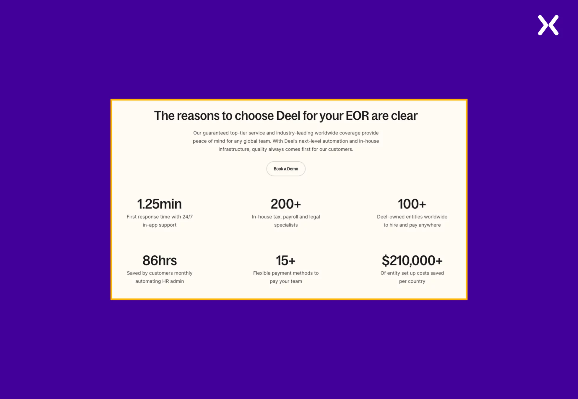
Deel is a cloud-based platform that helps companies manage the payroll and much more of a global workforce. Their SaaS demo landing page comprises two core components: social proof and product value but with a different take on presentation.
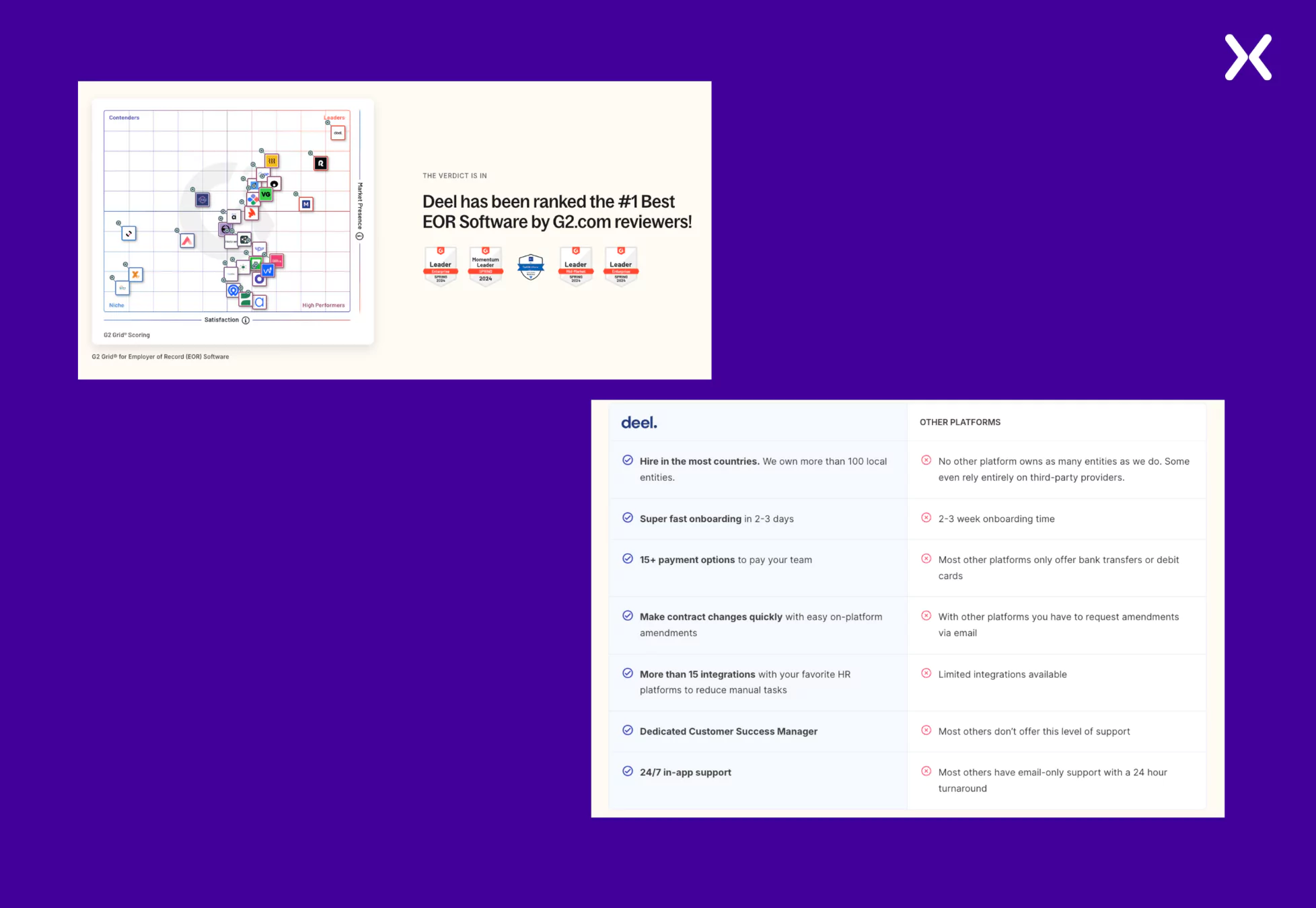
The SaaS demo page reiterates the consumer pain points and then coherently addresses these concerns by sharing product USPs and benefits. Another crucial element of Deel’s book a demo page is not shying away from comparing its product with competitors and utilizing it to prove its market value.
- Quantified Social Proof If you are bored with putting testimonials, trust badges, logo bars, etc., on your SaaS demo landing pages, then try the quantified social proof. It uses specific numbers, statistics, or measurable data to build credibility and influence decisions. It demonstrates popularity, trust, or effectiveness through metrics.
- Addressing Competitors Making competitor comparisons efficiently displays what makes you a better choice than others in the market. Deel’s book a demo landing page utilizes awards and a comparison table to display its competitive edge and highlight why it is the best in business.
Most SaaS demo landing page examples have long forms with multiple fields. However, such long forms can be a turn-off for many visitors, and nobody wants to lose high-potential customers.
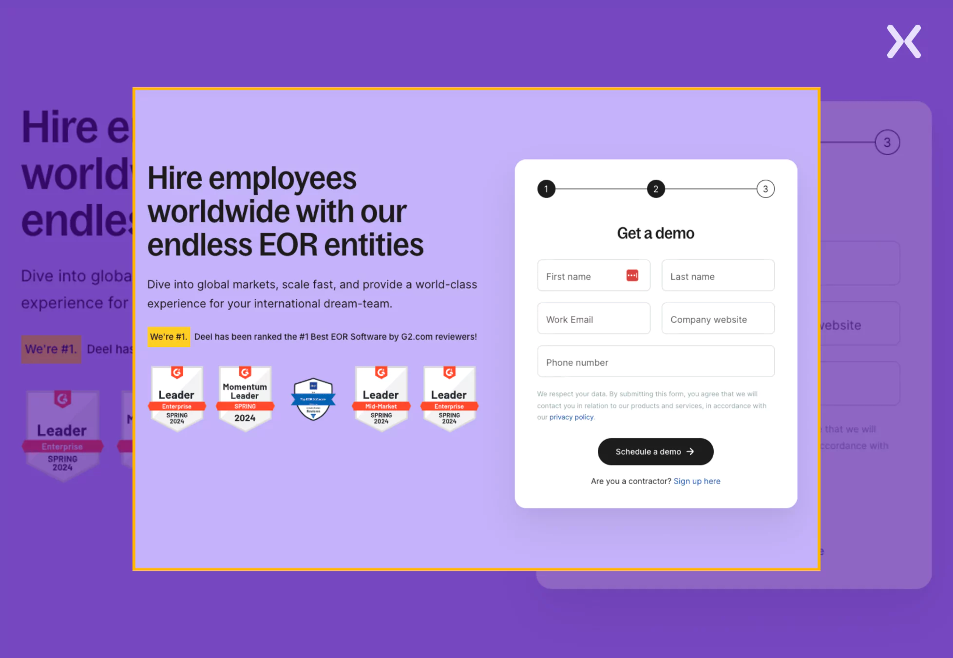
Deel tackles this challenge by replacing a long, intimidating form with a multi-step form that simplifies the process and keeps visitors engaged. Deel reduces cognitive overload by breaking the book a demo form into smaller, manageable steps, making it feel less overwhelming. This approach increases form completion rates and ensures potential customers move smoothly through the conversion funnel.

“A super-short form gets more sign-ups, but you’ll end up with a lot of unqualified leads. A long-form asks for too much upfront and scares people away. Multi-step forms break it up. First, just basic details, then a second step to qualify the lead, such as job title, company size, or main pain point. This keeps conversions high while making sure sales get good leads.”
Pecan is a predictive analytics tool that utilizes AI to drive robust data analysis. Their SaaS demo landing page example banks heavily on sharing product value through various visuals and copy. They have given special attention to their CTA and ensured it stands out on the SaaS book a demo page.
The SaaS demo page employs use cases to make visitors understand the tool’s application for pain points. With social proof and FAQs, the demo page creates a complete experience aimed at conversion.
- A Strong CTA
While most of Pecan’s SaaS demo page is in a light shade, they have used a bold dark purple color to make it easily visible, and it passes the squint test.
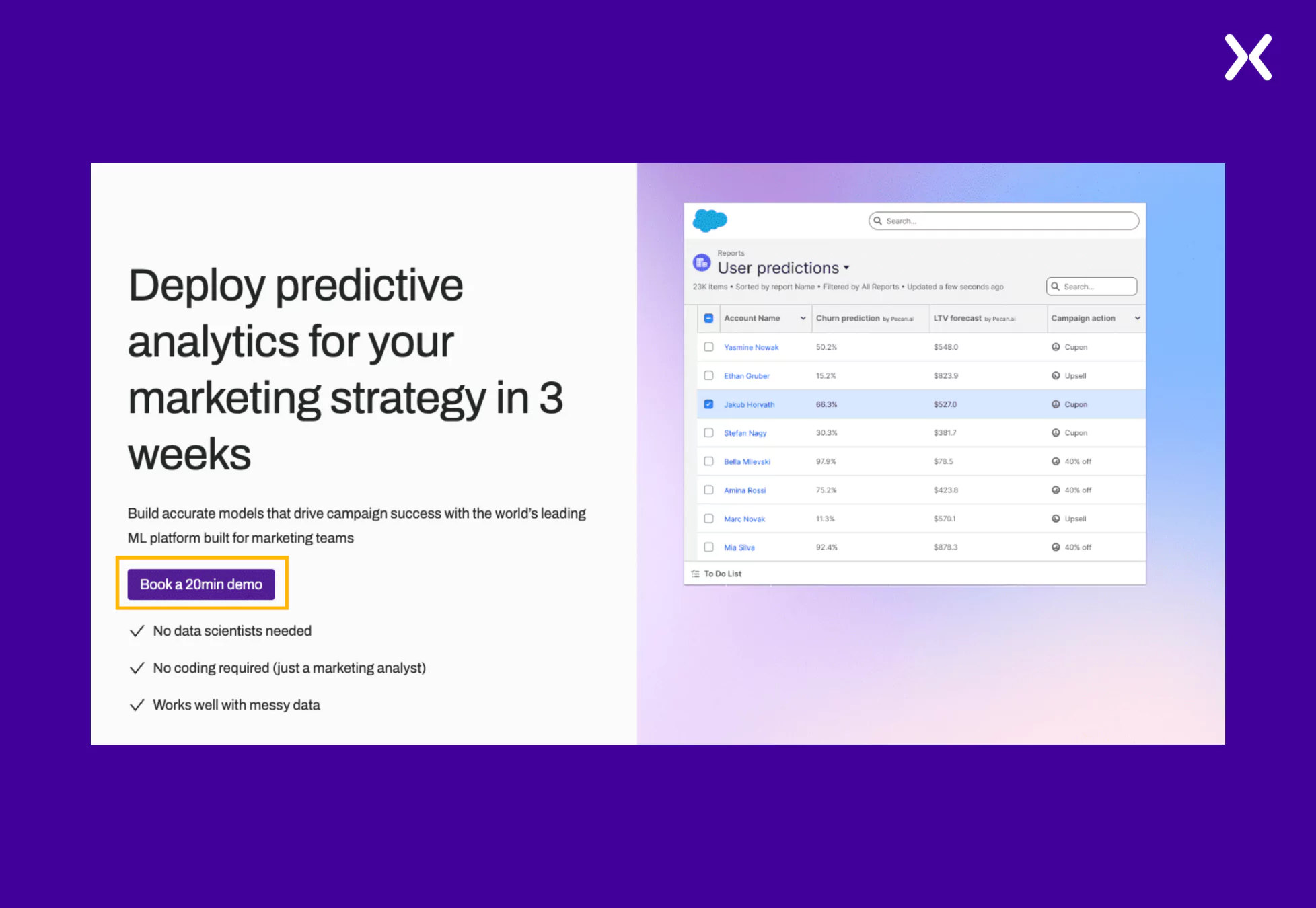
Coming to the copy, “Book a 20 Min Demo” works as a powerful copy that sets clear expectations for the visitor. By specifying the demo duration, Pecan reassures potential customers that the process is quick and efficient, reducing hesitation.
- Discussing Use Cases
By showcasing a dummy workflow of how marketing analysts can use Pecan for a specific pain point, it becomes easier for potential customers to visualize the platform’s real-world application.
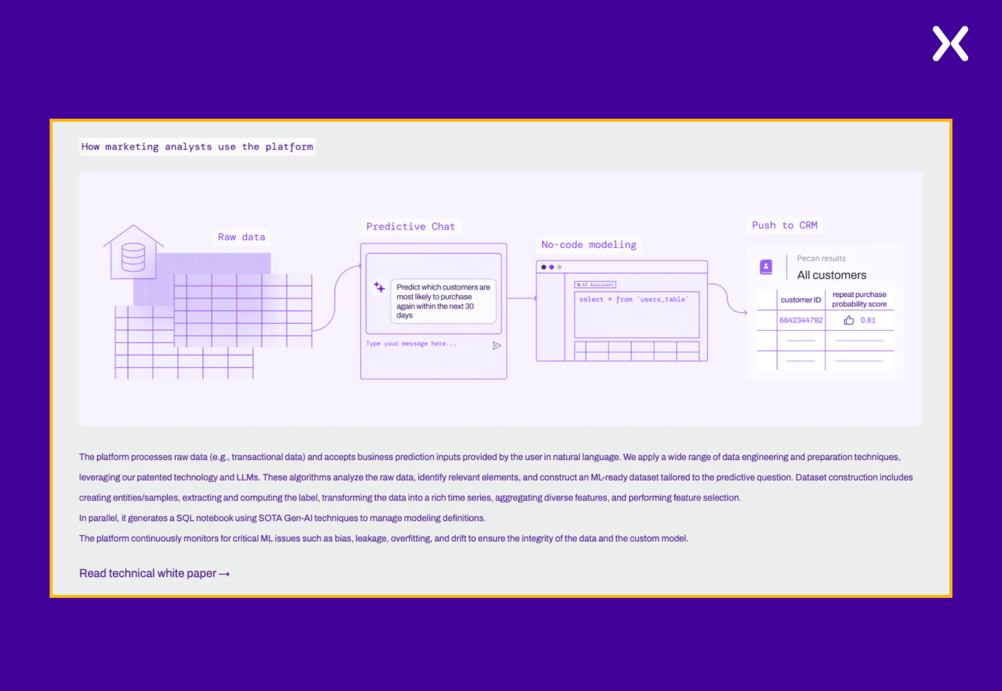
This approach demonstrates the tool’s functionality and helps prospects see its direct impact on their daily tasks. By addressing a specific pain point with a step-by-step workflow, Pecan builds trust and reinforces its value, making it more compelling for marketing analysts to book a demo.
Providing potential customers with a clear vision of how the process will unfold once they come on board with the SaaS can be a powerful trust-building tool. Pecan emphasizes this with its simple roadmap section, demonstrating how it can help visitors in under 4 weeks.
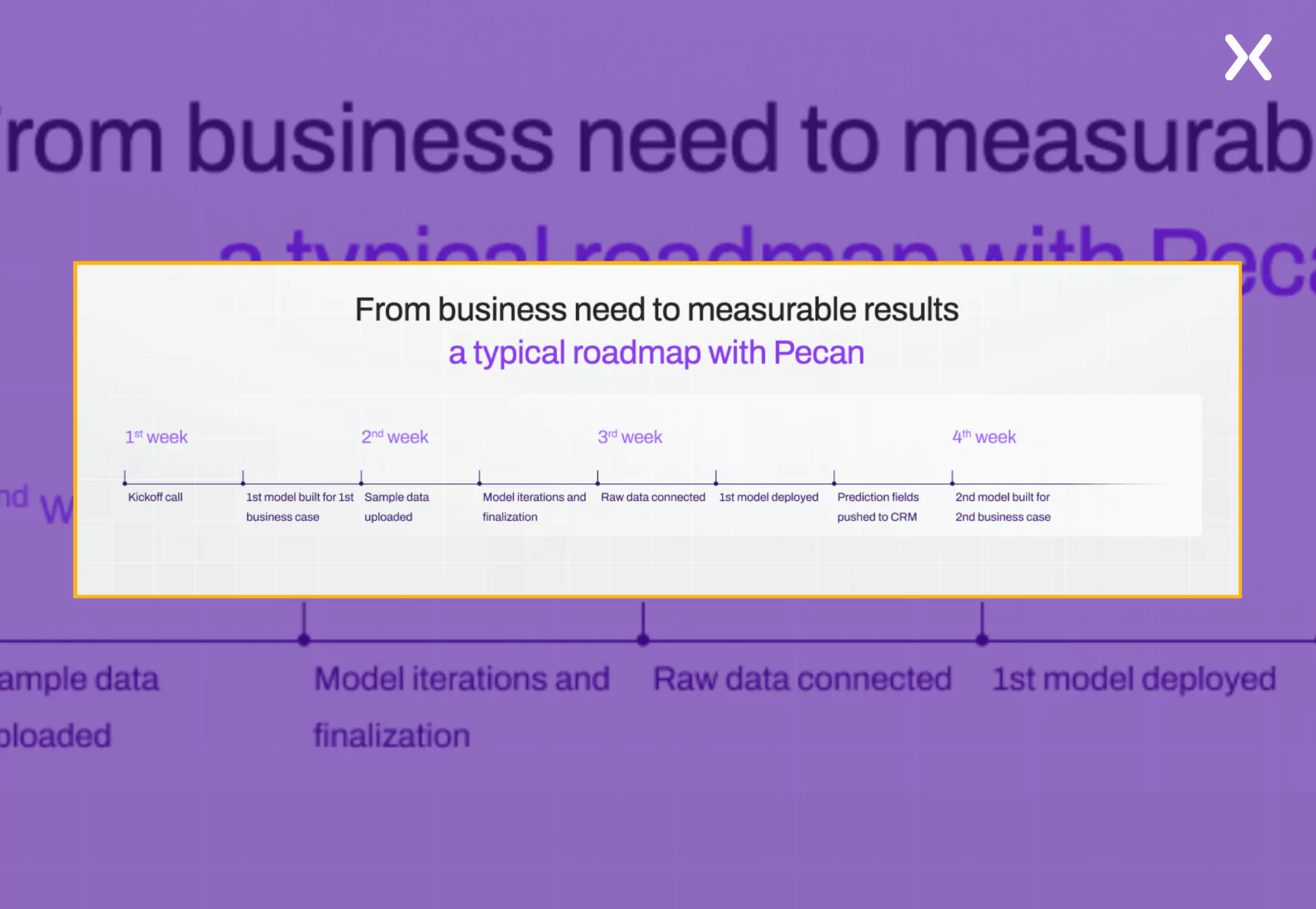
Showing visitors what to expect creates transparency, reduces uncertainty, and strengthens their confidence in your solution, making it a must-have element on your book a demo landing page.
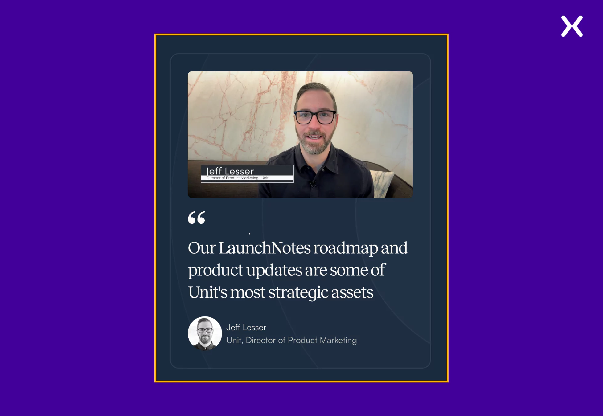
LaunchNotes is a centralized hub to update SaaS customers about new features, bug fixes, and other changes. Their SaaS demo landing page example is concise, with enough elements to nudge you toward conversion.
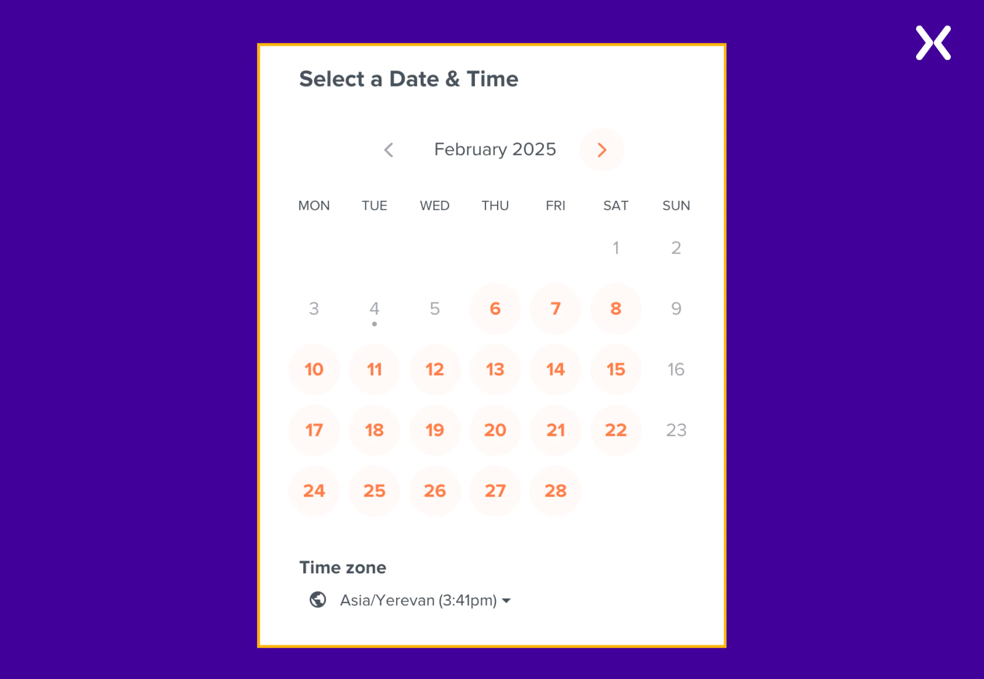
Keeping a minimalist approach at the center, LaunchNotes demo page utilizes social proof and a calendar overview to help users set up the right time to book the demo call.
- Video Social Proof
LaunchNotes leverages their customer’s video testimonials in many ways. The detailed customer feedback highlights how the SaaS tool solved their various problems. It is a great way to communicate your product value to visitors that wins trust and shares crucial product details.
- Calendar Overview
A calendar overview helps users easily see available time slots and select the best option. Allowing visitors to adjust the time zone to their preference eliminates confusion and ensures they book at a convenient time. This flexibility enhances the scheduling experience, making the demo booking process smooth and hassle-free.
Instead of leaving visitors uncertain about what to expect in the demo meeting, LaunchNotes provides precise details upfront, ensuring every booker knows exactly what will be covered. By setting expectations in advance on their book a demo landing page.
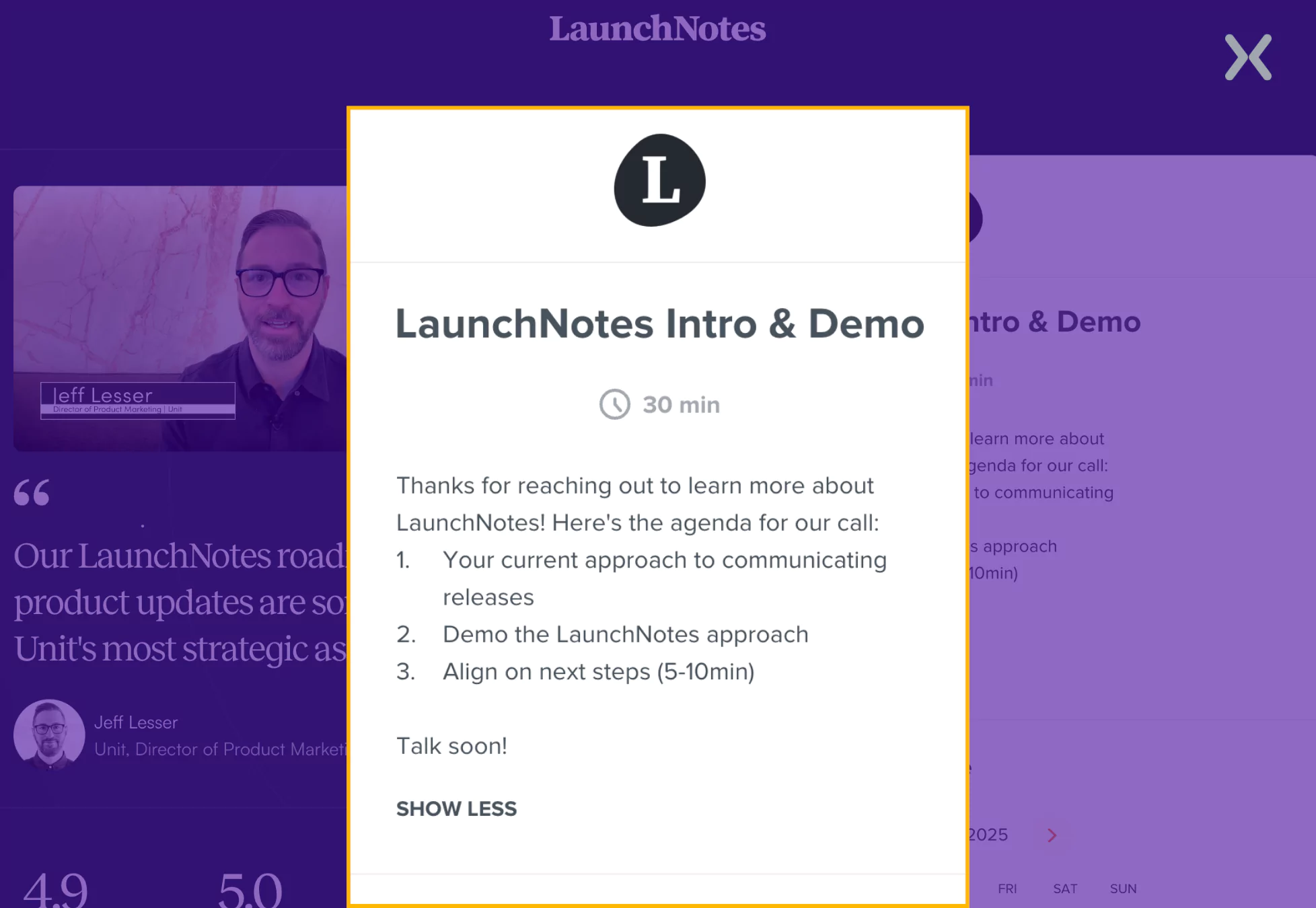
Such transparency helps prospects feel more prepared and makes the demo feel like a valuable, structured experience rather than just another sales call.
CleverTap is a SaaS platform that helps businesses retain and engage their customers. They have a sleek SaaS demo landing page that effectively communicates its value without overwhelming users with excessive graphics or text.
The page highlights crucial aspects of the tool and uses different tab toggles to keep the page compact and sharp.
- Soptlighting Target Audience Sometimes, the wrong audience might land on your demo page. CleverTap filters out irrelevant prospects by calling attention to the industries its SaaS platform is designed for.
It sends a clear message that helps attract the right audience, ensuring demos are booked by sectors where the tool can provide the most value and improve conversion rates.
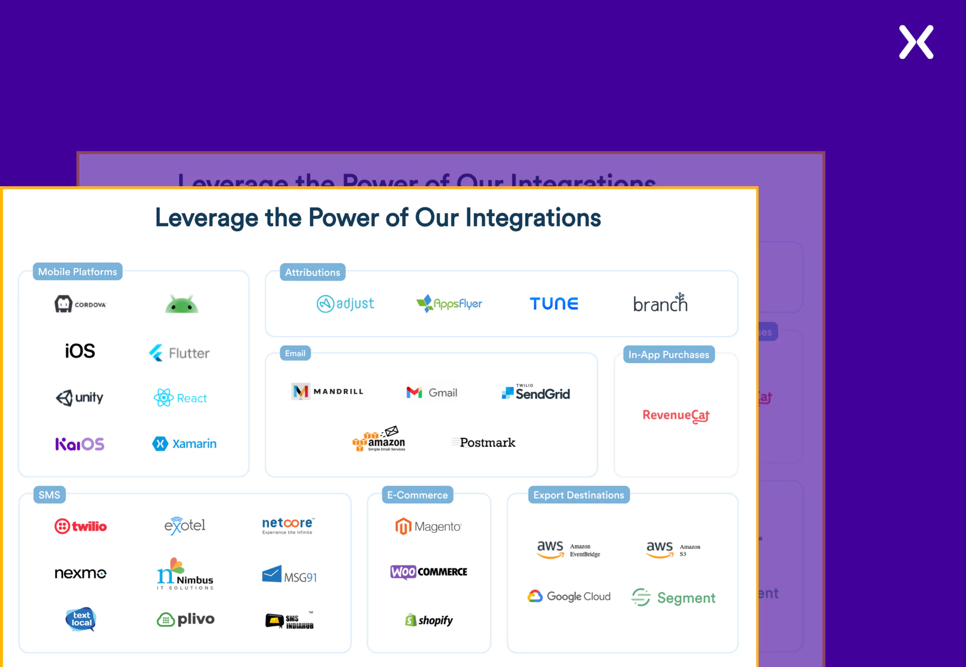
- Feature Explanation The SaaS demo page uses visuals to communicate complex features. Instead of simply stating that it offers numerous integrations, the page showcases a collage of all the tools CleverTap integrates with, making it visually clear and easy to understand.
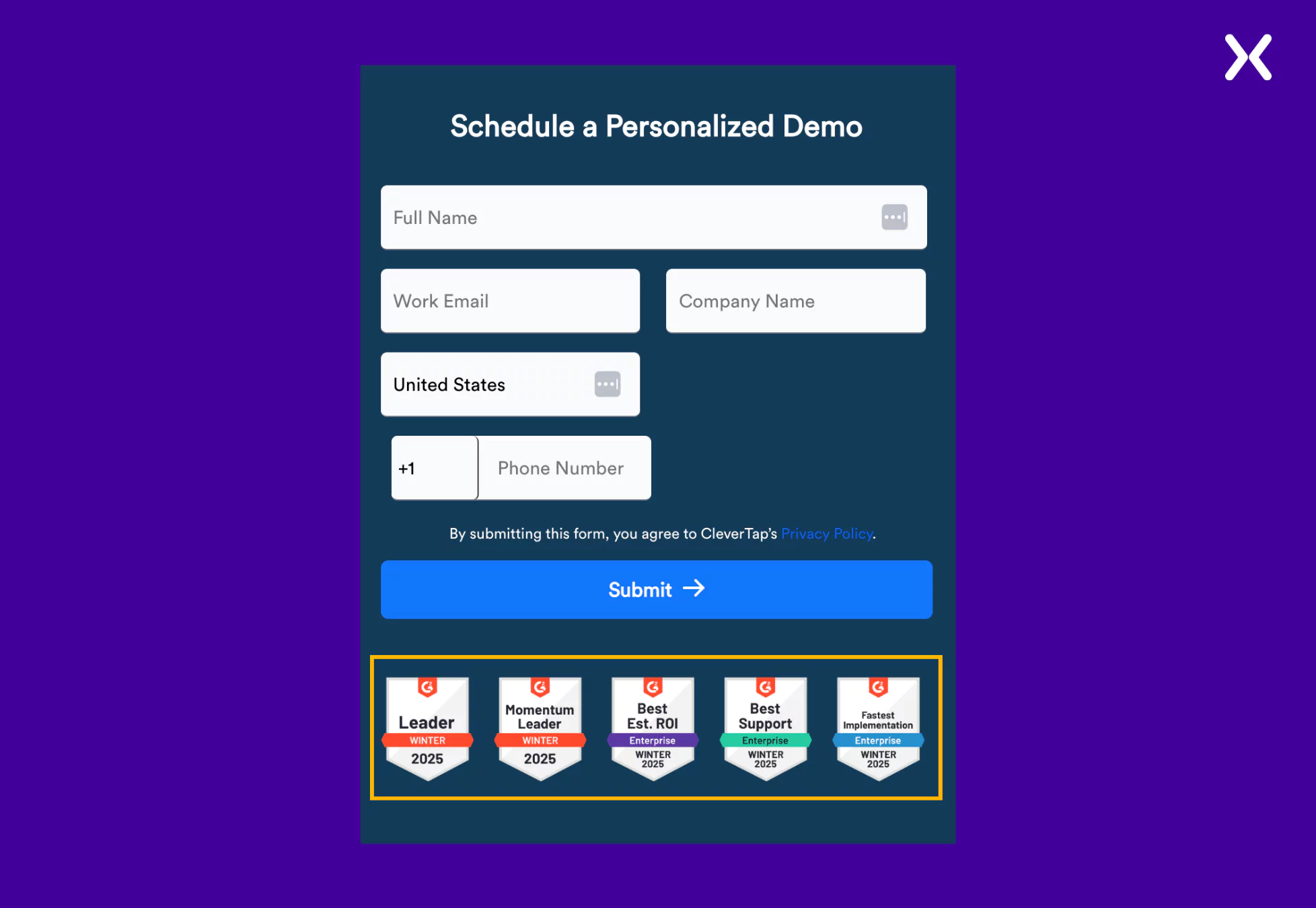
CleverTap strategically positions award badges just below their form CTA, adding a layer of credibility and trust. This thoughtful placement helps reinforce the value and recognition their platform has received, subtly influencing potential customers’ confidence and encouraging them to take action.
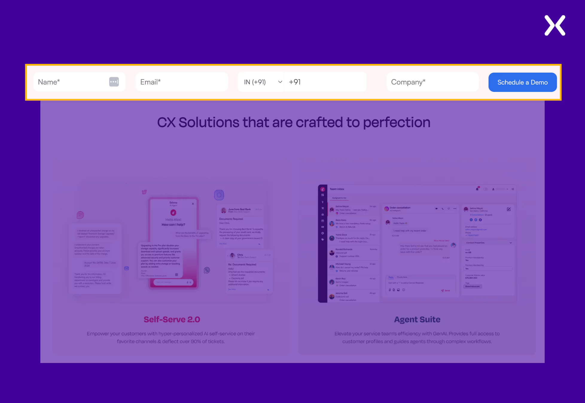
VWO is a go-to platform for many marketers to optimize their campaigns and websites. Their landing page offers two CTAs: “free trial” and “book a demo.” This is a hit-or-miss tactic, and the page must be A/B tested to ensure whether two or a single CTA works for it.
Returning to VWO’s SaaS demo landing page, we see it has everything, from features to benefits to social proof. It is a long landing page exploring the pain points VWO can solve.
- Built For Ad Campaigns
The SaaS demo landing page deep dives into every crucial benefit VWO has to provide its customers, not missing a beat with the visuals. The page is built for ad campaigns, where visitors might not be fully aware of VWOs’ capabilities.
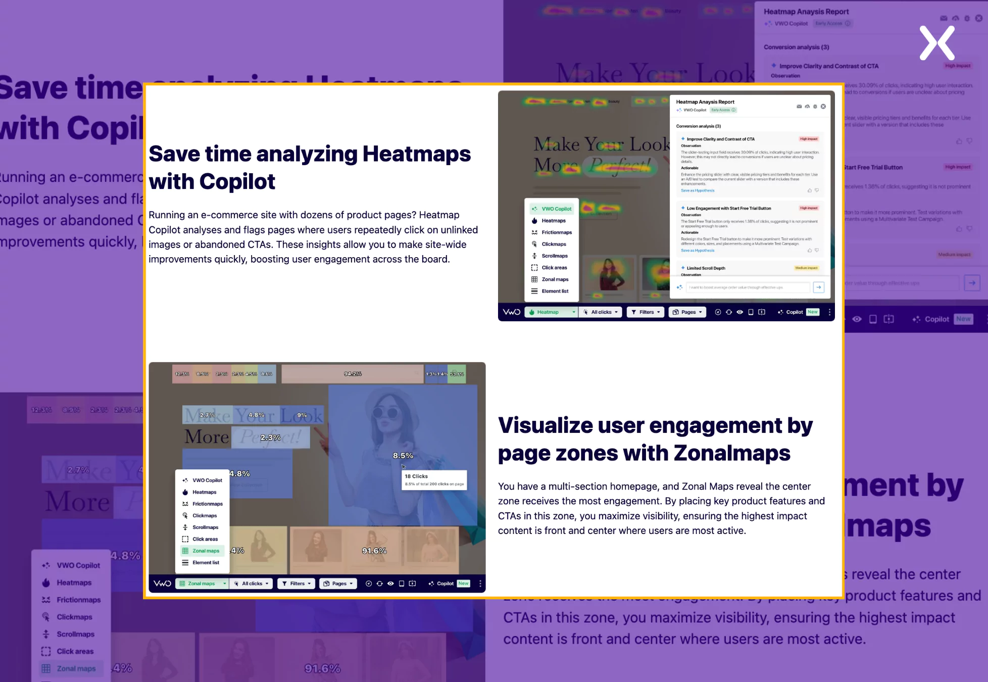
The book a demo page is a short masterclass on the power of heat maps, which convinces you of the importance of the VWO for better testing.
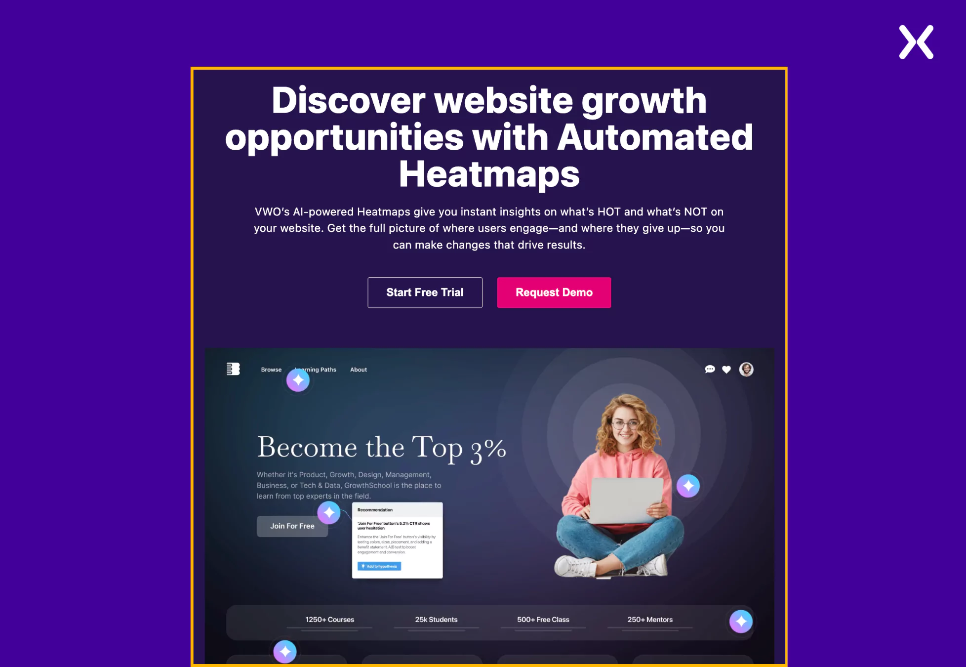
- Strong Top Fold
A compelling headline paired with an engaging GIF showcasing VWO in action—highlighting its powerful web insights and optimization capabilities—creates a strong, high-impact top fold.
SaaS products are inherently data-intensive, requiring extensive information processing to deliver meaningful outcomes. VWO goes a step further by prioritizing customer data security and transparency.
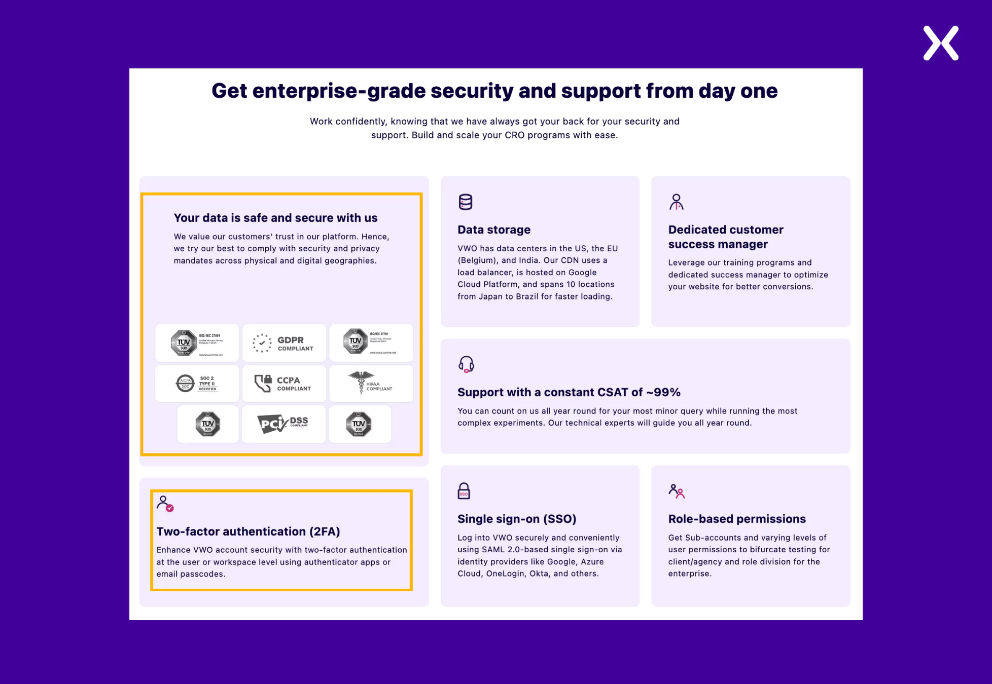
A dedicated section highlights the robust measures to protect user data, reinforcing trust and confidence. Even a small section like this can significantly impact visitor assurance and credibility on your book a demo landing page..
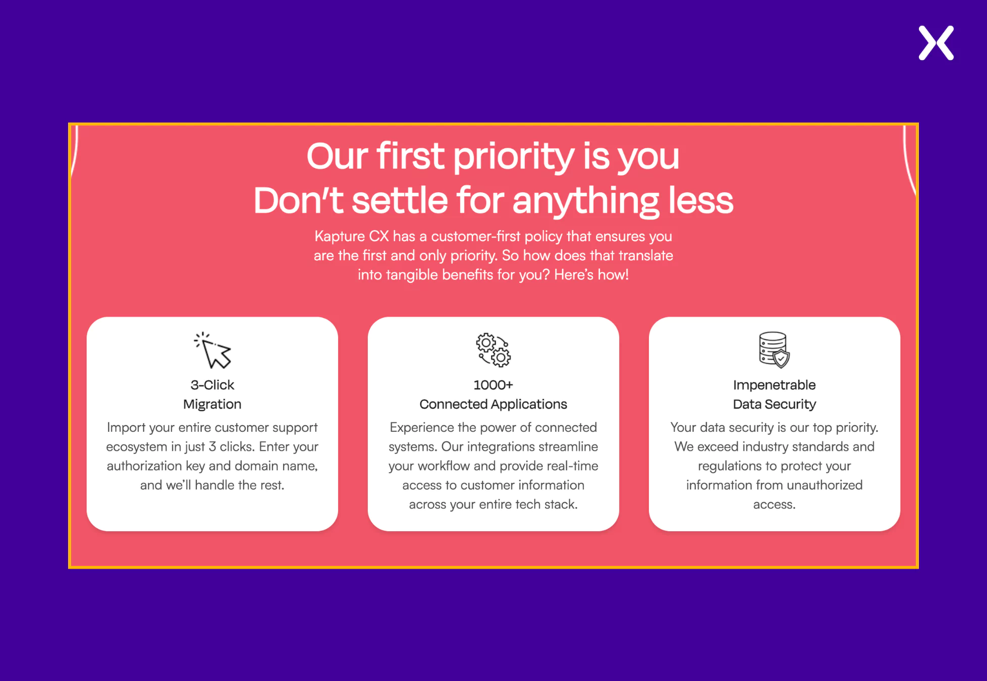
Kapture helps businesses automate their inbound processes like sales, distribution, marketing, etc. A SaaS demo landing page may not have space to showcase every feature in detail, but this demo page effectively does so by leveraging competitor comparisons.
In this case, the demo page highlights key features by comparing Kapture with Zendesk, its competitor, ensuring that each strength stands out clearly. The brand colors have been used effectively on the SaaS demo page, making its design and content highly appealing.
- A Sticky NavBar Again
Though we have already discussed the sticky navbar on the Craver SaaS demo page, which had just the CTA, Kapture takes it up a notch. They include a CTA in the navbar and a short, easy-to-fill form for booking a demo call.
- Powerful Copy
The Kapture demo page’s strongest point is its copy. It is crisp and concise, communicating the message of the page clearly. The language is direct, engaging, and free of unnecessary jargon, making it easy for visitors to grasp the key benefits at a glance.
The SaaS tool already has substantial content, and adding a full comparison table between Kapture and Zendesk could have made it even longer.
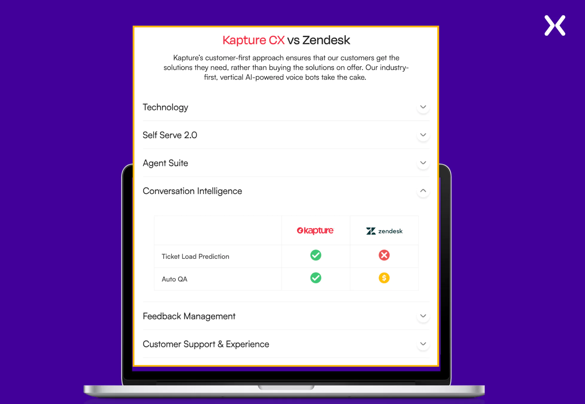
However, Kapture smartly addresses this by using toggles, allowing users to see high-level feature comparisons at first glance and revealing more details only when toggled. While not all SaaS demo landing pages rely on comparisons, toggles are a great way to present extensive information without overwhelming the visitors.
Now, let’s focus on some short SaaS demo landing pages. A truly short SaaS demo landing page has just one section to offer: the top fold. All the tool’s USPs and crucial social proof are concentrated in this section, along with the long form.
Flare, a cybersecurity-focused SaaS tool, follows the same formula as previous book a demo pages but executes it within a concise landing page.
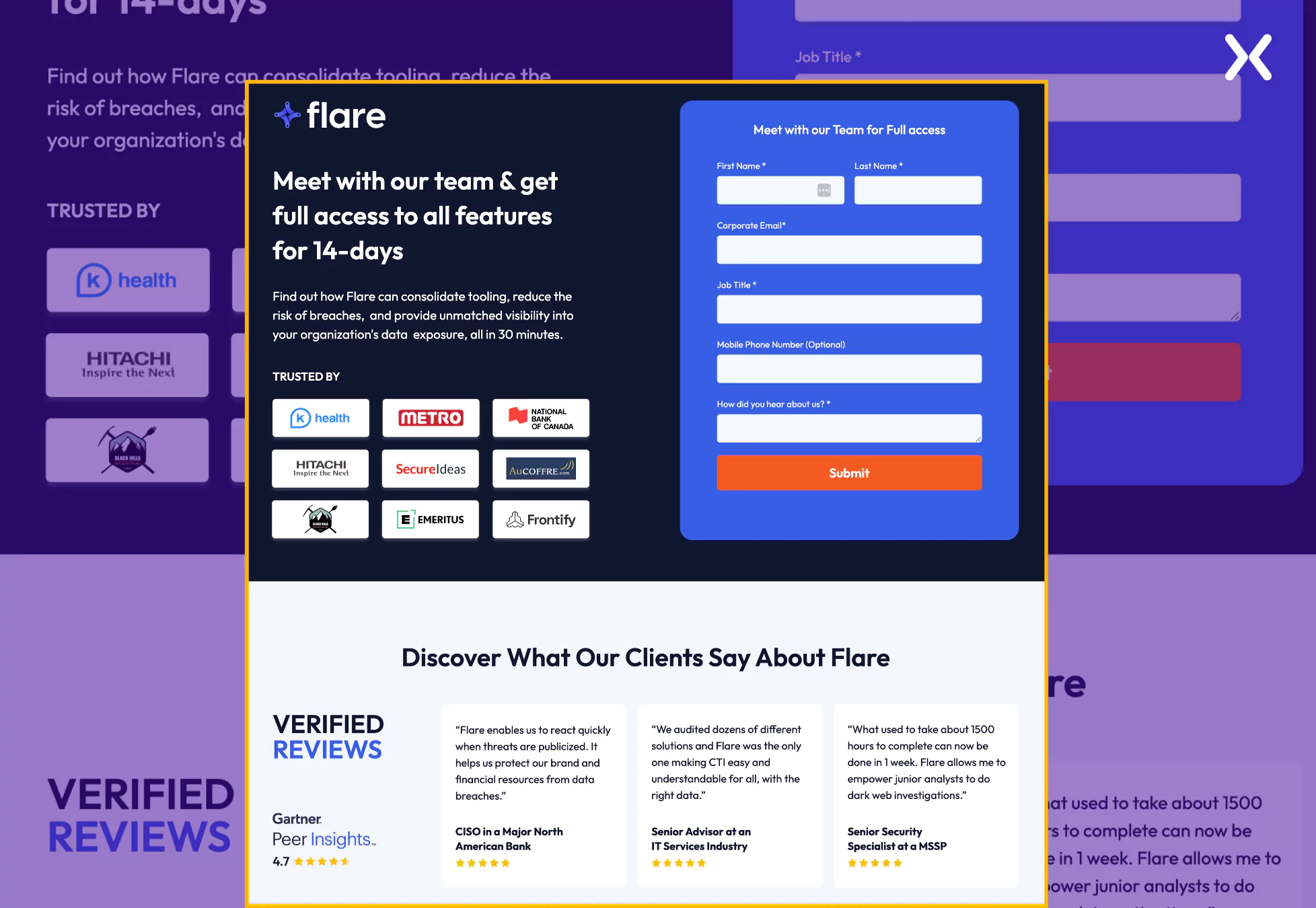
The page is neatly divided into two sections: one highlights the USPs, offer, and form, and the other is dedicated to social proof. This streamlined approach effectively captures serious leads for your business.
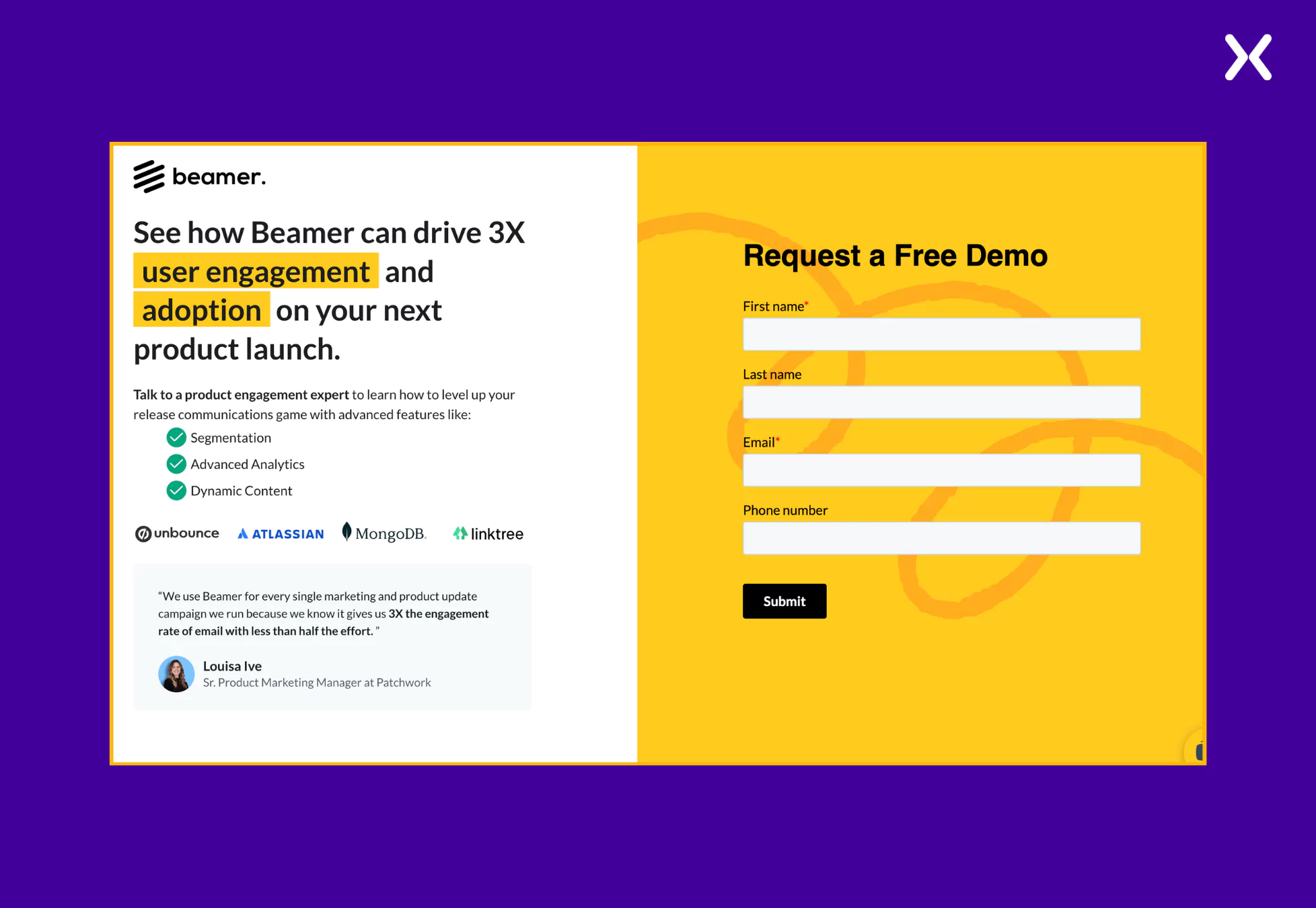
Beamer is a SaaS tool that helps product and marketing teams drive product adoption. They have a simple SaaS demo landing page example that covers everything crucial for a demo request landing page.
It is essential to explore various top SaaS landing page designs to finally pick the elements will become a part of your landing page. Such elements not only need to complement your brand but should also bring-in conversions. Also, don’t forget to complement your SaaS demo landing page with a thank you page as it will help you redirect new leads towards your socials and blog posts.
**Pro Tip: **Notice how none of the demo landing pages include a pricing section. This is a strategic choice, likely intended to encourage users to explore the product further, or engage with the sales team before making a decision. By removing potential price-based hesitation, the landing pages focus on showcasing value and driving conversions.
Creating impactful SaaS demo landing pages becomes easier when you understand which elements work.
The demo page examples above provided valuable insights into the design, messaging, and user experience needed to engage high-potential leads on a SaaS book a demo landing page effectively. Whether it’s multi-step forms, social proof, or clearly communicating product value, each element plays a crucial role in shaping the user journey and should be given careful consideration.
By analyzing these SaaS demo landing pages, we can craft conversion-focused campaigns that are strategically designed to drive results.
Apexure has 100+ blog posts on landing pages? We have shared everything, from creation to testing, analysis to optimization. Check it out before you build your SaaS demo landing page.
Making a SaaS demo landing page on your own with just examples can take a lot of time. Get the help you need from our experts. Book a call and one of our experts will contact you soon.
Check out our landing page portfolio to discover conversion-friendly landing page elements that might. Filter your industry and check which landing page design is trending.
A clear value proposition, strong CTA, engaging visuals, social proof, multi-step forms, and a seamless user experience.
Related Articles:
As CEO and Founder of Apexure, Waseem Bashir's decade-old experience in building high-converting landing pages extends to collaborations with Fortune 500 leaders. From free to paid he has tried his hands on all landing page builder tools and knows just the right fit for every business. Read more


Drive More Sales or Leads With Conversion Focused Websites and Landing Pages
Get Started


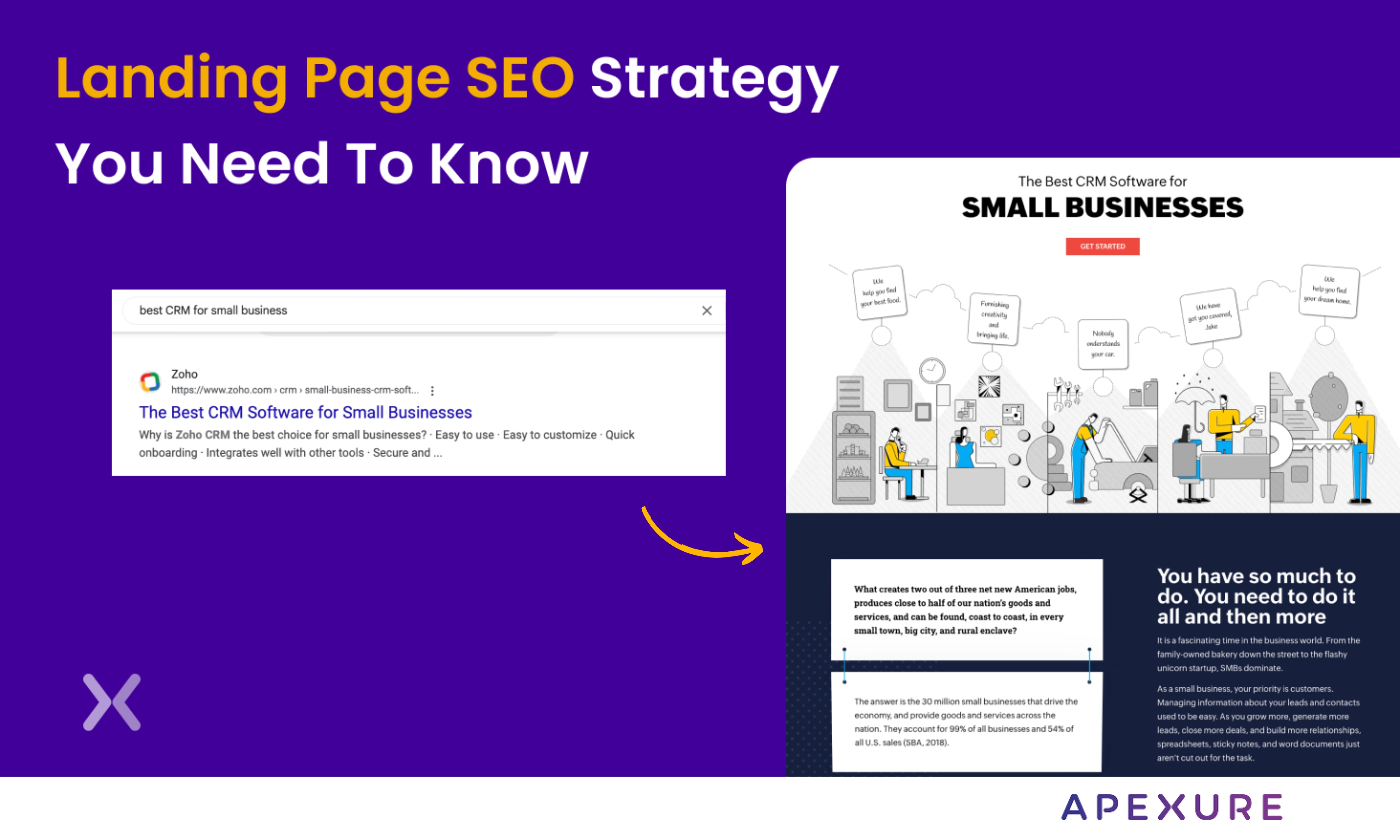
Landing page SEO is for companies still figuring out whether they want to do PPC. We know, PPC...
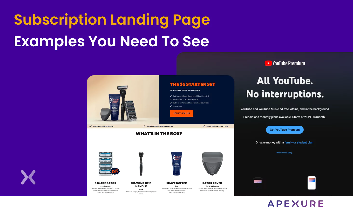
A subscription landing page is crucial to any marketing campaign, whether for a newsletter or a paid SaaS...
Get quality posts covering insights into Conversion Rate Optimisation, Landing Pages and great design
