Advertorial landing page designs are challenging traditional ads and present better alternate solutions to counter engagement deficit.
Traditional ads often fail to capture the audience’s attention and deliver in-depth information that consumers need to make buying decisions. Advertorials fix this by providing educational content in an engaging and compelling format, winning visitors’ trust.
To execute advertorial designs effectively, it’s crucial to understand how other brands are innovating with them. This article will cover all the basics and advanced practices that can make your advertorial landing pages deliver valuable insights while driving conversions.

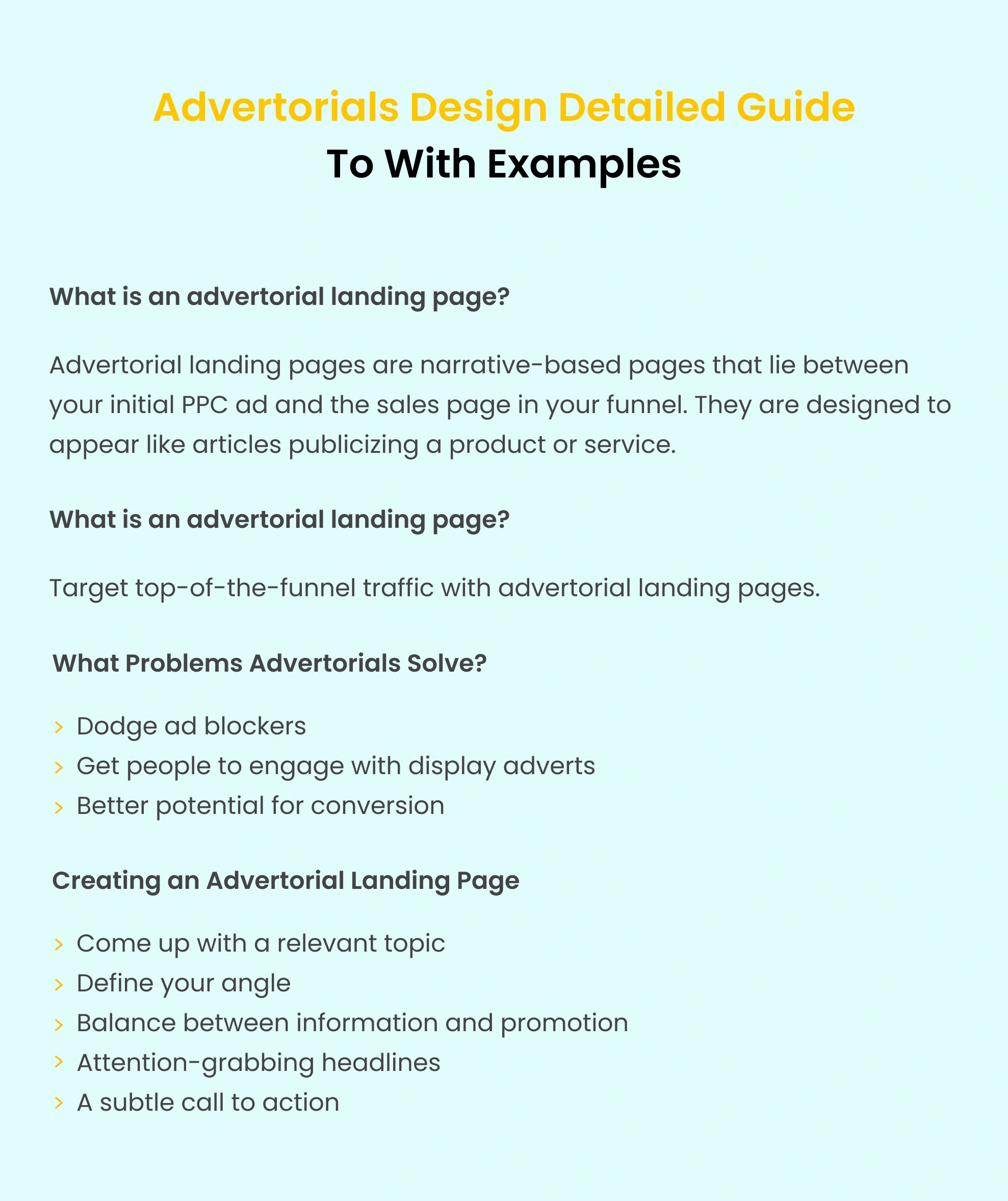
Advertorial landing pages are narrative-based pages that lie between your initial PPC ad and the sales page in your funnel. They are designed to appear like articles publicizing a product or service and can be used for various industries like SaaS, finance, insurance, etc.
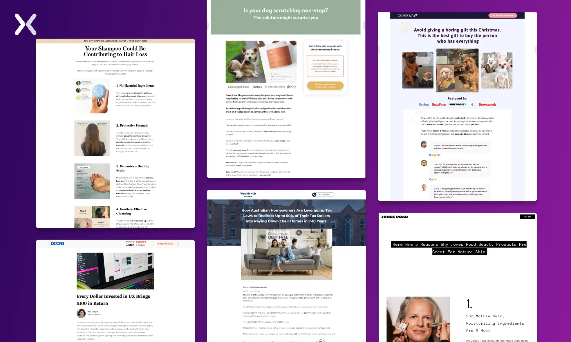
People familiar with landing pages know that they are the place where a visitor “lands” after clicking on a link in an email or on paid ads from Google, Facebook, Instagram, and other websites. Landing pages, unlike web pages, are developed with a single objective: persuade visitors to take a desired action.
Advertorials are a clever play on words, combining the terms “advertising” and “editorial.” In simple words, advertorials are advertisements that appear in the form of an article. They are long-form sponsored advertisements disguised as educational pieces.
An advertorial landing page poises visitors to buy from you well before they ever arrive on your sales page, thanks to expertly produced stories that bring them further along the buyer’s awareness cycle.
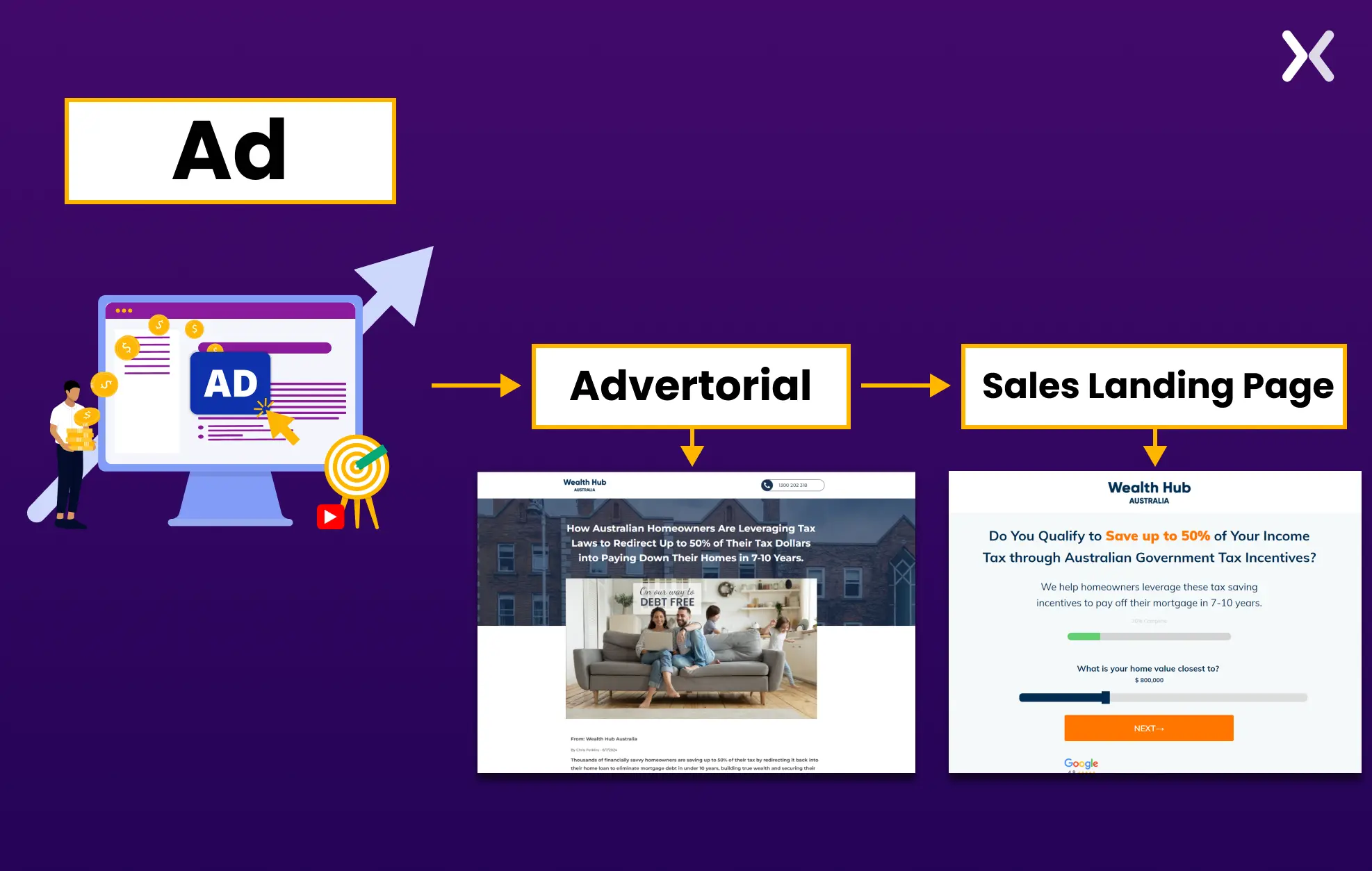
The ability to create an outstanding marketing campaign depends on how well one meets a consumer’s expectations right after they have engaged with their paid ad. It is all about creating that perfect post-click experience, which becomes better with the help of compelling advertorial designs.
Creating an advertorial landing page that does its job well is very much like making small talk at a social gathering: it breaks the ice gently, lets you put a foot in the door, and makes the selling process that much more effective. In addition, they warm up cold traffic so that readers who click on your ad are eager to buy even before they get to your product landing page.
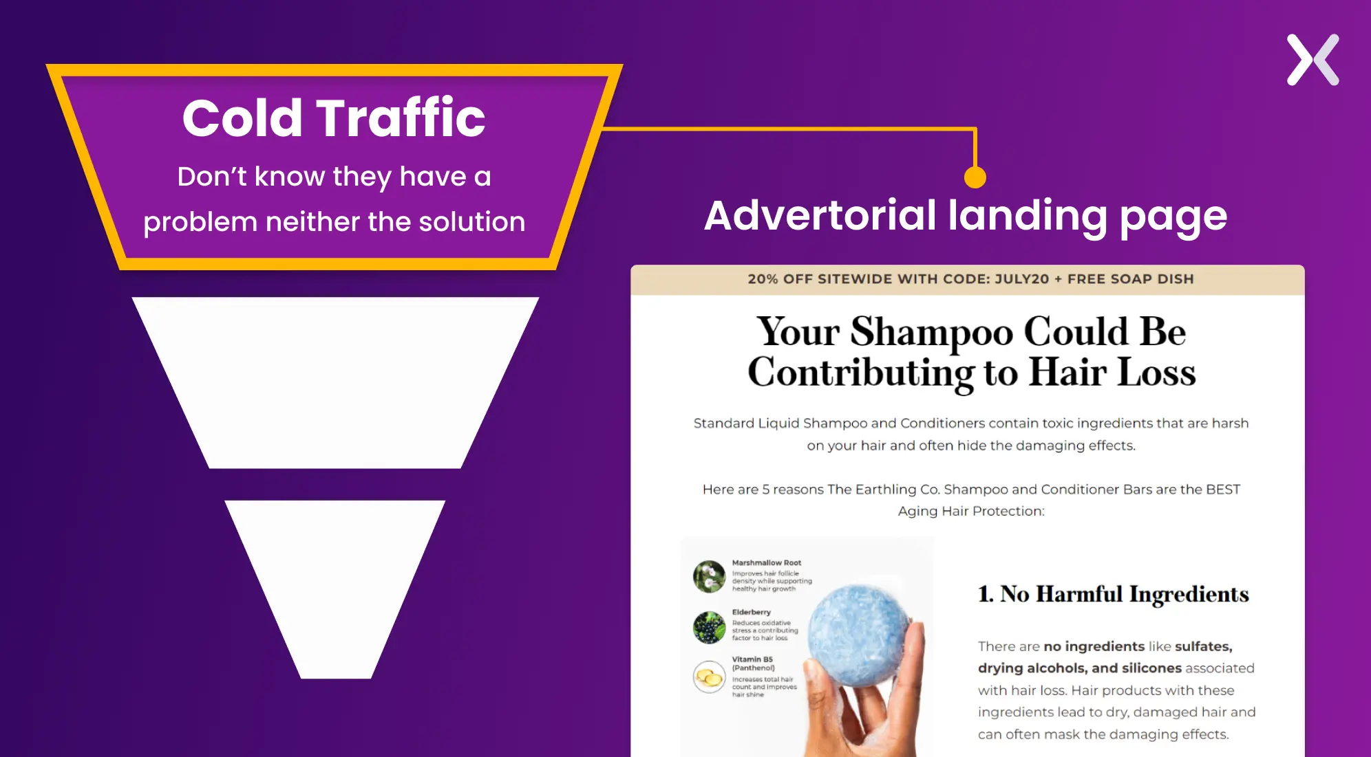
One of the greatest things about employing advertorials is that they provide a lot more information, both in quantity and quality, are easy to build and cost effective. The necessity of being subtle does not hold them back, presenting the consumer with a remarkable amount of knowledge that is otherwise lost in the advertising process.

This essentially means that digital marketers, entrepreneurs, and B2B companies can use it to efficiently warm up cold traffic, making them perfect for targeting top-of-the-funnel leads.
Let’s learn from advertorial design examples the best practices for such landing pages.
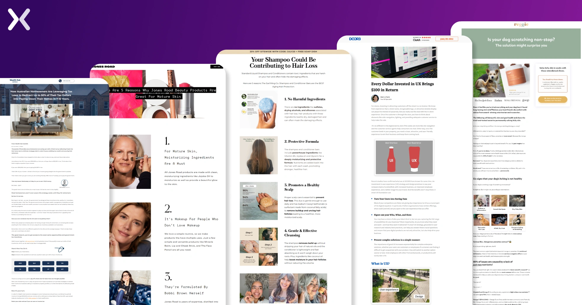
Opening with a proper headline and relevant image, the advertorial landing page has just one click-to-call button in sight, sitting at the top right of the page. It allows users to easily access the call option without interfering with their reading experience.
A crucial element of this landing page is that the author and their image are credited at the start of the page, which makes the content appear genuine and trustworthy.
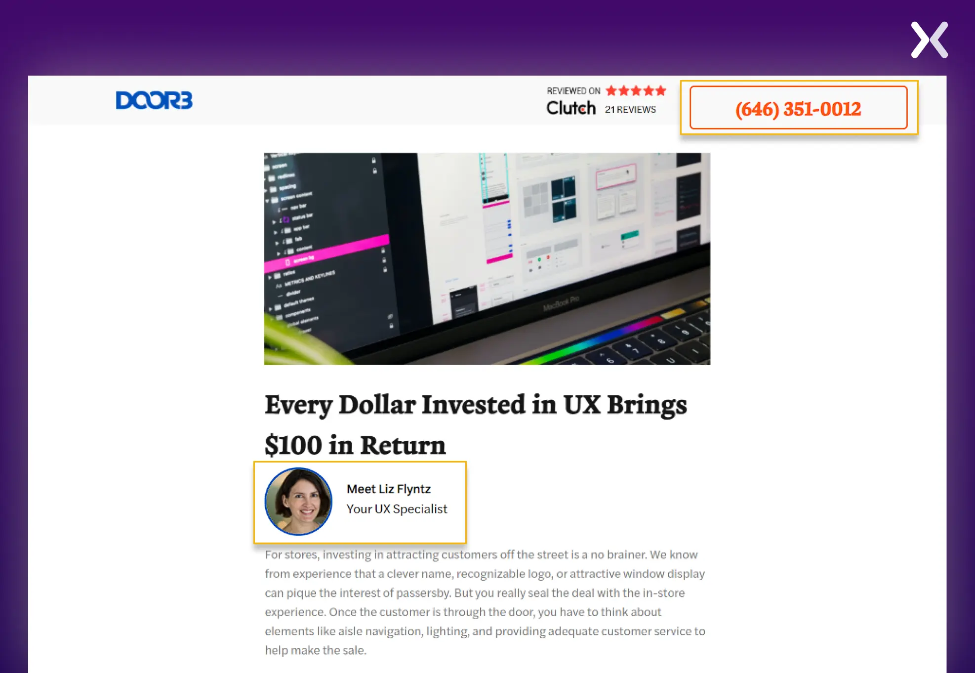
The editorial is filled with relevant information, and the impact is amplified with images.
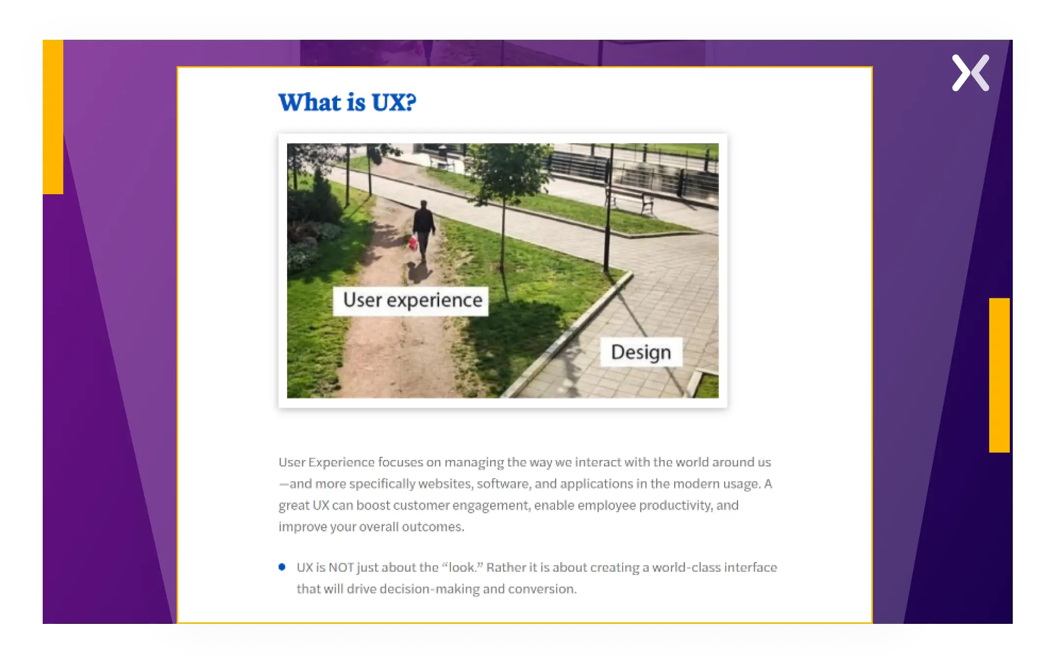
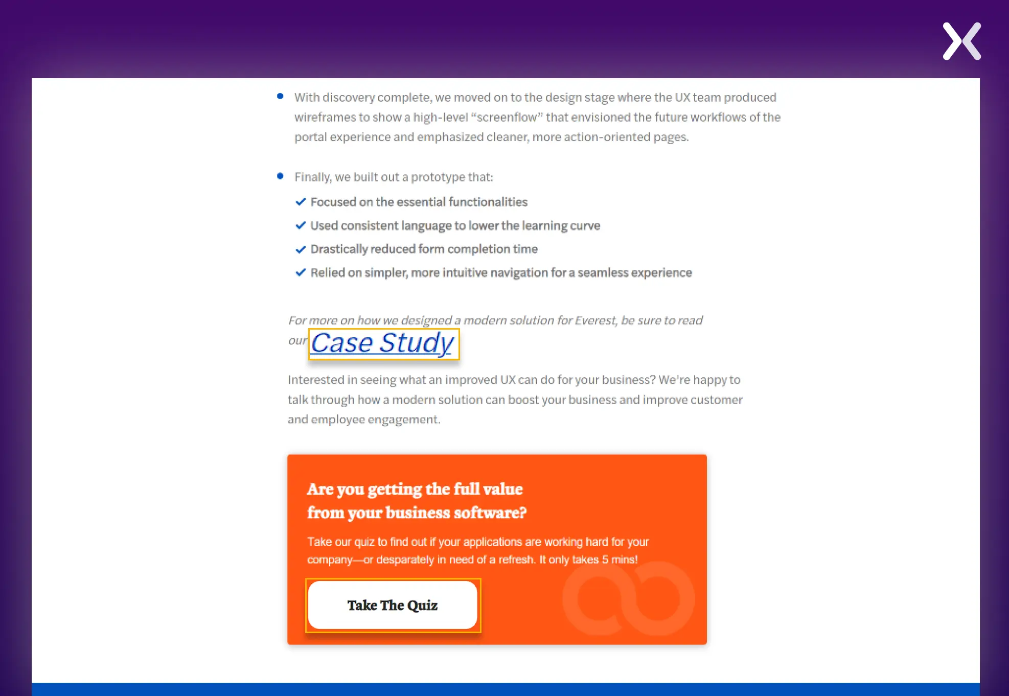
The advertorial design is not riddled with CTAs everywhere and is filled with enough breathing space. The page ends with two CTAs, one that leads to DOOR3’s recent case study and another that encourages readers to take a quiz that will help them further understand their problem and finally schedule a call with their team.
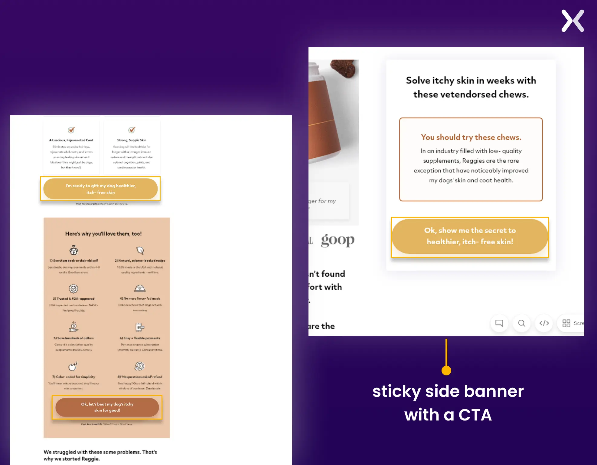
Reggie’s advertorial design does it right when it comes to educating your audience. They have an in-depth editorial discussing visitors’ pain points and ensuring that they don’t leave without knowing the solution.
If, unlike DOOR3, you want to put CTAs across your advertorial landing page, then you can definitely take notes from Reggie’s page. They have created specific sections that are dedicated to featuring different benefits of their product, followed by a well-placed CTA. They also have a sticky side banner with a CTA that follows you throughout the page without disturbing your reading experience.
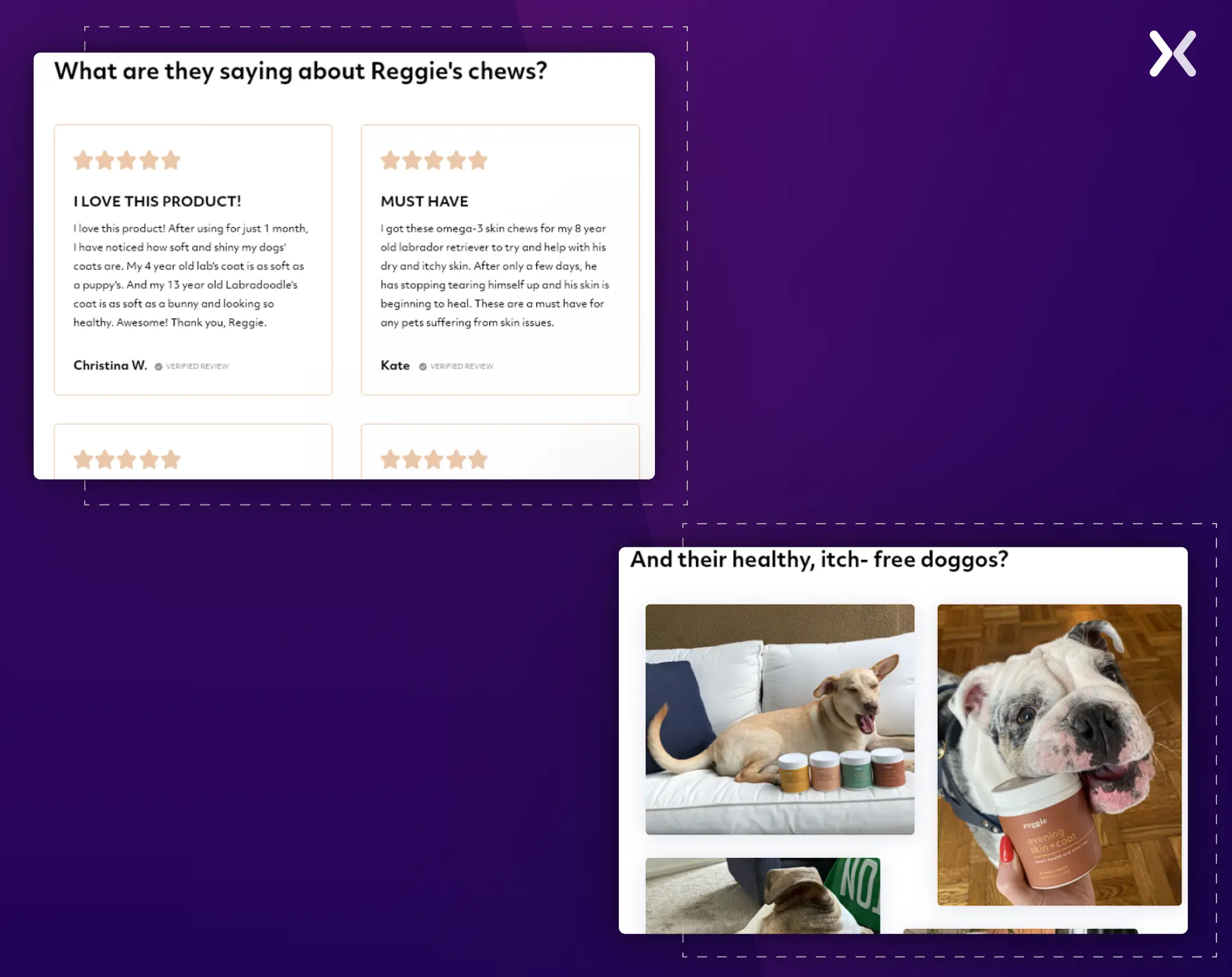
The page ends with a lot of social proof, like testimonials and cute dog pics of their product, which work great for building up to the final CTA.
The final CTA banner showcases the product and lists out in-short what makes the product amazing.

Earthling Co’s advertorial design is different from the ones we discussed before, as it utilizes a listicle format.
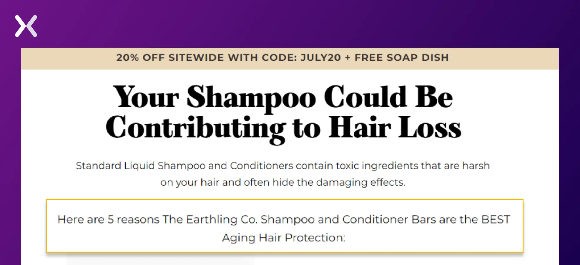
The heading is persuasive, followed by a subheading that sets the stage for the upcoming listicle. The five points are extensively used to showcase all the benefits and features of their product effectively. The vibrant and descriptive images add more value to each point.
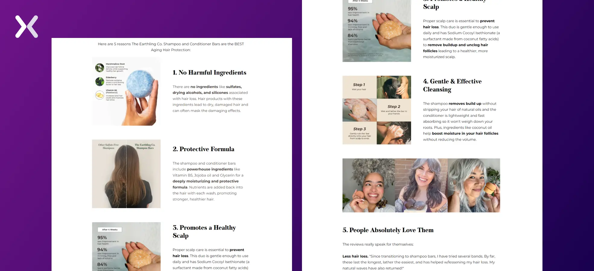
The fifth point focuses on testimonials and showcases various problems the product has solved for the customers, increasing the credibility of the product.

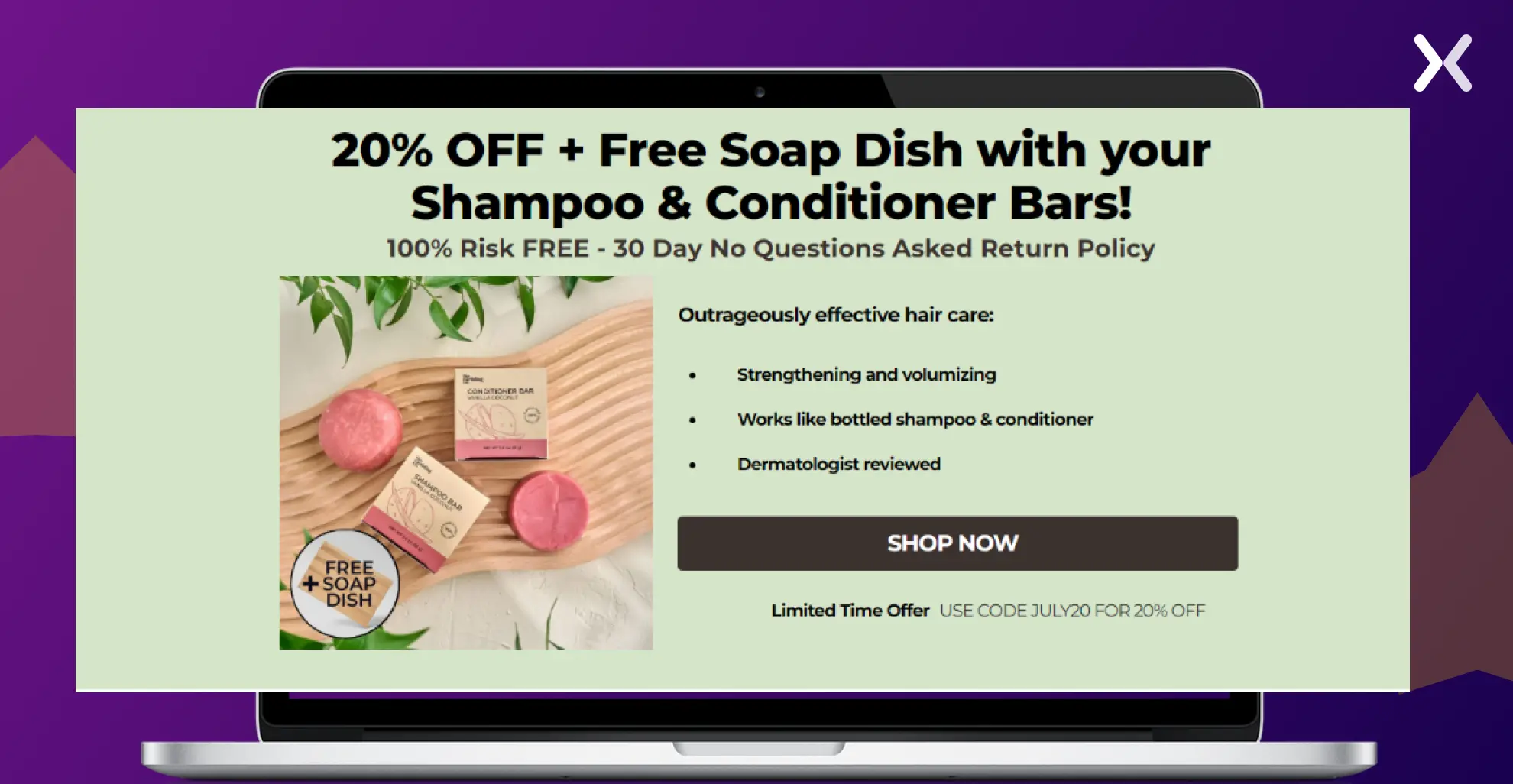
The page ends with a final CTA banner that offers incentives like a free soap dish, a 20% discount to entice purchases and a 30-day return policy.
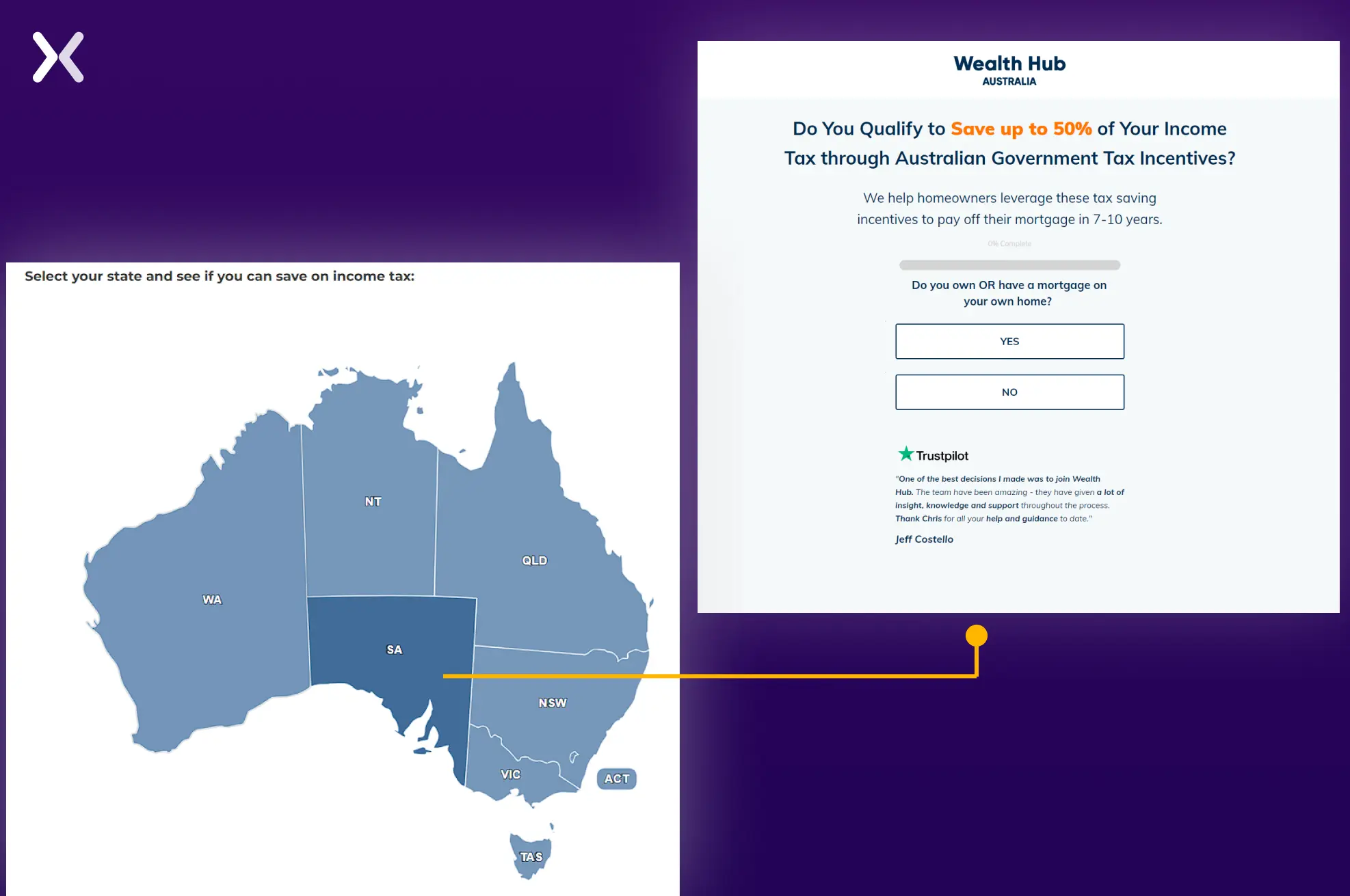
Wealth Hub has a simple advertorial landing page and shares information using the article format. The headlines highlight the value proposition. This direct approach captures the user’s interest and sets a strong foundation for the content.

But here’s what you need to notice, to kick off the conversion process, they ask a basic question to the reader: Select your state and see if you can save on income tax.

The map is interactive, which allows users to share their state easily. The page then redirects to a landing page that captures further user information with a multi-step form and also has social proof on it. This clever tactic slowly pushes your visitors towards conversion.
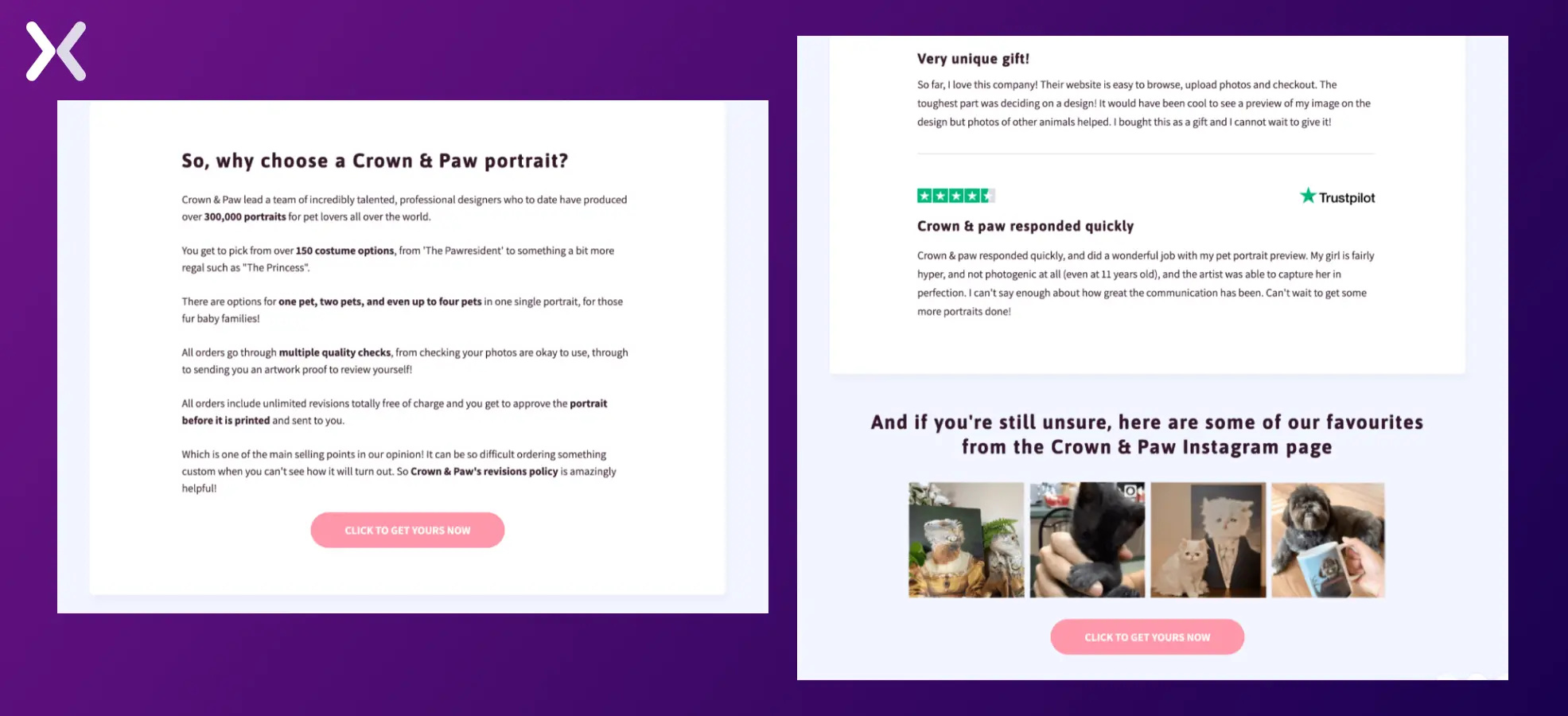
Crown & Paw demonstrates its robust social proof with the help of an advertorial landing page. Filled with testimonials and images, the customer reviews themselves make up a great case for why you try out their services.
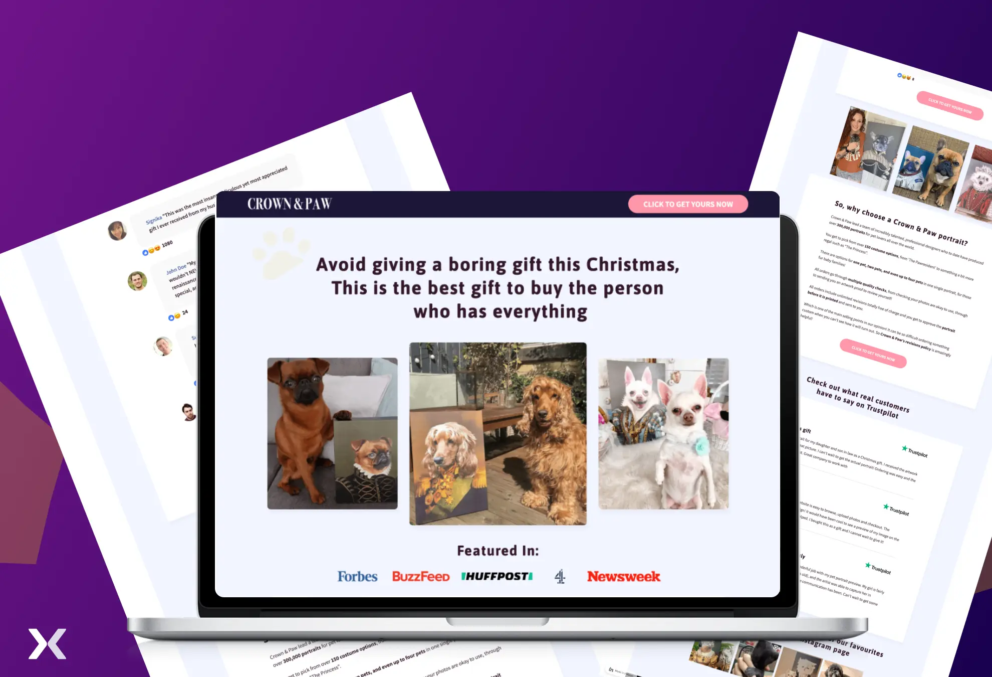
Their advertorial design starts with a great heading and user-generated content images. Before sharing the testimonials, a small para introduces visitors to the product.

Another section is dedicated to Crown & Paw’s variety of product options, with a simple CTA at the end. The page ends with more social proof.
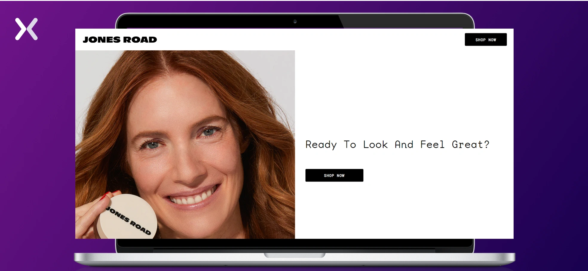
Here, we have another advertorial listicle landing page. Jones Road utilizes a clear headline and high-quality images that accompany all the points made in the listicle.

The page is kept simple, with only two CTAs, one of which is a sticky button. There is enough whitespace. Overall, the page’s vibe rightly complements the brand.
The advertorial begins with a compelling headline that clearly identifies its target audience. The page is then adorned with vibrant images of the product and satisfied users, creating an excellent first impression.
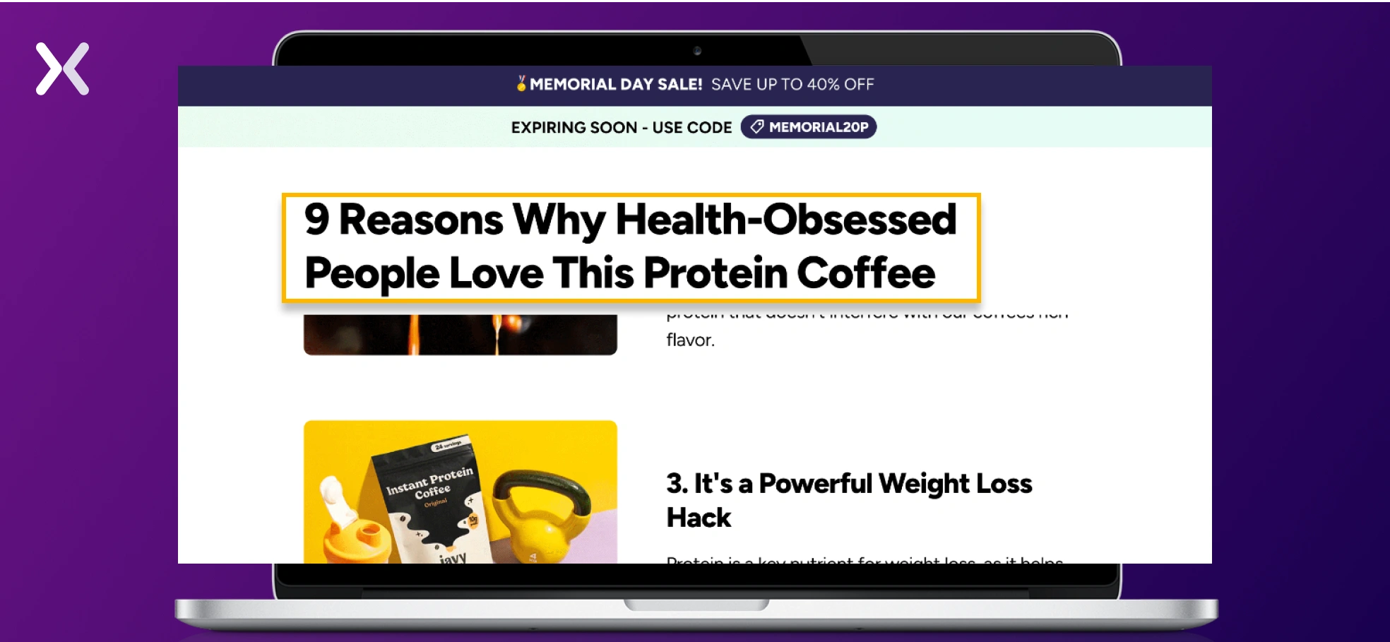
Javy showcases its protein coffee through various use cases illustrated with images. For instance, placing the protein coffee shake beside a breakfast plate or alongside chocolates creates compelling visuals and reinforces strong visual messaging.
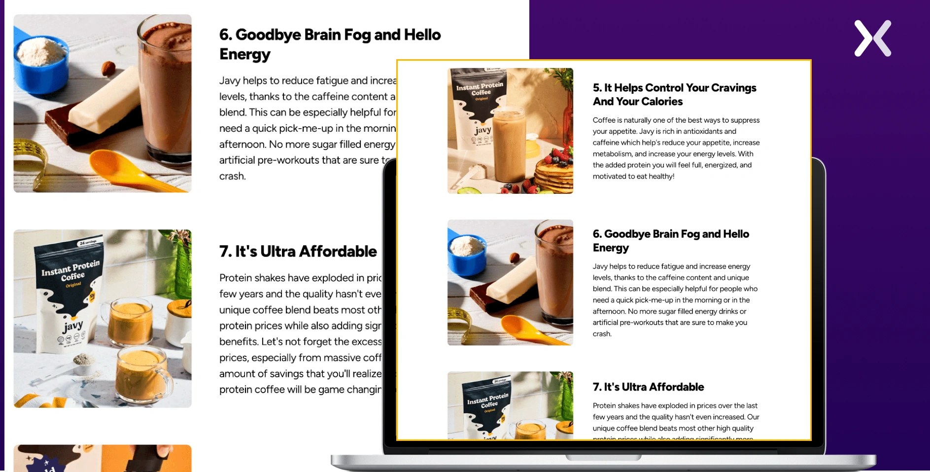
The page ends with a final CTA banner with all the USPs for the product in a list.
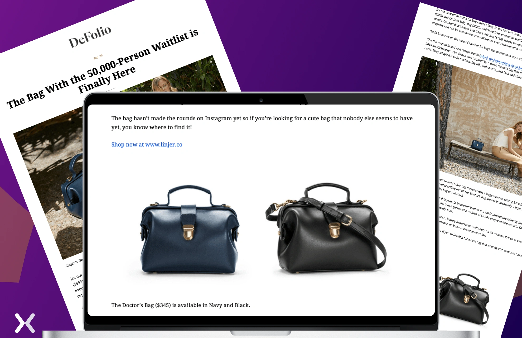
With an intriguing headline and captivating product images, DeFolio leaves visitors wanting more, encouraging them to scroll and explore the full story.

The advertorial is kept concise, providing small, specific details about the product. It concludes by showcasing the available colors, offering visitors a choice, and subtly nudging them toward purchasing the bag.
This advertorial effectively compares a new, superior product against older or less effective alternatives.
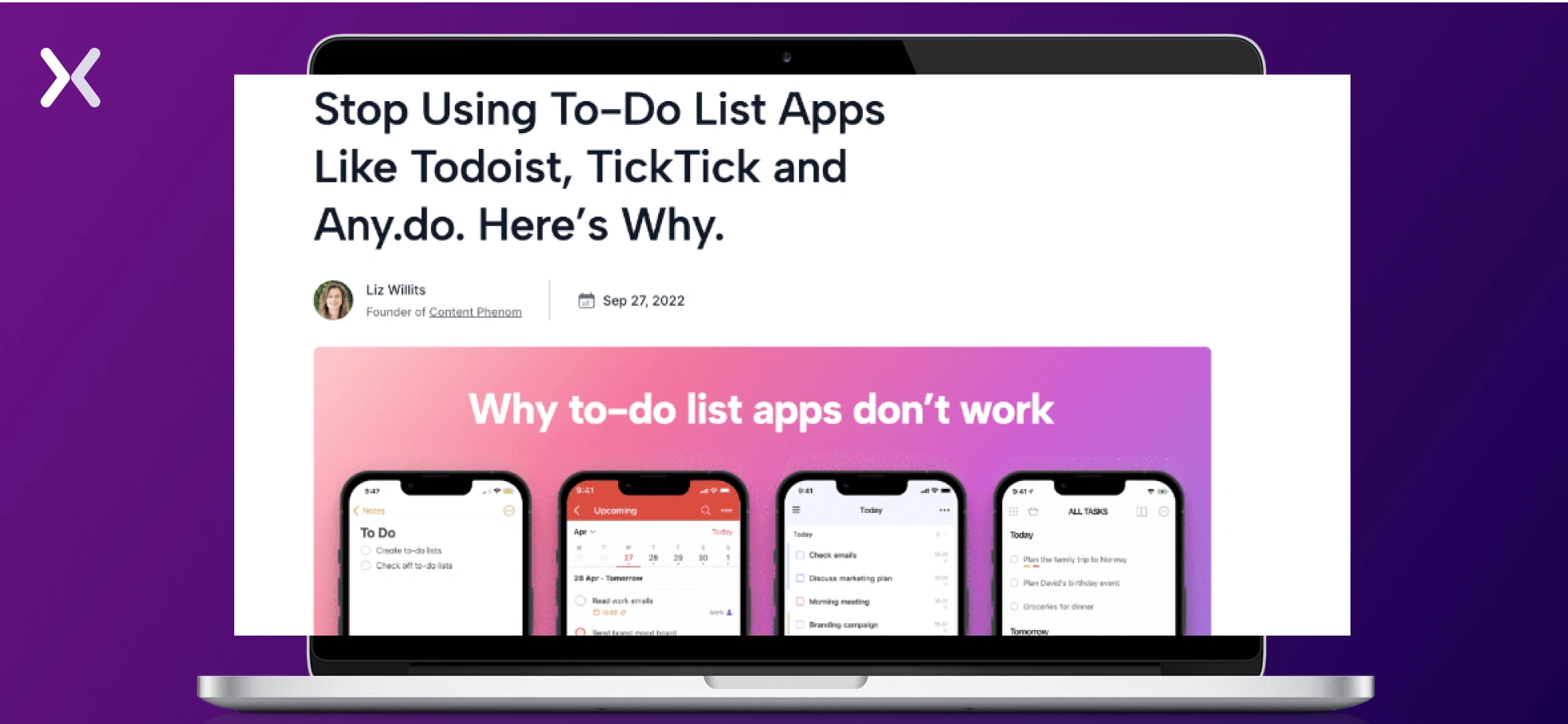
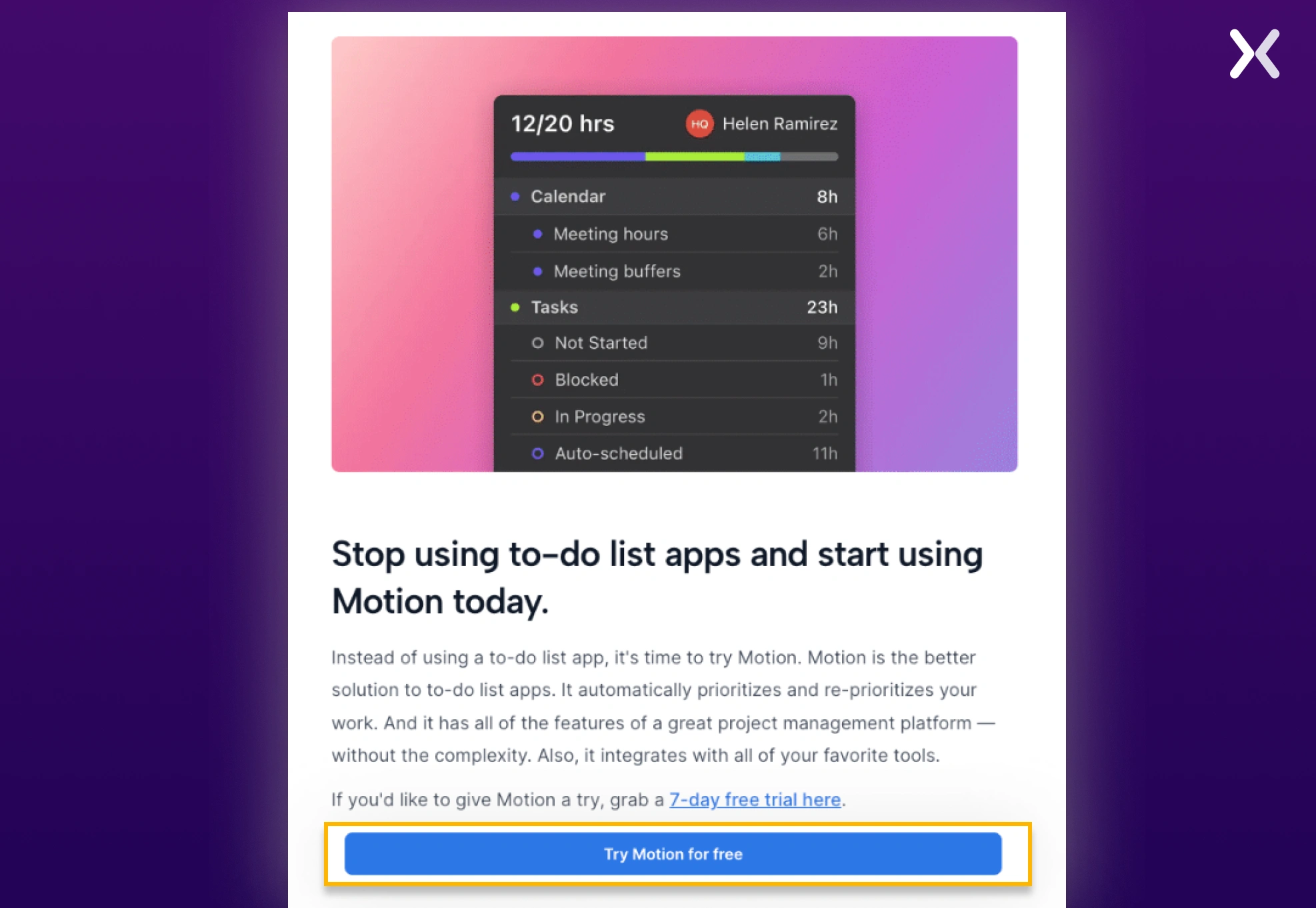
By highlighting the contrasts, the new option appears significantly more appealing. Motion uses images of all its competitors and clearly points out their various features.
Psychologically, these contrasts emphasize and exaggerate differences, making the choice seem obvious within the context of the advertorial. Without being pushy, the advertorial conveys the message that Motion offers a better product, encouraging visitors to simply “Try Motion For Free.”

“Advertorials have been a real game-changer for us. We used them to educate potential customers on credit card rewards. This resulted in a 40% increase in the number of qualified leads. Social proof is one of the key psychological triggers we have found most effective. We increased our conversion rate by 25% simply by adding user testimonials.”
Advertising is a skill in and of itself, and knowing what to employ at when the time will help you tap into it effectively. For example, to make the most out of your pre-sales page, it would be useful to be able to recognize and select the appropriate form of advertisement for which you’re paid to advertise.
Advertorials are most often confused with native advertisements and sponsored posts, another form of marketing prevalent in today’s advertising projects. Because they are so similar, distinguishing when to use one and when to use the other will be extremely crucial.
Essentially, native advertising is a form of marketing that has been carefully curated to make the reader feel like they are gleaning important knowledge. The main purpose of native advertising is to actually help the reader rather than sell them a product.

On the other hand, advertorials prove to be extremely useful in situations wherein the audience is expecting to be sold on a product. The direct, fact-of-matter nature of an advertorial makes the reader feel like they have been well-informed about the product before they are asked to buy it.
Over the years, sponsored posts have become prevalent on social media platforms like Instagram and YouTube. They are focused on sharing crucial information about the product with the viewers and having a clear CTA.

The main difference between them lies in the way that the user experiences the paid content. When it comes to brand recognition and general advertising, leveraging native advertising and engaging with advertorials when consumers are prepared to accept a sales pitch from the article would be beneficial. Sponsored content is crucial when most of the audience consumes influencer content.

“Although an advertorial may resemble a landing page, it is essentially a blog post infused with landing page elements. While it deviates from the traditional landing page format by starting as a blog post or editorial, its goal remains the same: to support a specific campaign by delivering personalized and targeted information.”
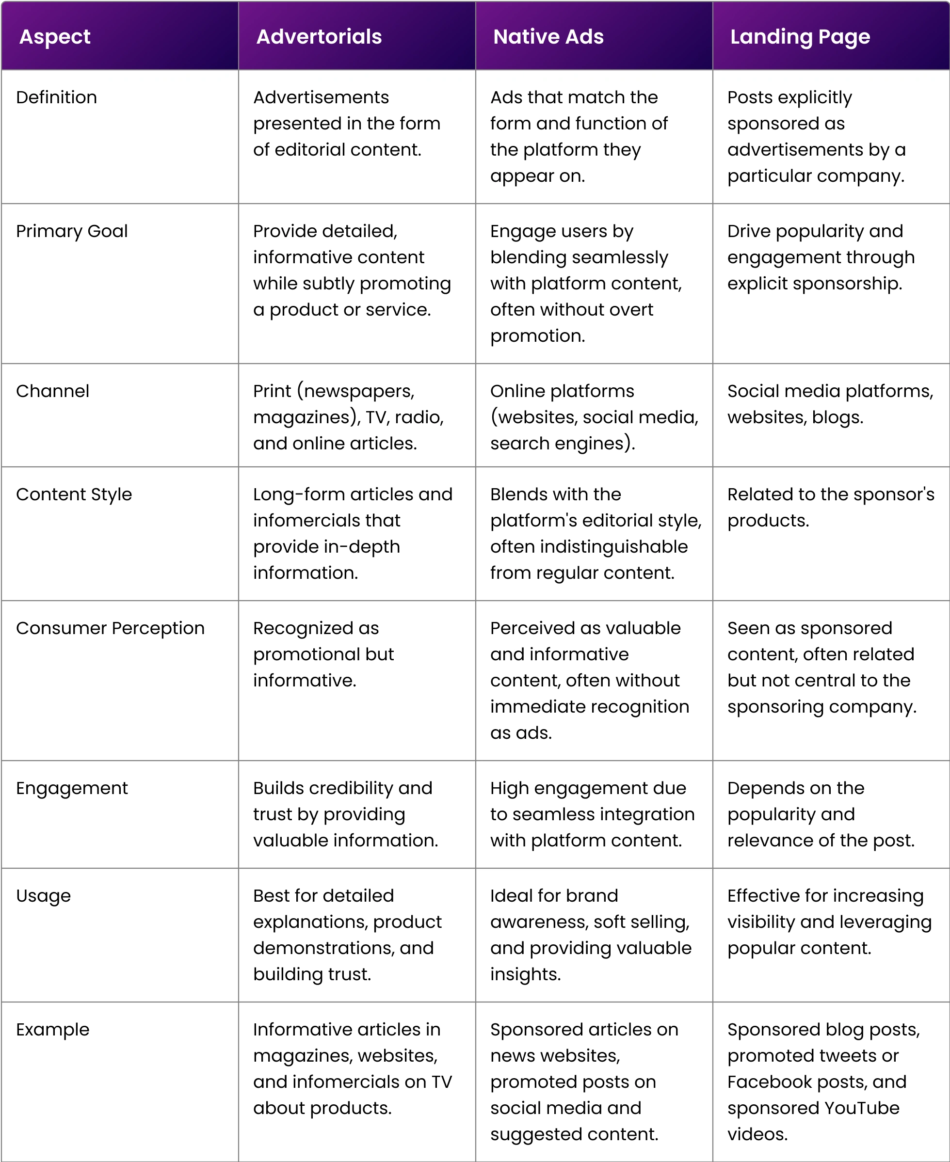
Here’s a comparison table for making things easier.
One of the primary advertorial landing page goals involves solving the problems presented by other means of advertising. Here are a few ways in which advertorials prove to be extremely advantageous:
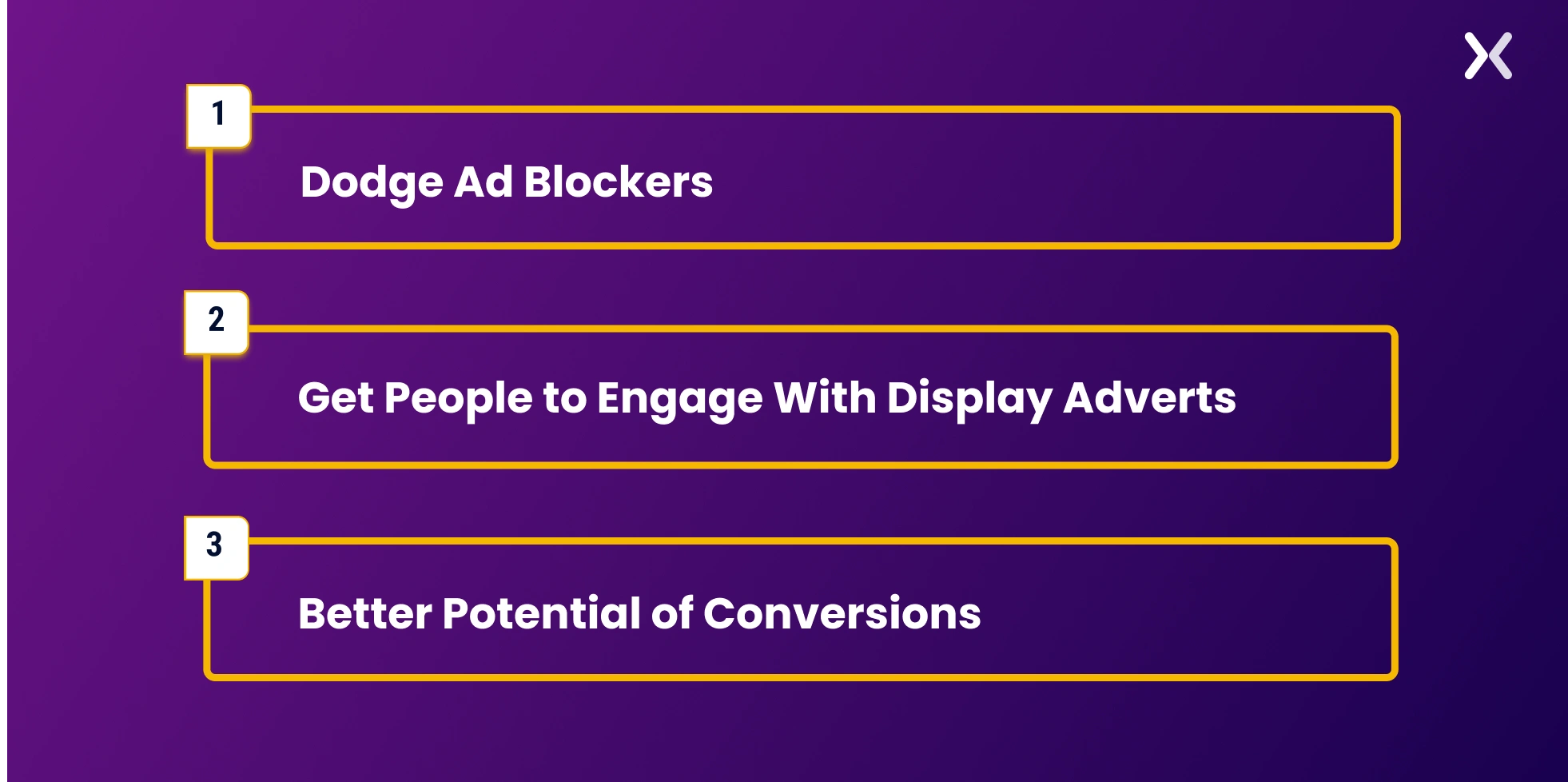
Sick and tired of the intrusive nature of pop-up adverts, nearly a quarter of the users on the Internet have employed some ad-blocking mechanism. Unfortunately, this essentially means that a significant part of paid articles does not reach their intended audience. Advertorials help because they are embedded in the site itself, meaning that they cannot be categorized as advertisements. This means that they are effective loopholes around ad blockers.
Since advertorials seem less meddlesome than their pop-up counterparts, the reader is more likely to engage with the content they present. In rare cases, they may even prove useful in bringing in organic shares, a mechanism that normal ads would not be able to capitalize on.
Offering a softer approach to dealing with the reader strengthens their connection. In addition, an advertorial’s storytelling ability can help the reader develop trust in your content, eventually leading to the realistic possibility of making a sale.

“Advertorials have been a vital part of our marketing strategy to build brand awareness and drive user engagement. For instance, we built a campaign, 'Helping Shoppers Save,' where we employed advertorials to educate users about how to leverage our platform to find the best deals. We use psychological triggers such as scarcity ('Hot deal, expires soon') and social proof ('Verified by thousands of shoppers') to drive action on our advertorials. However, the key aspect is maintaining authenticity and providing value to ensure a positive response from our customers.”
Whether you are a technology consulting company or business services provider, it is extremely important to be well-versed in advertorial landing page best practices.
Researching and surveying your target audience will prove extremely advantageous for you as a digital marketer. Understanding exactly how your audience is talking is talking about and perceiving the proposed product/topic will help you customize your advertorial to fit their needs.

The main point of an advertorial is its format. Therefore, defining the angle you will take when approaching the potential buyer will greatly increase the effectiveness of your landing page.
People are naturally drawn to stories. Advertorials that tell a compelling story can transport readers into a different mindset, making them more receptive to persuasion.
Utilize narrative transportation, where engagement in a story increases persuasion by reducing counterarguing and increasing identification with the characters. It makes the message less of an overt pitch and more of a shared journey.
Advertorials often create a curiosity gap by providing just enough information to pique interest but not enough to satisfy curiosity. This gap between what people know and what they want to know compels them to click on the advertorial to learn more.
By using such a technique, you can leverage the psychological principle that humans have a natural desire for closure and resolution, which prompts them to seek out the missing information.
Overly promotional content often puts off readers, and too much information might divert attention from promoting the product itself. This is where using advertorials makes a huge difference.
Engaging in a storytelling process makes it easier for the reader to consume your content, paving the way for potential conversion into a sale. It is all about hitting that Goldilocks note.
One of the basic rules of advertisements is the attention-grabbing ability of a tool. Generations of advertisements have used this tactic, ranging from catchy slogans to bold editorial titles, and have received noteworthy success.
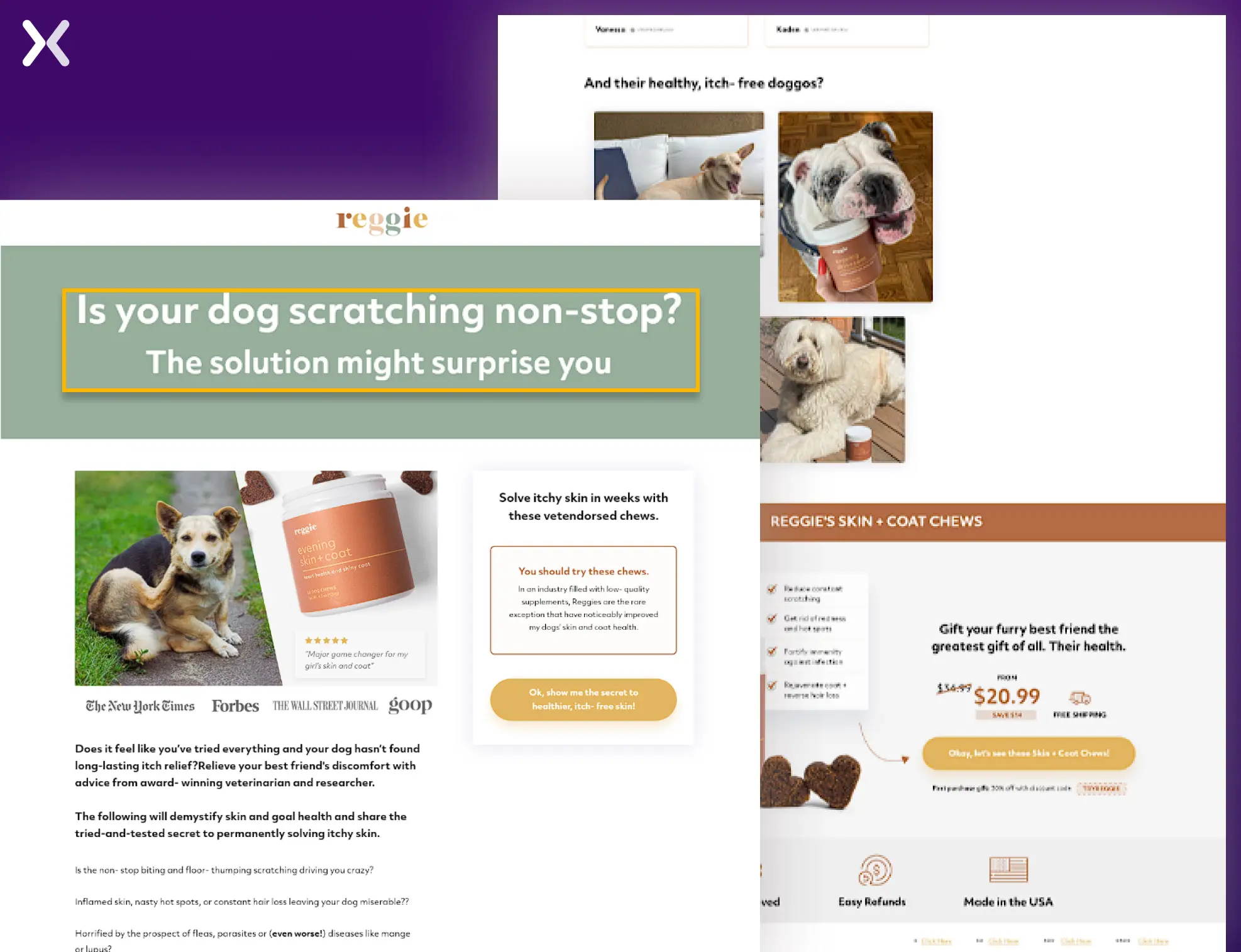
Advertorials are essentially advertisements; therefore, using eye-catching headlines would be ideal.
Ultimately, the point of an advertorial is to encourage the customer to buy the product it endorses. Therefore, it would be prudent to add a call to action, asking the consumer to take tangible steps to buy the product. Business services could achieve this by placing a URL that will take potential buyers to the main site itself.
And don’t forget the final CTA banner.
.webp)
Advertorials that are well-executed add value to the target audience while simultaneously selling a product or service. They’re a content marketing ploy that takes advantage of the site’s reputation where they’re published. Using them in landing pages is a clever tactic that every digital marketer hoping to get the most out of their advertising process must note.
Apexure has over 100 blog posts on landing pages. We have shared everything, from creation to testing, analysis to optimization. Check it out before you build your advertorial landing page.
Making a landing page on your own can be overwhelming. Get the help you need from our experts. Book a call, and one of our landing page experts will contact you soon.
Check out our landing page portfolio to discover conversion-friendly landing page elements that might be missing from your campaigns. Filter your industry and check which landing page design is trending.
An advertorial mimics editorial content to share information and subtly promote a product, while an advertisement is a straightforward promotional message.
Related Articles:
Drive More Sales or Leads With Conversion Focused Websites and Landing Pages
Get Started.png)
Landing page SEO is for companies still figuring out whether they want to do PPC. We know, PPC...
A subscription landing page is crucial to any marketing campaign, whether for a newsletter or a paid SaaS...
Get quality posts covering insights into Conversion Rate Optimisation, Landing Pages and great design