A referral program is only effective if you promote it right. Referral landing pages help you complete your sales funnel and turn word of mouth into a powerful sales tool.
A well-designed referral landing page clearly and transparently explains the rewards, terms, and how the program works. It also allows users to easily generate referral links, reducing friction and encouraging participation.
Without clear referral pages, users may misunderstand the program, resulting in high abandonment of the page or participation without fully benefiting—leading to frustration or mistrust.
In this article, we’ll analyze various B2B referral landing page examples to understand the elements they use to establish transparency and gain loyal customers.
Let’s start by defining what a referral landing page is.

A referral landing page is a web page that explains and manages a referral program in which existing customers bring in new customers in exchange for rewards.
The page spells out how the program works, provides referral links or buttons to share, and monitors referrals for both the person referring and the company. It aims to make the referral process more accessible, encourage participation, and ensure proper reward allocation. Until you want something complex, such pages are cost-effective and help gain high potential leads.
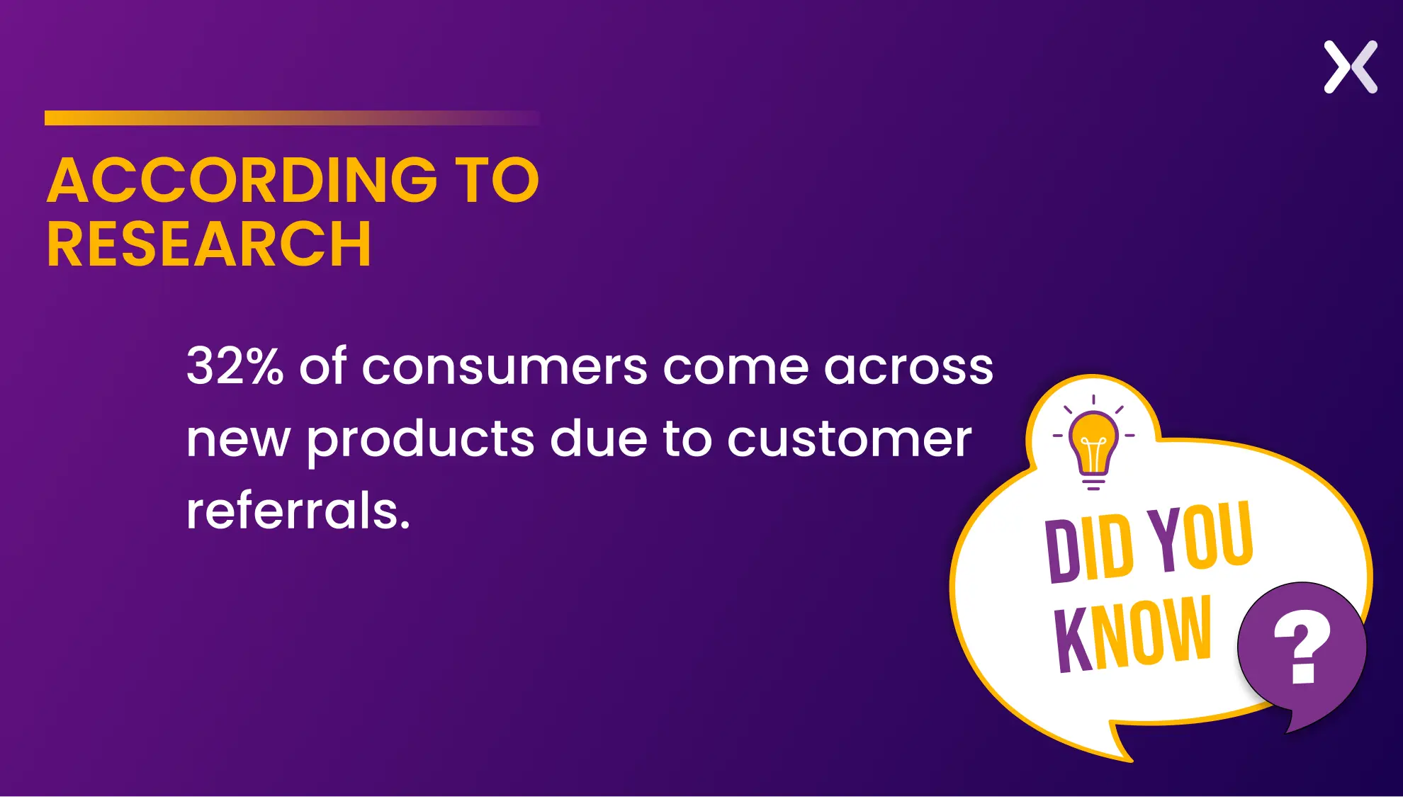
In short, it’s the central page where users learn about the referral program and take action to refer others.

Once you’ve established your referral program and promotional strategy, it is time to build your referral landing page. Let’s examine examples of how the pros design their referral pages.

Here’s a short comparison table to understand the difference between affiliate and referral programs.
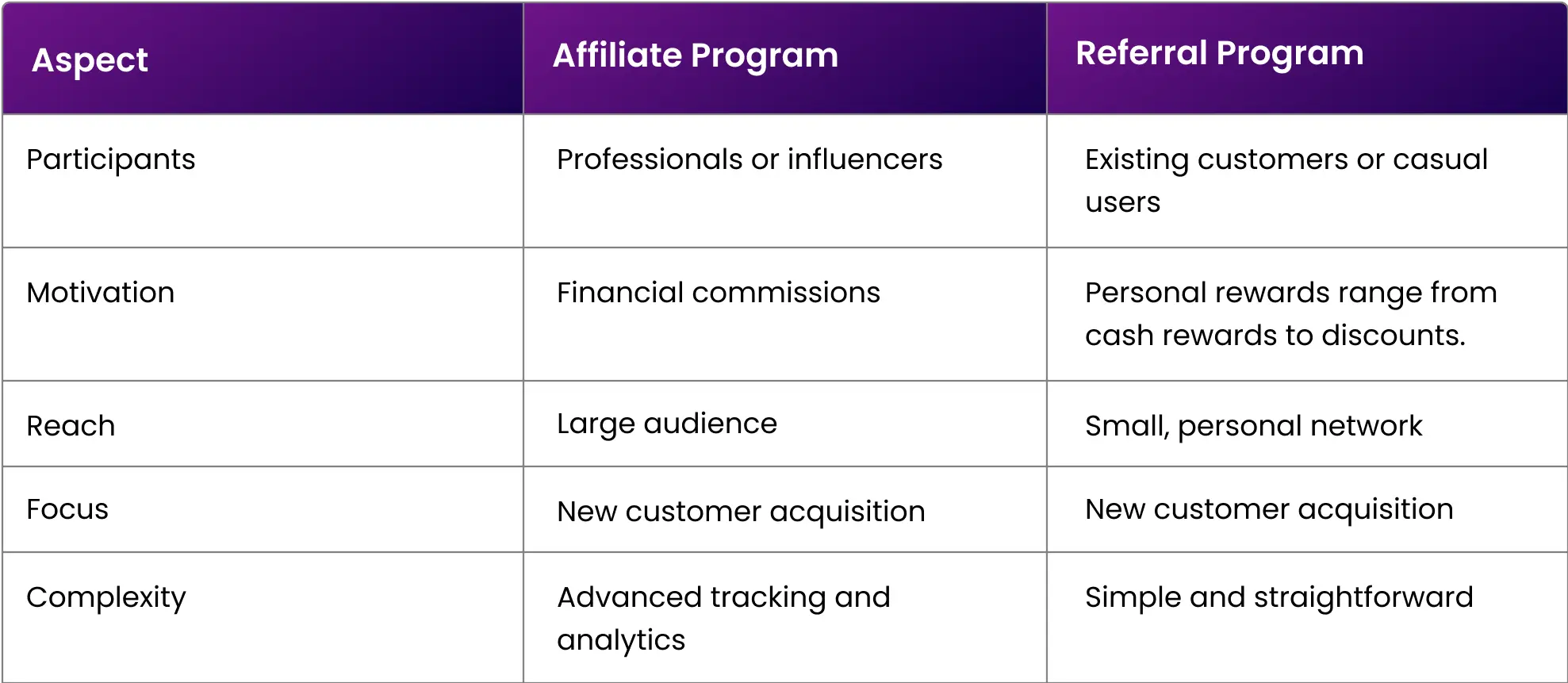
Affiliate and referral programs have different participants, but the focus on both campaigns is the same. Hence, we will discuss affiliate and referral landing pages with similar elements.
Checking out examples is a great way to get ideas for landing page design. Here are 11 referral landing page examples to spark your campaign’s creativity and boost user engagement. Check them out for effective tactics and features to add to your projects!
Ubindi is an easy-to-use platform for instructors to manage class schedules, bookings, payments, and other administrative tasks. It simplifies administrative tasks so teachers can focus on teaching.
Their referral landing page is short and simple, covering every essential detail. The first fold of the page has a headline, subhead, and form that complement each other.
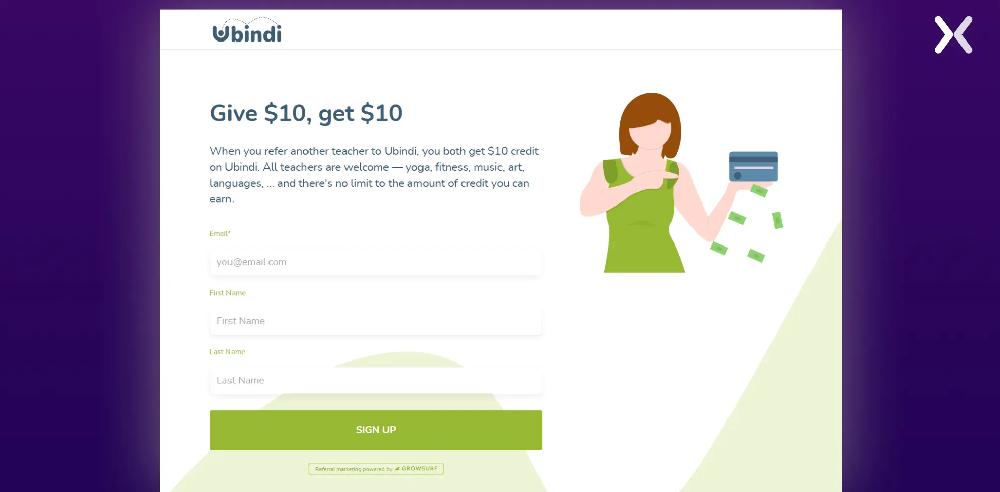
The copy of the subhead shines out here as it highlights crucial elements of the rewards and conditions. Terms like “All teachers are welcome” and “There’s no limit to the amount of credit you can earn” give visitor information in a friendly tone.
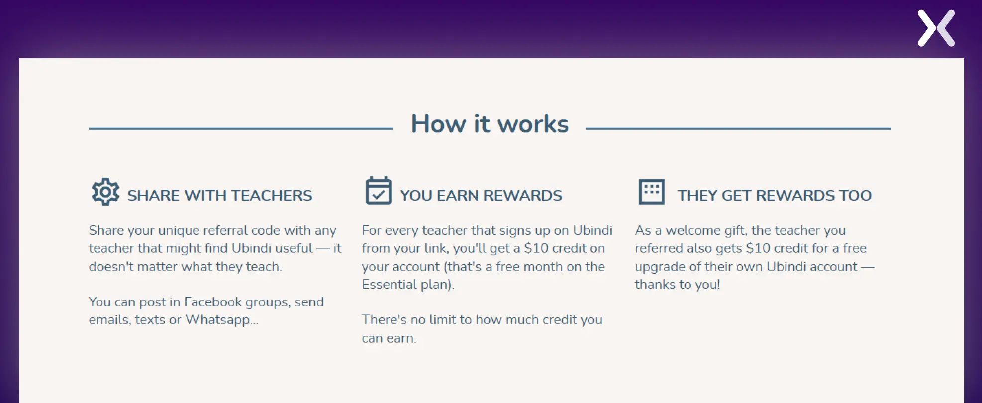
These points are reiterated in the second fold, which showcases the step-by-step process of referring and earning rewards through the Ubindi referral program.
A strong copy that reiterates the rewards and conditions of the referral program.
Trello is a visual collaboration tool that helps teams organize tasks, projects, and workflows using boards, lists, and cards. Though Trello doesn’t have a referral program, they have a “recommend page,” which has exciting features and, hence, can’t be ignored.
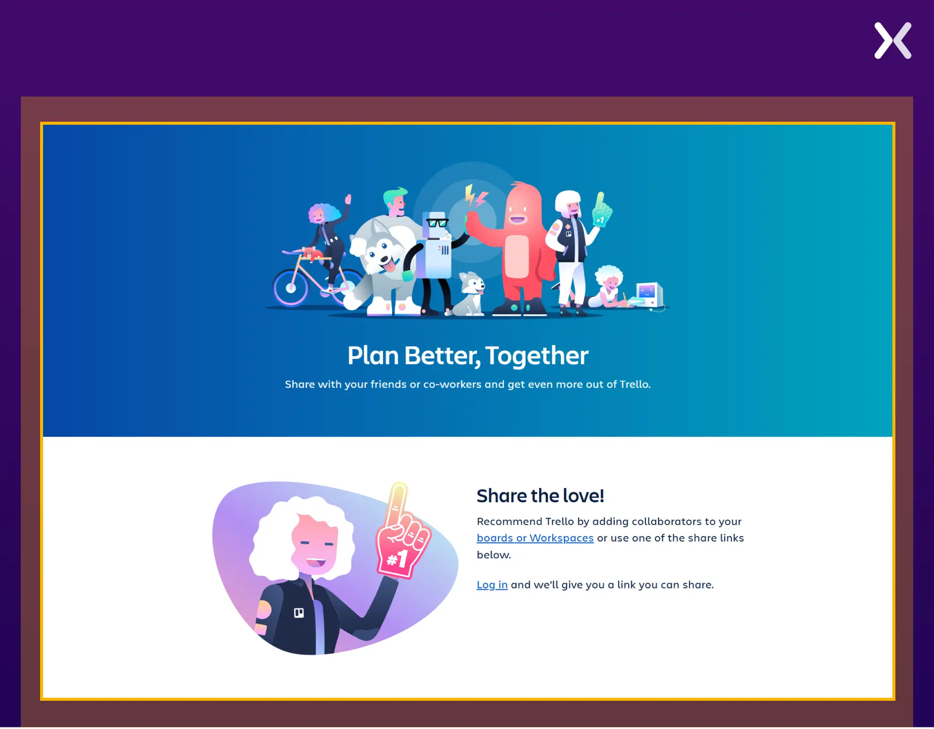
To generate an invite, you first need to log in. Once logged in, a customized link is automatically generated to copy or share on social media using the various options provided.
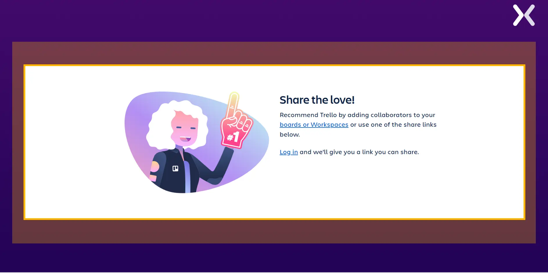
If you want to build a highly accessible referral landing page, you should consider adding this customized referral URL generator and social sharing buttons.
A customized referral URL generator on a referral landing page decreases participation friction.
Unbounce is a landing page builder designed to help marketers create, publish, and test landing pages without needing a developer. Their referral/ affiliate landing page has much to offer, yet never skips a beat in clarity.
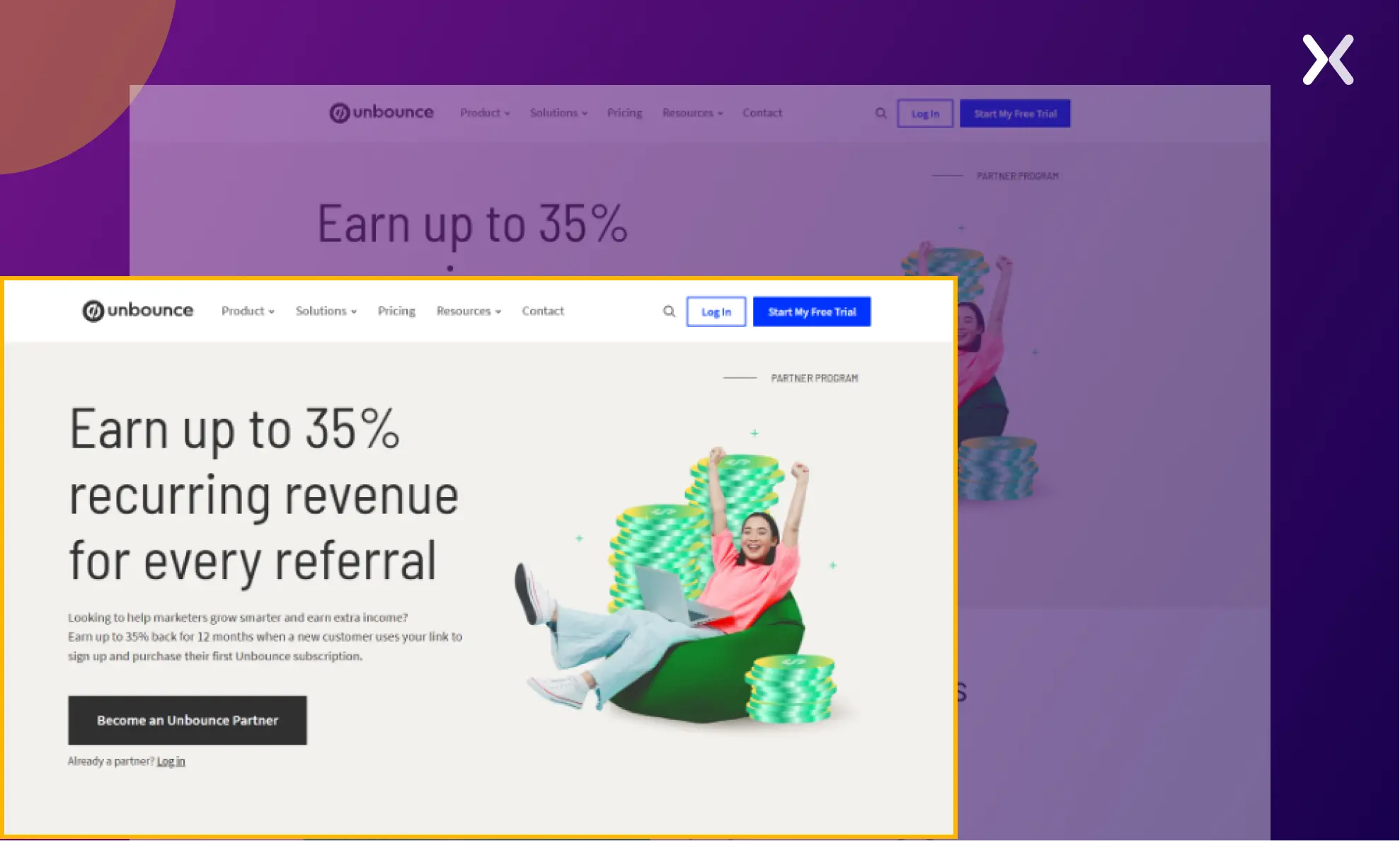
The heading copy with the “35% recurring revenue” offer is enough to catch user attention. The page has a section communicating who can benefit from this referral program.
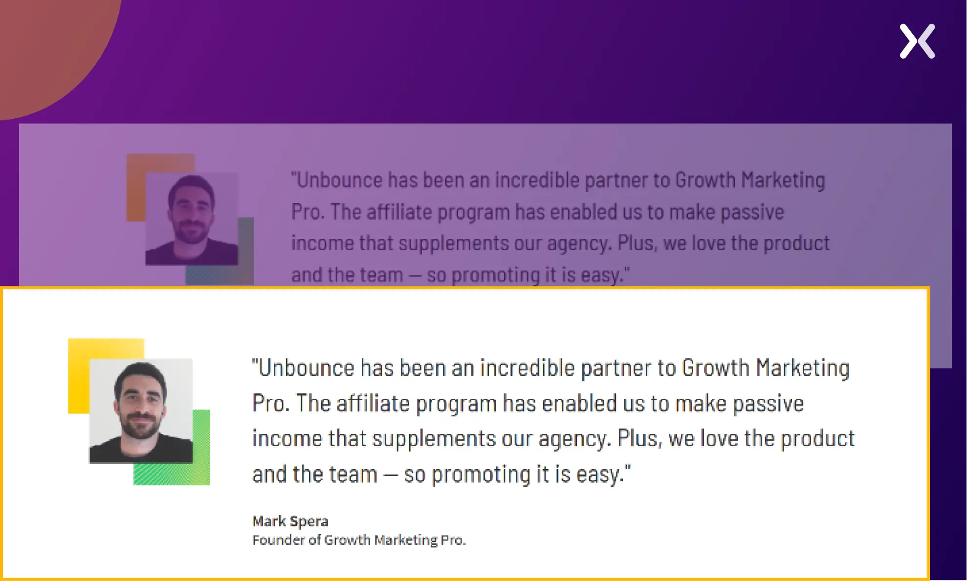
It also showcases estimates of the cash rewards referrers can earn if a certain amount of people sign up, which motivates them to participate. We also have social proof in the form of partner companies and testimonials. All these elements combine to make an impactful referral landing page by Unbounce.
Utilizing social proof on referral landing pages.
ClickUp is a comprehensive project management tool that enables teams to plan, track, and collaborate on tasks. Its referral landing page is minimalistic and provides information section by section, making it easy to grasp.
The landing page utilizes two sections well. The first is “Guidelines for Success,” which highlights the referral program’s dos and don’ts. It helps referrers understand clearly what they need to do to earn the referral incentive.
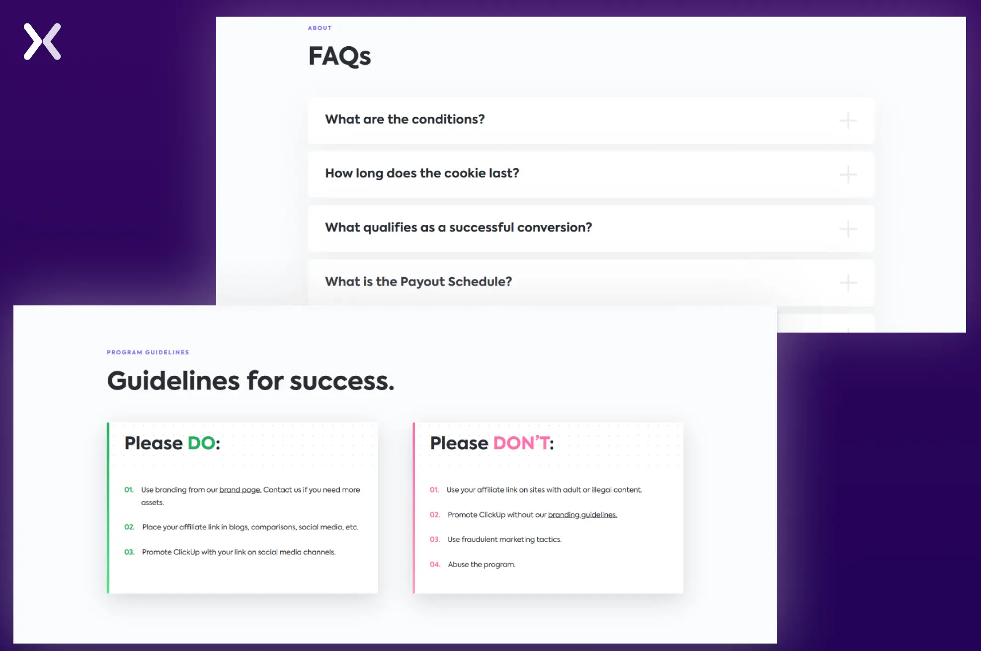
The second section is the FAQs part, which utilizes questions to share the terms and conditions of the referral campaign.
A guideline section explaining the dos and don’ts of the referral program.
Zoho is a cloud-based software suite for businesses that offers CRM tools. It is designed to streamline operations and enhance productivity.
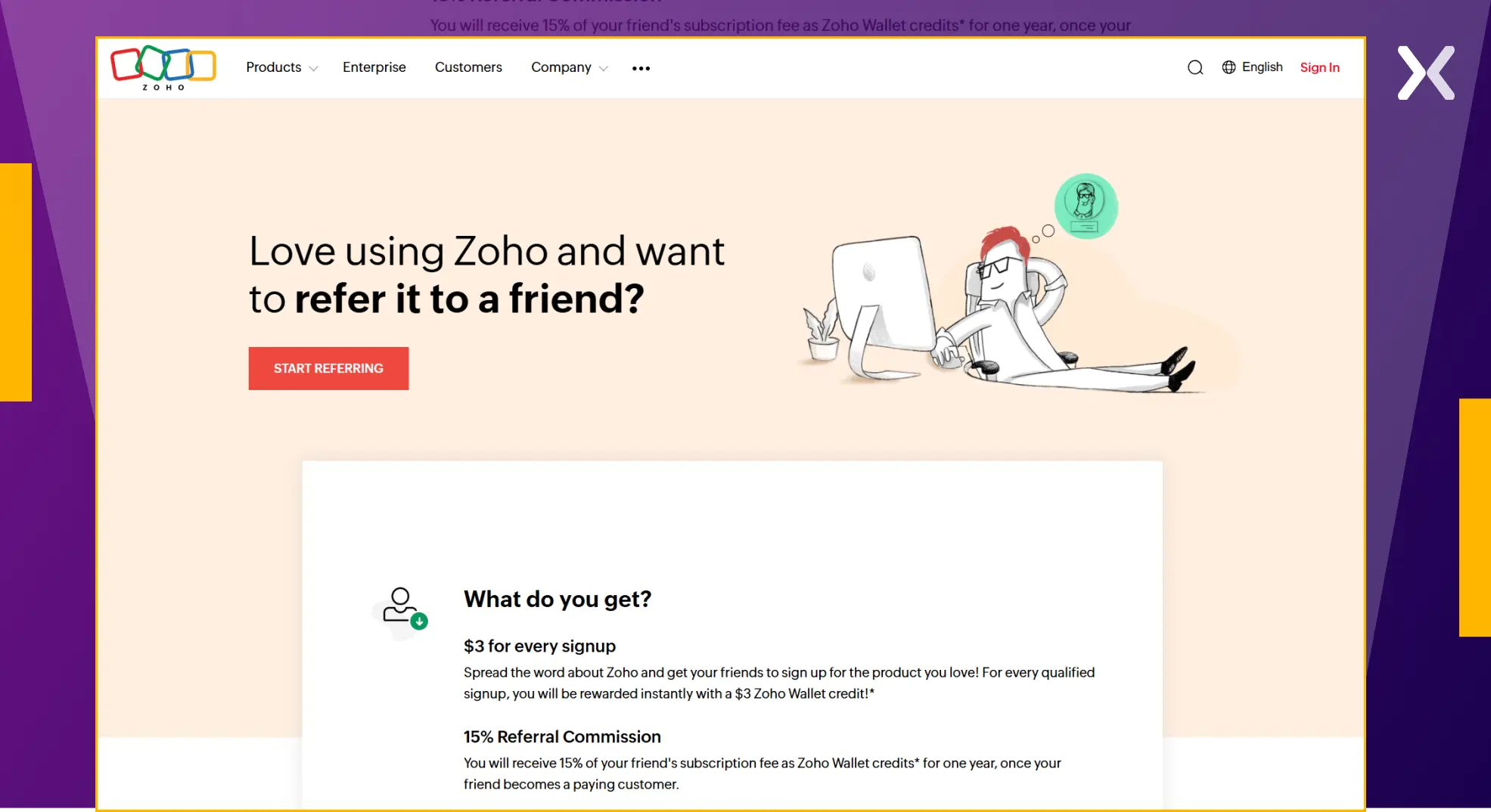
They have a to-the-point referral landing page. Without wasting time, the page directly shares the rewards to be earned once the referral is complete.
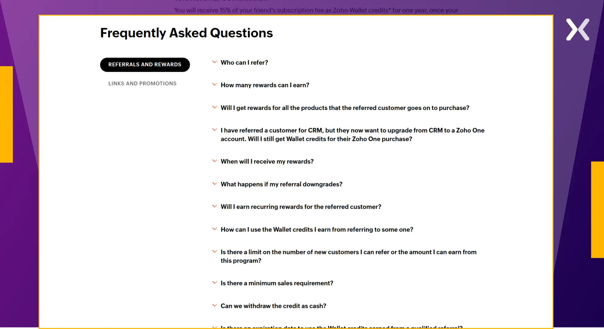
Like ClickUp’s referral page, Zoho’s FAQs share its terms and conditions in a simple question-and-answer format.

"Replace dense, legal-sounding terms and conditions with a user-friendly FAQ addressing questions like: 'When will I receive my reward?' 'How many referrals do I need to qualify?' and 'Are there limits to the benefits?' This makes the information clear, accessible, and less intimidating."
Adding a meaningful FAQ section at the end of the referral page to reiterate the referral program’s terms and conditions.
HubSpot is an all-in-one marketing, sales, and service platform that helps businesses attract, engage, and delight customers through various tools. The platform’s referral/ affiliate landing page utilizes a video, social proof, and other elements to showcase the value of becoming a referrer.
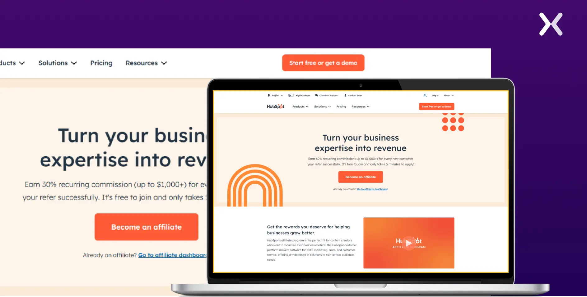
The page has a tier comparison table highlighting how affiliates reward their referrers.
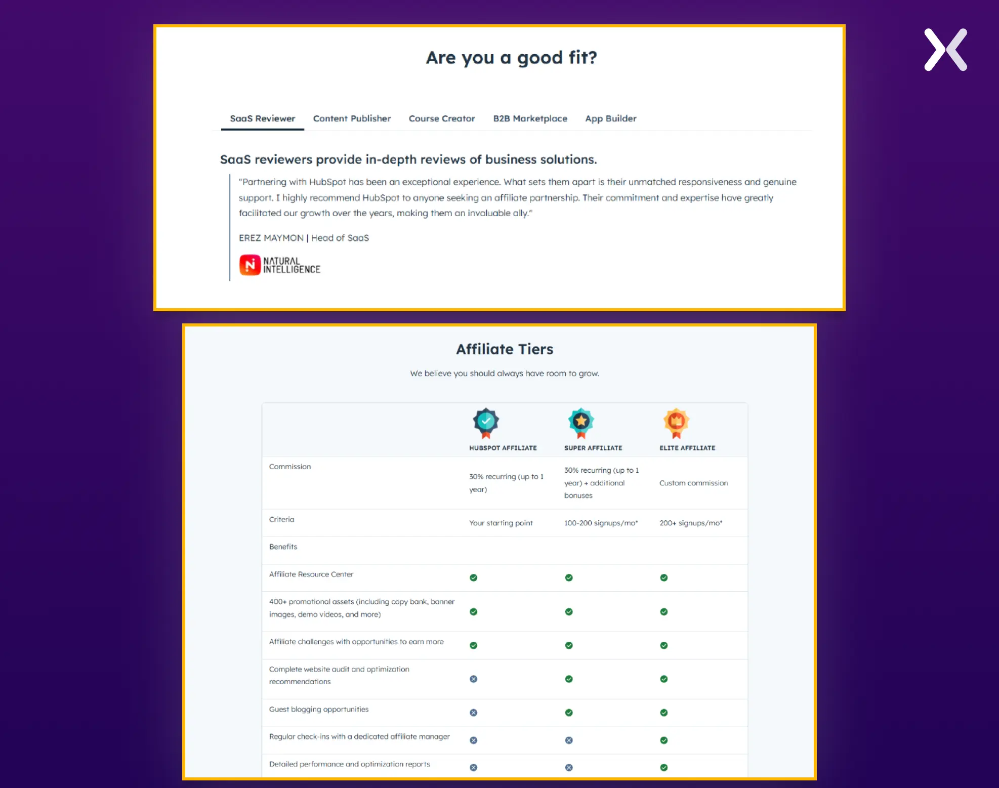
The “Are You a Good Fit?” section highlights the types of professionals who should participate in the referral program, supported by social proof from similar professionals. This adds a personal touch to the page and ties everything together cohesively.
Use a comparison table to highlight various tiers of your affiliate program.
TimeCamp is a time-tracking software that helps businesses and individuals track work hours, generate reports, and analyze productivity. Their referral landing page employs the brand colors to build an impact.
The referral page’s copy and design are clean, and the highlight is the step-by-step process for earning a referral.
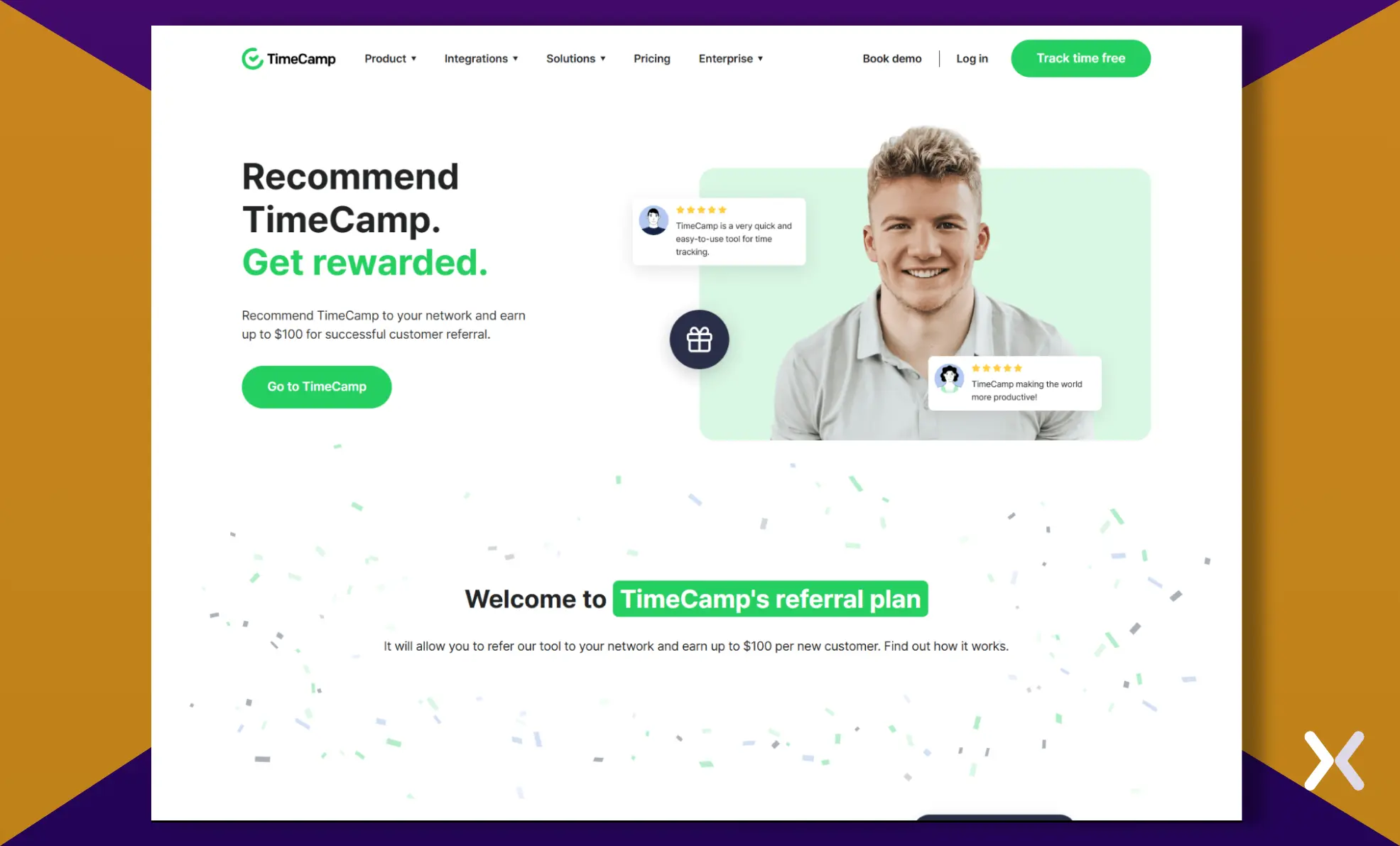
The process effectively communicates where to find the referral link once a user has logged in to the dashboard. The offer is shared multiple times across the page to motivate visitors to participate.
A section dedicated to sharing the step-by-step process users need to follow to secure the most out of the referral plan.
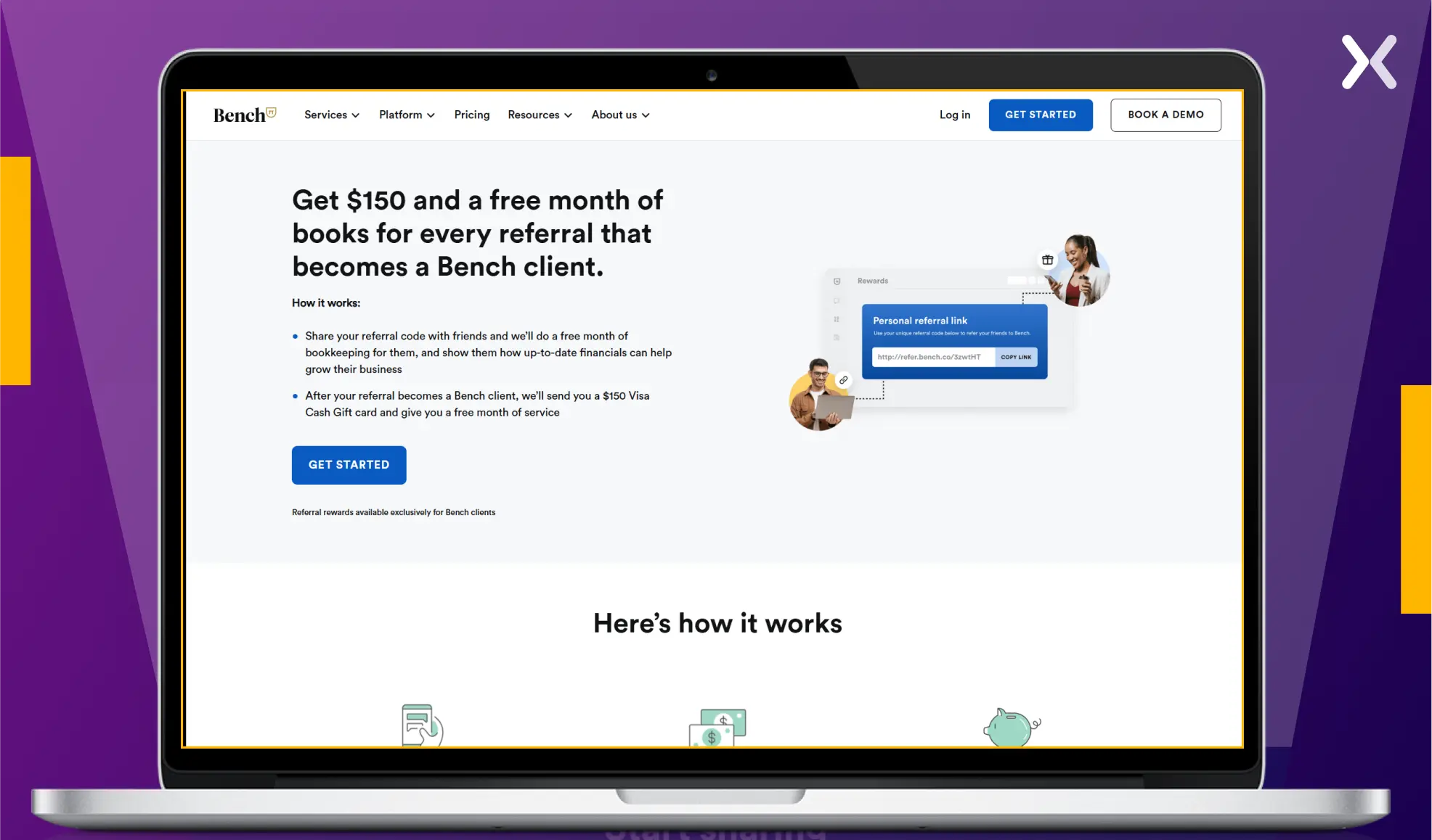
Bench is a platform that simplifies bookkeeping and tax filing for small businesses through expert support and easy-to-use software. On their referral landing page, they made a smart move by sharing all the critical information about the referral program in the first fold. The rest of the page only complements the first fold’s copy.
We also need to pay close attention to the social proof used on this referral page. Instead of picking a generic testimonial, Bench’s landing page uses a testimonial that specifically talks about its referral program.
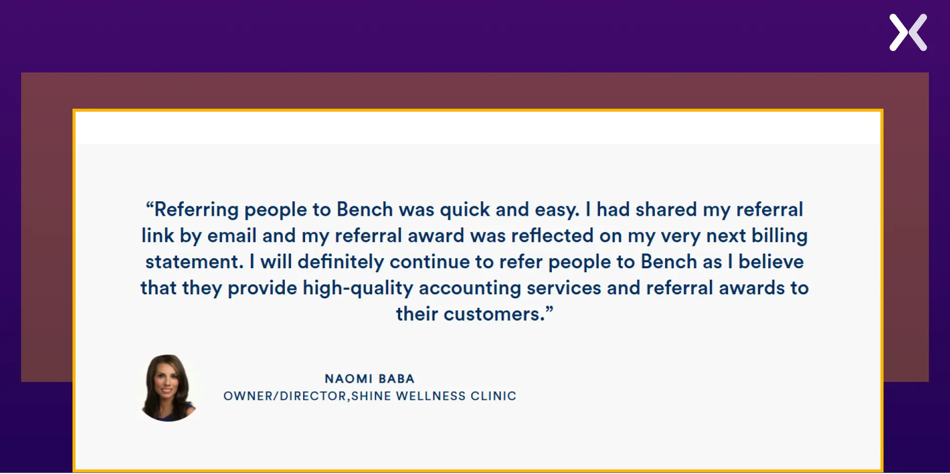
It helps build trust with the visitors, encouraging them to become referrers.
Have an impactful above the fold.
ActiveCampaign is a customer experience automation platform that offers businesses email marketing, CRM, and sales automation. Its referral landing page presents information aesthetically. Without overcrowding the page, every section is dedicated to sharing information about the referral program with visitors.
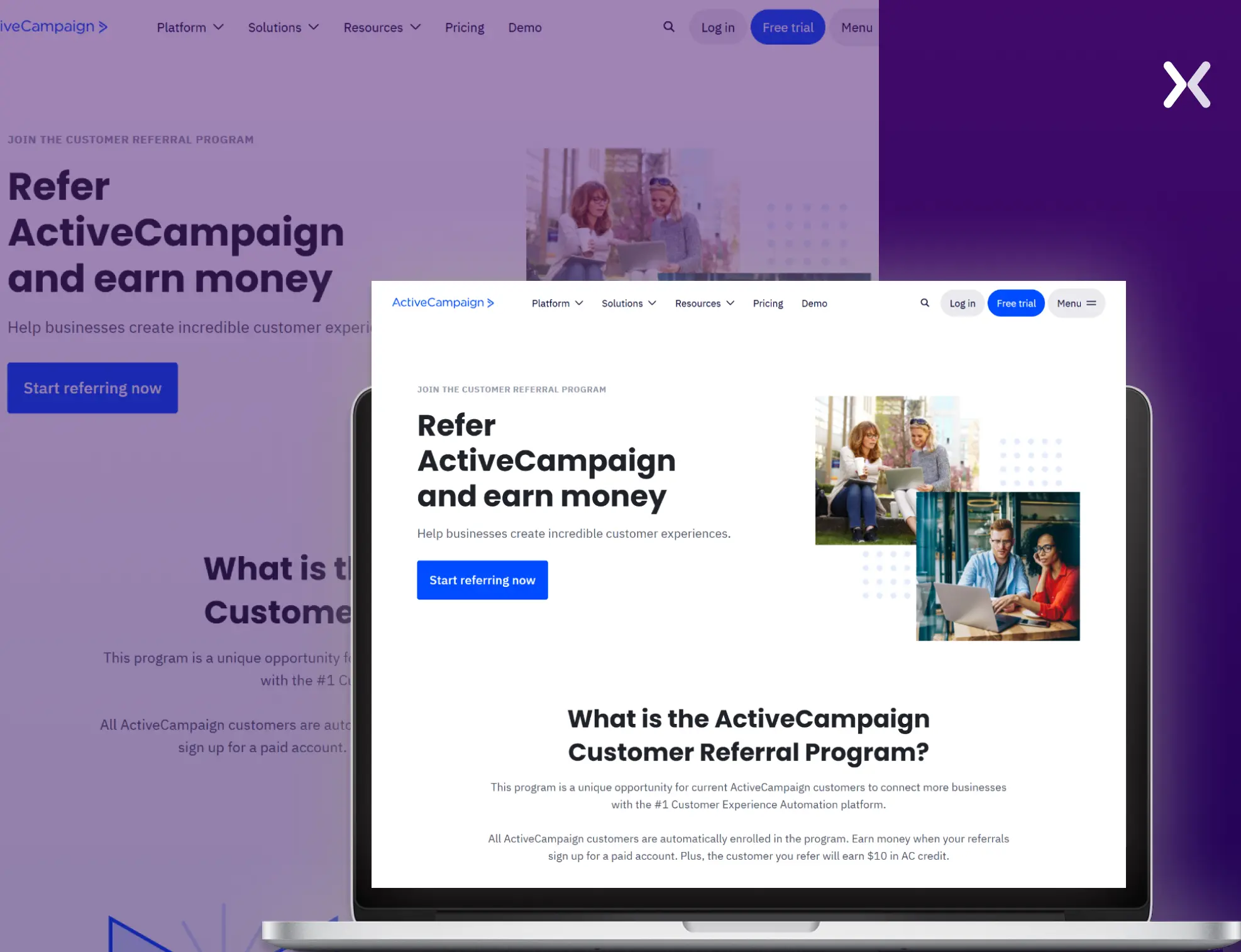
The referral page has a simple top fold supported by segments like “How it works” and “How to earn.”
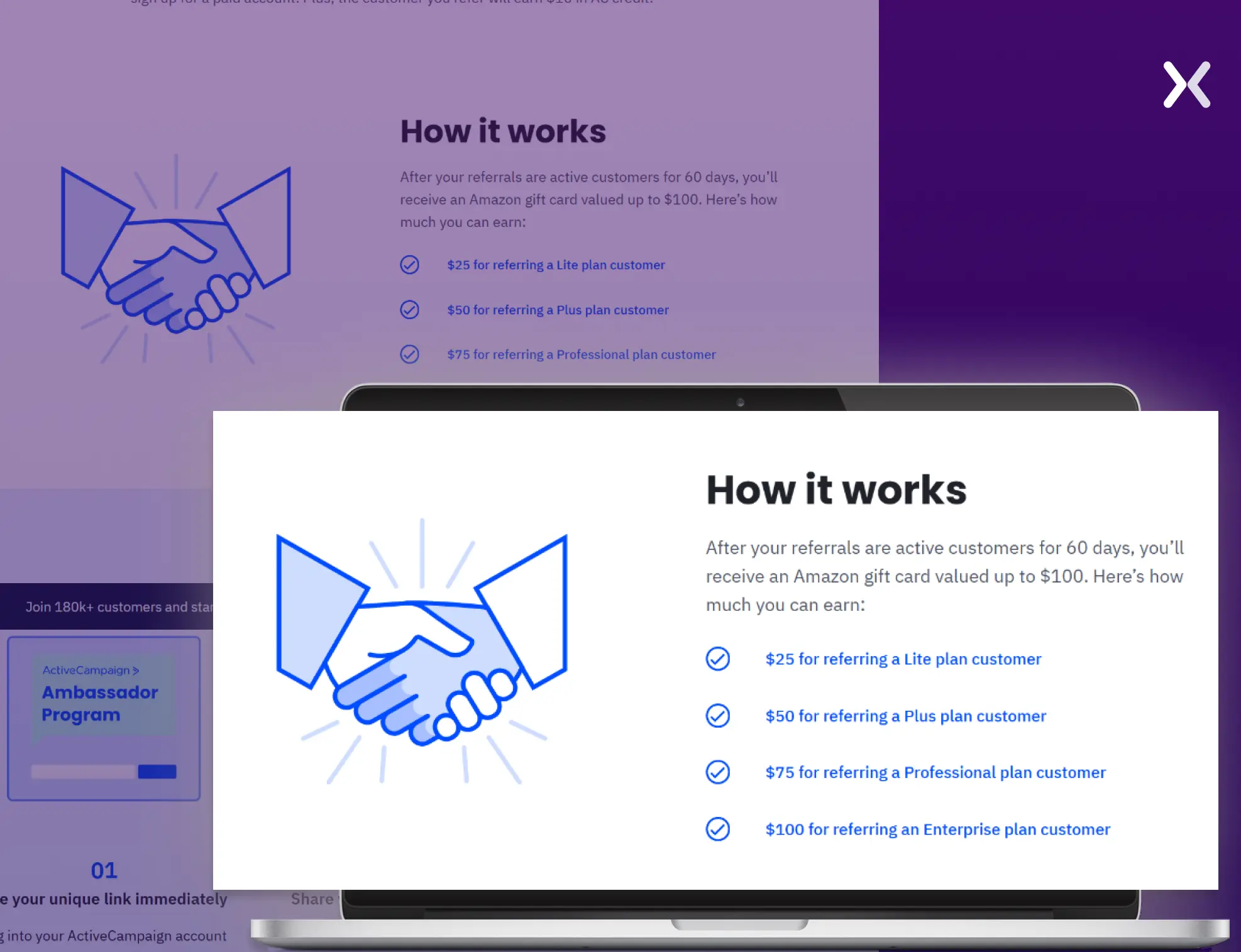
The “How it works” section provides the most crucial information about the referral program in bullet points, making it easier to grasp.

“Showcasing terms and conditions effectively rely on brevity and readability. Use layman's terms, break them down into bullets, and highlight the crucial points to ensure transparency. Again, you need to make this information accessible without OVERWHELMING your visitor.”
Using bullet points to communicate essential information.
Hiver is a Gmail-based help desk solution that enables customer service teams to manage email communication, collaborate, and automate workflows directly from their inbox. Everything fits perfectly into this referral landing page, from the color palette to the copy. With such an amazing page, it is hard to say which stands out the most, but it has to be the rewards section hands down.
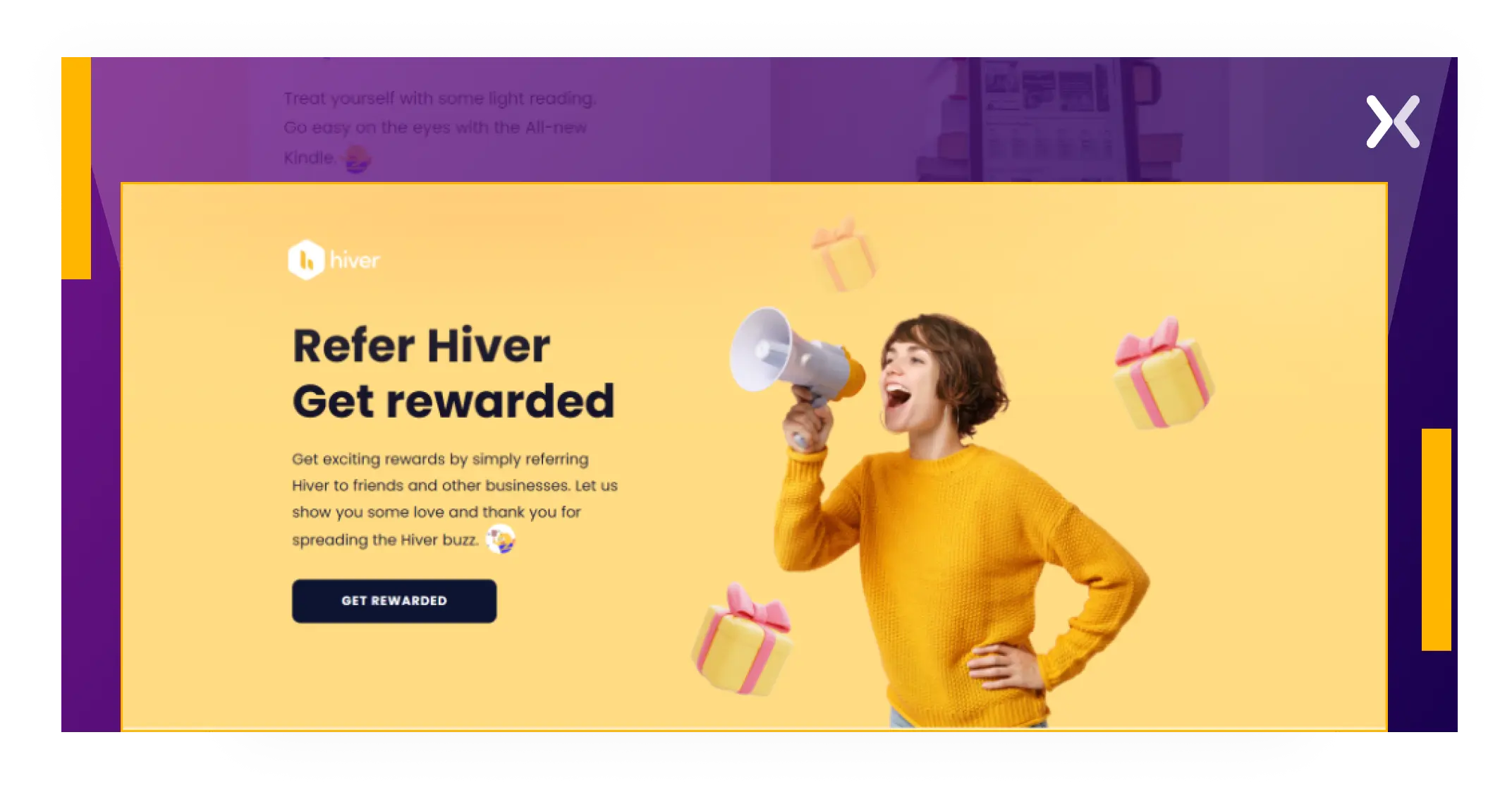
The referral page’s reward segment features copy that powerfully showcases how every milestone helps referrers win rewards.
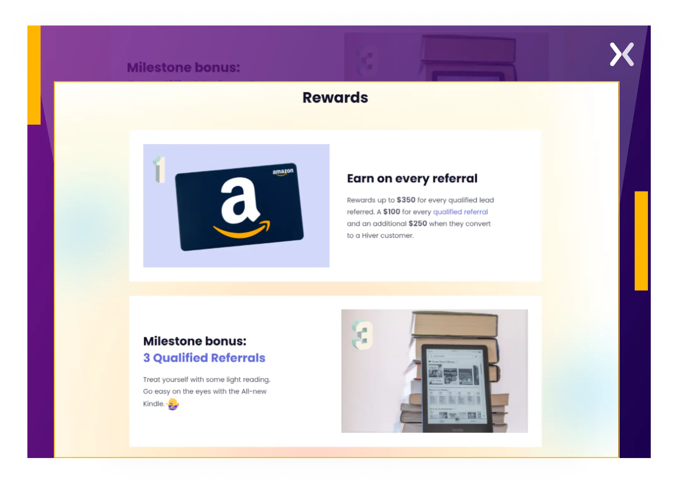
One thing to notice in their “how it works” section is the use of specific terms like “qualify your leads,” which can confuse some visitors.
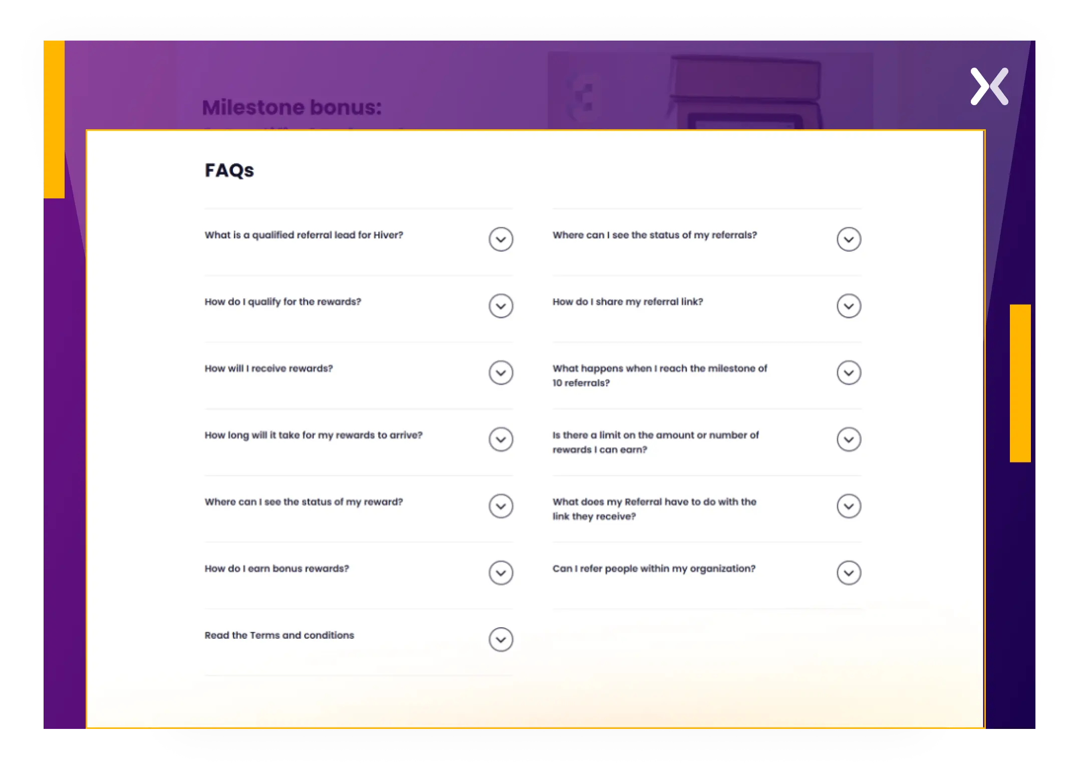
These terms are well-defined in the FAQs at the end of the page to clear the confusion.
Showcase rewards in an impactful way with copy and images.
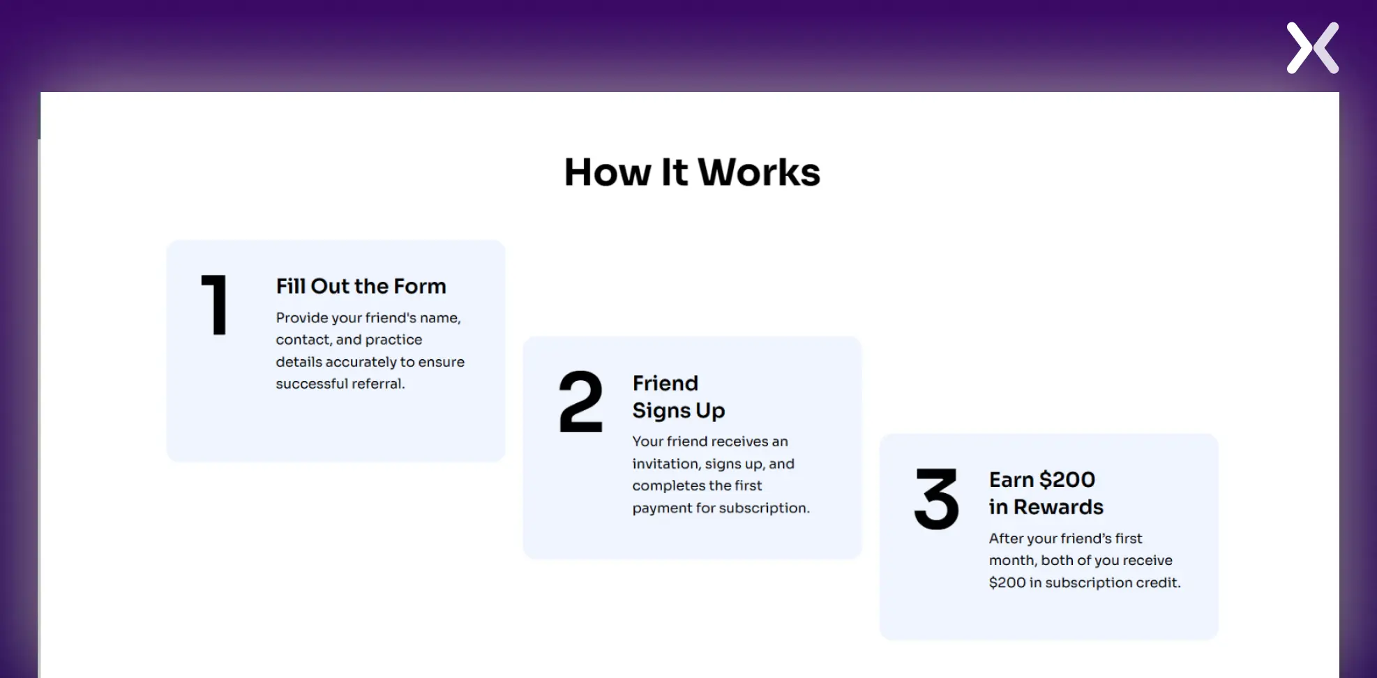
TheraNest is a comprehensive practice management software for mental health professionals and small practices. Its referral page is minimalistic and focuses on simplifying the referral process. The layout guides users through each step without clutter, making it easy to understand how to refer a friend and earn rewards.
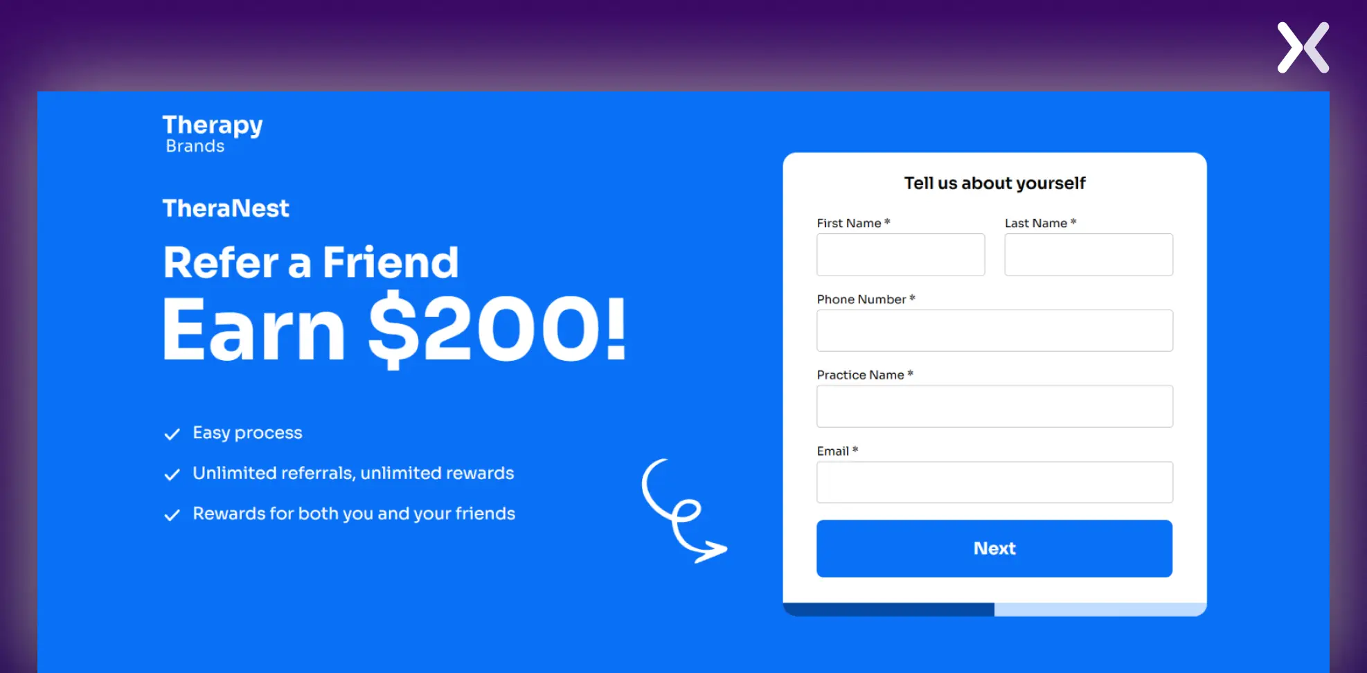
The page communicates the eligibility requirements and explains when credits are awarded, ensuring transparency and helping participants understand how the reward system works.
Also, the top fold highlights in bullet points how the referral program can benefit the user.
Outlining eligibility and conditions for credit rewards is vital for maintaining clarity and trust.

Setting up a referral program using a landing page can be a smart and cost-effective way to grow your audience and reward existing customers. Here’s how you can approach this using two methods:
Referral program tools simplify the process and often come with advanced features. They can help you automate tracking, reward distribution, and analytics. Here are two popular options:
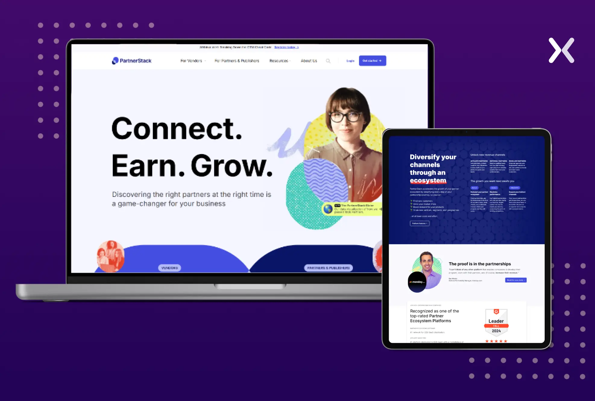
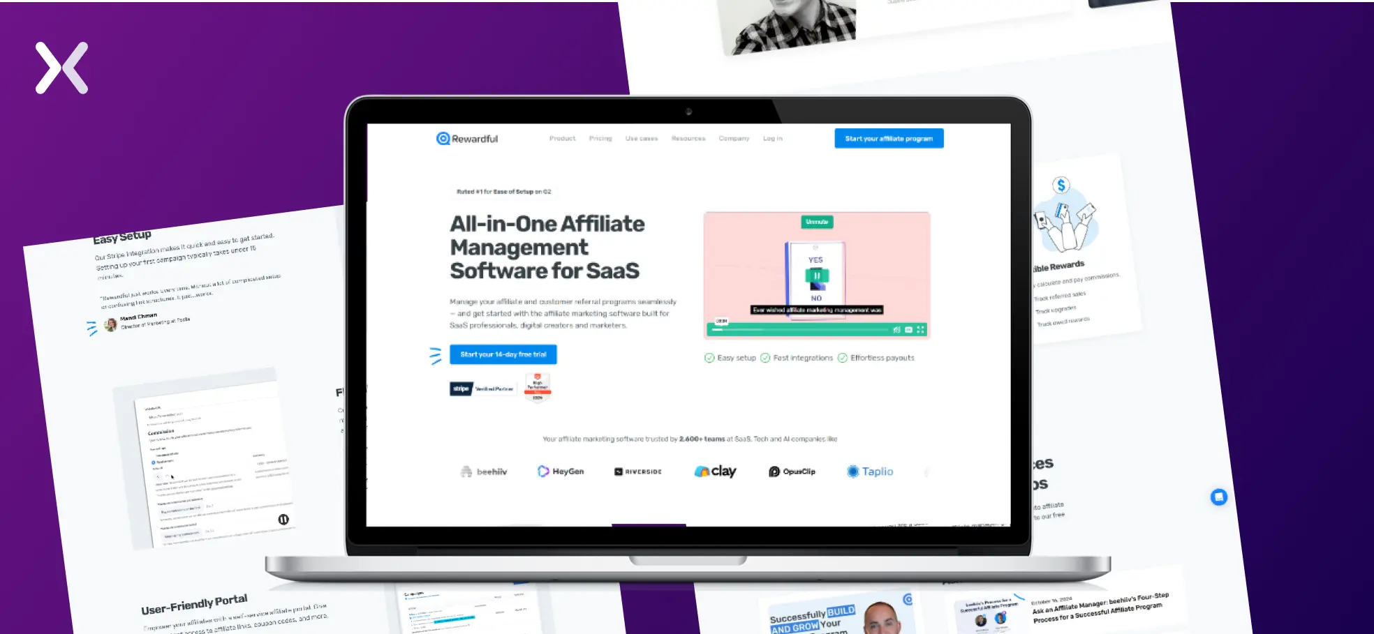
While these tools often require a subscription and are expensive, they save time and ensure accuracy in tracking. For businesses prioritizing scalability, they can be effective.
A referral landing page can work wonders if you prefer a more hands-on and cost-effective approach. Here’s how to set it up:
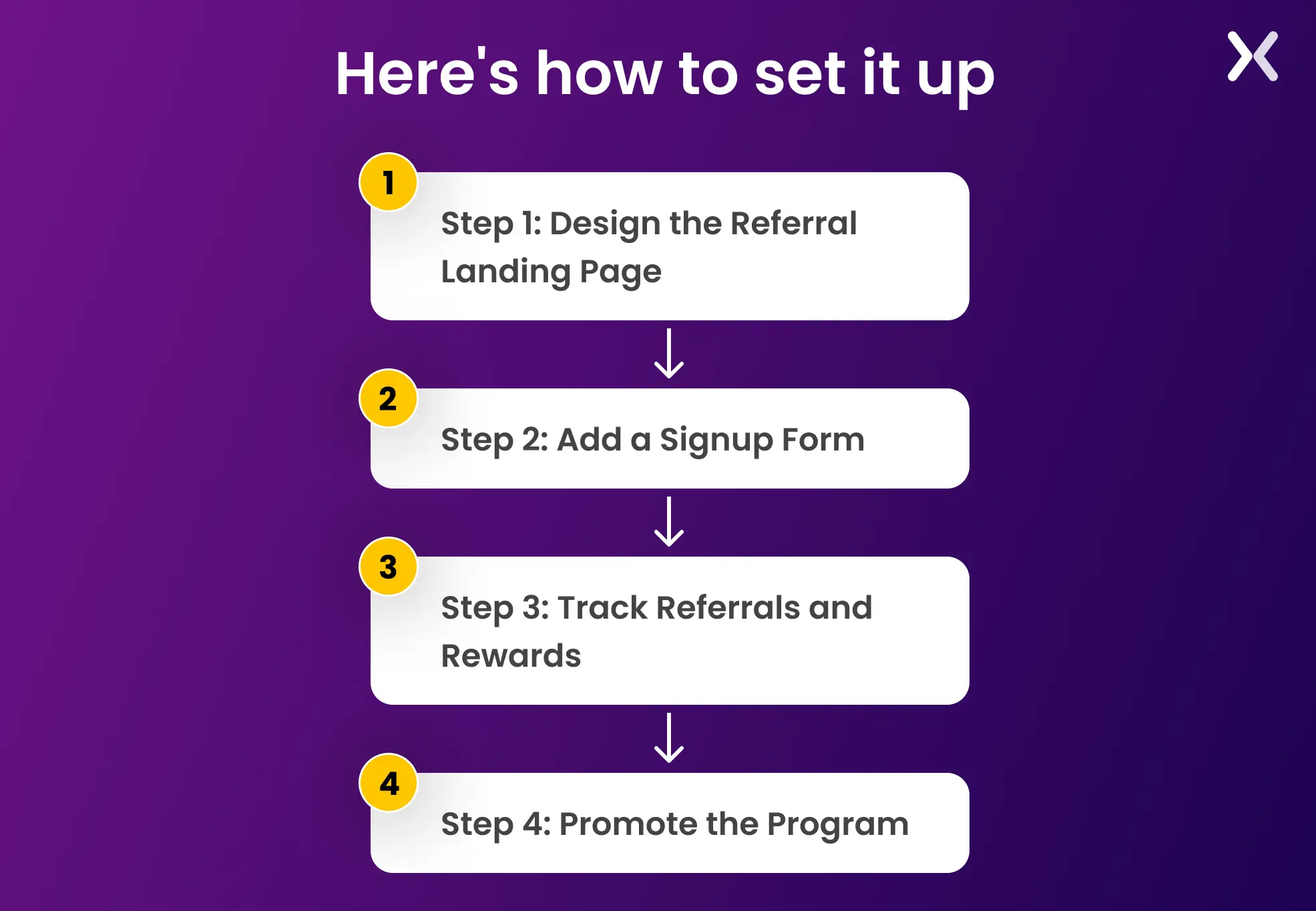
Step 1: Design the Referral Landing Page
Create a clear and attractive landing page. Use a catchy headline like “Invite Friends, Earn Rewards!” and a short description explaining how the program works. Add visuals or icons to make the process easy to follow.
Step 2: Add a Signup Form
Include a simple form where users can enter their name and email. After signing up, they should get a unique referral link or code to share. Keep it quick and user-friendly. Don’t forget to add a thank you page after the signup form.
Step 3: Track Referrals and Rewards
Track referrals using tools like Google Analytics or custom scripts. Automate rewards, such as sending discount codes or cashback, to keep the process smooth for everyone.
Step 4: Promote the Program
Share the referral page via email, social media, and website pop-ups. Make it easy for users to find and join the program, ensuring maximum participation.

"The most critical element of a high-converting referral landing page is the value proposition—answering, 'What's in it for me?' Highlighting tangible benefits, like rewards or discounts, can greatly boost conversions."
To wrap up, a good referral landing page is critical to getting the most out of your referral program. By making things clear and easy to use, you can showcase the perks of your program while getting customers to join.
The examples discussed show different effective methods, such as clear messages, good rewards, and simple designs, which can increase the number of people who use your page and sign up.
If you’re starting or want to improve your current program, paying attention to these main points will help you create a robust tool that grows your business through people telling others about it.
Did you know that Apexure has 100+ blog posts on landing pages? We have shared everything, from creation to testing, analysis to optimization. Check it out before you build your landing page.
Making a referral landing page on your own can be overwhelming. Get the help you need from our experts. Book a call and one of our landing page experts will contact you soon.
Check out our landing page portfolio to discover conversion-friendly landing page elements that might. Filter your industry and check which landing page design is trending.
This page helps you send referral links and explains how the program works, including tracking your referrals and rewards.
Related Articles:
Drive More Sales or Leads With Conversion Focused Websites and Landing Pages
Get Started
Most landing page audit checklists floating around the internet read like they were written by someone who has...
Key Takeaways 25+ real B2B landing page examples from Apexure's portfolio — each with a CRO score, design...
Get quality posts covering insights into Conversion Rate Optimisation, Landing Pages and great design