
An app landing page increases your visibility and helps you effectively showcase your product’s features to your target audience.
While being listed on the Apple App Store or Google Play Store provides exposure, it often isn’t enough to fully highlight your product’s capabilities. A basic webpage also falls short, especially for PPC ads.
A conversion-optimized app landing page combines compelling visuals and persuasive copy to build curiosity and trust to attract new users.
As marketers and product managers, we aim to create a conversion-friendly app landing page. In this post, we will explore some winning app landing page examples. Whether launching an app or optimizing an older page, these examples will surely give you ideas about which elements to use.

Even if you don’t have a full website, you can still create a landing page for your app. It’s a great way to build traction, showcase your features, and drive more downloads — a solid first step before launching a full site.
Here are some examples of mobile app landing pages that make up for great inspiration. Even if you don’t have a website you can still built your app landing pages for more traction and downloads.
Rocket Money is a personal finance app that empowers users to manage subscriptions, track spending, and achieve financial goals.
Their app landing page is short but delivers impactful information about the product without wasting time with a filler copy. It features gifs and social proof that grab attention and intrigue visitors. The layout intuitively guides visitors through key features and benefits with concise copy and engaging visuals.
Here are some standout elements from the Rocket Money app landing page.
- Strong, Benefit-Driven Headline
A catchy headline at the top of the landing page sets the tone for the whole page. The minute visitors land on Rocket Money’s app landing page, they see a big header: “Join Rocket Money today and experience financial freedom!” This header uses a crucial keyword for its target audience: “financial freedom,” ensuring users don’t leave without scrolling further.
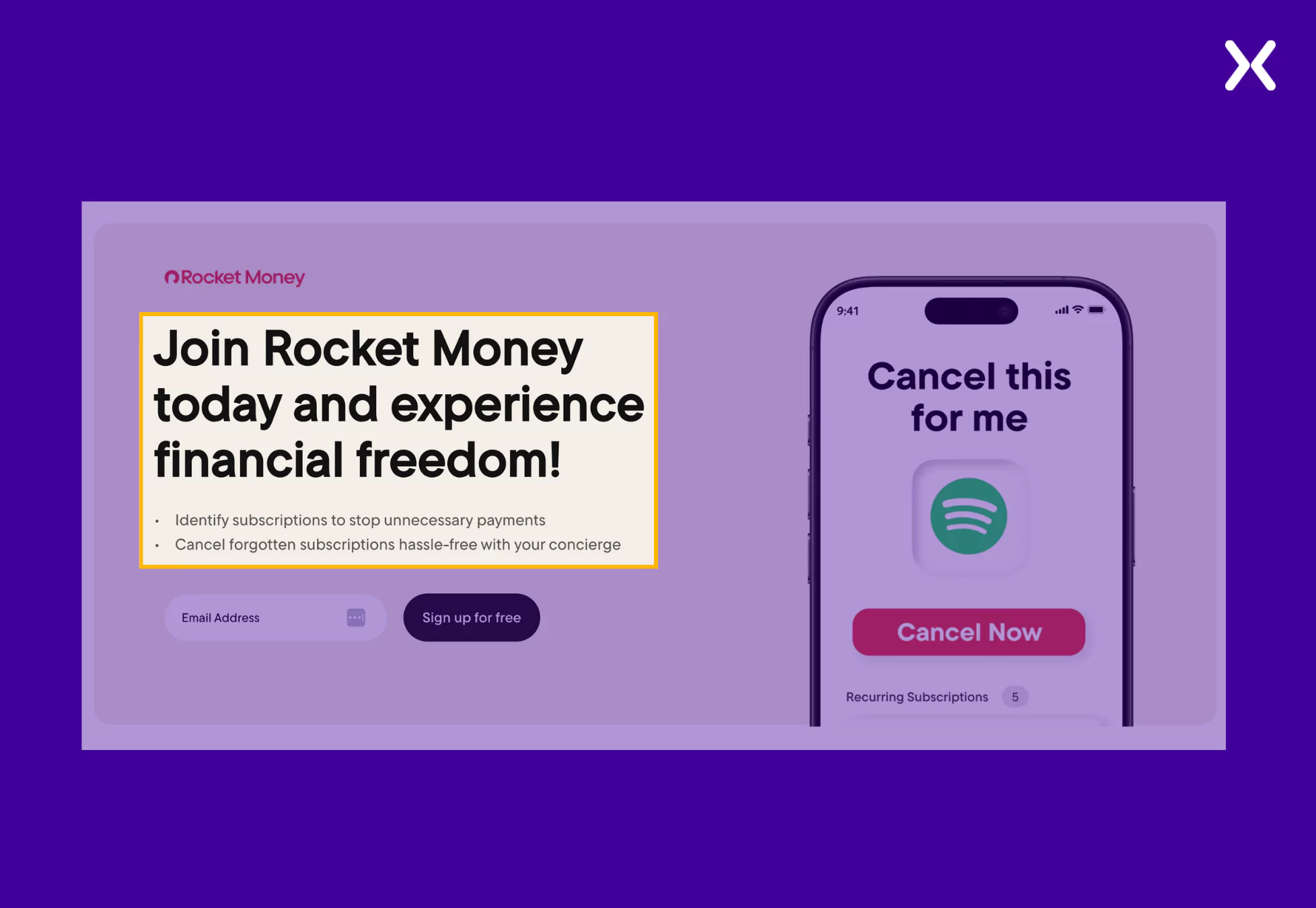
To complement the headline, we have a subhead in the form of two bullets that highlight the USPs of the app. Instead of using complex jargon, the app landing page makes a great first impression with its top fold, keeping it engaging with visuals and interesting with the copy.
- Clear Call-to-Action (CTA) Above the Fold
The CTA on your app landing page should be the stand-out element. Rocket Money’s mobile app page highlights its CTA using a light and dark color contrast.
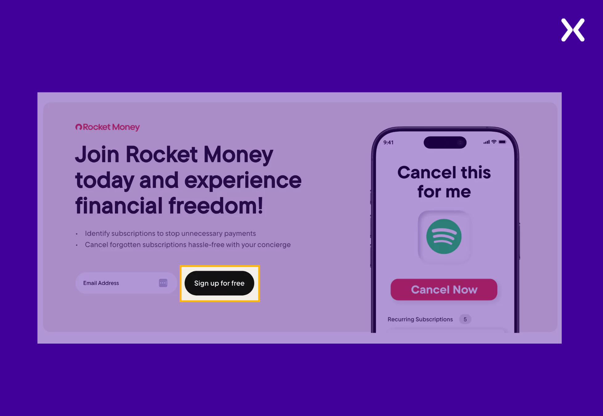
Ditching boring CTA copy, the app landing page CTA shares a tempting offer: “Sign for free,” which can definitely get more sign-ups than something simple like “Sign up now” or “Explore,” etc. Additionally, the CTA is repeated throughout the page, constantly reminding users to get started.
- Visual Storytelling with Mobile Mockups
Visuals on landing pages need to tell a story, as copy alone can’t keep the users engaged. Rocket Money understands this and uses smooth transitions and subtle animations to communicate the value of their product.
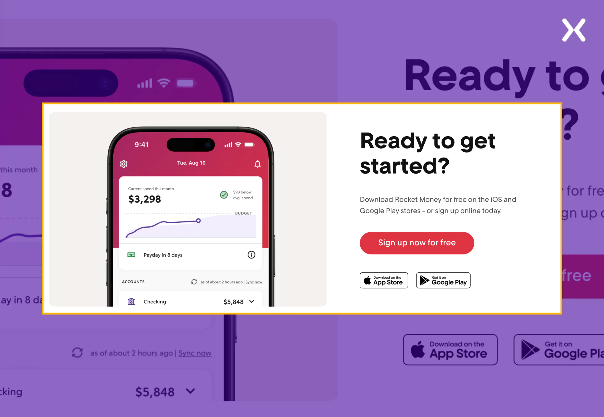
The page images show the app’s interface on mobile screens, making it easy for visitors to imagine using Rocket Money on their devices. The app will eventually be used on mobiles.
Monarch Money is a comprehensive personal finance app similar to Rocket Money. It is designed to help users track spending, manage budgets, and achieve financial goals collaboratively.
Their app landing page has a clean design with well-organized sections that take users on a journey to understanding how the app benefits them feature-wise. The page has a simple CTA with supporting text that keeps the CTA’s copy short but packs an impact.
Check out the standout elements from the Monarch Money app landing page.
- Strong Social Proof with Recognition from Major Brands
Social proof is your go-to landing page element to build trust. Monarch Money uses it on critical parts of the app landing page, like right after the top fold or in the feature-benefits section.
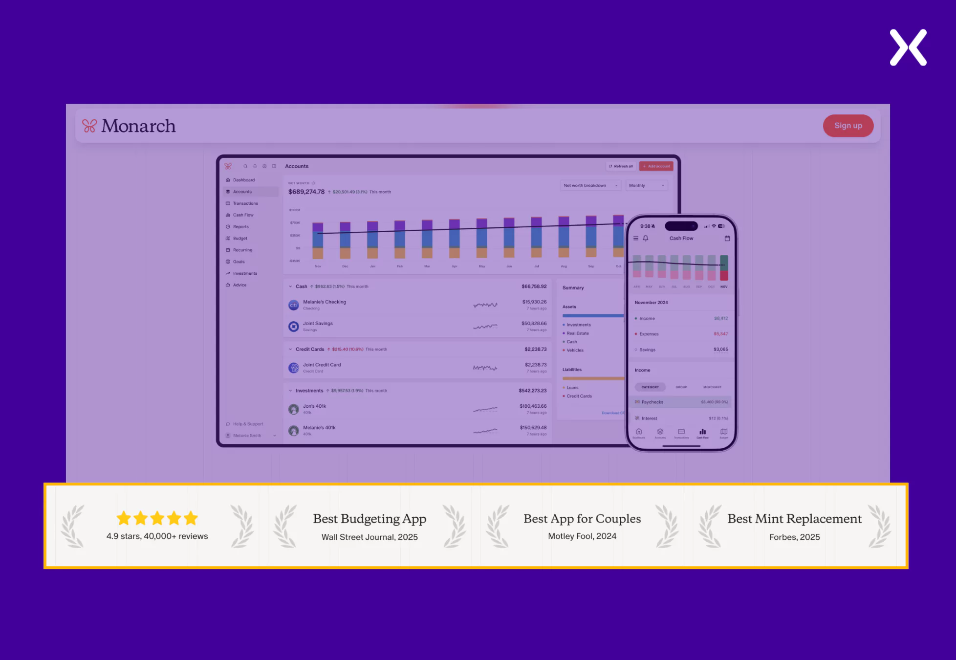
They utilize logos from recognizable brands, reinforcing credibility and winning visitor trust. Such social proof signals visitors that your app is well-regarded and used by industry experts, reducing their hesitation to sign up.
- Interactive and Engaging Feature Highlights
Copy complemented with the right visuals hits home runs in sharing a product’s value. Monarch Money talks about every crucial feature, such as budgeting, investment, collaboration, and financial planning, with a digestible copy paired with clean images that showcase the feature in action.
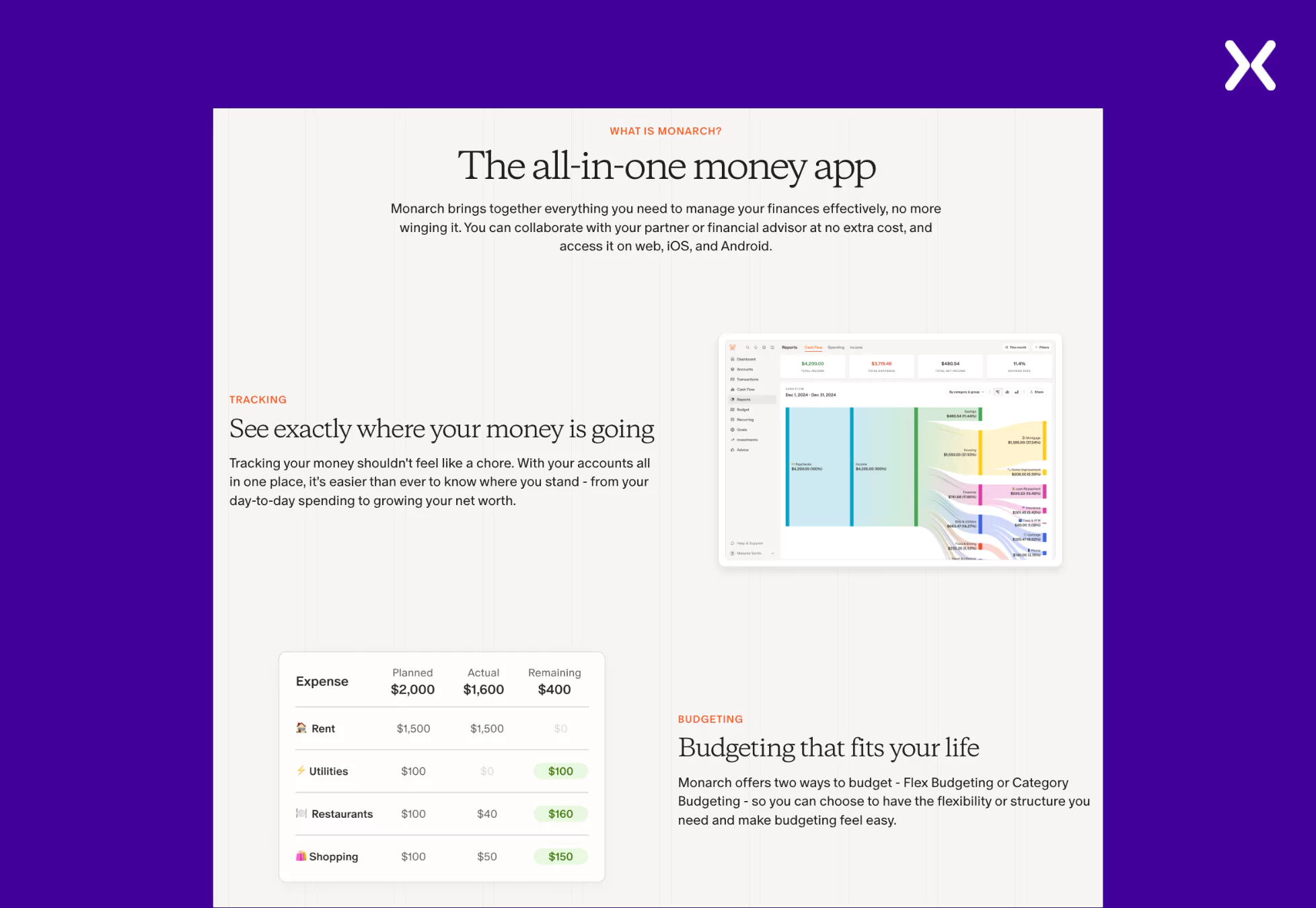
The layout ensures users can quickly grasp the app’s benefits without sifting through heavy text.
- Personalized and Emotion-Driven Copy
The copy on the landing page is user-focused and emotionally engaging, speaking directly to the reader’s financial goals.
Phrases like “Take control of your financial future” and “Reach your goals faster—together” appeal to emotions and position Monarch Money as a long-term financial partner, not just a budgeting tool. This approach makes the brand feel more relatable and encourages deeper engagement.
Another key detail on Monarch’s app landing page is their URL. Often overlooked, a well-structured URL for a landing page can be a powerful tool for tracking visitors and analyzing campaign performance. Monarch’s URL is thoughtfully designed with UTM parameters, ensuring detailed insights while maintaining a clean and memorable structure.
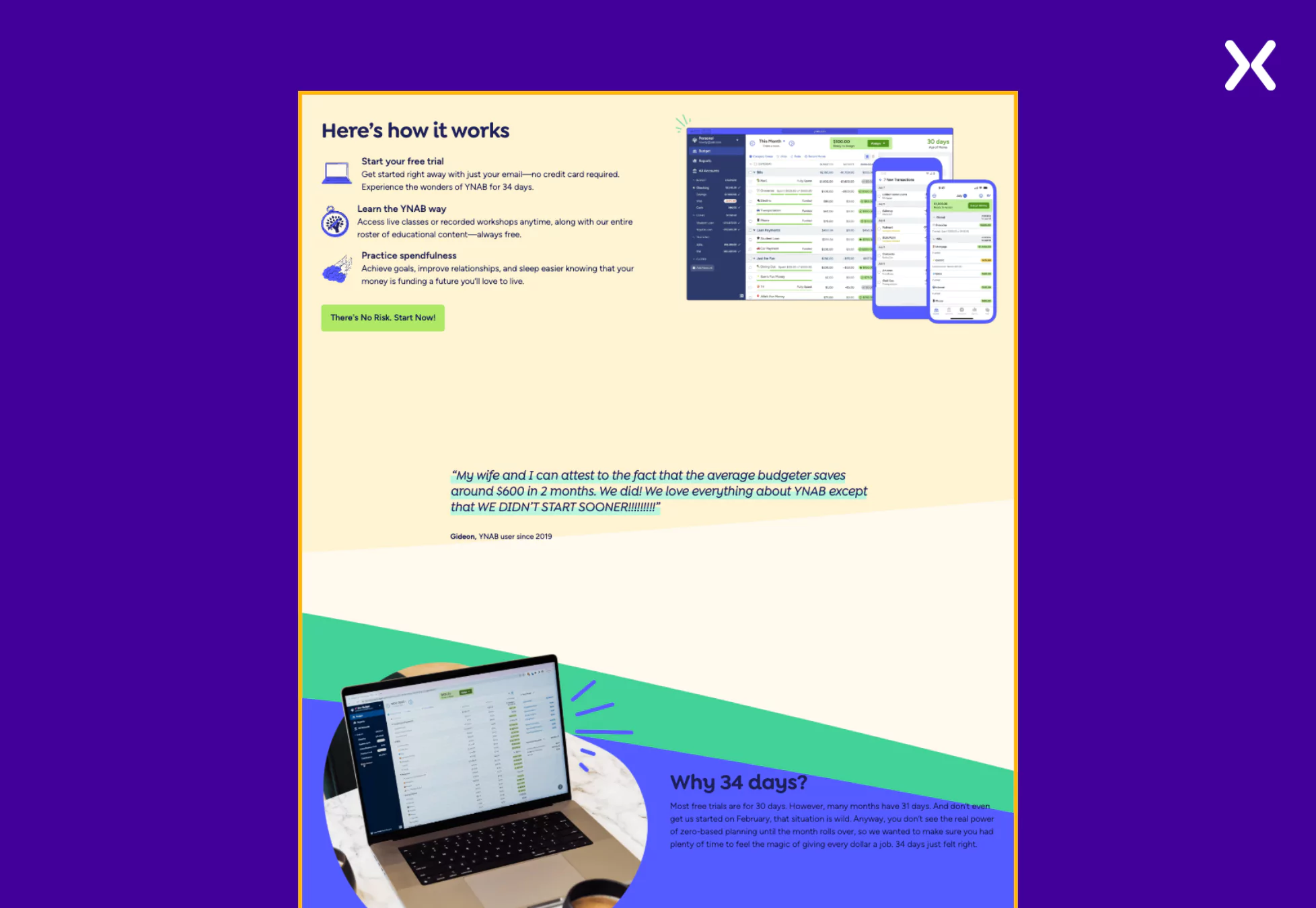
You Need a Budget (YNAB) is a personal finance app designed to help users manage their money by implementing a proactive budgeting approach.
This app landing page relies heavily on social proof to communicate the product’s value to visitors. The playful design and conversational copy engage visitors and nudge them toward conversion. Let’s examine these elements in more detail and see how they help YNAB’s app landing page.
Let’s look at the YNAB app landing page’s standout elements.
- Friendly, Conversational Copy that Reduces Hesitation
Sales-driven copies are out, and conversational copies are in as they feel more human and approachable. But that doesn’t mean your copy can’t address potential visitor concerns. YNAB app landing page has a conversational copy that makes the app’s features easy to understand and adds to the flow of the page.
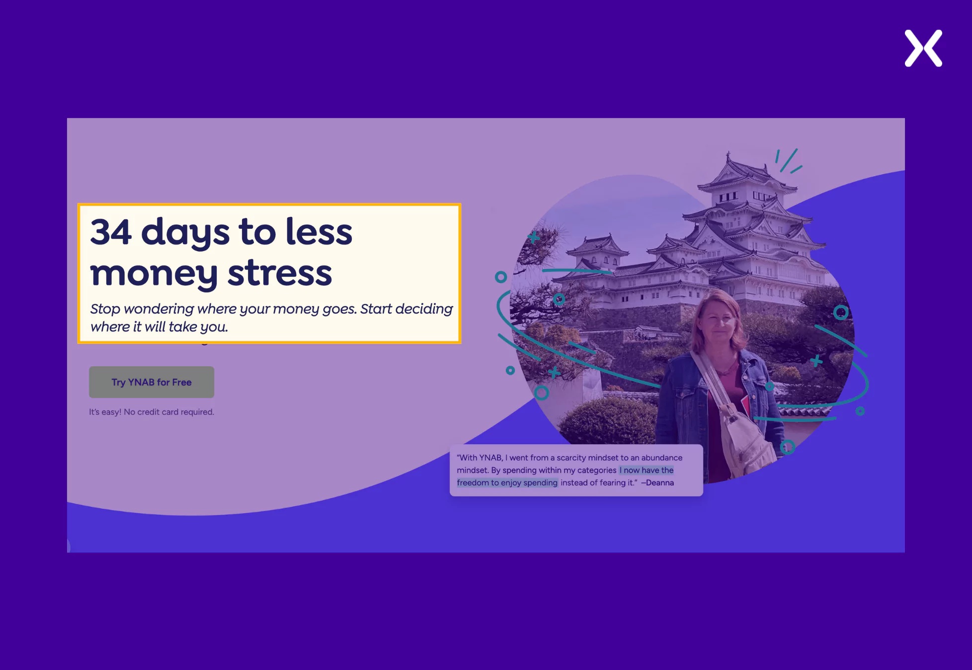
- Clear Visual Flow That Guides the Eye
The app landing page has no dull sections. Every segment contains user stories or crucial information, such as “how the app works.” It uses a simple visual hierarchy with images and text blocks to ensure users can absorb the key benefits without feeling overwhelmed.
- Subtle Social Proof Without Overcrowding the Page
Instead of filling the app landing page with claims, YNAB let their social proof do the talking through testimonials. They have used a mix of their app’s images along with their customers to make the visitors feel an affinity with them.
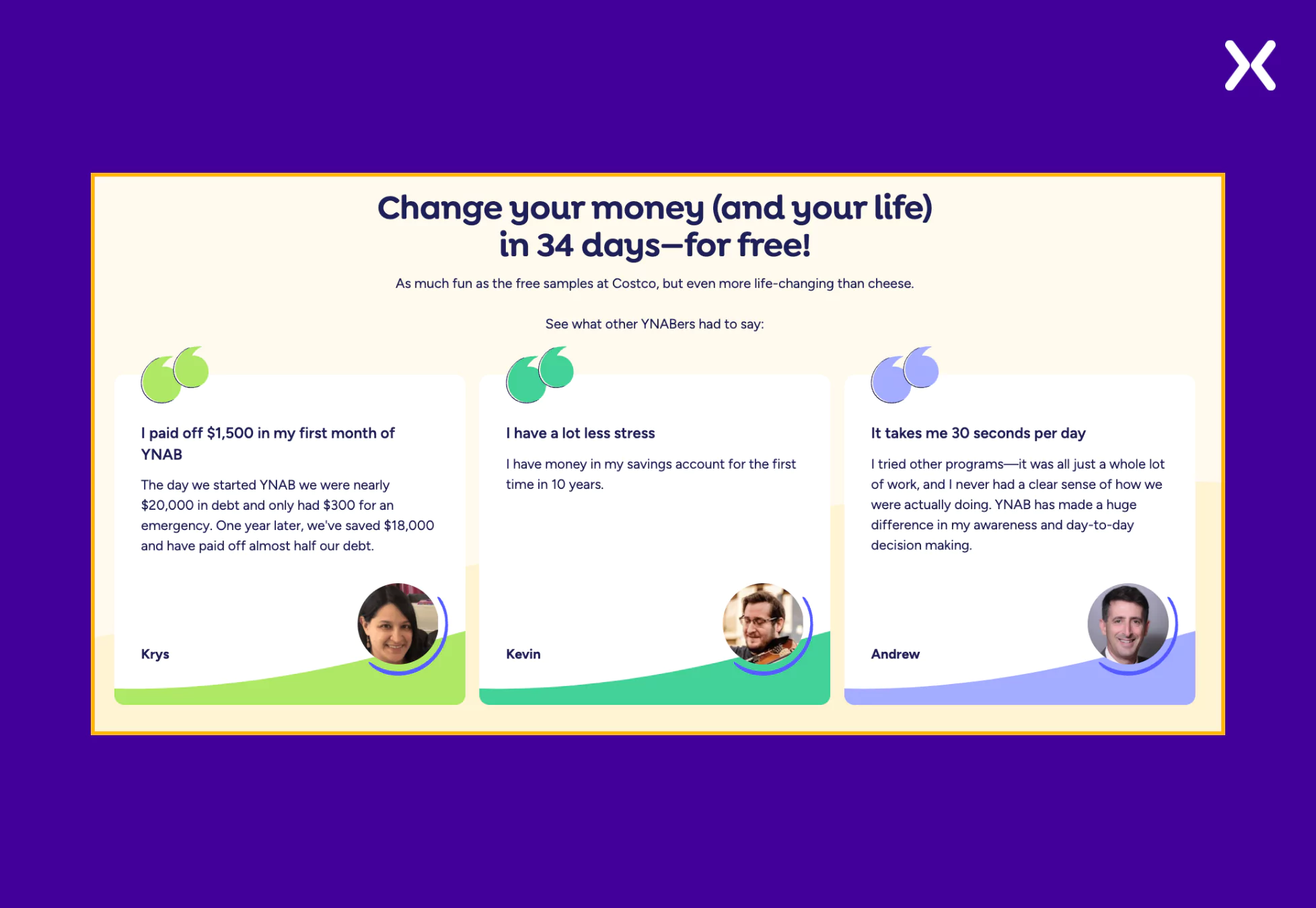
The testimonials have been purposively used to create mini-stories that inspire visitors to sign up; for example, phrases like “On average, new users save $600 in their first two months” serve as user-backed proof of the app’s effectiveness, making the offer even more compelling.
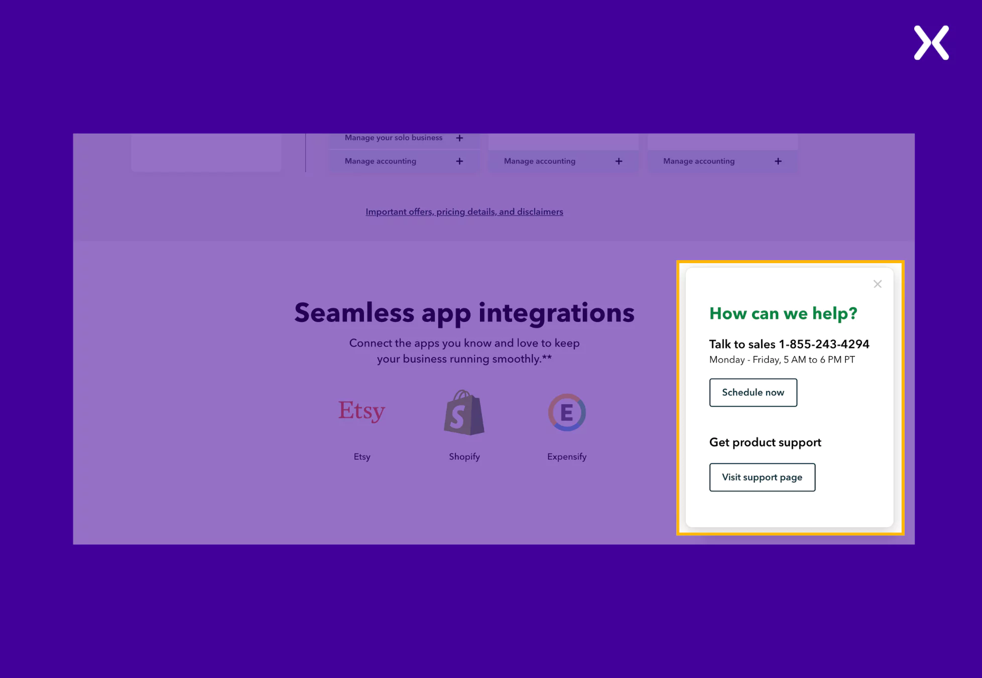
QuickBooks is a comprehensive accounting solution designed to help small businesses manage their finances efficiently.
Their app landing page perfectly balances social proof and product USPs. Since the app can be used on desktop and mobile, many images show its UI in action on various devices. The page also features short videos that deliver crucial information about the tool.
QuickBooks landing page’s standout elements are as follows.
-Clear Value Proposition with Supporting Statistics
Usually, the top fold is followed by a logo banner that mentions all crucial clients. QuickBooks replaces the banner with something even more impactful: a small section full of three quantified social proofs.
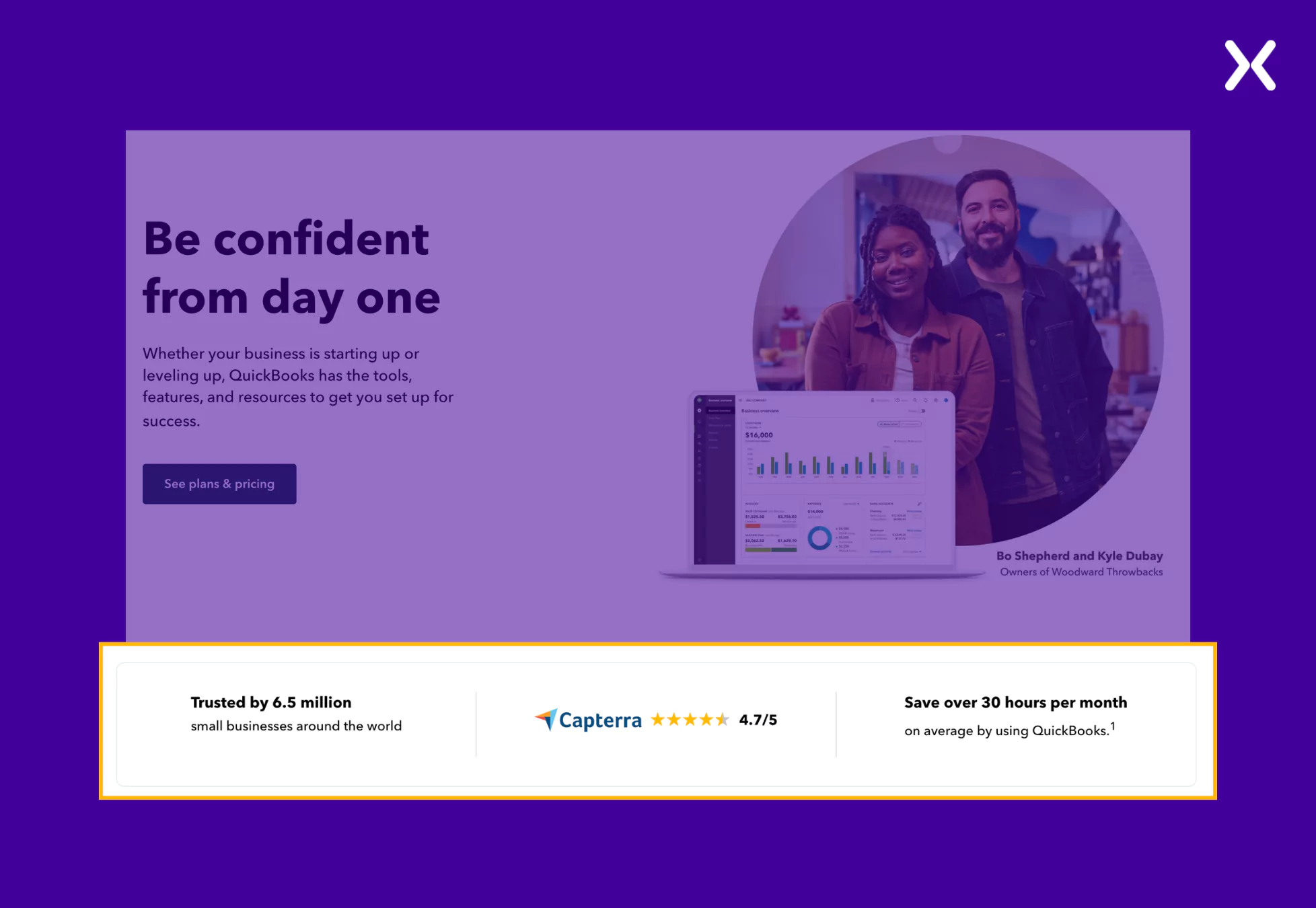
While visitors might not know the logos of all the companies using your app, quantified social proof is definitely effective for all types of visitors. This section is quickly followed by a segment highlighting four valuable QuickBooks USPs, making a strong case for conversion.
- Tailored Plan Recommendations
To assist users in selecting the appropriate plan, the page offers a “Find a plan that fits you” section. It uses toggles to answer deeper questions about specific tier features without overcrowding the landing page with content.
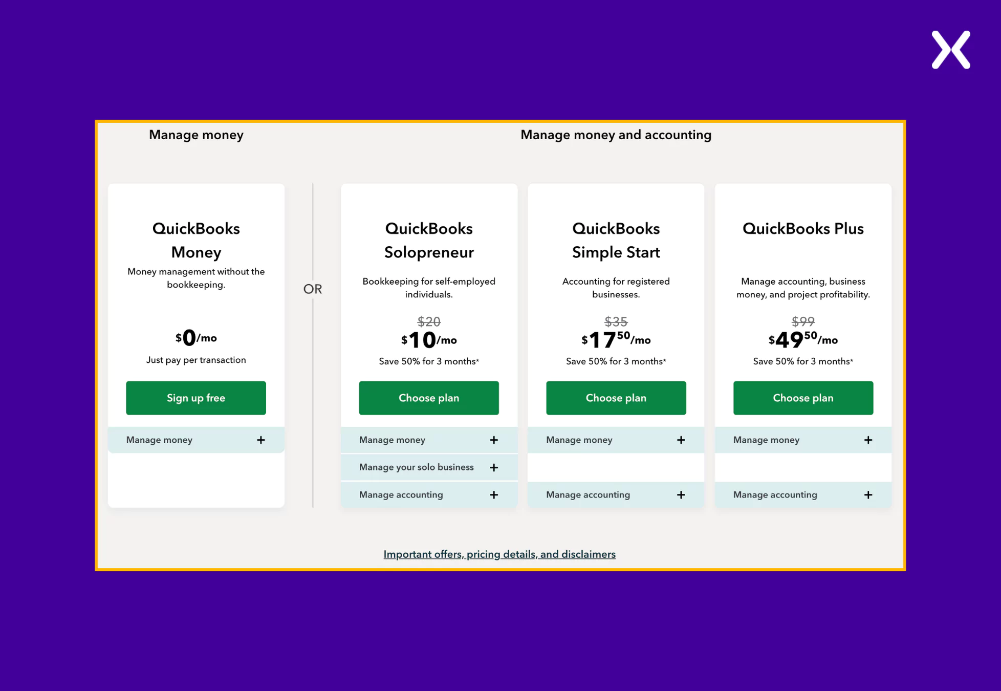
By answering a few questions about their business priorities, visitors receive personalized recommendations, simplifying the decision-making process.
- Schedule Calls With a Click
The app landing page has a sticky navbar and a button, which are always available to share direct contact information of the QuickBooks team, with operation time and days mentioned. It is a great way to enhance user experience as they can easily schedule calls with your team if potential customers want to know anything specific about the tool.
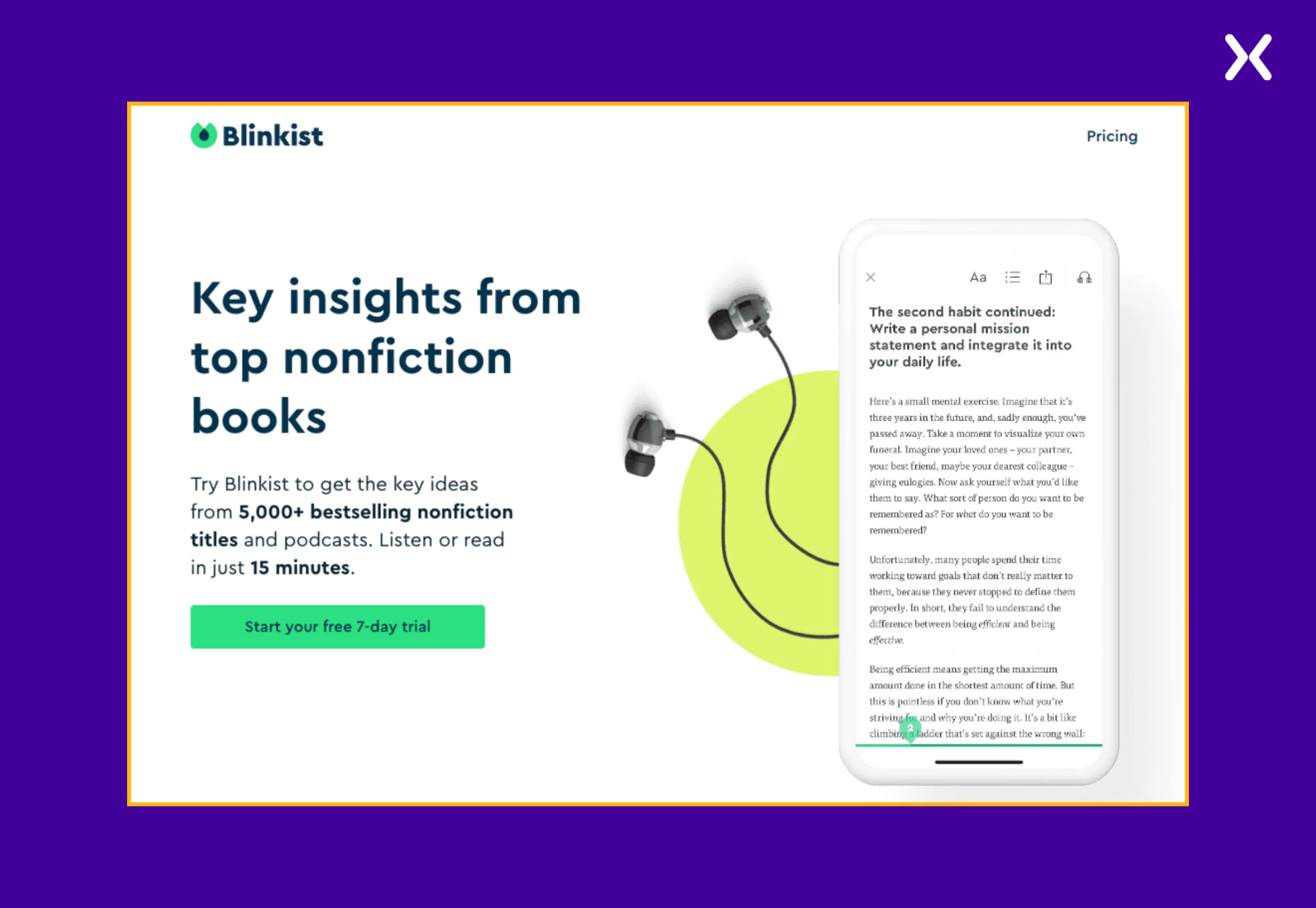
Blinkist is a reading app that provides key insights from over 5,000 bestselling nonfiction books and podcasts. It allows users to absorb knowledge in just 15 minutes.
The app landing page follows a modern, clean, and trust-building design. The color scheme features Blinkist’s signature green and much white space, making the content easy to digest. The layout is structured to guide users from understanding the product to signing up for the free trial, utilizing sections that showcase features, user reviews, and book categories.
Some of the impactful elements of the Blinkist app landing page are as follows:
- Strong, Benefit-Focused Headline
The headline “Key insights from top nonfiction books” at the top of the page immediately conveys Blinkist’s core benefit. The supporting copy reinforces the value proposition, explaining that users can get key takeaways from books and podcasts in just 15 minutes. This messaging is direct and easy to understand, appealing to busy individuals seeking efficient learning.
- Visual Categorization of Book Topics with Interactive Elements
Instead of listing books randomly, the landing page organizes content by categories such as productivity, society and culture, and relationships.
Clickable category filters allow users to explore topics relevant to them.
Book cover carousels make the page visually engaging, helping users discover specific titles.
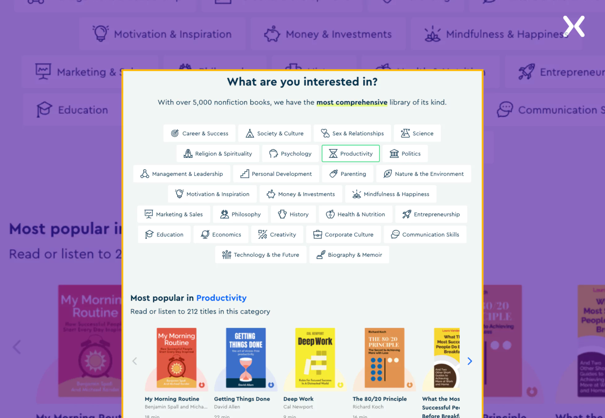
This interactive and structured layout enhances usability, making it easier for visitors to find books they’re interested in.
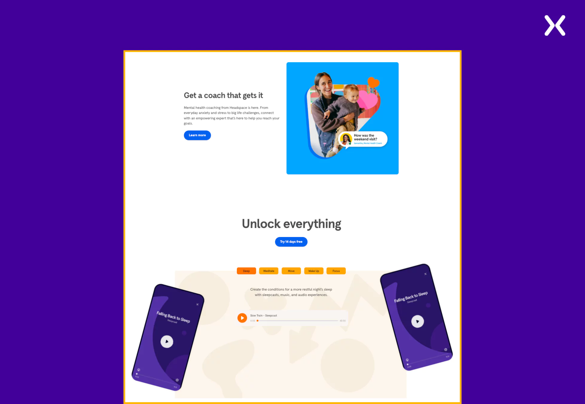
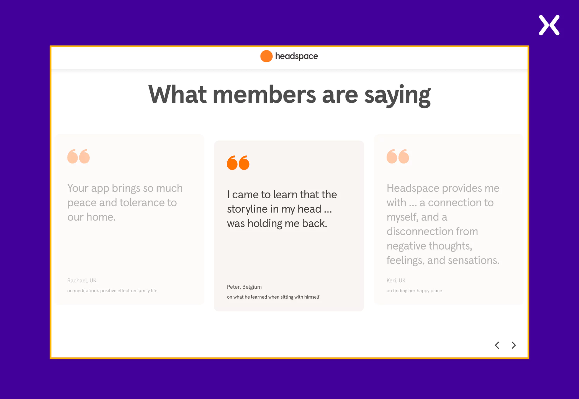
Headspace is a digital health company that helps people improve their mental well-being through guided meditation and mindfulness programs.
Staying true to the brand, the app landing page is visually calming, uses soft colors, ample white space, and a minimalist approach to its design. It effectively balances visuals and copy, creating a soothing user experience resonant with the brand on the landing page.
Here are the standout elements from the Headspace app landing page.
- Visual Hierarchy for Easy Navigation
A neatly organized layout with every crucial information packed in larger font sizes makes this page worth taking inspiration from. Bold headings, bullet points, and short sections have been used on the page to ensure you feel nowhere overwhelmed by the content.
- Emphasis on Transparency
Sharing personal data is a huge deal for users and often a bottleneck in conversions. Maintaining transparency on your app landing page is crucial to counter such an issue.
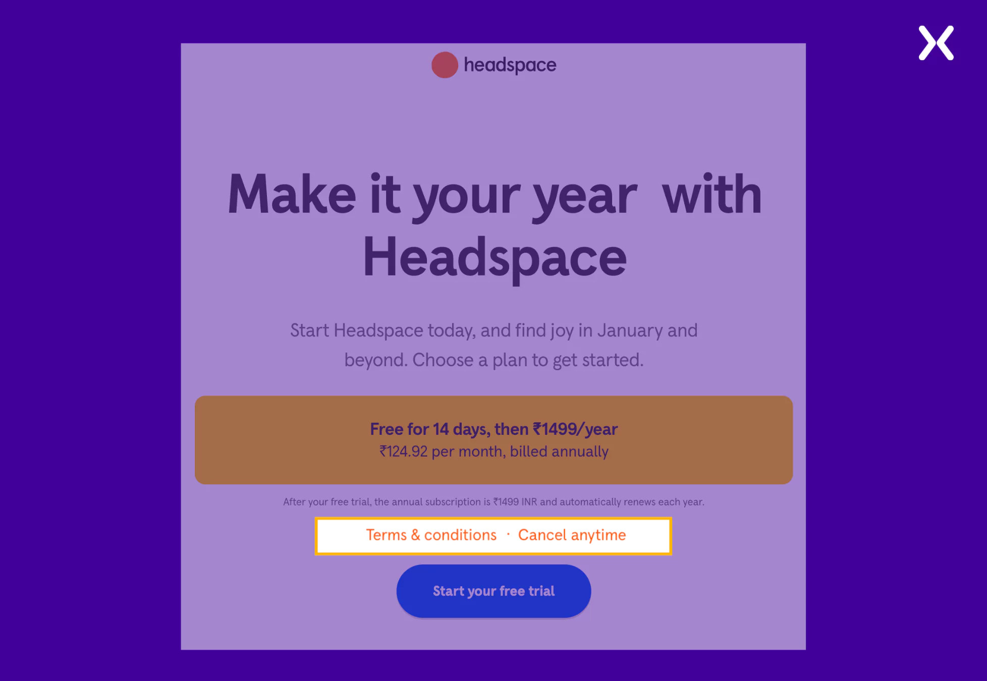
Headspace solves this by placing its terms and conditions policy above the CTA. This policy is complemented by another text, “Cancel anytime,” which removes user anxiety about a complex subscription cancellation process. Both these elements help win user trust and sign-ups.
- Emotional Testimonials and Social Proof
Headspace focuses on sharing testimonials that showcase the app’s real-life impact on users. By seeing how various customers have used the app to upgrade their lives and outlooks, visitors can feel inspired and sign up for its subscription.
Spotify is a leading music streaming service that offers users access to millions of songs and podcasts.
Their app landing page has a dark layout, bright images, and bold headings. Most of the layout follows a centered design approach, where key elements like headlines, CTAs, and images are positioned centrally for a balanced and visually appealing experience. Overall, the page has an inviting tone that aligns with the brand.
- Compelling Headline With An Offer
The landing page immediately captures attention with the headline, “Listen without limits. Try 1 month of Premium for $0.” This clear and enticing offer encourages users to experience the benefits of Premium without any initial financial commitment.
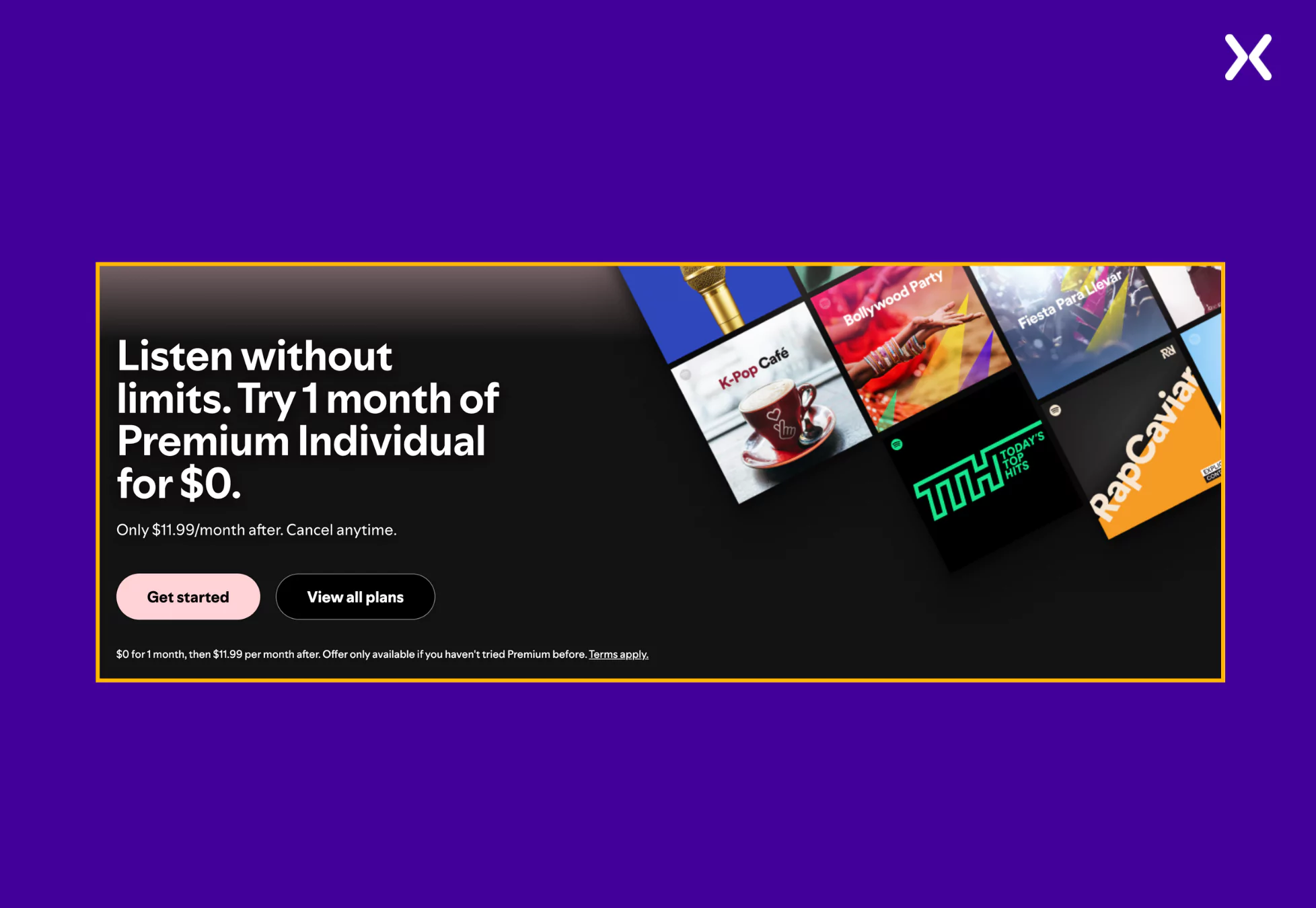
By highlighting the free trial prominently, Spotify lowers the barrier to entry, inviting potential subscribers to explore the service risk-free.
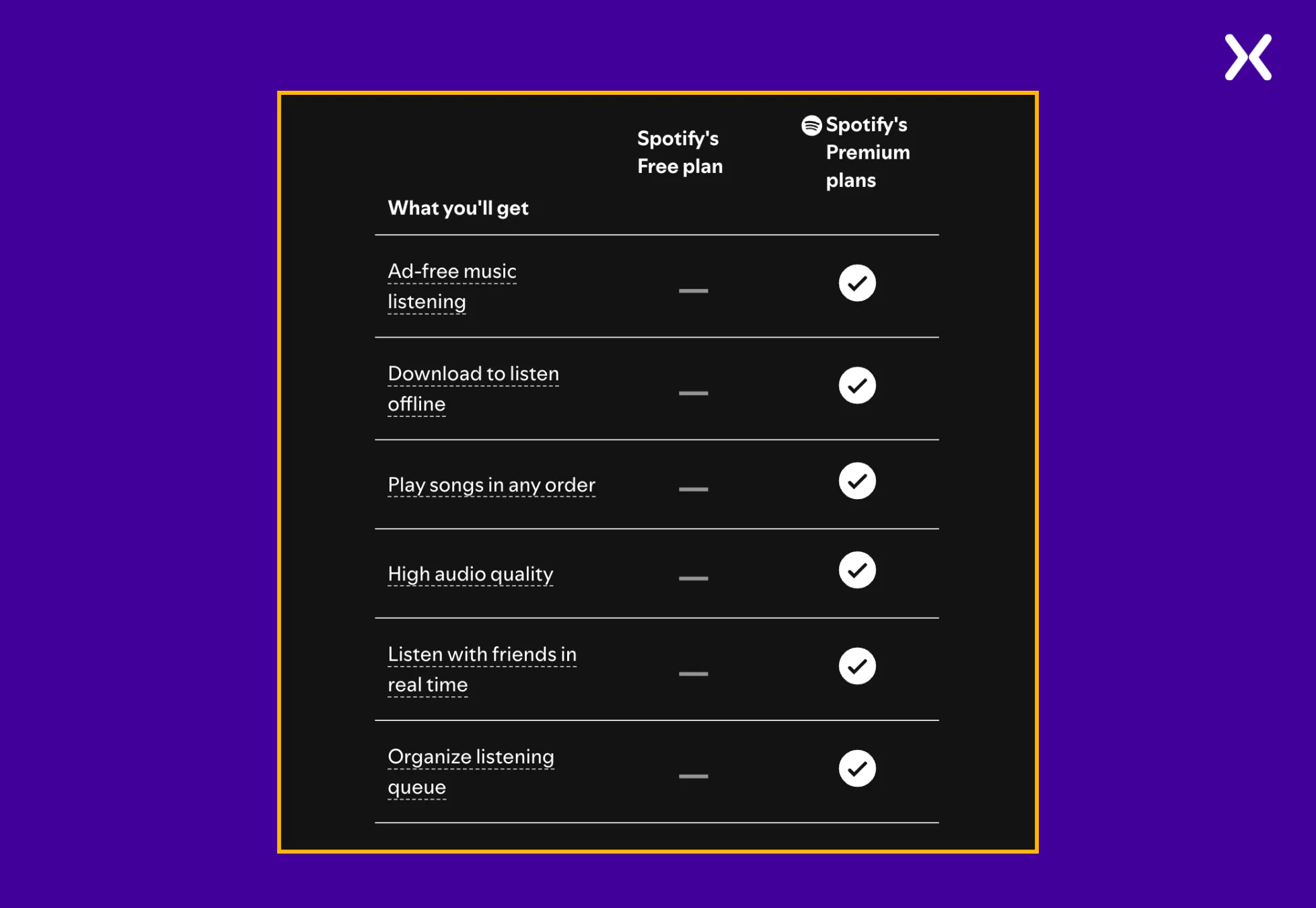
- Detailed Comparison Between Free and Premium Plans
Spotify uses a comparison table to help users understand the differences between the benefits of premium and free subscriptions. This section communicates additional app features and spotlights them for visitors to see. By clearly delineating the benefits, Spotify helps users make informed decisions about Premium’s value over the free version.
- User-Centered Subscription Plans
The landing page recognizes users’ requirements and showcases multiple Premium plans, including Individual, Duo, Family, and Student options.
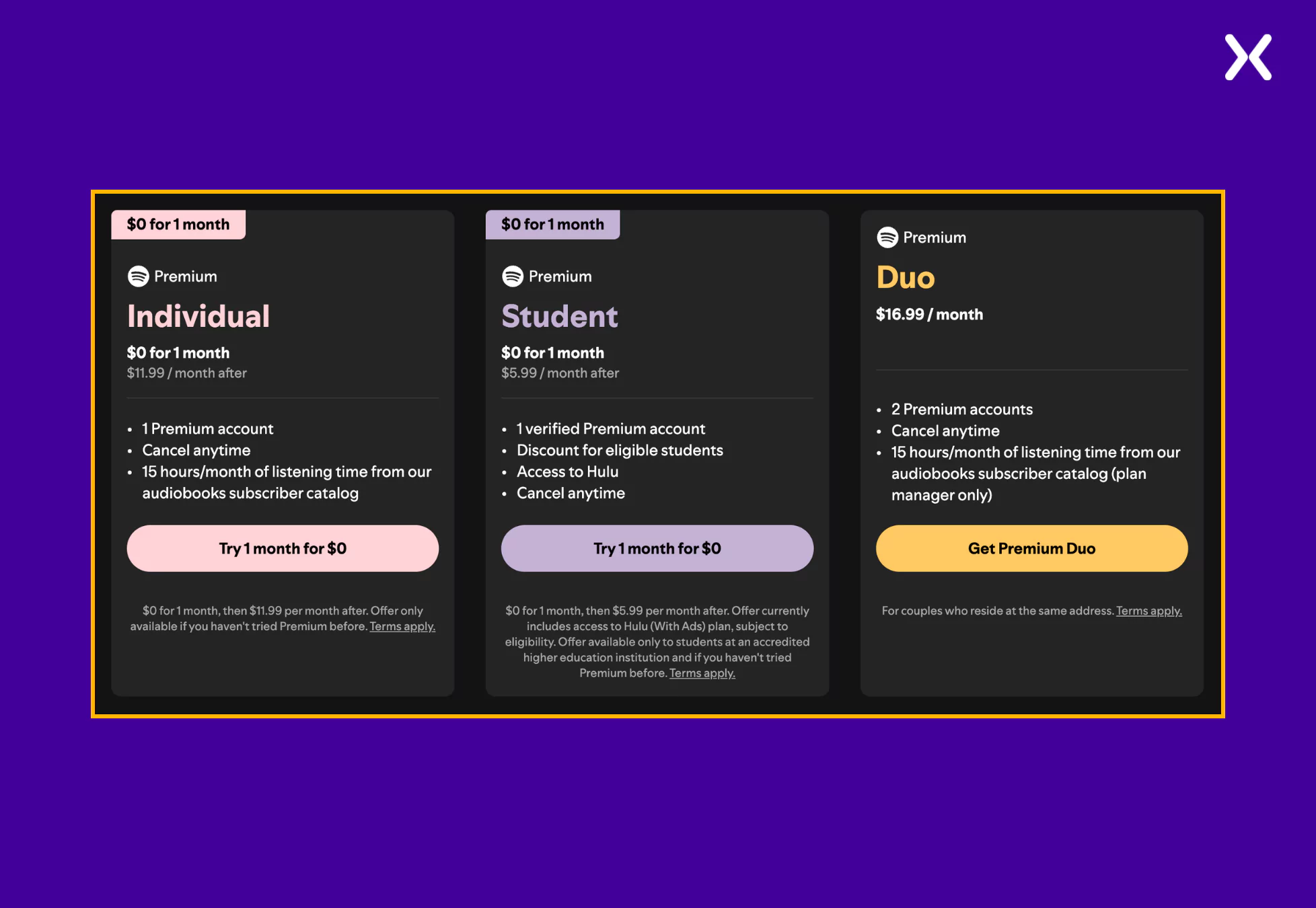
Each plan is accompanied by a brief description and pricing details, enabling users to select the option that best fits their circumstances. This way of showcasing various subscription tiers helps people make better purchase decisions, coming in return as added user trust.
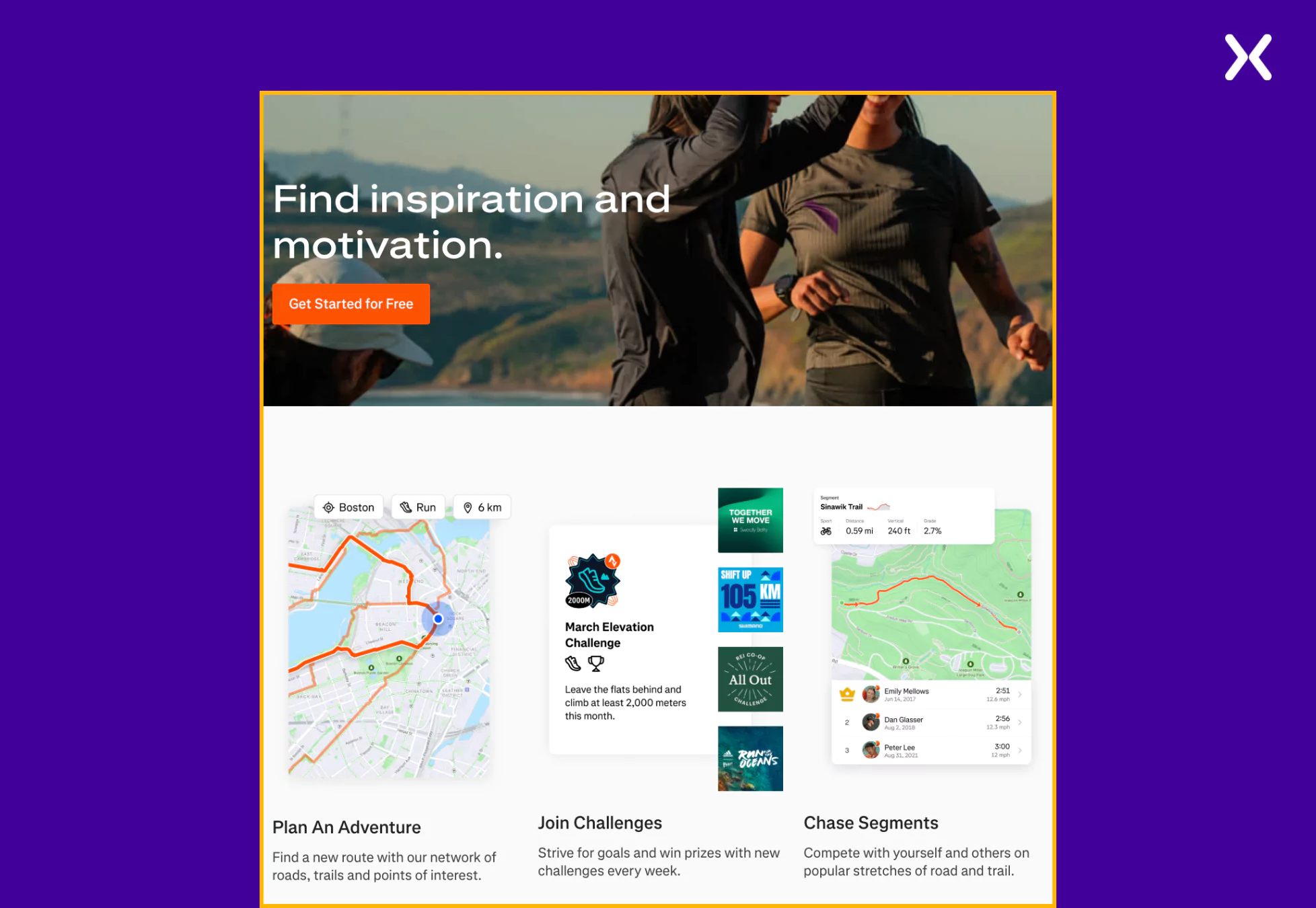
Strava is a leading social fitness platform that enables athletes and fitness enthusiasts to track their activities, analyze performance, and connect with a global community.
The “Get Started” app landing page welcomes new users with a dynamic visual of an athlete in motion, immediately conveying the platform’s energetic and community-driven spirit. The clean and intuitive design motivates visitors to join the app with clear benefits and engaging visuals.
Strava app landing page standout elements are:
- Highlighting Value
The landing page repeatedly highlights the importance of community and how Strava makes it easier to build one. By showcasing various features, such as giving kudos, club creation, etc., the landing page ensures that product value is conveyed to visitors, slowly nudging them toward conversion.
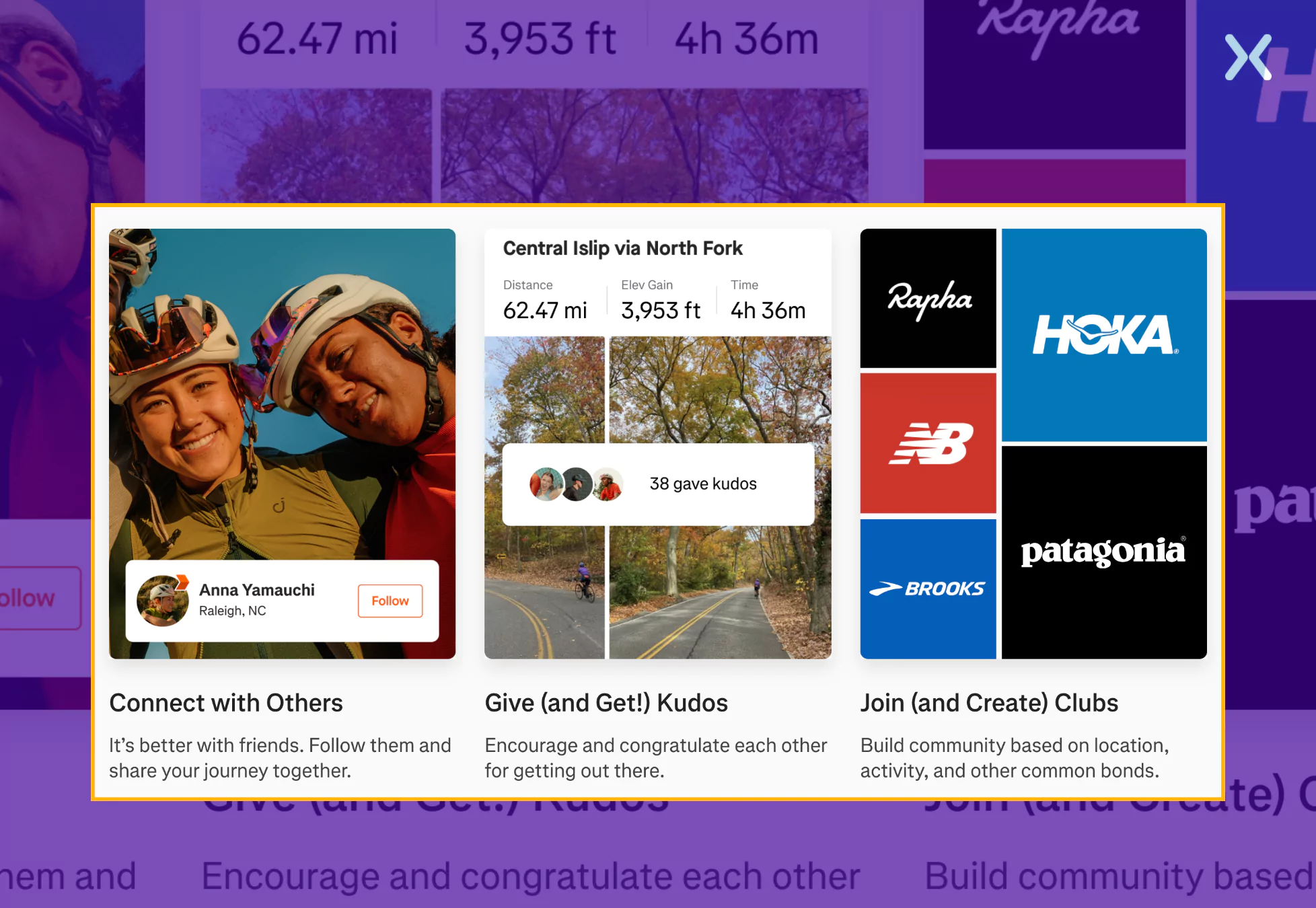
- Visual Appeal and Dynamic Imagery
The use of high-quality, dynamic images of athletes in action serves to inspire and motivate visitors. This visual strategy captures the essence of athletic pursuit and aligns with Strava’s brand identity, creating an immediate connection with the page’s target audience, fitness enthusiasts.
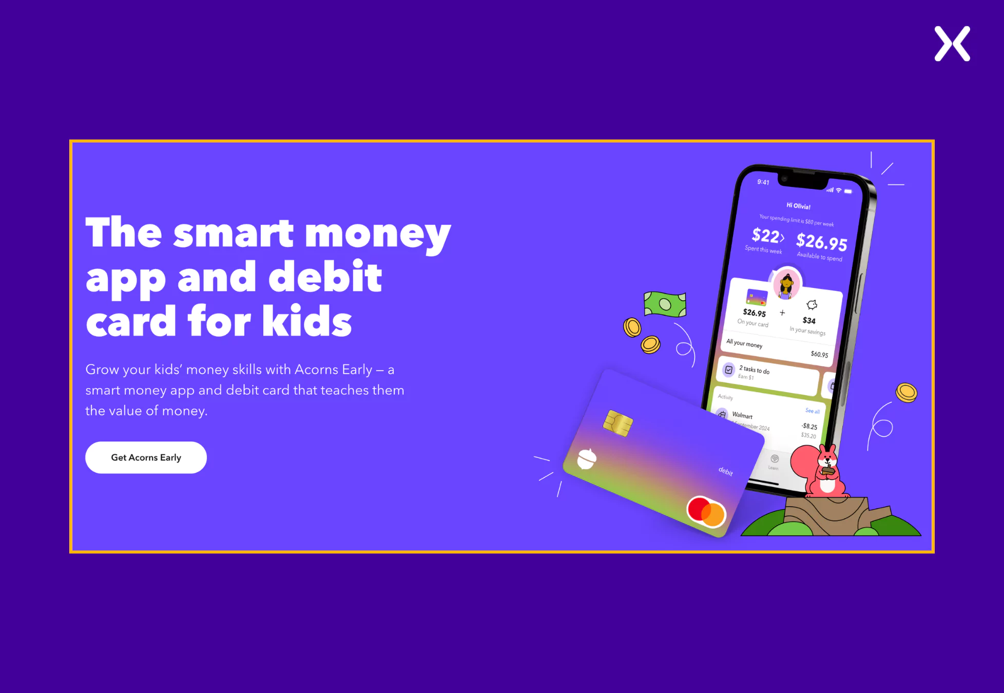
Acorns Early is an investment account designed to help parents start saving and investing for their children’s future, seamlessly integrated within the Acorns financial ecosystem.
The app landing page is visually clean, trust-building, and easy to navigate. It utilizes soft colors, rounded fonts, and real-life imagery of parents and children, creating an emotional connection with visitors. The design reinforces security and long-term planning, making it approachable for parents unfamiliar with investing.
Let’s look at the Acorns app page’s standout elements.
- Powerful Headline & Copy
Sentences like “Start saving and investing for your kids in minutes” emphasize ease of use, reducing hesitation for visitors who might see investing as complicated.
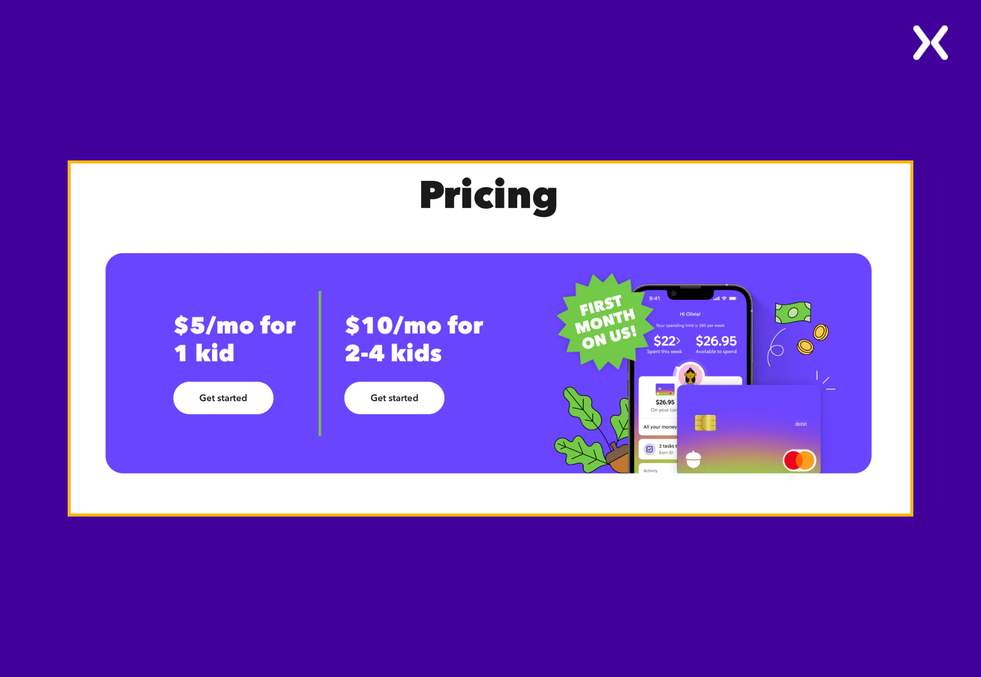
- Simple Pricing Section
Instead of long pricing explanations, the page presents a clean, easy-to-read pricing section. The breakdown uses large, bold typography and a minimalistic design to highlight that Acorns Early is part of Acorns Premium ($3/month). The page removes friction in decision-making by presenting this clearly with no hidden fees.
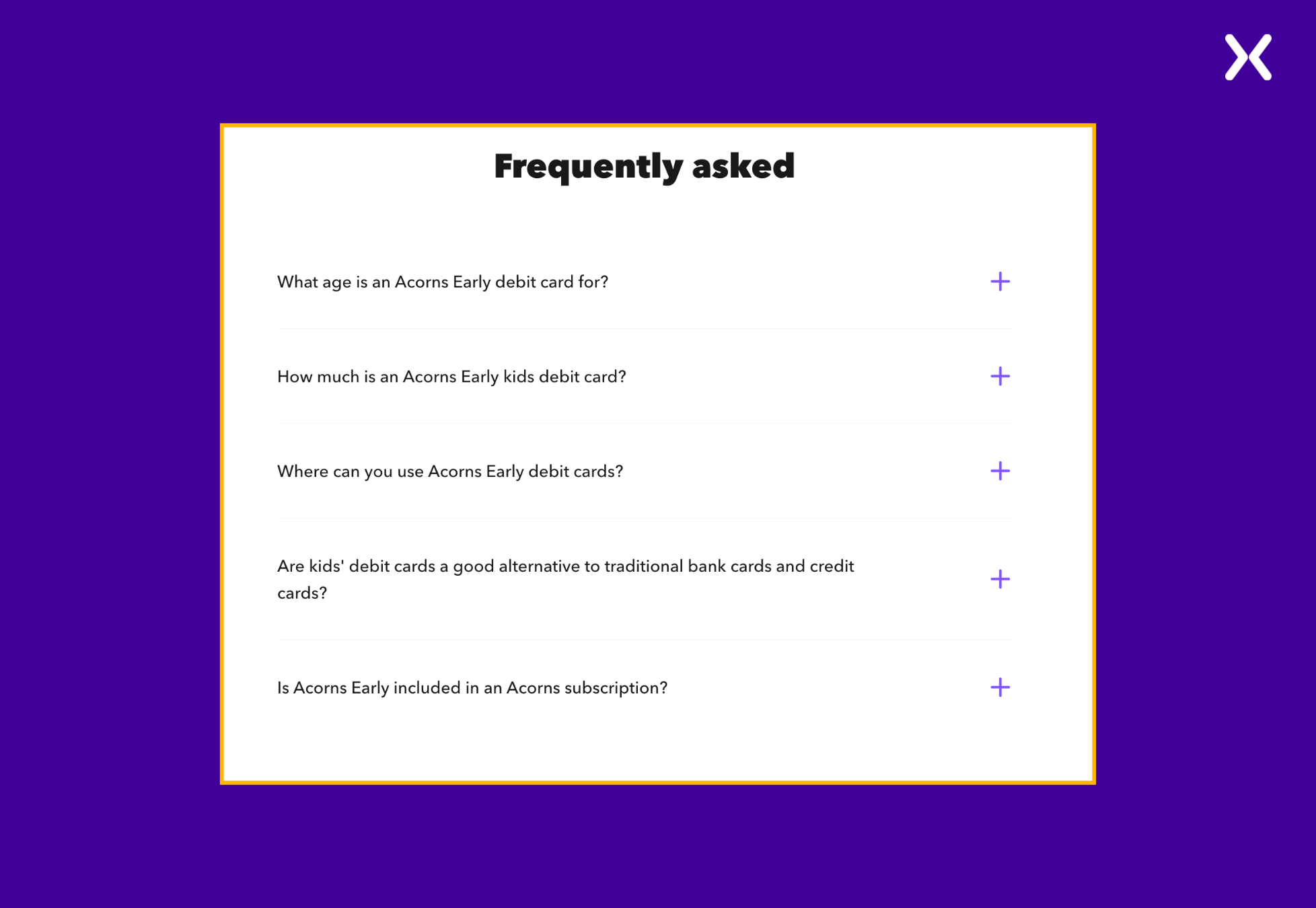
- FAQs At The End
The app landing page includes a crucial FAQ section at the end, addressing last-minute doubts that might prevent potential users from signing up. Providing clear answers helps reassure hesitant visitors, increasing the likelihood of conversions.
Most app landing page examples we analyzed focused on visual design and copywriting. However, functionality is just as necessary. As a app owner, you must ensure your SaaS landing page is fully responsive across all devices.
Every example above featured a clean, well-optimized mobile version, which is crucial since most users will ultimately access your app from their phone. Conducting competitor research can help you create a more compelling app landing page, whether it offers a demo, a free trial, or instant download options.
Make your app landing pages even better by adding a thank you page after the visitors and done filling your form and clicking the submit button. It looks professional and add more space to start a conversation with your new lead.
A well-designed app landing page does more than showcase an app—it drives conversions by clearly communicating value, building trust, and guiding visitors toward action. The best app landing pages make a lasting impression with strong headlines, engaging visuals, trust signals, and compelling CTAs.
Studying these examples can help you gain insights into creating or improving your app landing page, ensuring it looks great and converts visitors into users.
Apexure has 100+ blog posts on landing pages? We have shared everything, from creation to testing, analysis to optimization. Check it out before you build your SaaS demo landing page.
Making an app landing page on your own with just examples can take a lot of time. Get the help you need from our experts. Book a call and one of our experts will contact you soon.
Check out our landing page portfolio to discover conversion-friendly landing page elements that might. Filter your industry and check which landing page design is trending.
An app landing page is a standalone web page designed to promote and provide information about an app, encouraging users to download or sign up.
Related Articles:
As CEO and Founder of Apexure, Waseem Bashir's decade-old experience in building high-converting landing pages extends to collaborations with Fortune 500 leaders. From free to paid he has tried his hands on all landing page builder tools and knows just the right fit for every business. Read more


Drive More Sales or Leads With Conversion Focused Websites and Landing Pages
Get Started


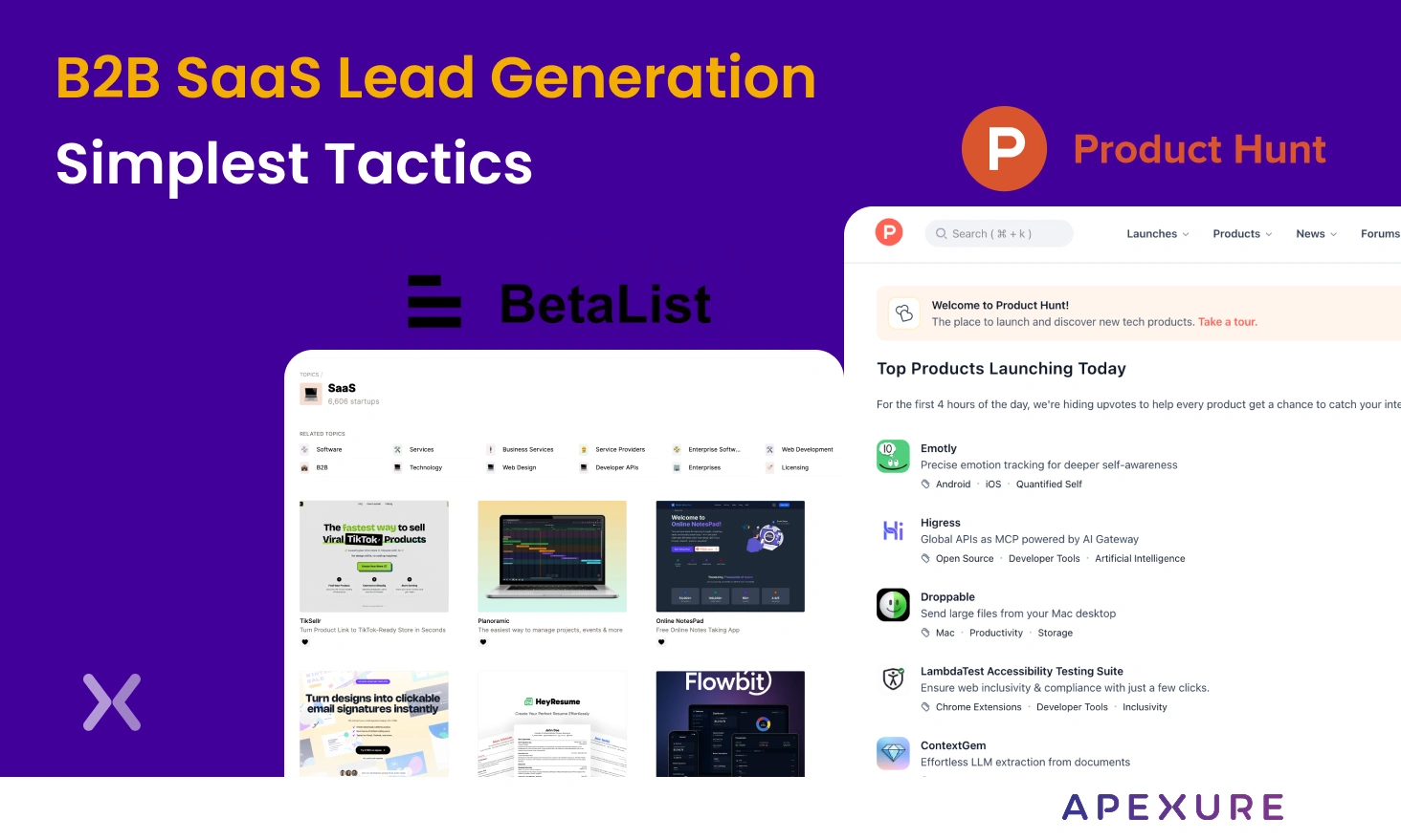
Every B2B SaaS lead generation starts with cold outreach. But is it worth sticking to one strategy when...
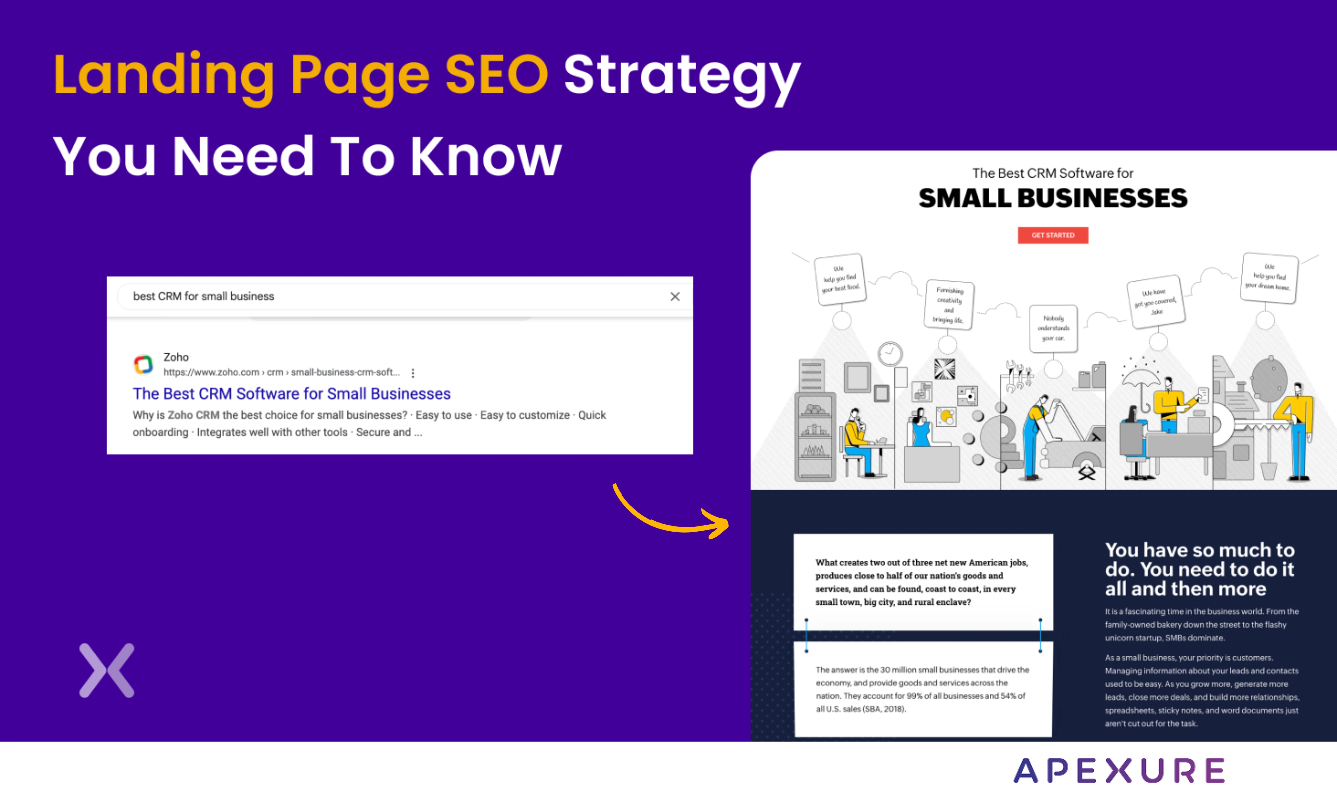
Landing page SEO is for companies still figuring out whether they want to do PPC. We know, PPC...
Get quality posts covering insights into Conversion Rate Optimisation, Landing Pages and great design
