Optimising a landing page only after its conversion rate drops is a losing strategy. By that point you are already behind, dealing with an overwhelming pile of unsorted data, not enough time to test every hypothesis, and pressure from leadership to make gut-based decisions. Landing page optimization works best as a proactive, continuous process. You set up tracking, watch how users actually behave, build data-informed hypotheses, test them, and feed the results back into the next round. Done well, it compounds, each cycle makes the page better and teaches you something about your audience that your competitors do not know. After building and optimising 3,000+ landing pages across 300+ clients. We have distilled our process into 12 best practices that consistently produce measurable results. This guide walks you through each one with examples from our own work.
What is landing page optimization?
Landing page optimization (LPO) is the process of improving every element of a landing page, from headline copy to form design to page speed, using data-driven insights. The goal is to increase the percentage of visitors who complete the desired action, whether that is filling out a form, booking a demo, or making a purchase. As a business owner, understanding LPO matters because your landing pages are the conversion layer of your marketing. You can have the best ads in the world, but if the page they land on fails to convert, every click is wasted spend.

Without optimized landing pages, you are wasting money, time, and opportunities on Google Ads. Conversion is the goal; if the page fails, so does the campaign.
12 landing page optimization best practices
These are the practices that consistently produce results in our testing. They are ordered by where they fit in the optimisation cycle, from setting up measurement to running tests to building feedback loops.
1. Define your KPIs before touching anything
Before changing a single element, decide what you are measuring and why. Most teams track conversion rate and nothing else. That is not enough. The KPIs that actually tell you where to focus:
- Conversion rate, the obvious one, but segment it by traffic source, device, and campaign
- Form start rate, what percentage of visitors begin filling out the form?
- Form completion rate, of those who start, how many finish?
- Bounce rate, are visitors leaving immediately? If so, message match is likely the problem
- Average engagement time, how long are visitors actually spending on the page?
- Scroll depth, are visitors reaching your CTA, or dropping off before they see it? GA4 tracks all of these. Set them up before your page goes live, not after something breaks.
2. Start tracking at the right time
When and how often you review data depends on traffic volume:
- Review daily. You have enough data to spot trends quickly and catch problems before they cost you significant conversions.
- Review weekly. Daily fluctuations will be noise. Focus on weekly patterns and give A/B tests longer to reach significance.
Review landing pages every two weeks — or weekly for high-traffic sites. Benchmark against industry standards and adjust based on A/B test results.
3. Build your optimisation toolkit
Metrics tell part of the story. To understand WHY visitors behave the way they do, you need UX research tools alongside analytics.
Quantitative Tools (What)
- GA4, traffic, funnels, conversion tracking
- Google PageSpeed Insights, Core Web Vitals
- Looker Studio, custom dashboards
- Search Console, query performance
Qualitative Tools (Why)
- Hotjar / Clarity, heatmaps, session recordings
- VWO / Optimizely, A/B testing platform
- Wynter / UserTesting, user feedback
- Maze, unmoderated usability tests
You do not need every tool on day one. Start with GA4 and one heatmap tool (Hotjar or Microsoft Clarity, both have free tiers). Add A/B testing when you have enough traffic to run statistically valid experiments.

In order to create a good looking, fast landing page with a high quality score requires significant technical knowledge and often help from developers and/or designers.
4. Combine quantitative and qualitative data
This is where most optimisation efforts stall. Teams look at GA4, see a high bounce rate, and immediately start redesigning the hero section. But bounce rate alone does not tell you WHY visitors leave.
Quantitative data (GA4, funnel reports) shows you WHAT is happening: page views, drop-off points, conversion rates.
Qualitative data (heatmaps, session recordings, surveys) shows you WHY: where users click, how far they scroll, what confuses them. Together. They give you hypotheses worth testing. A high bounce rate plus a heatmap showing rage clicks on a non-clickable hero image tells you something specific and actionable. A high bounce rate alone tells you almost nothing.
5. Build testable hypotheses
A hypothesis is not “let us try a different button colour.” A hypothesis has three parts: action, outcome, and reasoning.
Template: “If we [action], then [outcome] will improve, because [reasoning based on data].”
Example: “If we move the client logos from the footer to directly above the CTA button, then form submissions will increase, because heatmap data shows 60% of visitors never scroll past the fold and our highest-converting traffic source (Google Ads) has the lowest scroll depth.” Without the reasoning, you are guessing. With it, you are learning, even when the test loses, because a failed hypothesis tells you something about your audience.
6. Prioritise tests with the EPIC framework
After a thorough research phase, you will have 15-20 hypotheses. You can test maybe 3-4 per month. Choosing the wrong three means months of wasted capacity. At Apexure, we score every hypothesis using the EPIC framework:
This prevents the most common optimisation trap: testing whatever is easiest or whatever the CEO mentioned in the last meeting. We have seen teams spend three months A/B testing hero images when the real conversion killer was a five-field form that could have been two fields.
7. Build a feedback loop
Every test, win, lose, or inconclusive, teaches you something about your users. The teams that compound their conversion gains are the ones that document and apply these learnings. After each test cycle:
- Record what you tested, why, and the result
- Update your hypothesis backlog based on what you learned
- Identify patterns across multiple tests (e.g., “trust signals consistently outperform urgency tactics for this audience”)
- Feed insights back into the next round of research This creates a knowledge base that makes each subsequent round of optimisation more efficient and more likely to produce winners.
Landing page optimization checklist
These are the tactical elements to audit and test on any landing page. We have organised them by category so you can focus on your weakest area first.
Functionality
Page speed
53% of mobile users abandon pages that take over 3 seconds to load. In 2026, Google’s Core Web Vitals set clear thresholds:
Use Google PageSpeed Insights to check your scores. Focus on LCP first, it has the biggest impact on both bounce rate and Google Ads Quality Score.
Layout and visual hierarchy
Experiment with layouts that maintain clear visual hierarchy and effective use of whitespace. Your page should guide the eye from headline to value proposition to social proof to CTA in a natural flow. Session recordings are invaluable here. They show you exactly how visitors move through your page, revealing confusing navigation paths and missed elements that analytics alone cannot surface.
Continuous testing
Do not treat optimisation as a one-off project. Regular A/B testing protects your conversion rate against audience shifts, competitor changes, and seasonal variations. Set up a testing calendar and commit to running at least 2-3 tests per month.
Mobile responsiveness
83% of traffic now comes from mobile, but mobile converts at roughly half the rate of desktop (2.9% vs 5.1% on average). Closing that gap is one of the highest-ROI optimisation opportunities.
Common Mobile UX Problems
- Buttons too small for thumb tapping
- Text requires pinching to read
- Forms with tiny input fields
- Desktop layout squeezed onto mobile
- CTAs below the fold on mobile screens
Mobile-First Fixes
- Minimum 48px touch targets (WCAG standard)
- 16px+ body text for readability
- Full-width form fields with proper keyboard types
- Single-column layout with stacked sections
- Sticky CTA bar at bottom of screen
Mobile optimization is often neglected. Mobile users need tailored experiences with larger buttons, readable text, and device-specific designs — especially for older demographics.
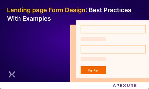
Form design
Forms are where conversion intent meets UX friction. Cutting a 7-field form down to 3 fields is one of the most reliable ways to lift completion rates. Baymard Institute’s 2026 research found that the average checkout has 23 form elements, while the ideal is 12-14. For lead-gen landing pages:
- Ask only what you need for initial qualification. You can gather more information later
- Use multi-step forms for longer processes, breaking a 7-field form into two steps of 3-4 fields reduces perceived effort
- Add inline validation so users see errors as they type, not after submission
- Support auto-fill and use correct input types (email, tel, url) for mobile keyboards
Headline and message match
Your headline is the first thing visitors see. If it does not immediately confirm they are in the right place, matching the promise in the ad or search result that brought them, they bounce. The rule is simple: your landing page headline should echo the ad copy or search query. If your ad says “Get a Free Landing Page Audit,” the page headline should not say “Welcome to Our Agency.” It should say “Get Your Free Landing Page Audit.” We call this message match, and fixing it alone can lift conversions by 15-25% without any design changes.
Social proof and trust signals
Trust is a UX element that directly gates conversion. Users look for signals that reduce perceived risk before committing. The most effective trust signals we see in testing:
- Client logos (especially recognisable brands) placed near the CTA, not buried in the footer
- Specific review scores with source, “4.9/5.0 on Clutch, 33 reviews” beats “Trusted by thousands”
- Case studies with concrete numbers, “63% conversion increase” beats “significant improvement”
- Security badges near form fields and payment inputs
- Real team photos rather than stock imagery
Single CTA focus
Every extra link, button, or navigation element on your landing page competes with your primary CTA. The most effective landing pages we build have one conversion goal, repeated at multiple scroll depths, with zero competing navigation. Remove header navigation, footer links, social media icons, and any other exit points. Your landing page has one job: convert. Everything else is a distraction.
Case studies: landing page optimization in action
Flare, 65% conversion increase
Flare, a scheduling software company, had low conversions on their “Book a Demo” page. Our analysis revealed content overload and mobile UX issues.
What we changed:
- Simplified the headline for clarity
- Added targeted social proof (customer logos and a testimonial)
- Simplified the form from 6 fields to 3
Result: A/B testing confirmed a 65% increase in conversion rate.
Imd, 63% conversion increase
IMD, a leading business school, wanted to increase MBA brochure downloads. The existing page converted at 3.91%.
What we changed:
- Moved video testimonials higher on the page (heatmap data showed users dropped off before reaching them)
- Repositioned the “About Us” trust section above the fold
- Both changes were merged into a single A/B test variant
Result: Conversion rate improved from 3.91% to 6.38%, a 63% increase.
Case Study: 63% Conversion Increase for IMD
IMD, a globally well-known business school, needed to boost brochure downloads for their MBA programme. We audited their landing page, built hypotheses around trust signal placement, and ran A/B tests.

- We identified that video testimonials and the About Us section were buried too far down the page, causing early drop-offs before visitors reached trust signals.
- After repositioning content and running structured A/B tests, conversion rate improved from 3.91% to 6.38% — a 63% increase.
Results from our landing page optimization work
"Every month we need to create new landing pages for campaigns, events, or influencers and edit the previous ones. Apexure's team is always on time, and they always answer to all of our needs. Their team is very reactive, proactive, and friendly."
Ready to Optimise Your Landing Pages?
With 3,000+ landing page projects and 200+ five-star reviews, Apexure helps businesses turn more visitors into customers. Our landing page optimization services cover everything from audit to implementation. Get a free audit with a prioritised action plan.
Book a Free Landing Page Audit →What you should do now
Found this helpful? Here are more ways we can help:
- Get a free landing page audit
We will review your landing pages for conversion leaks, UX friction, and missed optimisation opportunities. Book a call to get started.
- Learn more
Read our Complete Guide to CRO or our CRO Consultant Guide to understand when and how to bring in expert help.
- See our results
Our case studies show how landing page optimisation has lifted conversion rates by 40-150% across SaaS, healthcare, finance, and e-commerce.
Frequently asked questions
Start by identifying your weakest metric, is it bounce rate, form abandonment, or low CTA clicks? Use GA4 and heatmap tools to find where users drop off, then build a hypothesis about why. Test one change at a time using A/B testing. The biggest gains come from fixing message match (ad-to-page alignment), simplifying forms, and improving page speed.
The five highest-impact practices based on our testing: (1) Match your headline to the ad that brought the visitor, (2) Reduce form fields to the minimum needed, (3) Keep page load under 2.5 seconds, (4) Place social proof near your CTA, (5) Use a single conversion goal per page. These five changes alone account for most of the conversion lifts we see across clients.
Review metrics weekly for high-traffic pages and bi-weekly for lower-traffic ones. Run A/B tests continuously — not as one-off projects. The best-performing landing pages are never “done.” They go through ongoing cycles of research, hypothesis building, testing, and iteration.
It depends on your industry and traffic source. B2B SaaS demo pages typically convert at 3-8%. E-commerce product pages average 2-4%. Paid campaign landing pages should target 5-15%. The industry average across all types is around 6.6% (Unbounce, 2025). Rather than chasing a benchmark, focus on improving your current rate through structured testing.
The standard 2026 toolkit includes GA4 for analytics, Hotjar or Microsoft Clarity for heatmaps and session recordings, VWO or Optimizely for A/B testing, Google PageSpeed Insights for performance, and Looker Studio for reporting. You do not need all of these to start — GA4 plus one heatmap tool is enough to begin identifying problems.
EPIC is the prioritisation framework we developed at Apexure to score CRO test hypotheses. Each potential test is scored on four dimensions: Experimentation (how innovative), Priority (how urgent), Impact (expected uplift), and Cost (time and resources). Tests with the highest combined score run first. This prevents wasting capacity on low-impact changes.
Yes. Google Ads Quality Score includes a “landing page experience” component that evaluates relevance, usefulness, and page speed. A well-optimised landing page with strong message match, fast load times, and mobile responsiveness directly improves Quality Score, which lowers your cost per click.
Length should match the complexity of the decision. A free newsletter signup needs a short page (one screen). A high-ticket SaaS demo or financial product needs a longer page with detailed information, social proof, and objection handling. Test both — we have seen both short and long pages win depending on the offer and audience.
View all sources
Page Load Time Statisticsthinkwithgoogle.com
Cart Abandonment Rate Statistics 2026baymard.com
Average Conversion Rates for Landing Pages (2025)unbounce.com
Core Web Vitals and Google Searchdevelopers.google.com
Landing Page Optimization: An Ultimate Guide (2026)vwo.com

Waseem founded Apexure in 2015 and has led its work on 3,000+ pages for 300+ clients since. He writes about what the team sees after the click, which is pages, forms, tracking and the systems behind them.
 Valley Solar
 T4Media
 Safe Place Bedding
 Cosmetic Dental
 Cassidy Artz
 24hour-AR