
Optimizing landing pages is crucial for better conversions. But what exactly should you be optimizing?
We’re here to help you with that.
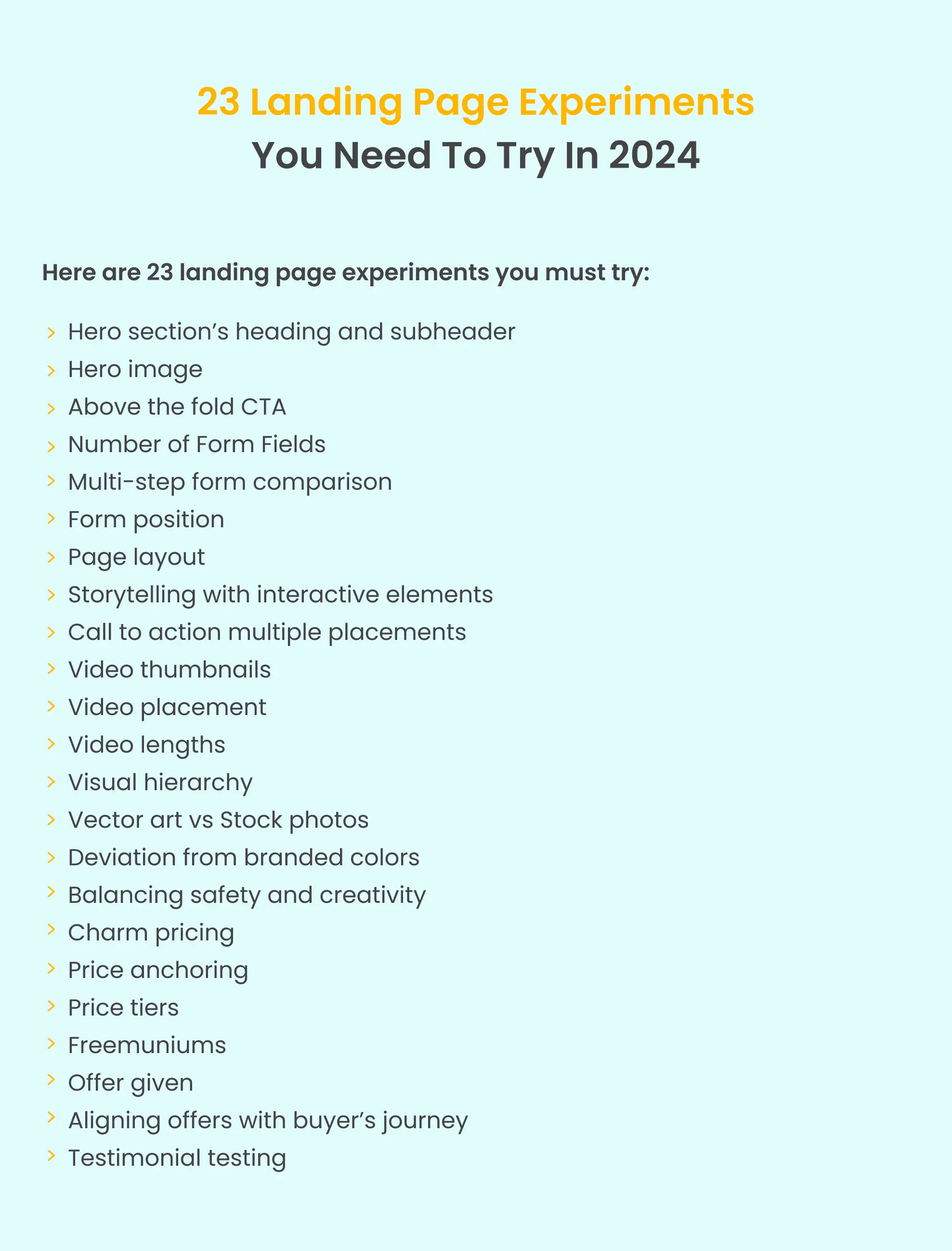
Coming up with effective landing page experiments is not easy. You need to understand all your landing page elements before diving into testing. Whether your landing page is brand new or has been around for a while, optimization is always on the agenda. Knowing which elements to experiment with can save you from the usual headaches when testing time comes.
So, here’s a blog where we will cover various landing page experiment ideas you can test this year to boost your conversion rates. We’ll also share insights from our landing page experts on prioritizing these experiments and tackling the low-hanging fruit first.

We have broken down landing pages into various parts and discussed how each section should be tested. Whether you have a newsletter sign-up page, SaaS demo or free trial page, or an event page, these experiments are applicable to all. Let’s start with the most important section first.
Visitors usually spend very little time browsing your landing pages, so it’s important to have a strong first impression. And by that, we mean although your entire landing page has to offer a great user experience the first element visitors will look at is the hero section.
A hero section typically groups the headline, call to action, and imagery in a way that when a visitor lands on the page, the hero section does the heavy lifting of:
Grabbing visitor attention
Explaining what the page is about
Hero sections encourage visitors to stay on the landing page and can ultimately impact conversions.
Let’s break down Hubspot’s main landing page. Here in the hero section, we have a main headline, a CTA, and a supporting or hero image.
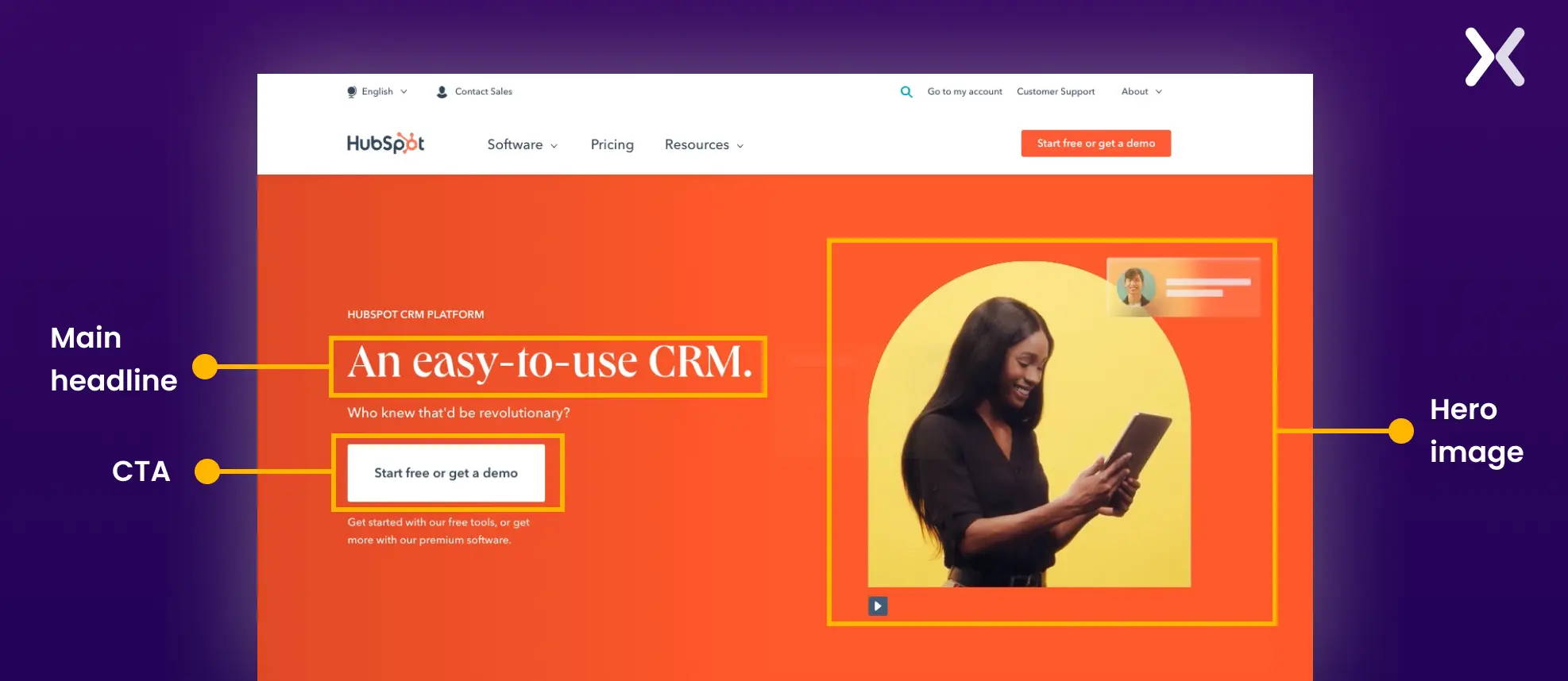
These three elements are great contenders for AB tests.
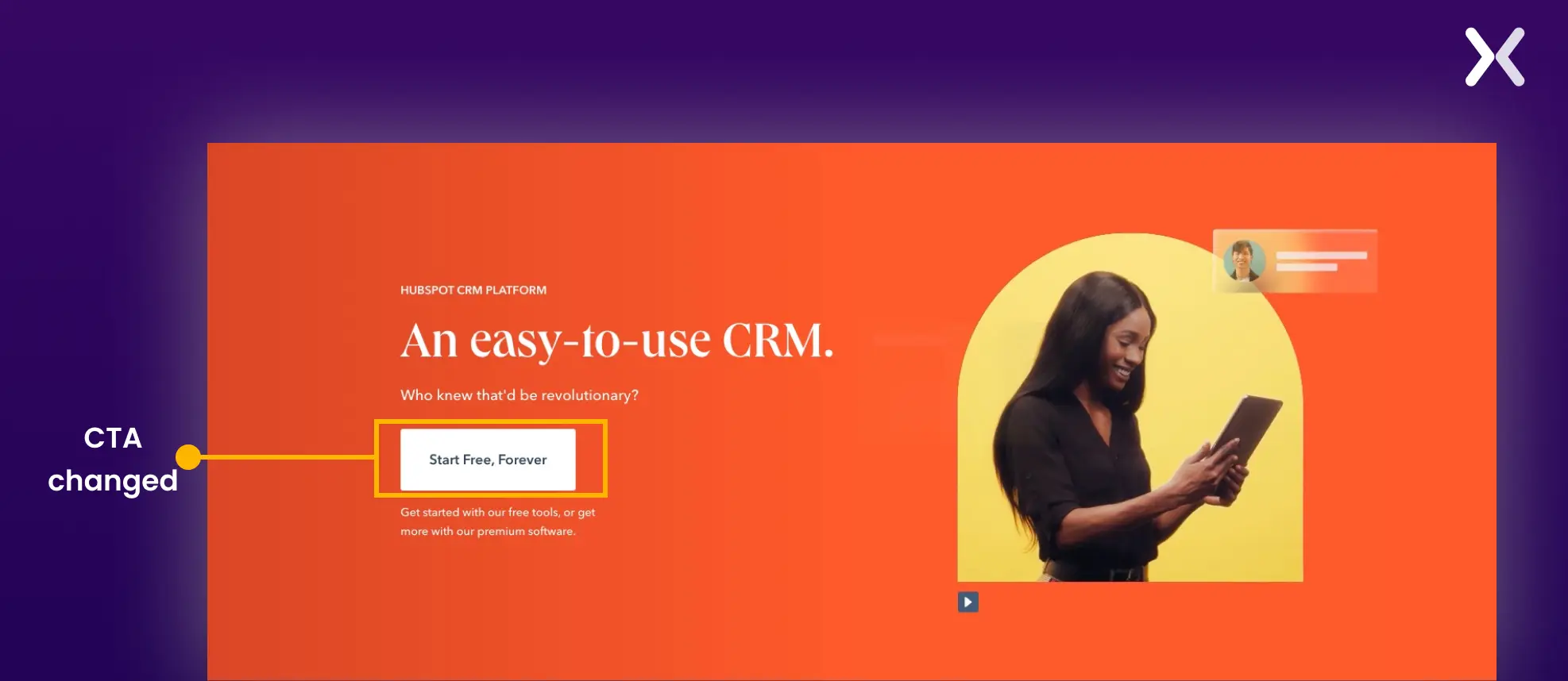
For example, we can change the CTA button text.
Or change the headline:
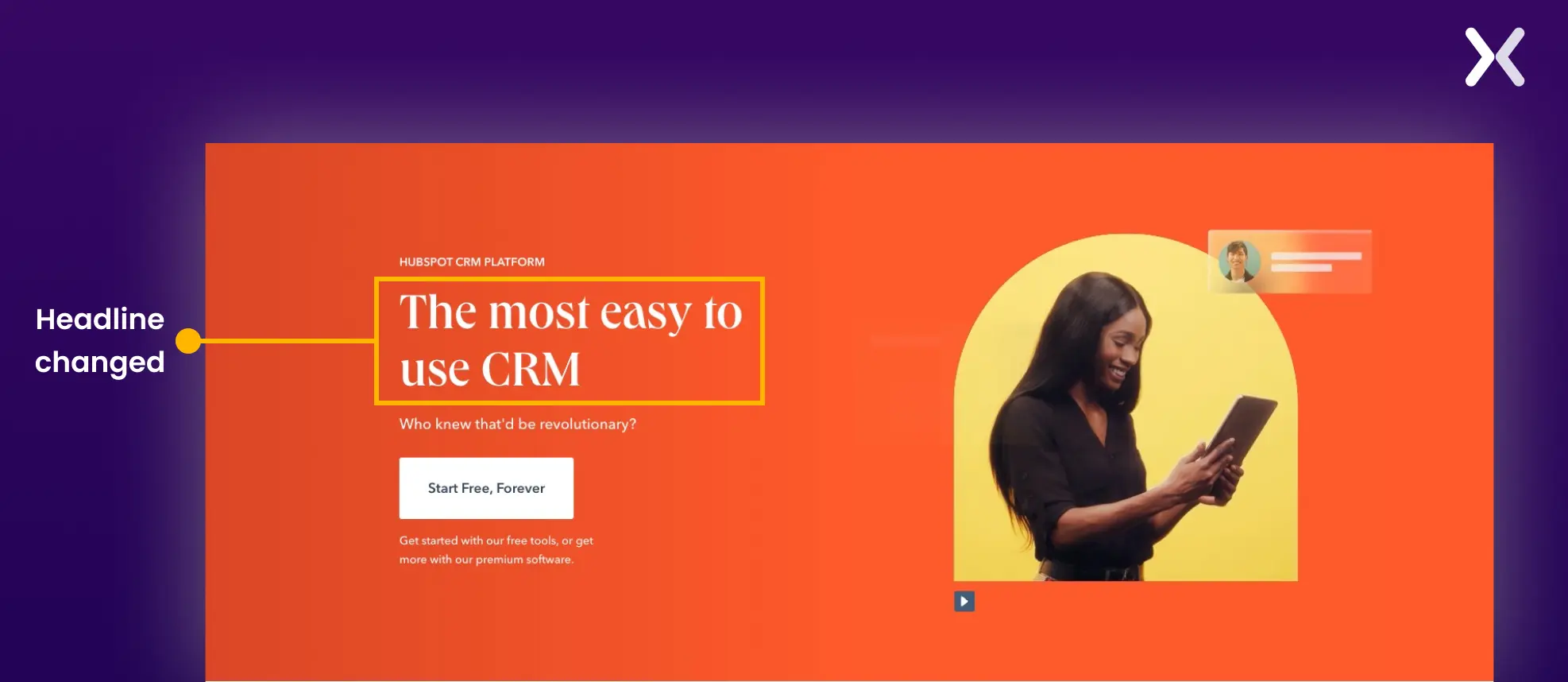
Or change the CTA button color to make it stand out
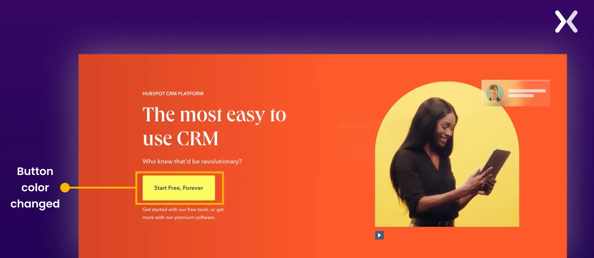
Hence, in the hero section, there are three things elements you need to experiment with.
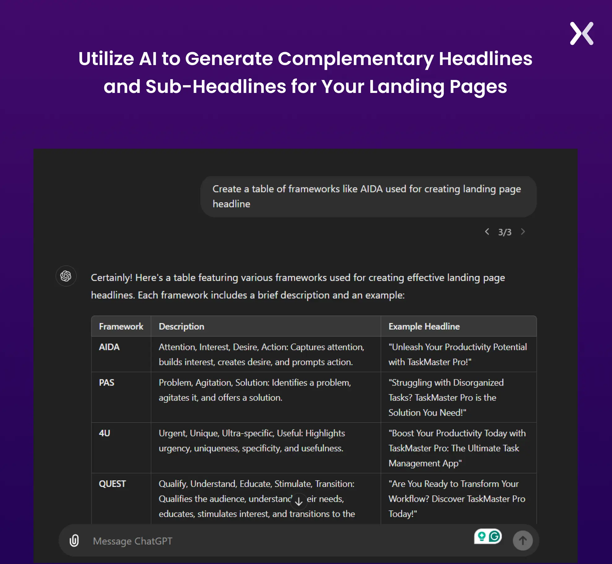
With the help of AI, you can easily create and test various heading and subheading copies, based on different frameworks and determine which works best for your audience.
There is so much to test when it comes to CTAs. The three most crucial things are its color, text, and placement. Don’t forget to test these three for the landing page hero section.
A hero image can make a huge impact on the scroll depth and conversion of your landing page. Ensure that you test various ones before finalizing one.

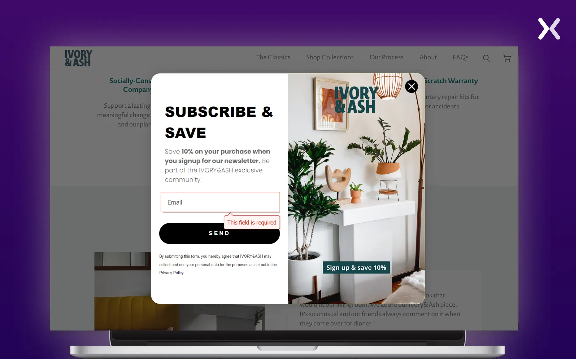
Asking too much or too little information can make or break your landing page campaign. Lead capture forms maintain a delicate balance between both.
For example, we have a splash landing page from Ivory & Ash. Their objective? Simple—get people to sign up for the waitlist. For this campaign, they only capture email addresses.
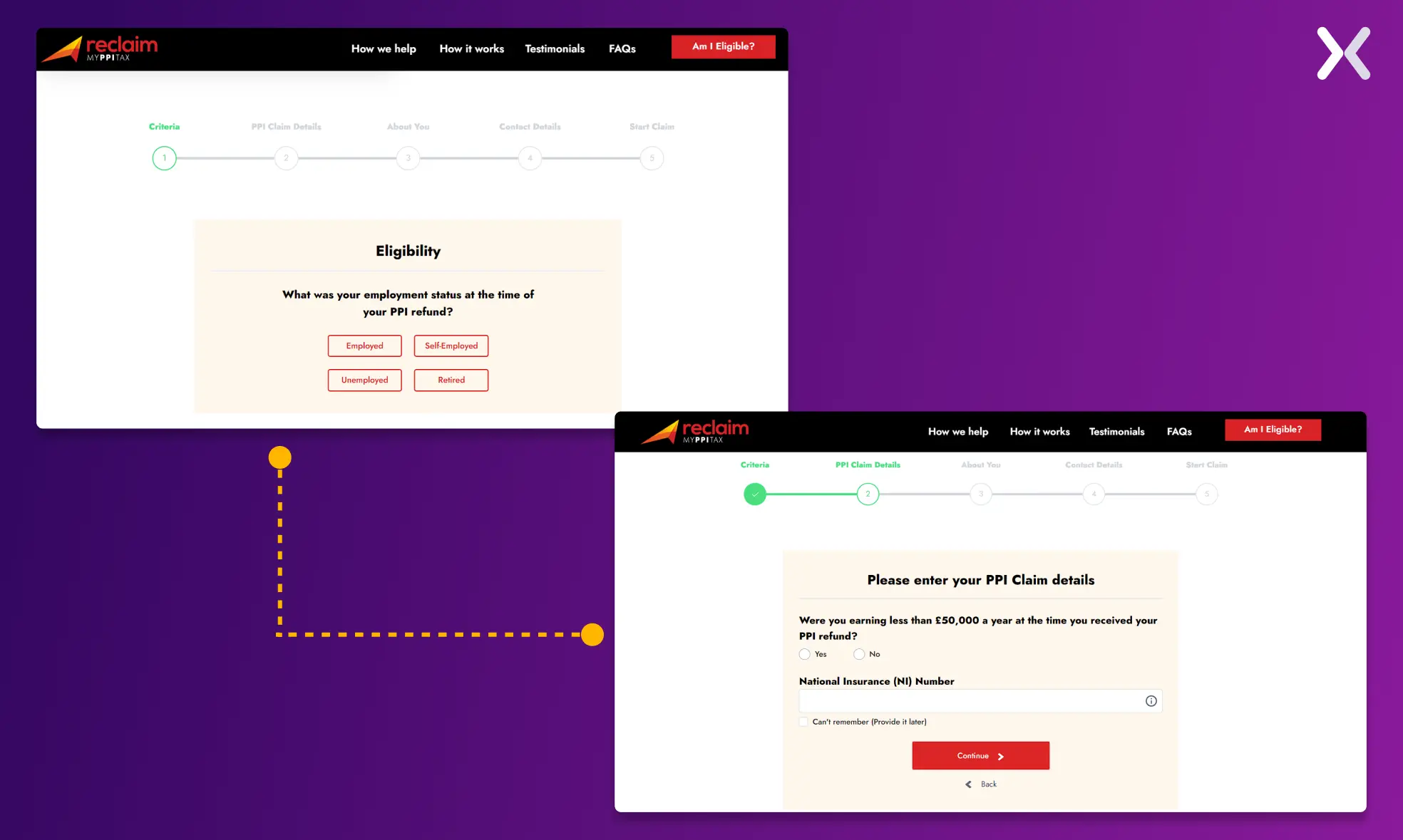
Then, there’s the Reclaim My PPI Tax. They need to qualify their leads, so their form asks for more information.
Now, you might wonder, ‘How can I A/B test a form?’ Well, there are several ways to test out lead generation forms.
Compare forms where you ask for less information. For example, if you have a landing page where you capture name, email, phone, company, and message, try a variation where you don’t capture the company and compare the results. Technically, you can gather a company name from an email’s domain address.
Break down the forms into multiple steps. If you can’t remove any form fields, you can split the forms into steps. It’s a neat way to gamify your lead generation and improve the user experience by asking visitors one question at a time without overwhelming them.
Rethink the positioning of your form. Placing your lead generation form in the hero section might not always be the best. According to Michael Aagaard of ContentVerve, “You should look at placing your form where it best complements your prospects’ decision-making process.”
And lastly, let’s talk about the ‘Submit’ button—it’s a key element in a lead generation form. Small changes here can reap some great results. You can test elements like the color of the button, the font size, and the actual copy on the button. I can tell you from experience when we use copy like ‘Download my free guide’, we get more leads. And remember, never use the word ‘Submit’ when naming your call to action button.
When visitors arrive at your page, they seek reasons to stay or take action. That’s why your content must be clear, persuasive, and engaging.
However, when we discuss content, we’re not just referring to the written words. 65% of humans are visual learners. So, when we say content, it also includes elements like infographics, videos, and previews of your offerings. And guess what? Each piece of your content provides a unique opportunity for A/B testing.
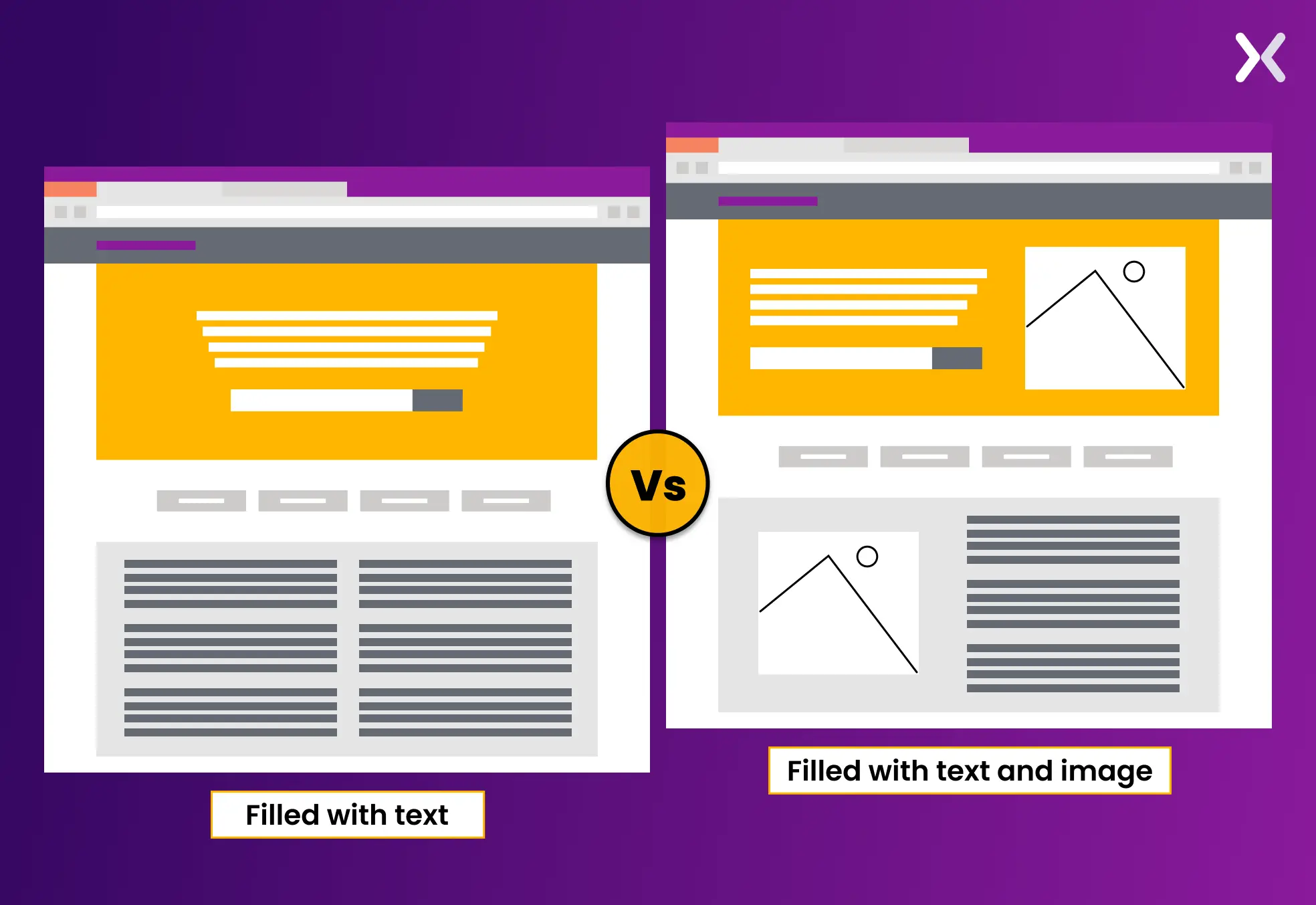
The amount of text on your landing page can impact your conversion rates. But how can you determine the ideal text length? This is where A/B testing comes in, allowing real visitors to help you find the perfect balance. Just ensure to give your variations the right URLs and UTMs. And you will be on your track to better conversions.

“Running an ad test and a landing page test at the same time is not recommended. If you do, ensure proper tracking with unique URLs and UTM codes for each combination. This helps identify which ad and landing page a visitor interacted with, though analyzing the results can still be tricky and may require tools like Google Sheets for comparison.”
Content isn’t just text. It includes videos, infographics, and even interactive tools. Experiment with different formats to see what your audience prefers. Maybe your users engage more with video explainers than written guides. A/B testing can uncover these preferences.
Stories captivate us. They’re memorable and engaging. Test incorporating short, relevant stories with interactive elements into your content. A/B test pages with and without these narratives to see their impact on conversion rates.
The placement of your CTAs within your content can dramatically affect user actions. Don’t just stick to one at the end. Test placing CTAs at different points in your content to find the most effective spots.
A compelling video can explain complex ideas simply, share stories that resonate, and ultimately, convince visitors to act. However, the effectiveness of a video can vary widely based on several factors.
The thumbnail is your first opportunity to get visitors to click play. Test different thumbnails featuring various images, text overlays, or even call-to-action prompts. Discover what makes your audience hit ‘play.’
Does your video work better at the top of the page or further down? A/B testing its placement can help you determine where it’s most effective in capturing attention and encouraging action.
Length matters. While some messages require longer explanation, others can be captured in seconds. Test short versus longer formats to see what keeps your audience engaged and drives the message home.
Videos are a powerful tool in your landing page arsenal, but their success isn’t guaranteed. Through A/B testing, you can scientifically determine what resonates best with your audience, ensuring your visual content isn’t just seen but felt and acted upon.
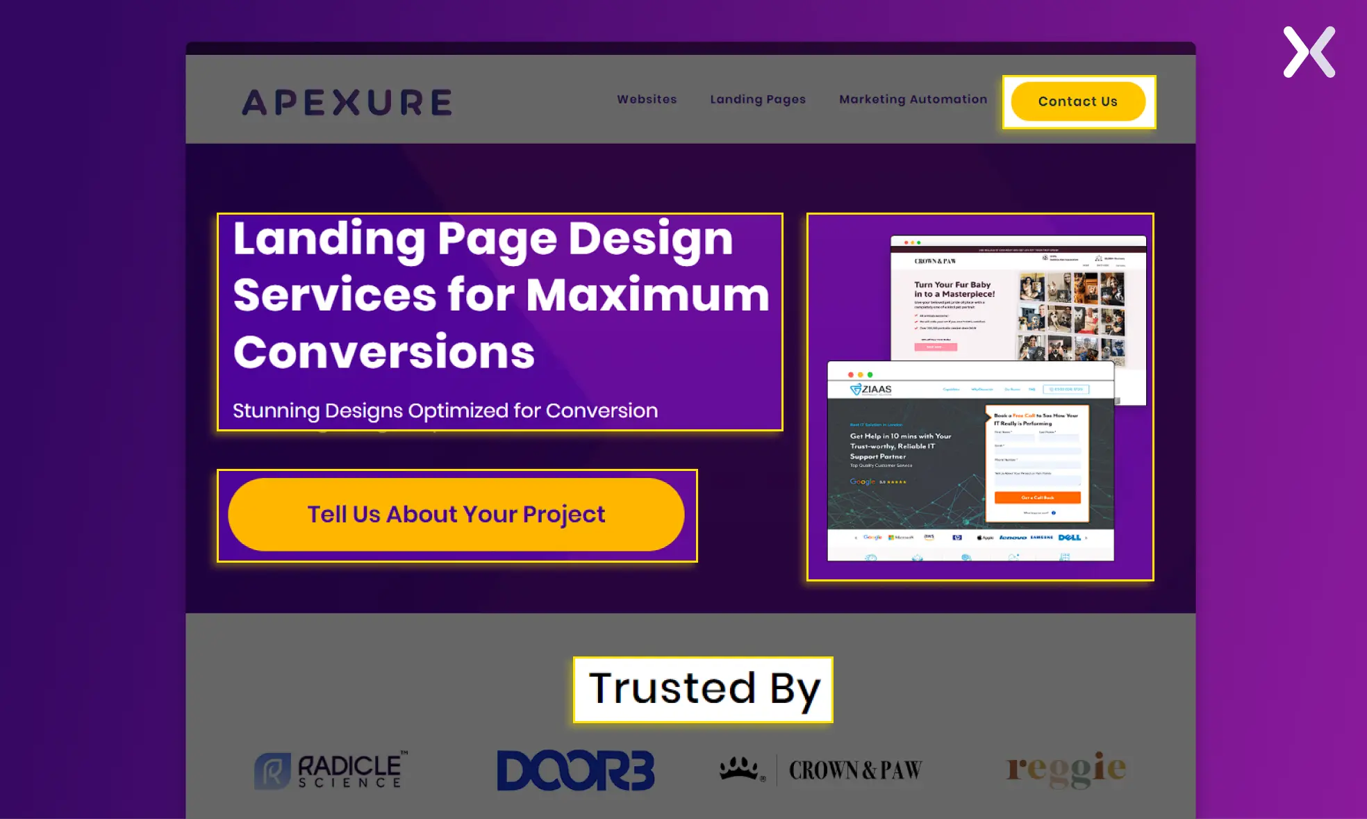
The main goal of your landing page design is to reduce cognitive load and enhance discoverability. Let’s break the tests down with examples.
A/B testing can reveal whether a more straightforward layout with a clear hierarchy helps users navigate your page with less mental effort, thus reducing cognitive load. For instance, placing a strong call-to-action above the fold might outperform a more cluttered, multi-section approach.
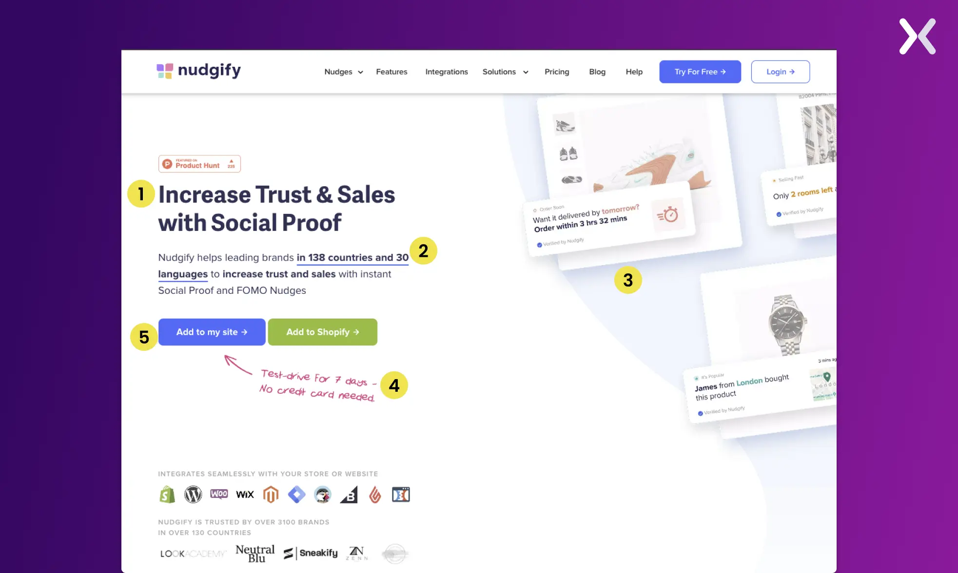
Check out this example from Nudgify. Here the visual hierarchy guides the visitor to follow certain elements. With the use of clever directional cues your eyes are guided towards the call to action.
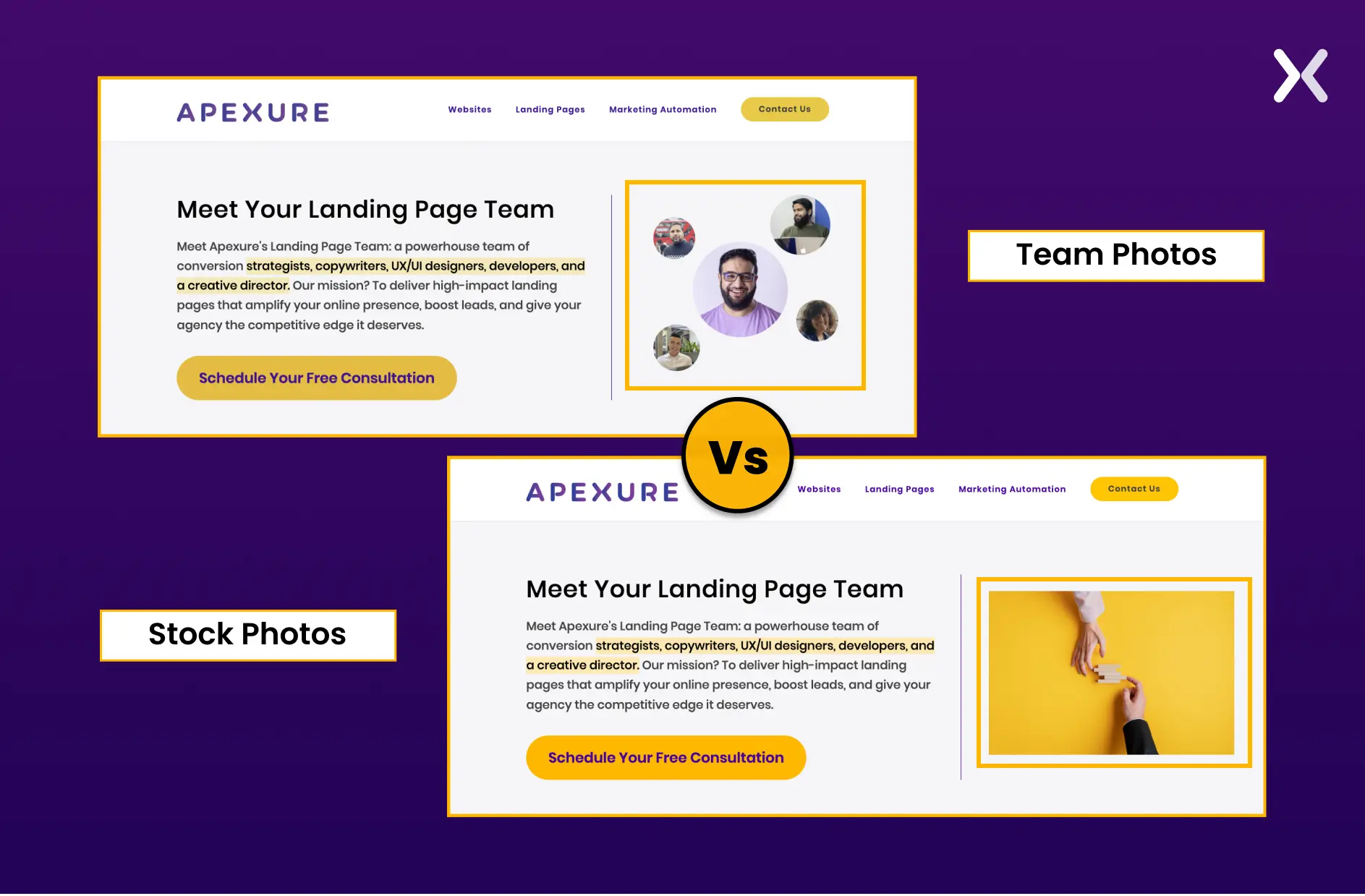
Next, let’s talk imagery. Testing vector art against stock photos, and even real team photos, can significantly impact how users perceive your brand. A/B testing might show that authentic team photos increase trust and reduce the time it takes for a visitor to decide to engage, compared to generic stock images.
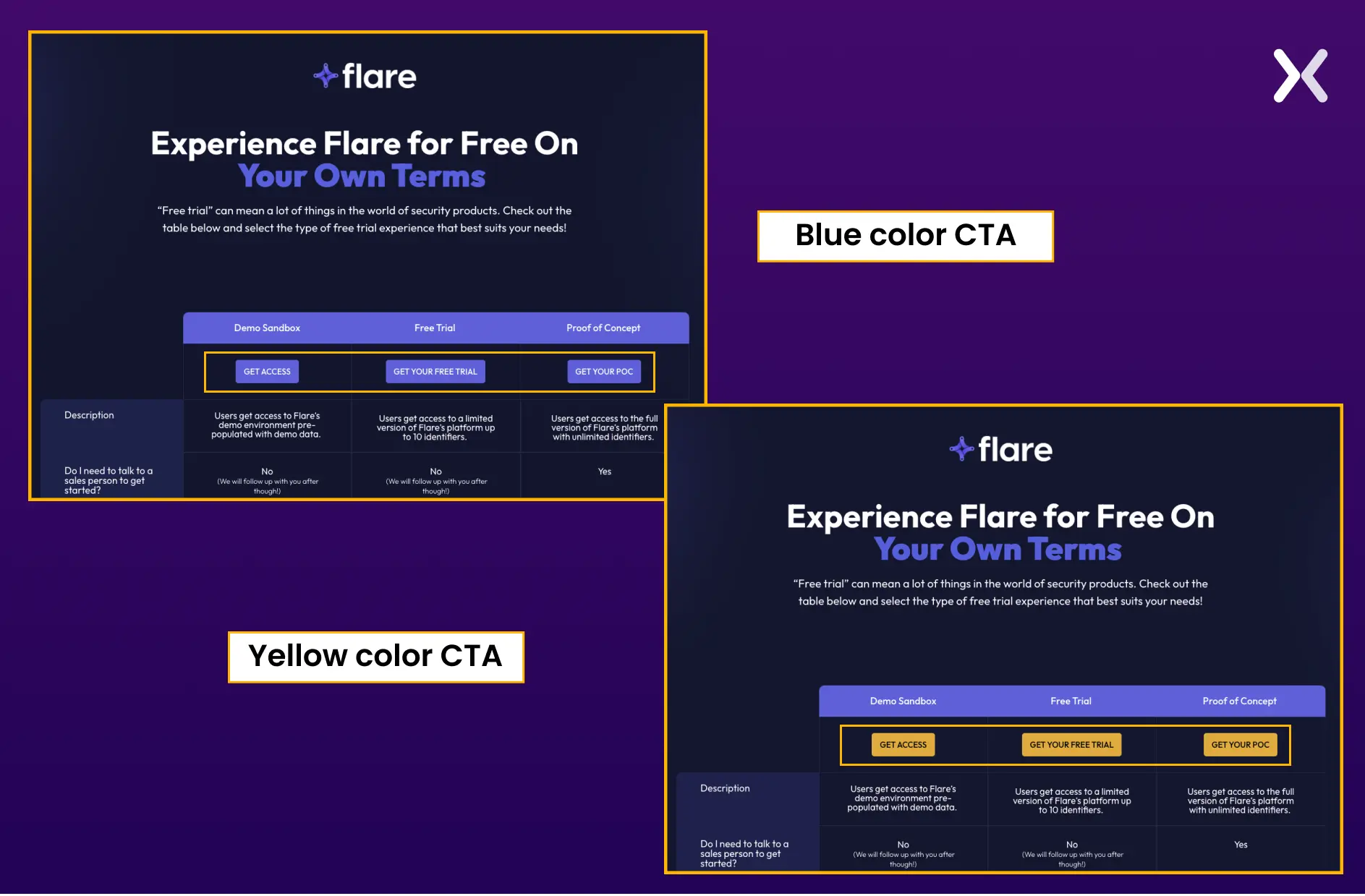
Colors speak volumes. While staying within branded colors ensures consistency, deviating slightly for certain calls-to-action or highlights might improve discoverability. A landing page experiment you must add to your list.
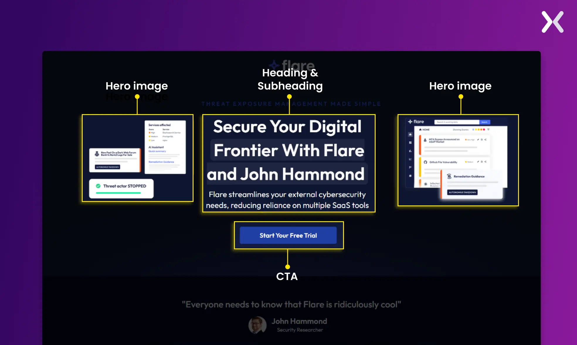
For example, take Flare’s SaaS landing page. Imagine testing a slightly brighter shade for your main CTA against the standard brand color and finding a noticeable increase in conversions.
While innovation is vital, it’s equally important to consider user familiarity and the learning curve associated with new design patterns.
For instance, adopting unconventional designs, such as placing the logo on the right instead of the traditional left, introducing horizontal scrolling on desktops, or swapping a navigation bar for a hamburger menu on desktop views, can significantly impact user experience.
Research, including findings from NNGroup, suggests that deviating from familiar design patterns increases the learning curve for users. Initial interactions with new, unfamiliar designs require more cognitive effort as users navigate through the learning phase.
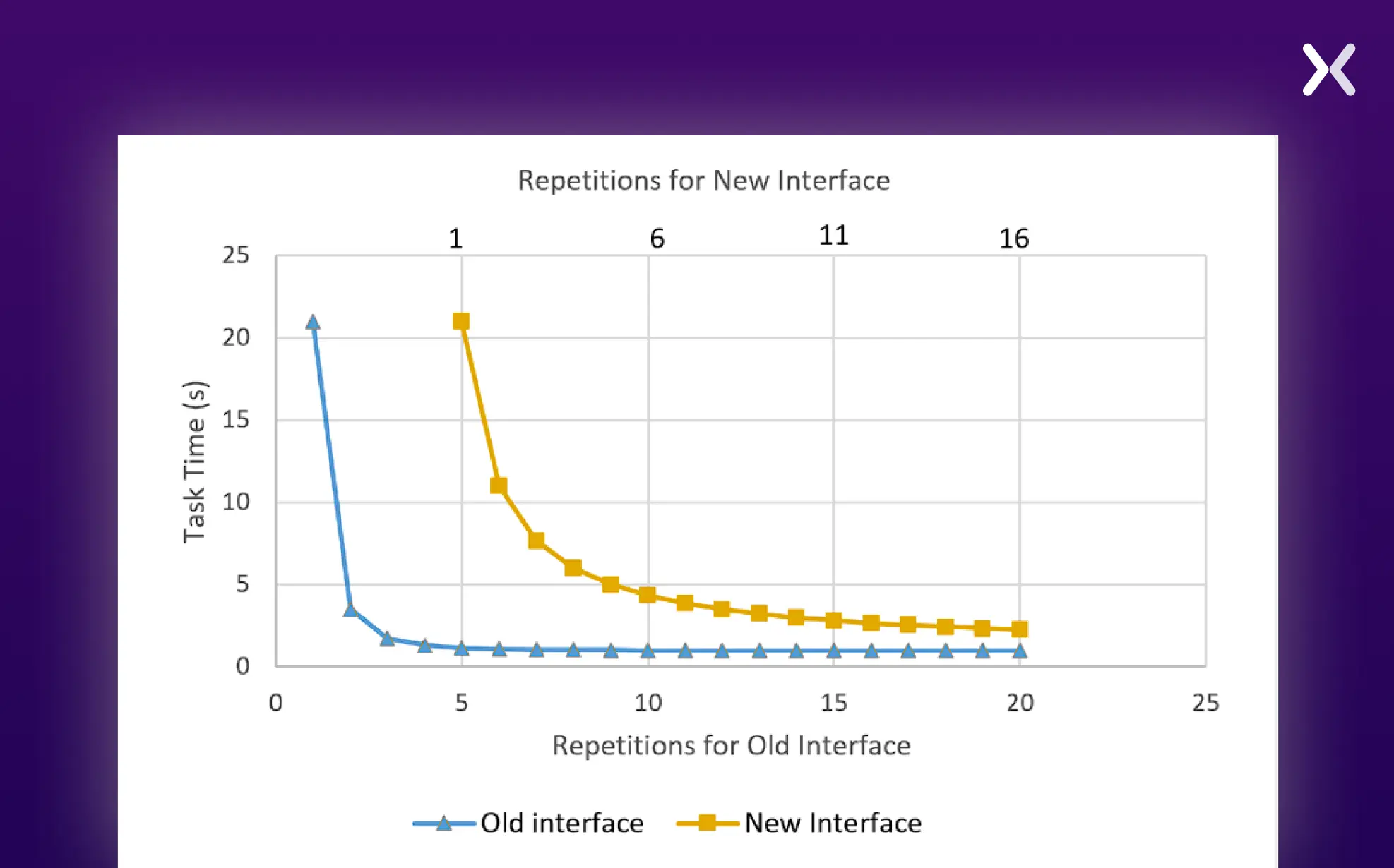
The concern is that if the learning curve is too steep, users might prefer to leave rather than adapt to the change. This is particularly true for non-captive audiences who have the freedom to choose among competing services.
This doesn’t mean we should shy away from innovation; rather, it highlights the importance of A/B testing when considering significant deviations from standard practices. By testing, we can gauge user receptiveness and the impact on user experience.
It’s crucial to ask: does the innovative approach genuinely enhance the user experience, or does it introduce unnecessary complexity?
Improving discoverability means ensuring that key elements like your value proposition, CTAs, and essential information stand out at first glance. Through A/B testing, we learn how design variations can make these elements more or less prominent, guiding the visitor’s focus effectively.
A/B testing your landing page’s design isn’t just about aesthetics; it’s a critical part of optimizing the user’s journey from arrival to conversion. By methodically testing and analyzing different design elements, we can significantly reduce cognitive load and enhance discoverability, leading to a more effective landing page.

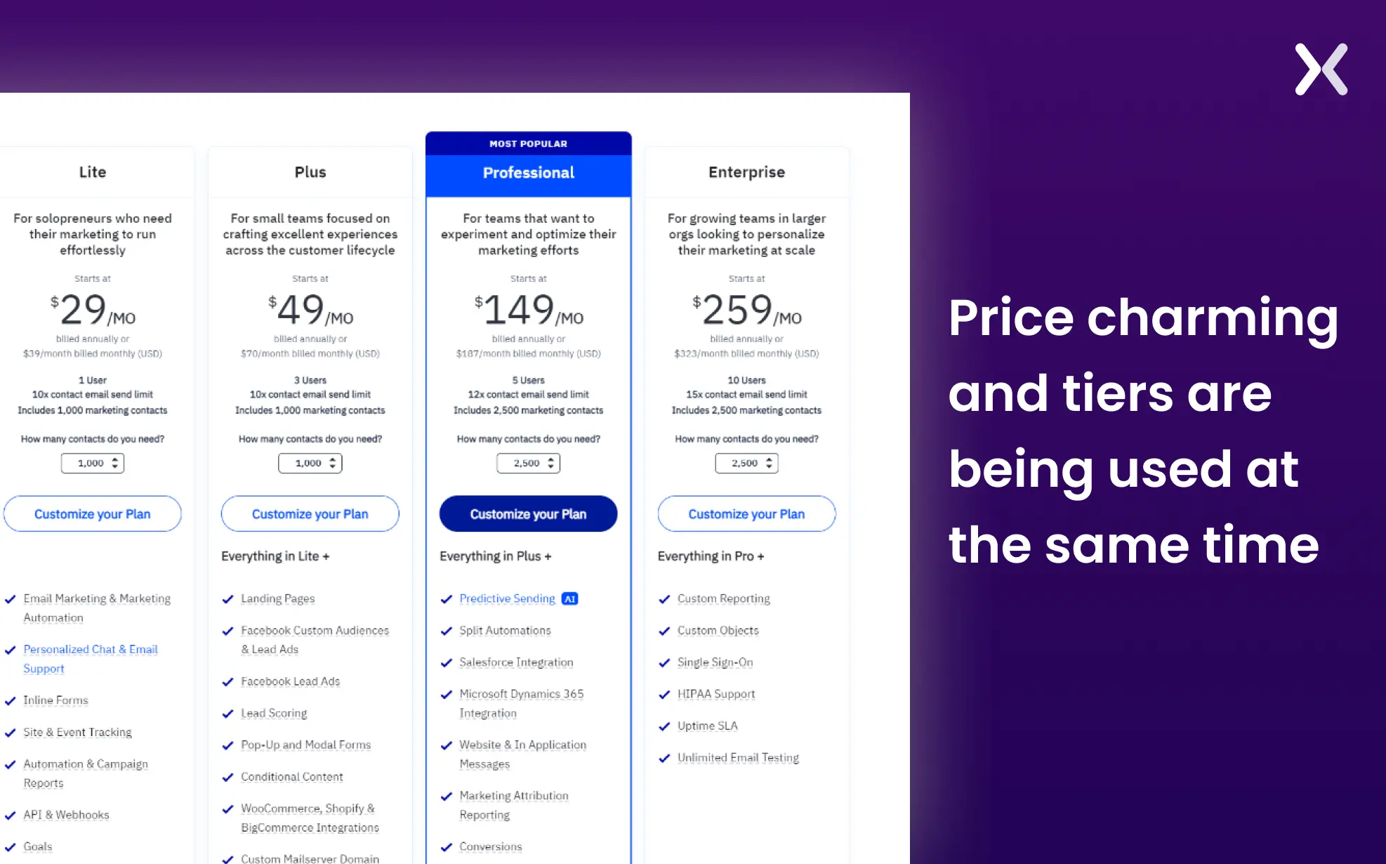
How you present your prices isn’t just about numbers; it’s about psychology, perception, and strategy. Here are some tried-and-true pricing tactics that brands have been using to sway customer decisions subtly yet effectively.
Ever noticed how $499 feels considerably less than $500? That’s charm pricing at work. This strategy leverages our psychological tendency to perceive prices ending in 9 as much better deals, even though the difference is minimal. It’s not just about making the price seem lower; it’s about making the value feel higher.
Imagine seeing a high-priced item first; suddenly, everything else seems more reasonably priced, right? That’s the essence of price anchoring. By presenting your ideal package next to a higher-priced tier, you make it appear more accessible and appealing.
Let’s talk about a fascinating example of price anchoring from Apple.

When they introduced the Pro Display XDR, they first mentioned the price of a high-end Sony monitor at $43,000. Later, they revealed the Pro Display XDR’s price at $4,999. This strategic comparison used the anchoring effect, making the Pro Display’s price seem much more reasonable by contrast, despite it being a premium product itself. It’s a clever way to shift our perception of value, highlighting how pivotal pricing strategies can be in marketing.
Creating product tiers is another strategic move. Even if you have a single core offering, consider introducing tiers by adding perks like expedited support for a premium package. Highlighting the premium tier first catches the eye, making the subsequent options seem like a steal. It’s all about framing and contrast.
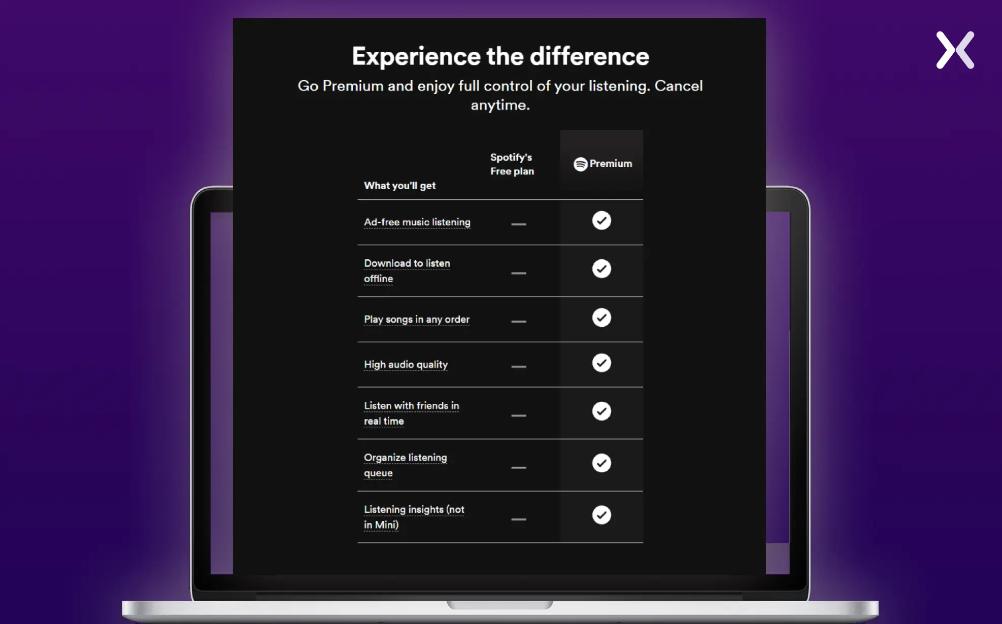
And here’s an interesting angle—offering a free version.
Take Spotify, for example. It’s a fantastic way to get your product into people’s hands, creating a pathway for exposure and engagement without an upfront cost. A free version not only broadens your reach but also introduces your paid offerings in a highly targeted manner.
These pricing strategies—charm pricing, price anchoring, tiered offerings, and free versions—are just the tip of the iceberg. Each has the potential to reshape how customers view your prices and value your products. AB testing these tactics can uncover what resonates best with your audience, guiding you toward more effective pricing and, ultimately, better conversion rates.
The offer on your landing page is the magnet that attracts prospects and transforms them into leads or customers. But remember, the effectiveness of your offer isn’t set in stone. It’s something you can—and should—continually test and optimize.
Consider this: not all lead magnets are created equal. One topic might resonate more deeply with your audience than another. And it’s not just about the content; the format matters too. Through testing, you might find checklists have an edge over e-books, or in e-commerce, experimenting with price points can reveal your audience’s spending threshold.

“The first step in my landing page testing checklist is to set clear, measurable goals. Without a defined objective, it's impossible to gauge the effectiveness of your tests.”
When driving traffic through Google, Facebook, or LinkedIn ads, alignment is key. Ensure your landing page offer matches the buyer’s journey stage. For example, if your prospects are early in the funnel and not ready to commit, a free report might be more appealing than jumping straight to a free consultation.
Finding the perfect offer is a journey. By A/B testing everything from your words to the offer itself, you discover what really clicks with your audience. It’s all about fine-tuning until you hit that sweet spot that gets people excited and ready to act.
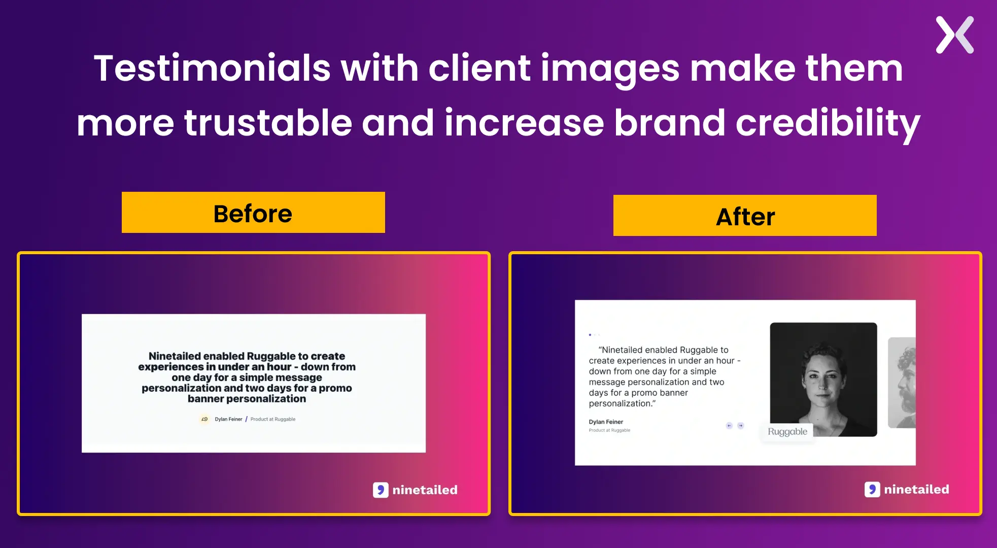
Testimonials serve as social proof, significantly affecting a visitor’s decision-making process. But the question is, do the gender and race of the individuals in these testimonials impact conversion rates? It’s an aspect worth exploring through A/B testing. By presenting diverse testimonials, we can understand if and how representation affects visitor trust and identification with your brand.
Setting up this type of A/B test involves creating variations of your landing page, each featuring testimonials from clients of different genders and racial backgrounds. The key here is to maintain the same level of positivity and satisfaction across all testimonials, ensuring that the only variable is the diversity represented.
So, in our testing, we tweak one element at a time. Change the placement, then test. Alter the design, then test. Switch from text to video, then test again. It’s a methodical process aimed at identifying the most impactful way to present testimonials, making sure they’re not just seen but also felt by the audience. That’s the power of A/B testing with customer testimonials.
For instance, consider testing the presentation of your testimonials on the landing page.
After analyzing 23 potential landing page experiments, the next question arises: which one should we implement first? It’s crucial to conduct landing page tests one at a time to accurately measure their impact. However, with such a long list, deciding the order of execution can be challenging.
At Apexure, we address this challenge using our in-house CRO framework called EPIC. This framework helps us prioritize landing page experiments based on various client needs and competitor analysis.
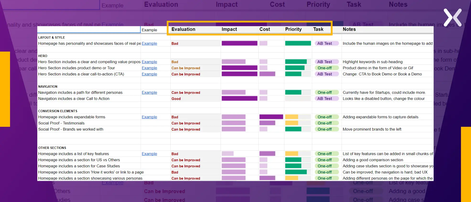
The EPIC CRO framework evaluates each experiment on three key criteria: Experimentation Impact, and Cost. By considering these factors, we systematically determine the optimal sequence for conducting our landing page experiments.
“We conduct competitive analysis as part of our landing page optimization strategy. We analyze competitors' ads and landing pages, identifying effective elements. Following Jakob's Law of UX, which emphasizes familiarity in design, we then create optimized wireframes and prototypes.”
Landing page experiments can help you optimize your ad campaigns for the best results. It allows you to gather live customer feedback and make improvements to your landing page strategy.
The key lies in prioritizing your tests according to their impact and cost. When done correctly, your landing page conversion grows exponentially.
Learn everything you need to know about landing pages from our collection of 100+ blog posts. From creation to testing, analysis to optimization, we have shared everything.
Making a landing page on your own with just examples can take a lot of time. Get the help you need from our experts. Book a call and one of our experts will contact you soon.
Our landing page portfolio is where you can discover conversion-friendly landing page elements that might be missing from your campaigns.
A landing page experiment is a test where different versions of a landing page are compared to see which one performs better in achieving its goal, like generating leads or sales.
Related Articles:
As CEO and Founder of Apexure, Waseem Bashir's decade-old experience in building high-converting landing pages extends to collaborations with Fortune 500 leaders and over 1000 clients. He transforms this wealth of expertise into remarkable landing pages, inspiring marketers towards targeted marketing success. Read more


Drive More Sales or Leads With Conversion Focused Websites and Landing Pages
Get Started


Video content is one of the most powerful tools in modern marketing. It has the ability to capture...

Building a high-ticket coaching funnel for an expertise-driven brand requires a very different approach than traditional marketing funnels....
Get quality posts covering insights into Conversion Rate Optimisation, Landing Pages and great design
