All of the best SaaS landing pages have several elements in common that make them stand out from their competitors.
The most successful SaaS landing pages have a fantastic design and a laser focus on getting conversions. From using real-product images to short conversion frictionless forms, landing pages for SaaS industries have come a long way.
Browsing numerous SaaS landing pages can inspire a visually appealing design. However, it won’t necessarily teach you how each element on these landing pages strategically guides visitors toward conversion.
Rather than spending hours sifting through countless SaaS landing pages, this blog post presents a curated selection that has been carefully analyzed. You’ll learn the purpose of each key element on these SaaS pages and discover how to apply those insights effectively to your own SaaS landing page.
In this guide, we not only explore various designs but also reveal what makes the best SaaS landing pages stand out in a crowded market.

Before exploring some of the best SaaS landing pages, it’s important to first understand the different types of landing pages within a SaaS funnel as it will help you estimate the cost, time required, and effort to put into the page more efficiently.
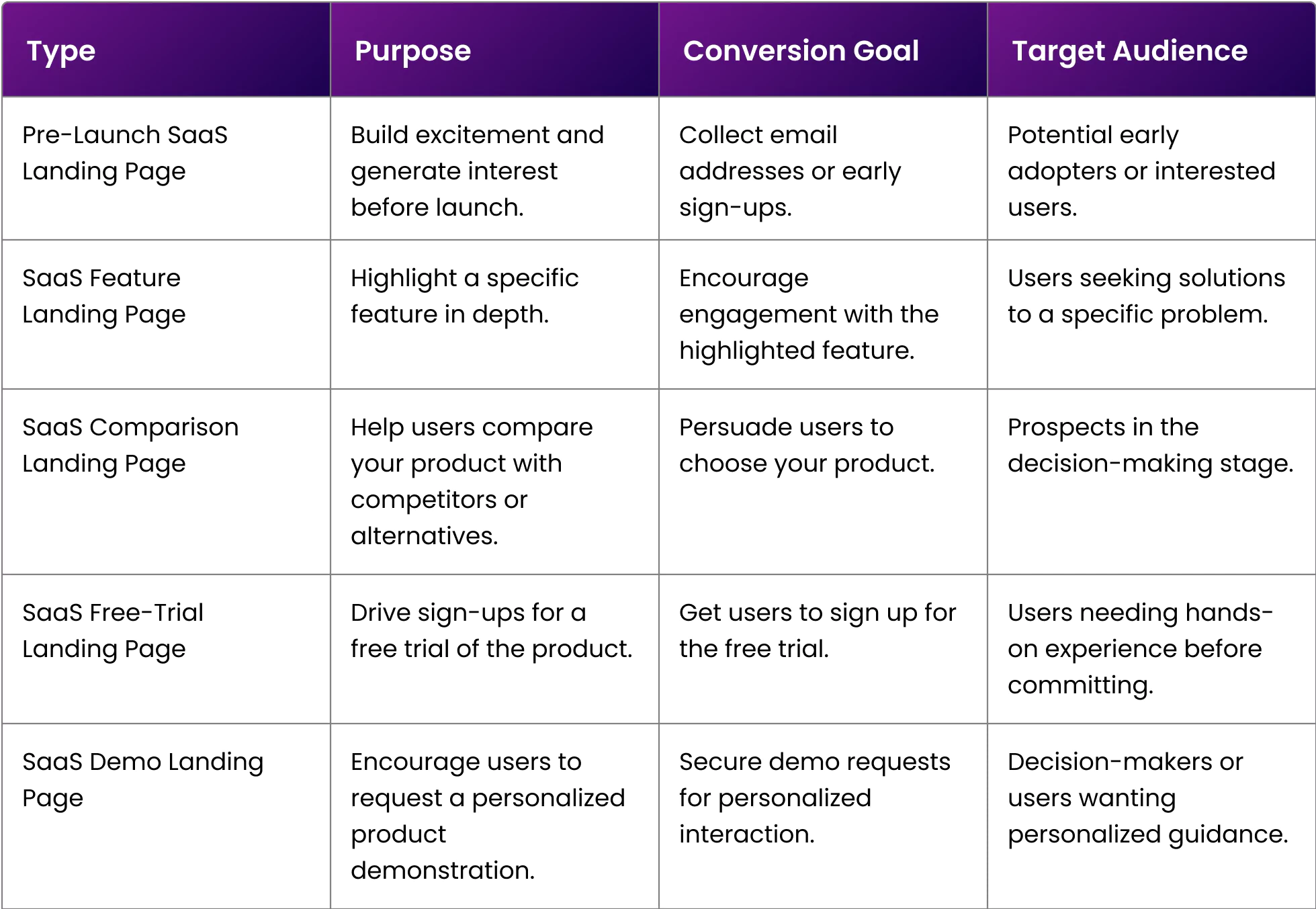
This distinction is crucial because not all SaaS landing pages are created equal—their elements, priorities, conversion goals, and target audiences vary depending on the specific type of page.
Now, rather than sharing a long list of many best SaaS landing pages with you, we picked some of the great ones for each type of SaaS landing page and discussed it thoroughly, highlighting the crucial elements used in them. In this way, no matter at what stage of the funnel you’re in, you will always have reference of the best SaaS landing pages for inspiration.
We enourage you to always analyze the best SaaS landing pages for innovative design cues. And nothing is more creative than pre-launch SaaS pages.
Crevio is a platform for creators to sell their digital products easily. Their SaaS pre-launch landing page looks effortless but conveys all the messaging through visuals and a concise copy. They have firmly shared a product image with a simple form with only one field, making it easier for visitors to convert.
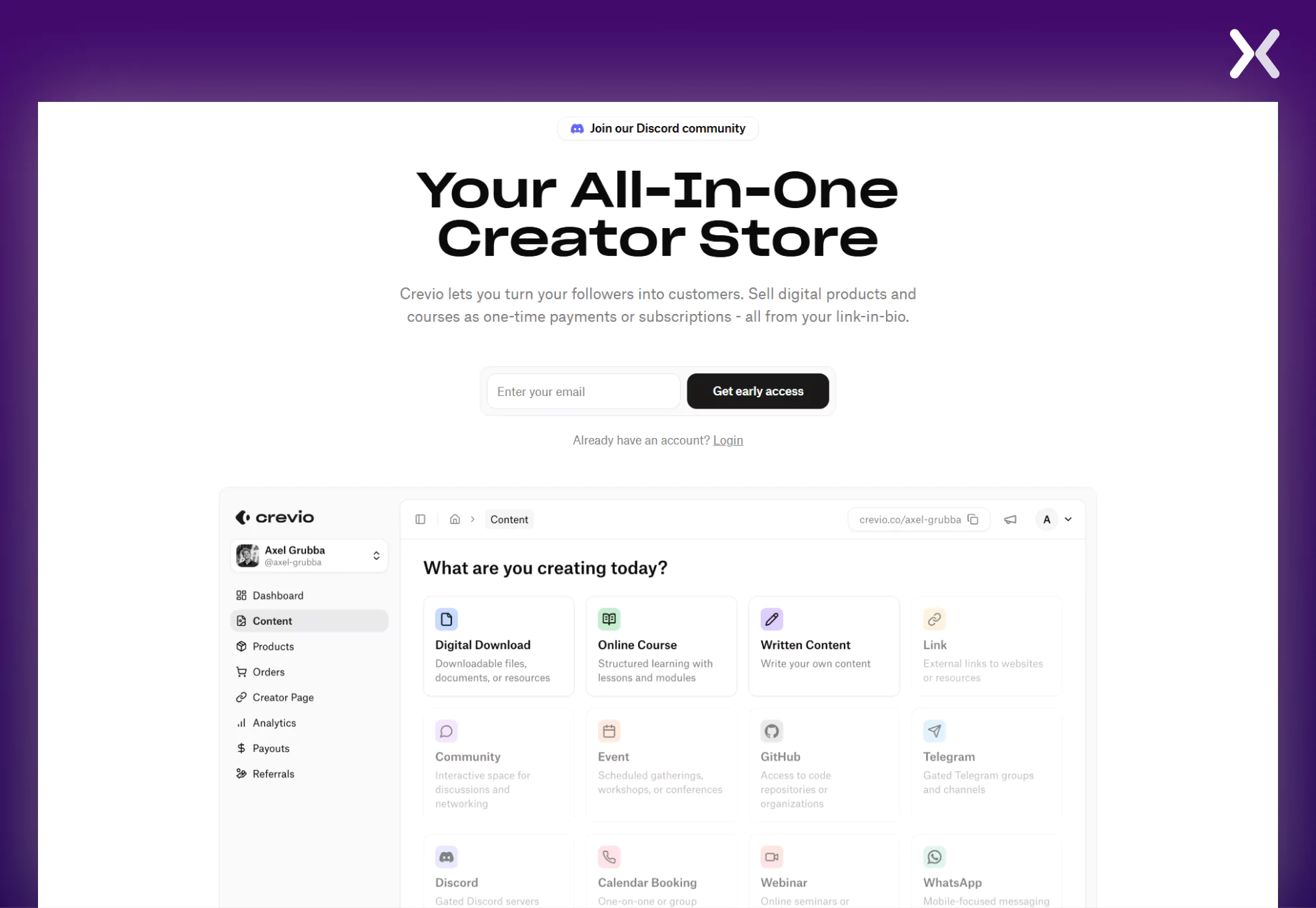
They feature a concise section highlighting the product’s origin story and the inspiration behind the founders creating Crevio. Overall, this is a straightforward yet highly effective SaaS page to showcase a powerful tool.
Migroot’s pre-launch landing page effectively introduces its upcoming SaaS platform, designed to simplify the relocation process for digital nomads.
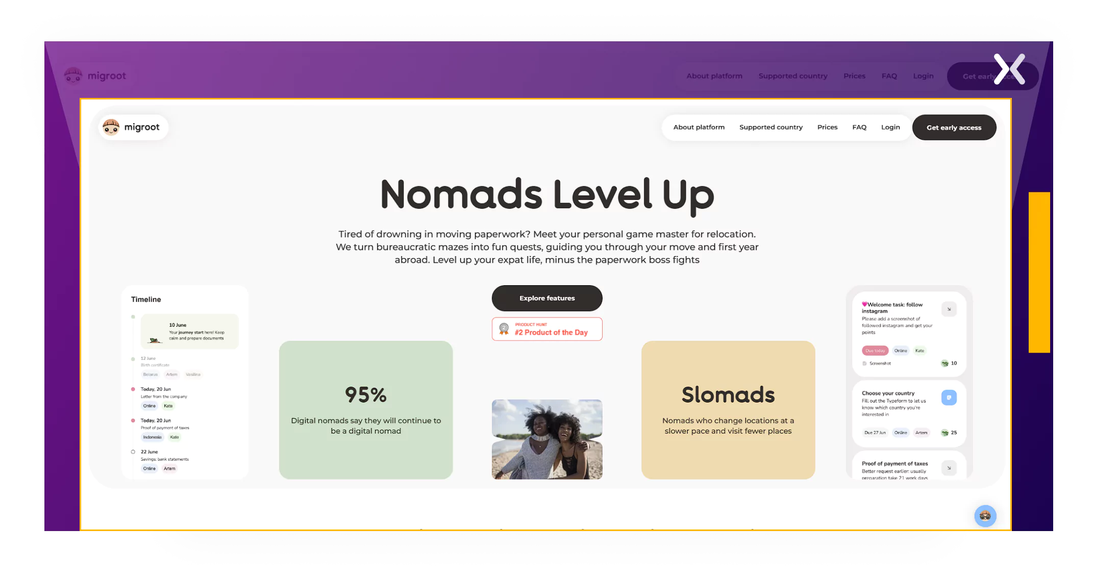
The page addresses common pain points digital nomads face, such as missed deadlines, incorrect documentation, and language barriers. This SaaS page resonates with potential users by presenting these challenges alongside their solutions, demonstrating empathy and understanding.
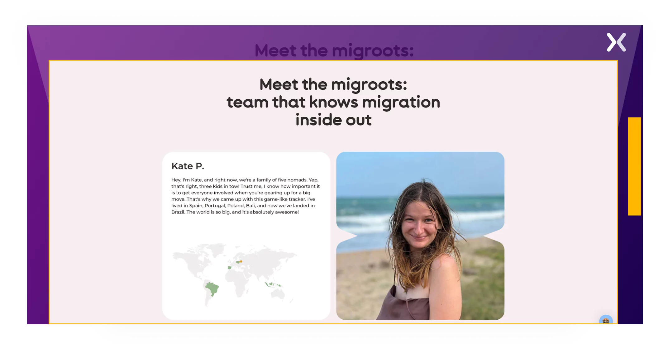
The SaaS pre-launch landing page combines great copy and visuals to capture early adopters. A section of the page also introduces the founders as digital nomads, which makes the SaaS brand even stronger.
Here are some feature-specific best SaaS landing pages.
When you’re focusing on showcasing a specific SaaS feature on your landing page, brevity is key. A medium-sized SaaS landing page will get the job done.
Rocket Money exemplifies this with a short, to-the-point SaaS page to discuss their subscription management feature. The top of the page features an image, a headline, and a subhead that quickly but clearly communicates the feature’s use case and pitches it to the visitors.
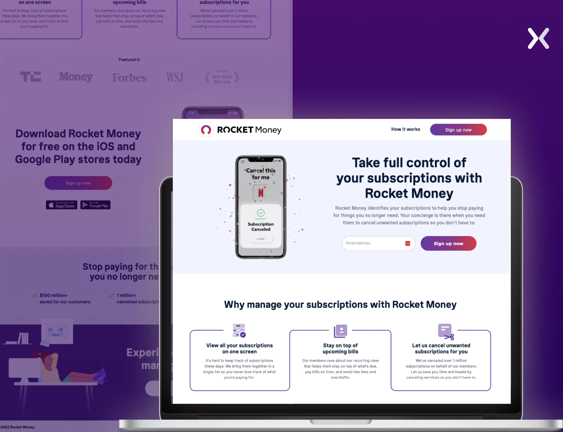
The most critical section follows, addressing the pain points this feature resolves. Since every feature targets specific problems and audiences, this section is essential. The page also incorporates various forms of social proof, product visuals, and compelling CTAs to reinforce its message.
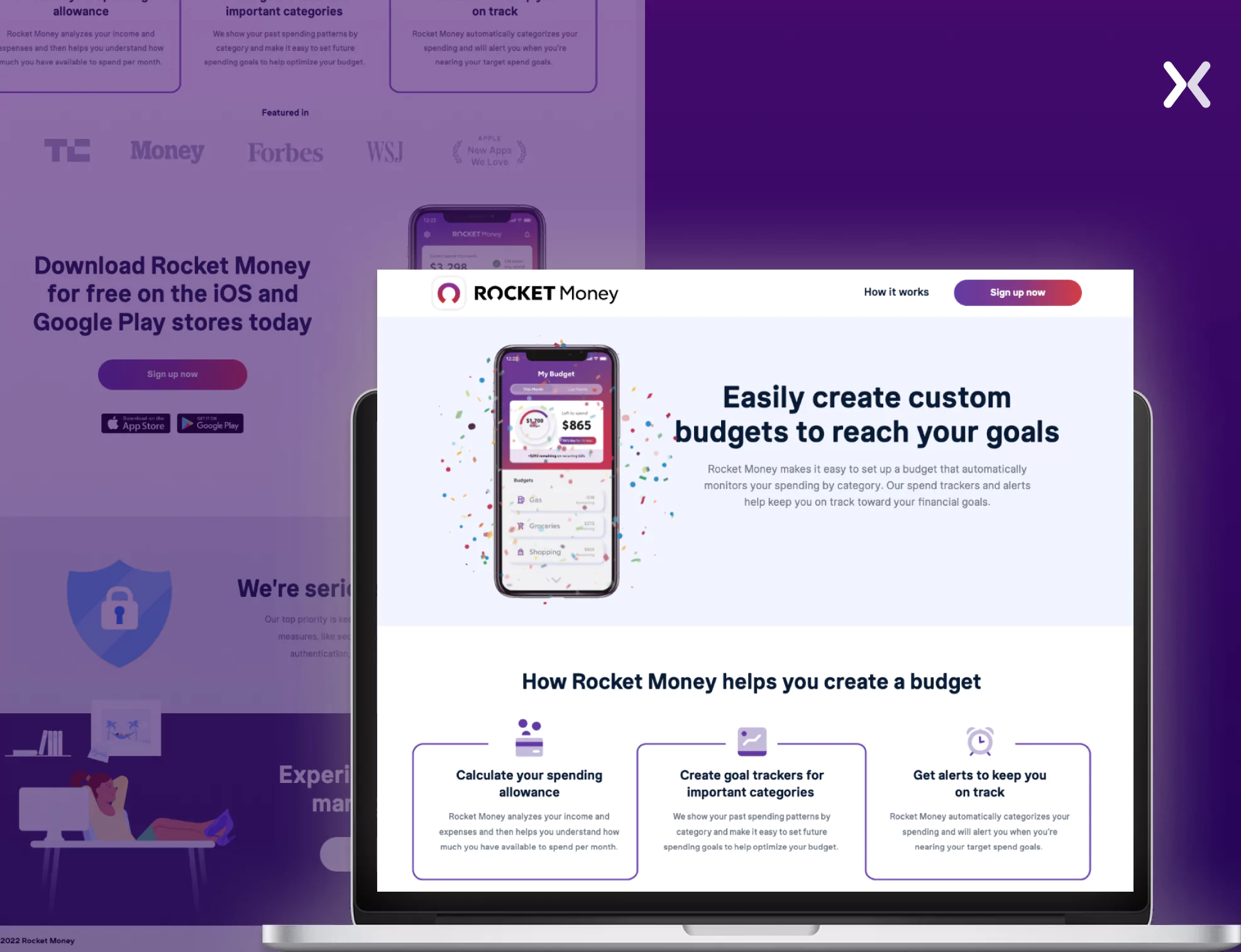
Rocket Money uses a similar approach for another feature-specific landing page, which is centered on their custom budget creation feature. Here, utilizing a clean layout and persuasive calls-to-action are hallmarks of the best SaaS landing pages.
Competitor comparison make up for great SaaS landing pages in your sales funnel as they help you display what makes you stand out.
ClickUp keeps its competitor Monday in check by building an impactful competitor comparison SaaS landing page. The page features three essential elements:
A killer above the fold
An extensive comparison table
Just enough social proof
The copy of the page never skips a beat when addressing the main point of the whole landing page, which is a comparison between the two tools. Also, on the comparison table, ClickUp effectively highlights that they are comparing Monday’s paid version with ClickUp’s free version, which adds a nice touch.
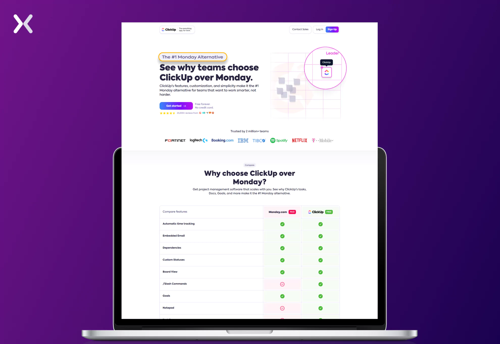
Lastly, the kicker text “The #1 Monday Alternative” used at the top fold is the best you can pick for such pages.
Notion goes a little deeper than ClickUp on their comparison page. They also have a comparison table that succinctly compares both tools. But instead of ending the page there, Notion includes more information about the features that make it better than Airtable.
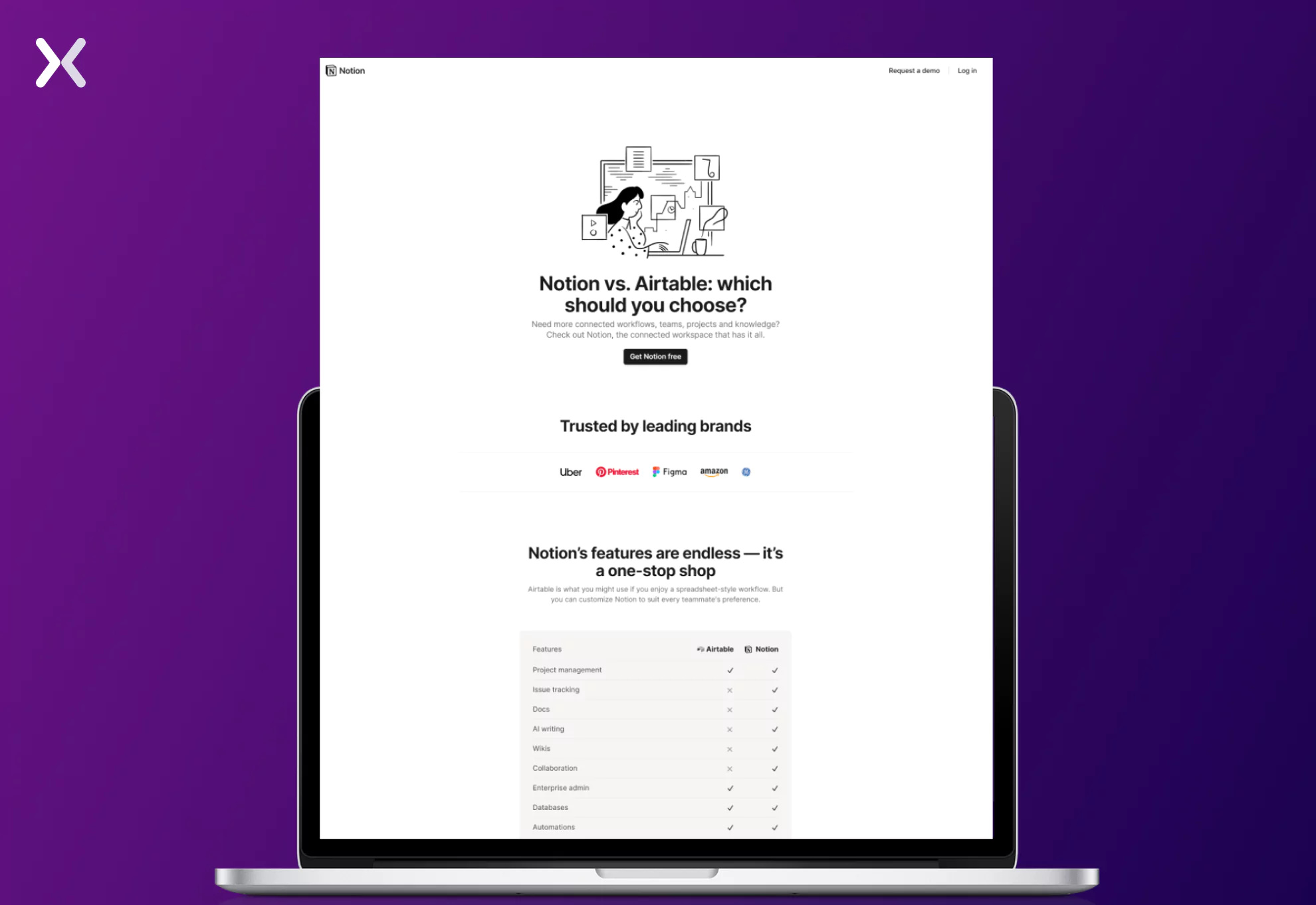
The page also has a section showing Notion in action for various management tasks on mobile to demonstrate its UI.
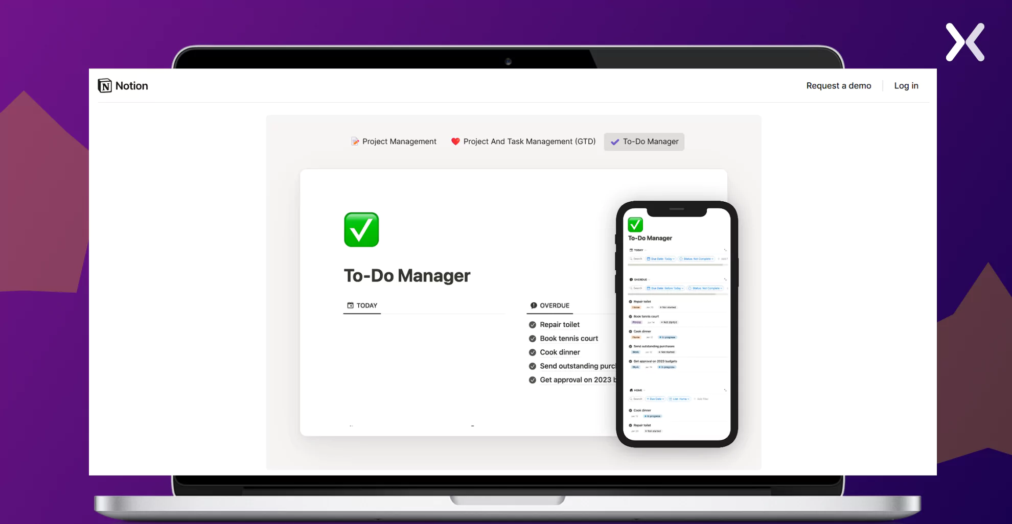
Another element on this page is the distribution of social proof throughout all the sections, be it testimonials, trust badges, etc., which makes the page even more powerful.
If you have a free forever version of your SaaS and want to convince your users to switch to paid accounts, you can also create a comparison landing page.
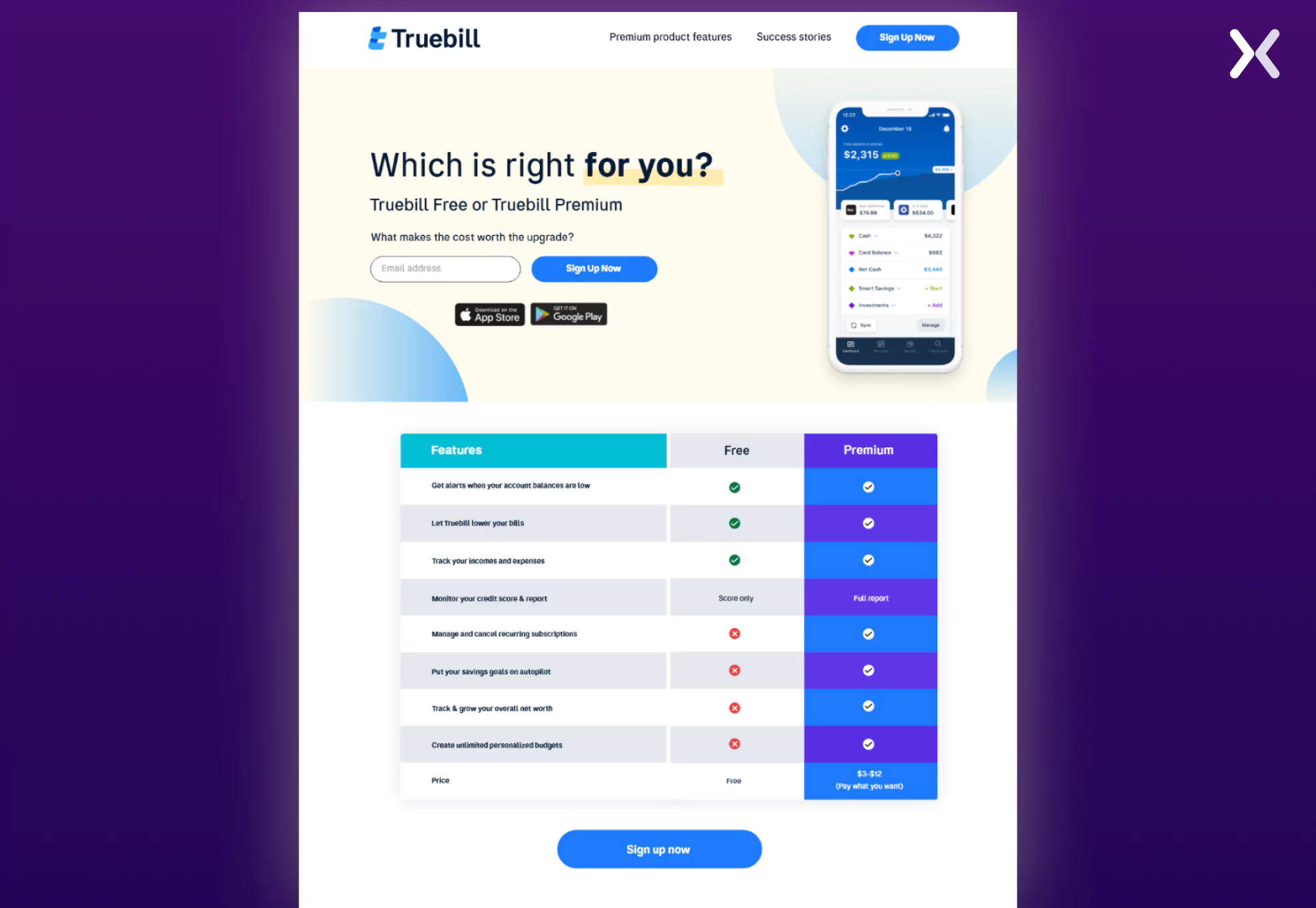
Truebill (Now Rocket Money) does the same. While they have competitor comparison pages, they also have a dedicated landing page to compare their SaaS‘s paid and free versions. They have used all the elements, like the comparison table, social proof, etc., to make their page convincing.
Every SaaS brand must have a free-trial SaaS landing page. It helps secure high-quality leads quickly. Let’s see how other brands are designing their free-trial pages. While many designs are visually appealing, only a few can be considered among the best SaaS landing pages due to their strategic focus on user engagement. Let’s see which landing pages take the spot.
A seamless user journey is one of the core attributes of the best SaaS landing pages, ensuring visitors can easily navigate and convert. Let’s look at a SaaS brand operating in a complex industry: cybersecurity. Flare’s free trial landing page is designed to first educate visitors about their tool and then demonstrate how it addresses their problems.
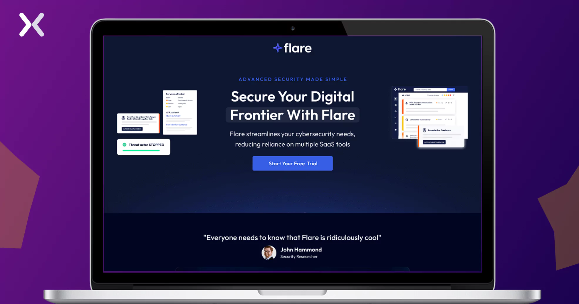
The copy strikes a balance—it’s not oversimplified to chase quick leads, nor is it filled with overly technical jargon. Instead, it’s crafted to resonate with visitors actively seeking solutions to cybersecurity challenges, effectively qualifying them as leads.
Just below the top fold, a video provides an overview of the tool, catering to visitors who prefer watching over reading. This ensures that everyone, regardless of their preference, understands the tool’s value and is guided toward conversion.
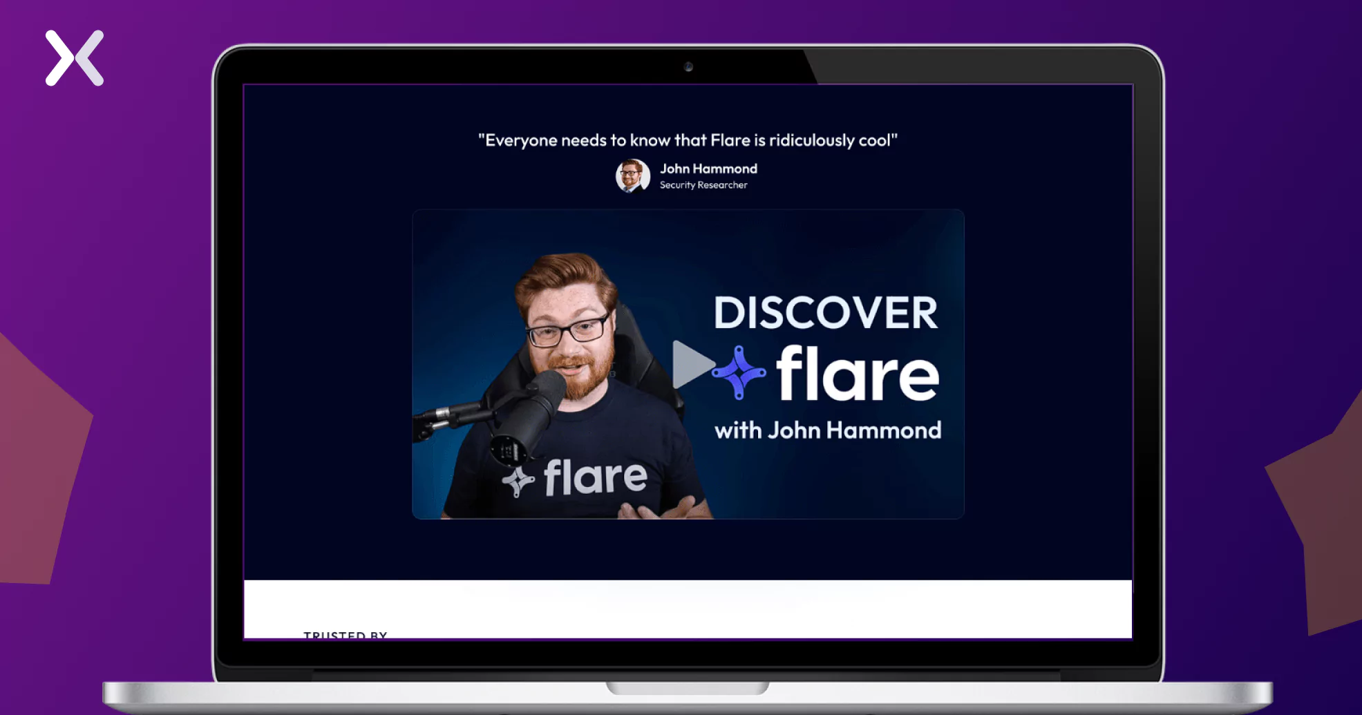
Sections like “What is Flare” and “Built for Security Teams That Want Less SaaS Tools” address the fundamental questions of “What does it do?” and “Who is it for?”—critical for a SaaS product in a specialized industry.
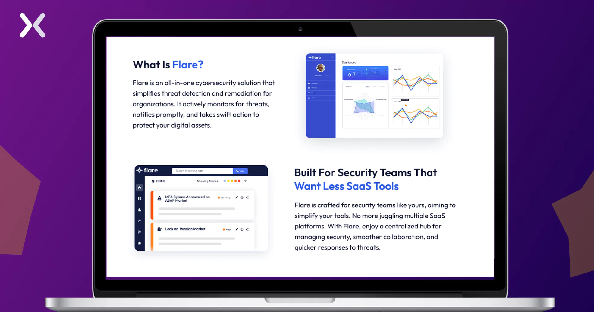
Finally, the inclusion of small, real-product images adds an authentic and engaging touch, making the page even more compelling.
HubSpot, a well-established brand, takes a straightforward approach with its trial page. It opens with a clear headline delivering key information: their free trial lasts 14 days. Accompanying the call-to-action is a highly effective subtext: “No credit card or commitment required,” which immediately reduces friction and builds trust.
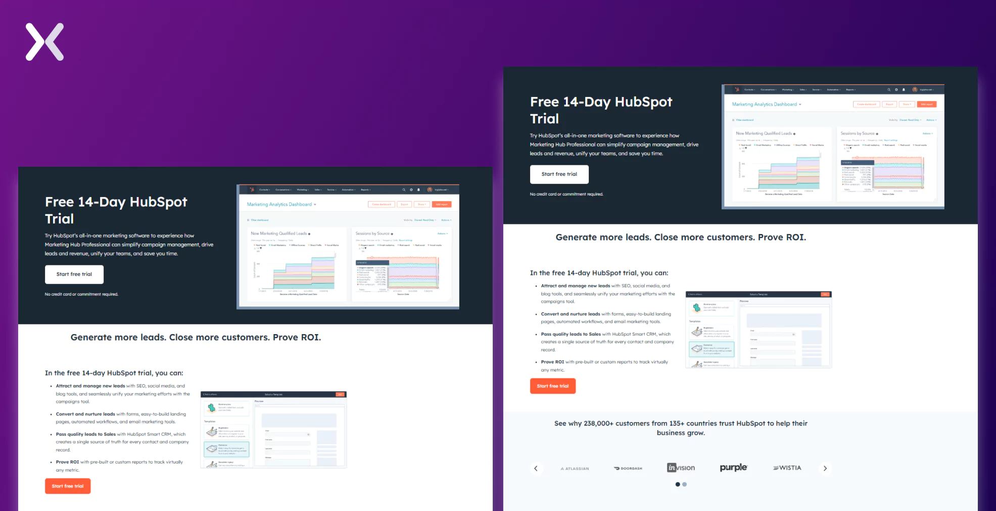
The next section highlights the features and benefits users can explore during the trial, guiding them on how to make the most of it. With just these two concise sections, HubSpot creates a simple yet highly impactful SaaS free trial landing page.
Let’s look at a landing page that breaks one of the cardinal rules: sticking to a single CTA. Marker.io challenges this norm by incorporating two distinct CTAs—“Start a Free Trial” and “Book a Demo”—on the same page.
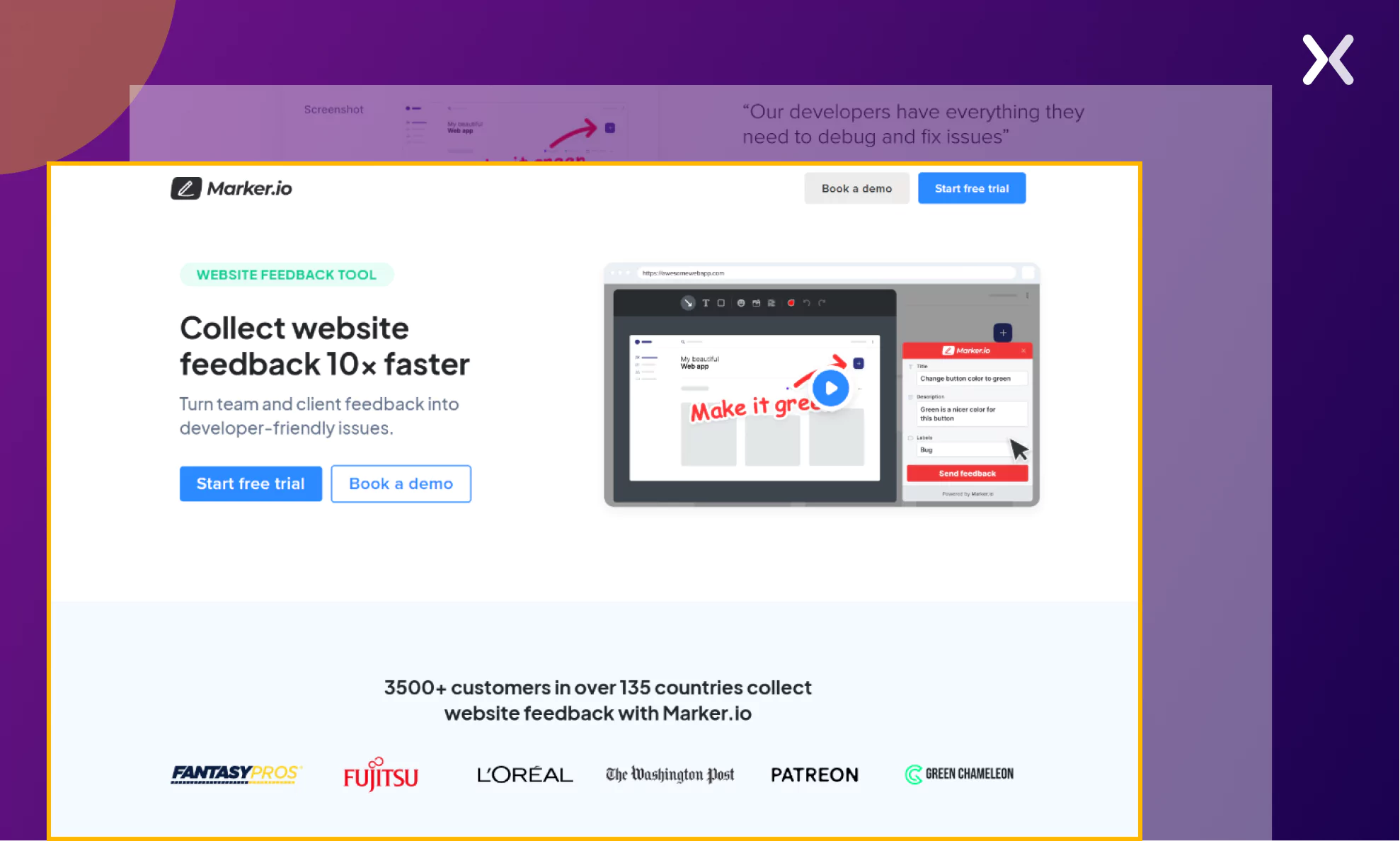
This approach works because both offers serve the goal of generating quality leads. While free trial users can become valuable prospects, those who book a demo are likely more qualified and relevant.
Most page elements—such as SaaS visuals, pain points addressed, social proof, and a shared video—align with a typical free trial-focused SaaS landing page. However, the dual CTA strategy might not be suitable for every SaaS brand and should be tested thoroughly before implementation.
Book a demo pages are as crucial in your SaaS sales funnel as much as free trial pages. Let’s see what best SaaS landing pages to book a demo have in common.
PT Acquisition offers an automation tool tailored for the healthcare industry, targeting primarily medical field officers. The page’s copy is carefully crafted to resonate with this specific audience.
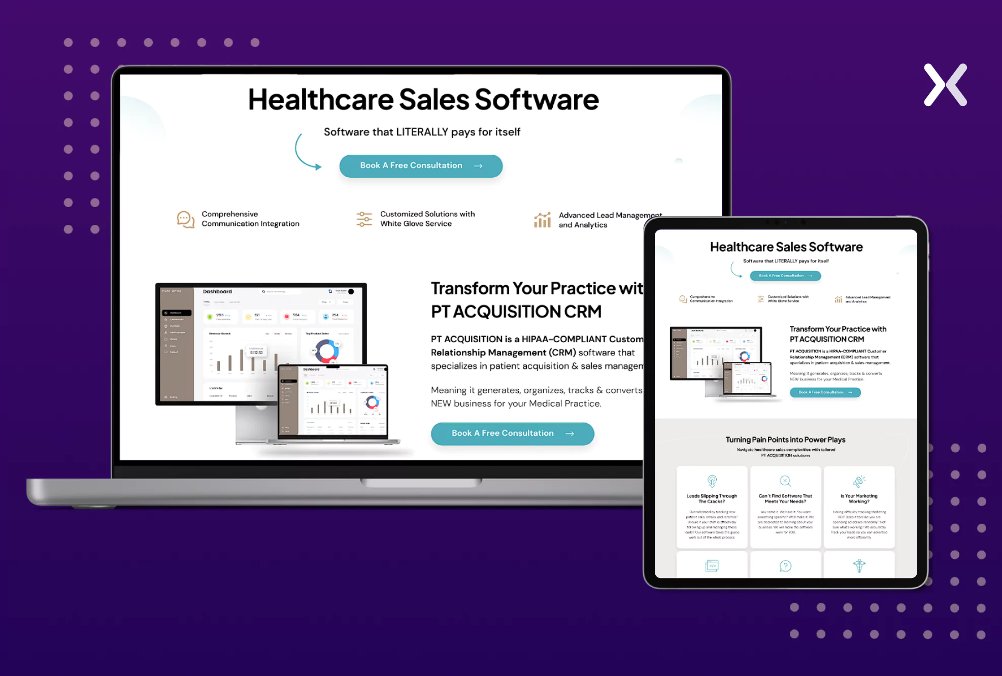
At the top, the page features a clear and concise headline that immediately communicates the SaaS’s purpose, accompanied by tool images. It also addresses a critical concern upfront—whether the CRM is HIPAA-compliant. By tackling this key bottleneck early, the page builds trust and encourages visitors to explore further.
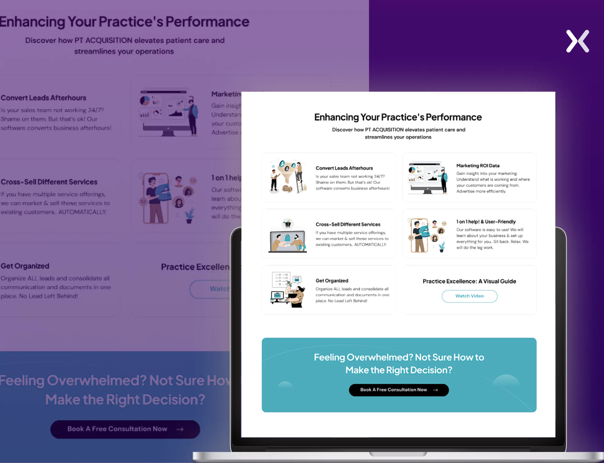
The landing page covers all the essential details about the SaaS, addressing visitor pain points comprehensively. CTAs are strategically placed throughout the page, making it convenient for users to book a call from any section. Each section introduces a new feature, delving into its benefits without rushing. By thoughtfully addressing each point, the page nudges readers to book a call if they have questions or need more information.
Craver has a classic book and a demo landing page. Right from the top fold to the last, each element has been put in there with thought and direct visitors towards conversion.
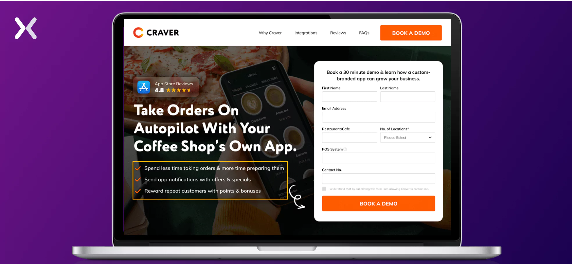
From the very top of the page, it features a mix of relevant visuals—alternating between showcasing the SaaS tool in action and images of the target audience. This clever approach demonstrates that when tool images are limited, audience-focused imagery can effectively convey value.
The page highlights the SaaS’s USPs with concise bullet points at the top, making them easy to grasp, while elaborating on these benefits in greater detail throughout the subsequent sections.
One standout feature is the FAQ section at the bottom of the page. This section is vital in addressing recurring queries that may not have been fully covered elsewhere on the page.
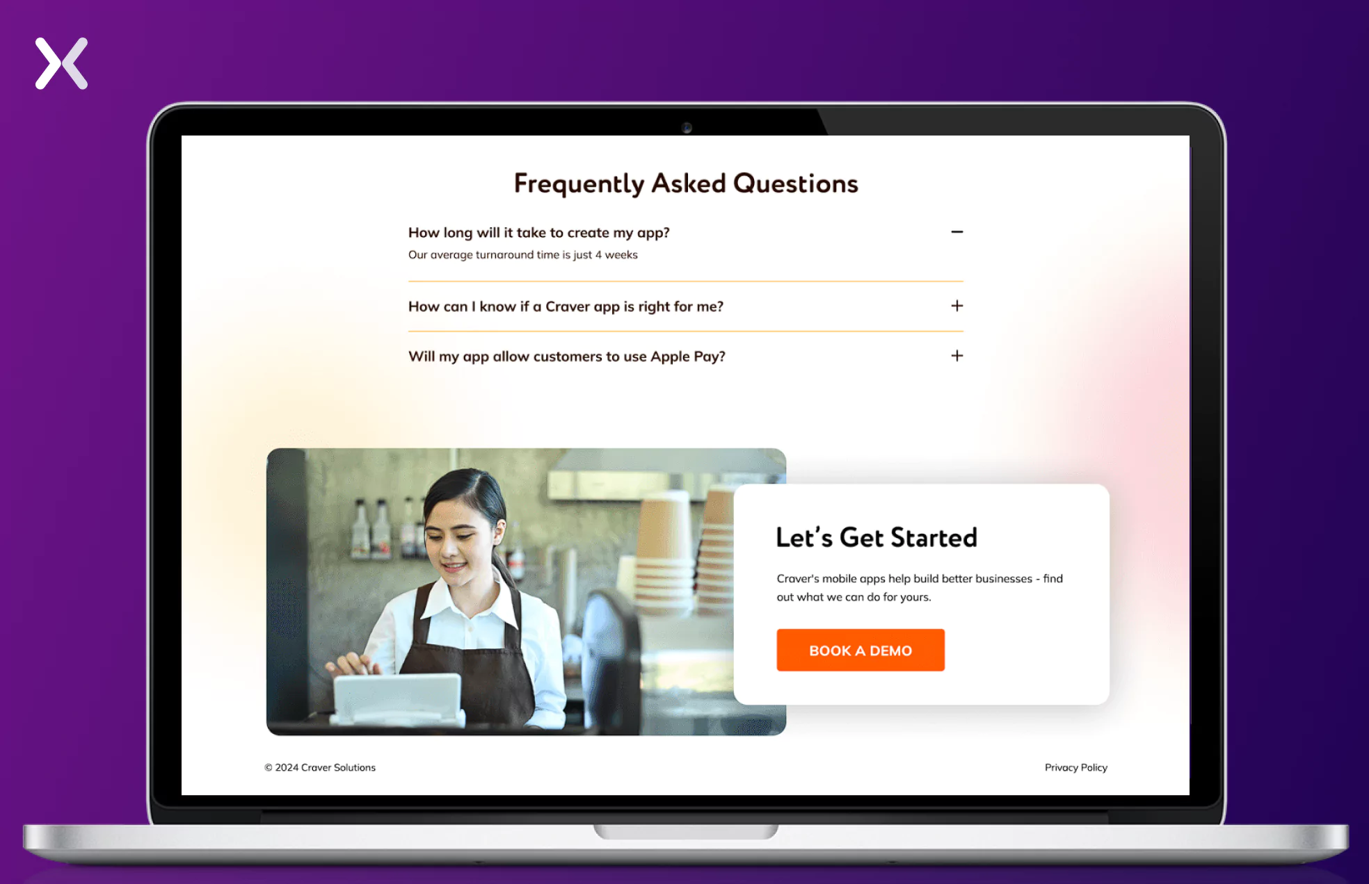
By preemptively answering common questions, the FAQ provides clarity and reassurance to potential leads, helping them decide whether to book a demo, download the app, or proceed without further consultation. This Q&A format streamlines the decision-making process and reduces the need for repetitive call inquiries, ensuring a smoother user experience.
Everlaw’s landing page incorporates similar elements to the examples above but takes a more copy-heavy approach. This works well given its target audience—law firms, corporations, and government organizations—who often expect detailed information.
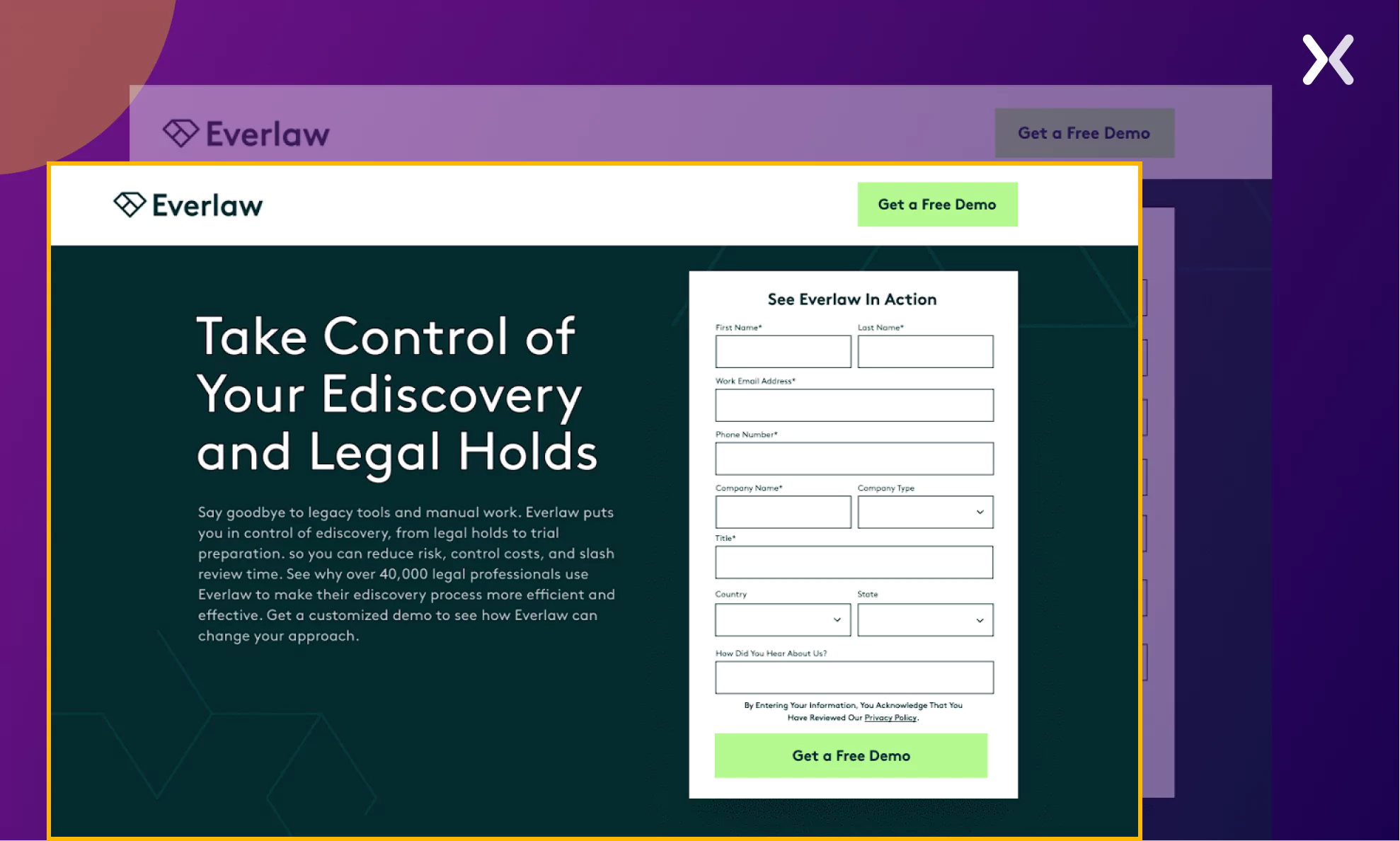
A notable feature is a section that clearly defines who the SaaS tool is designed for, ensuring visitors immediately know whether booking a demo will benefit them. Such an element is crucial for creating best SaaS landing pages.
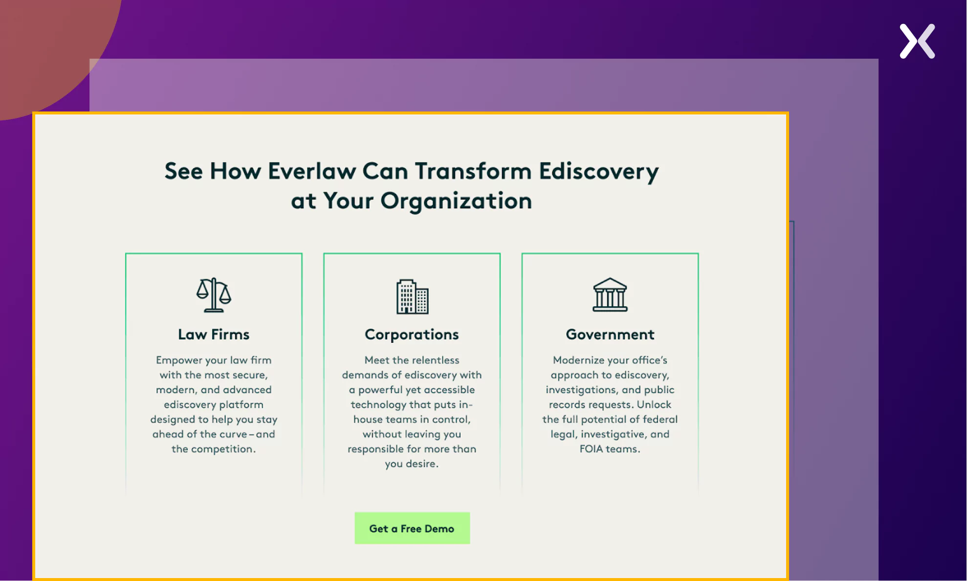
The page also includes a sticky header, a smart addition for lengthy pages with multiple sections. It ensures the CTA button remains visible at all times, making it easy for visitors to take action without having to scroll back up.
Pro tip: The best SaaS landing pages are incomplete without a thank you page. Ensure to add one for your new leads.
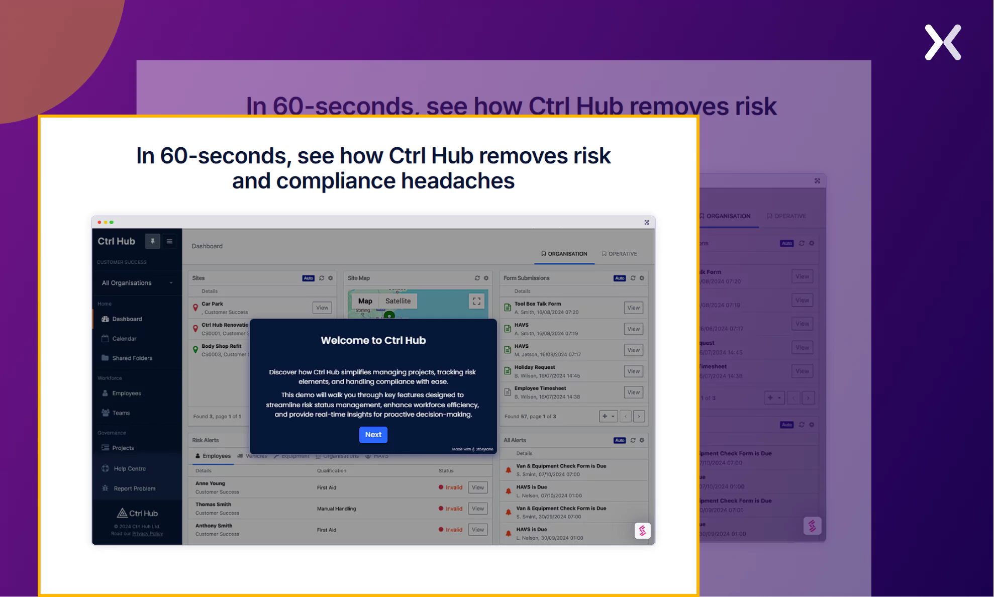
Ctrl Hub features a distinctive “book a demo” SaaS landing page. It begins with a compelling kicker text that clearly explains the tool’s purpose, making the heading and subheading easy to understand. The page also includes a concise yet impactful video that highlights the problem the SaaS addresses and demonstrates how it solves it for its target businesses.
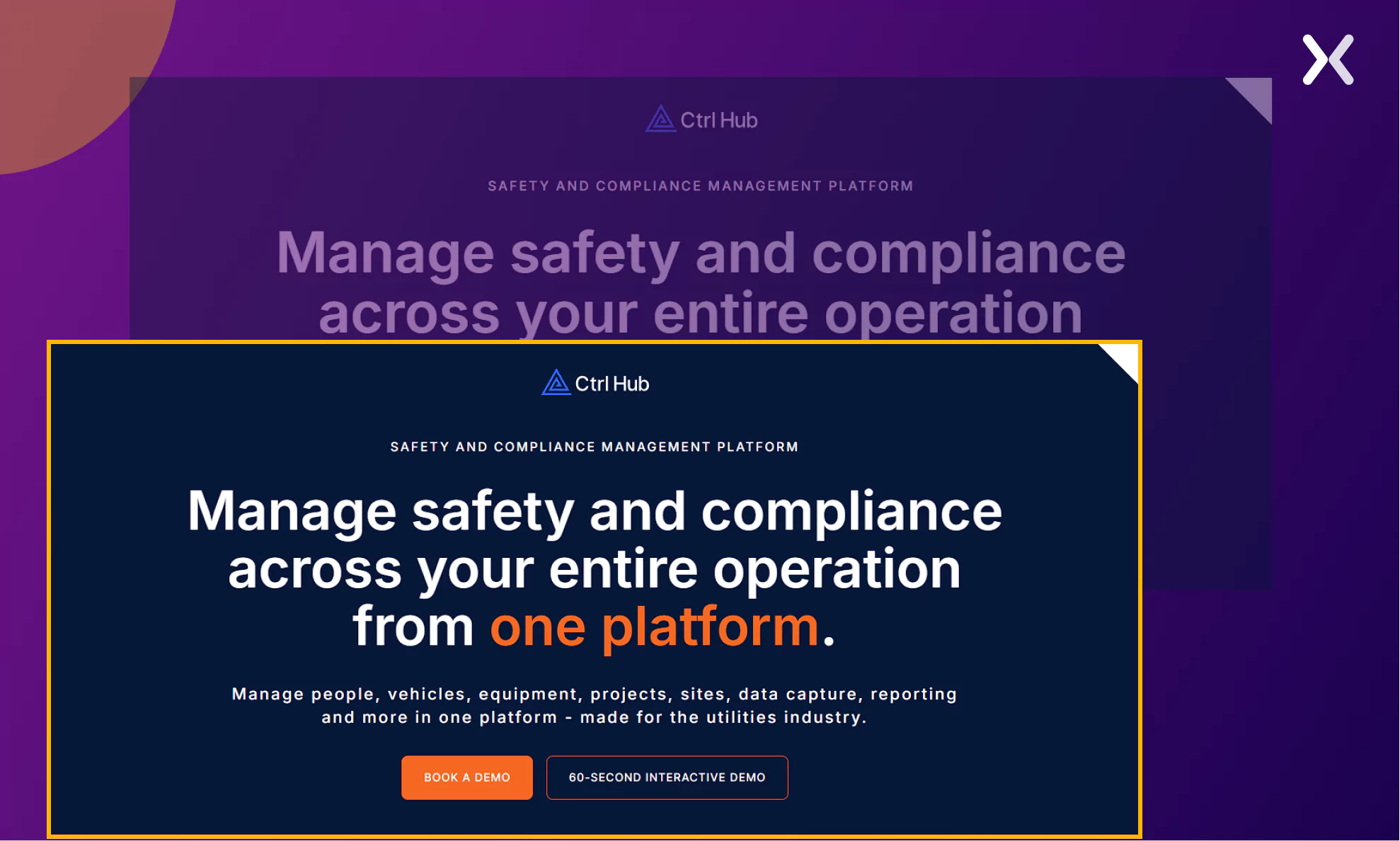
A key detail to note is the appearance of two CTA buttons. While the “Book a Demo” CTA takes users to a traditional demo scheduling page, the “60-Second Interaction Demo” CTA guides visitors to an interactive section of the page where they can experience the SaaS UI through a simple, step-by-step walkthrough. This provides an engaging and efficient way to showcase the product’s features.
Just after the first fold, the page jumps into discussing the visitors’ pain points. It then showcases how Ctrl Hub solves each of the visitors’ problems and even goes as far as to point out which feature solves which issue.
To enhance the landing page’s value and appeal, it includes a strategic pop-up highlighting an exclusive offer: a complimentary 1-on-1 consultation with the company’s managing director. This personalized session builds credibility and emphasizes how the consultation can help businesses optimize their efficiency, creating a compelling reason for visitors to engage further.
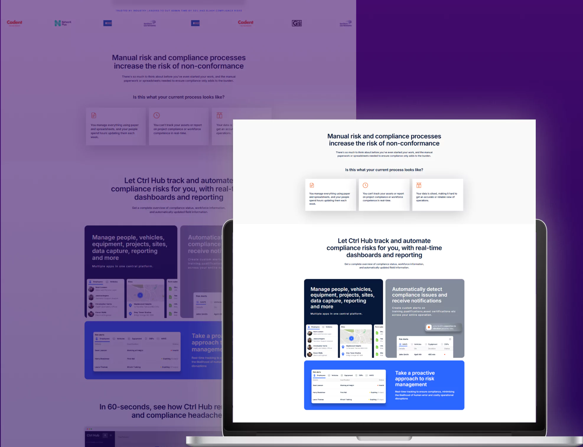
Overall, this is one of the best SaaS landing pages that can’t be ignored.
Discussing the best SaaS landing pages shouldn’t be without some case studies. So, here are some SaaS landing page case studies by Apexure that you might find interesting.
Flare’s original “book a demo” page was not performing as they expected, and that’s when they reached out to Apexure. After thoroughly analyzing their landing page, we found that their page had a lot of issues like information overload, redundant details, etc.
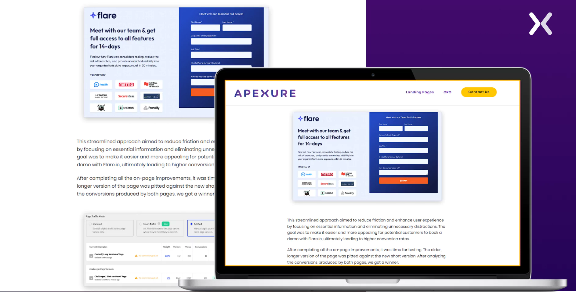
As soon as we could lock down the issues with the page, we optimized it into a much simpler “Book a Demo Page.” We ensured their page had enough social proof and copy to win visitors’ trust and ensure they converted.
The optimization worked well, and their conversion rate increased by 65%.

Craver’s needed a fresh landing page that looked great but was also conversion-focused. As they focused on a “Book a demo” page, our first step was understanding their target audience and their pain points, as it helped create a more impactful landing page design.
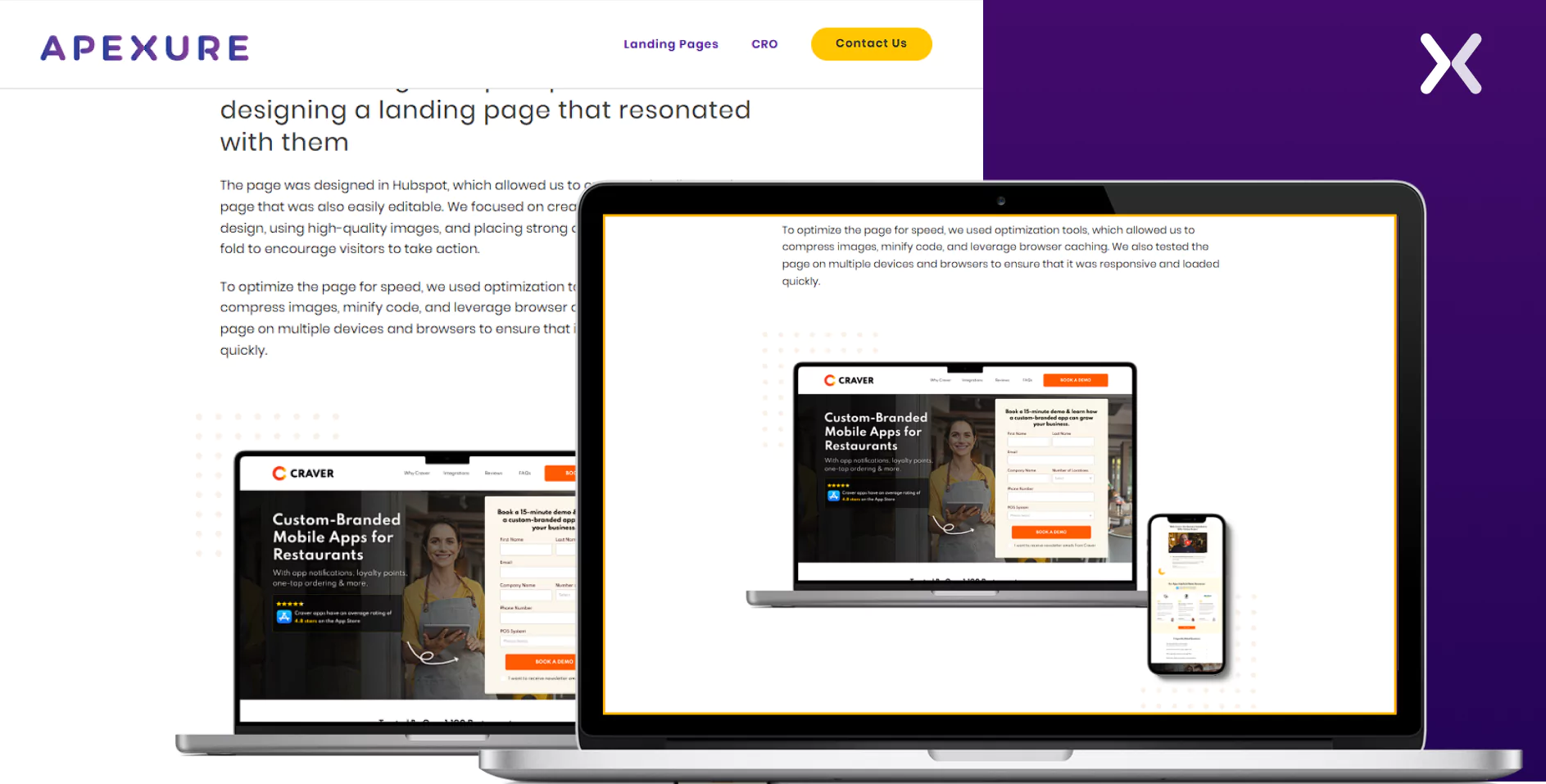
We ensured to include a lot of the SaaS images on the landing page along with visuals that resonated with the core audience. It resulted in Craver securing a lot of quality leads that later turned into paying customers.

Creating the best SaaS landing pages requires focusing on the conversion goal. Integrating landing page elements that align with your SaaS conversion goals boosts your chances of getting conversions.
Be it a pre-launch or free trial landing page, each one needs special attention to design, messaging, and user experience to guide visitors toward the desired action effectively. Adopting proven design frameworks is key to developing the best SaaS landing pages that not only look great but also perform effectively.
Did you know that Apexure has 100+ blog posts on landing pages? We have shared everything, from creation to testing, analysis to optimization. Check it out before you build your SaaS landing page.
Making the best SaaS landing pages on your own can be overwhelming. Get the help you need from our experts. Book a call and one of our landing page experts will contact you soon.
Check out our SaaS landing page portfolio to discover conversion-friendly landing page elements that might. Filter your industry and check which landing page design is trending.
A seamless user experience reduces friction and increases engagement.
Related Article:
Drive More Sales or Leads With Conversion Focused Websites and Landing Pages
Get Started
Video content is one of the most powerful tools in modern marketing. It has the ability to capture...
Building a high-ticket coaching funnel for an expertise-driven brand requires a very different approach than traditional marketing funnels....
Get quality posts covering insights into Conversion Rate Optimisation, Landing Pages and great design