Different types of landing pages are available in the market to fulfill various user intent demands. Still, potential clients often struggle to land on the right page despite searching for the right queries.
It is the job of marketers to build landing pages that are in tune with the theme of the marketing campaign and the audience’s intent.
For this, every marketer must be aware of different types of landing pages that they can use to strengthen their marketing funnel.
In this blog post, we will discuss 13 different landing pages that are most commonly used with two bonuses so that you are ready to upgrade your PPC ads with a more targeted landing page.

A landing page is where visitors land after clicking on a sponsored search engine result, promotional email, banner ad, or link. Its purpose is to prompt visitors to take specific action, such as signing up for a newsletter, booking a demo, etc.
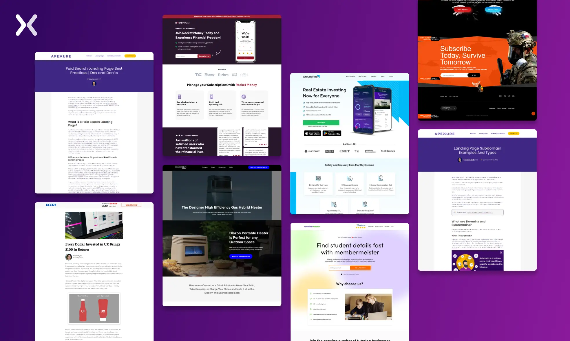
Landing pages are always oriented toward a single goal, such as a CTA, making for a powerful targeted advertising tool. Depending on your marketing and sales strategy, you can create several landing pages for your business.

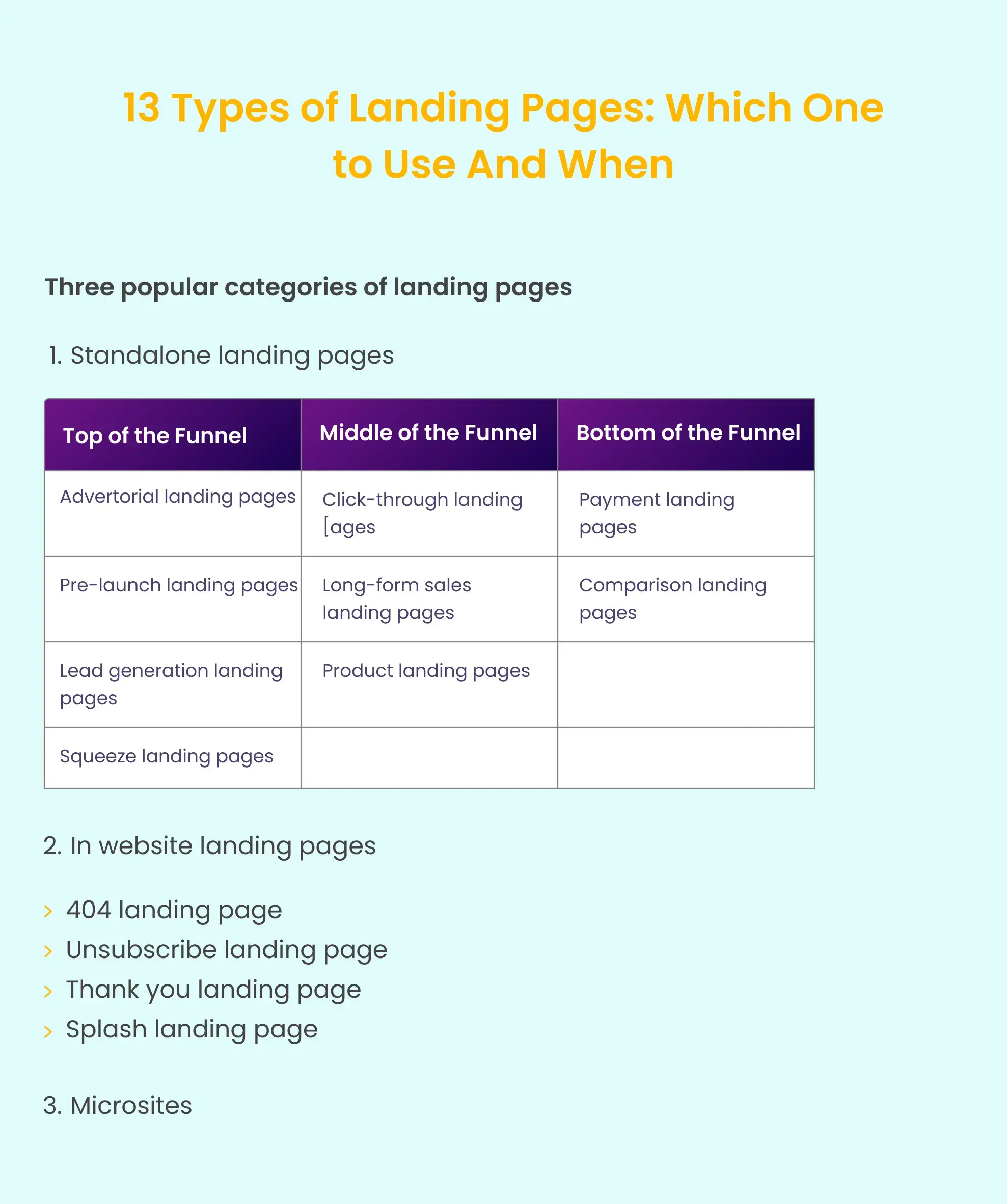
Broadly, landing pages can be divided into three categories, which depend on their purpose and hosting arrangement. Below are the three categories of landing pages:
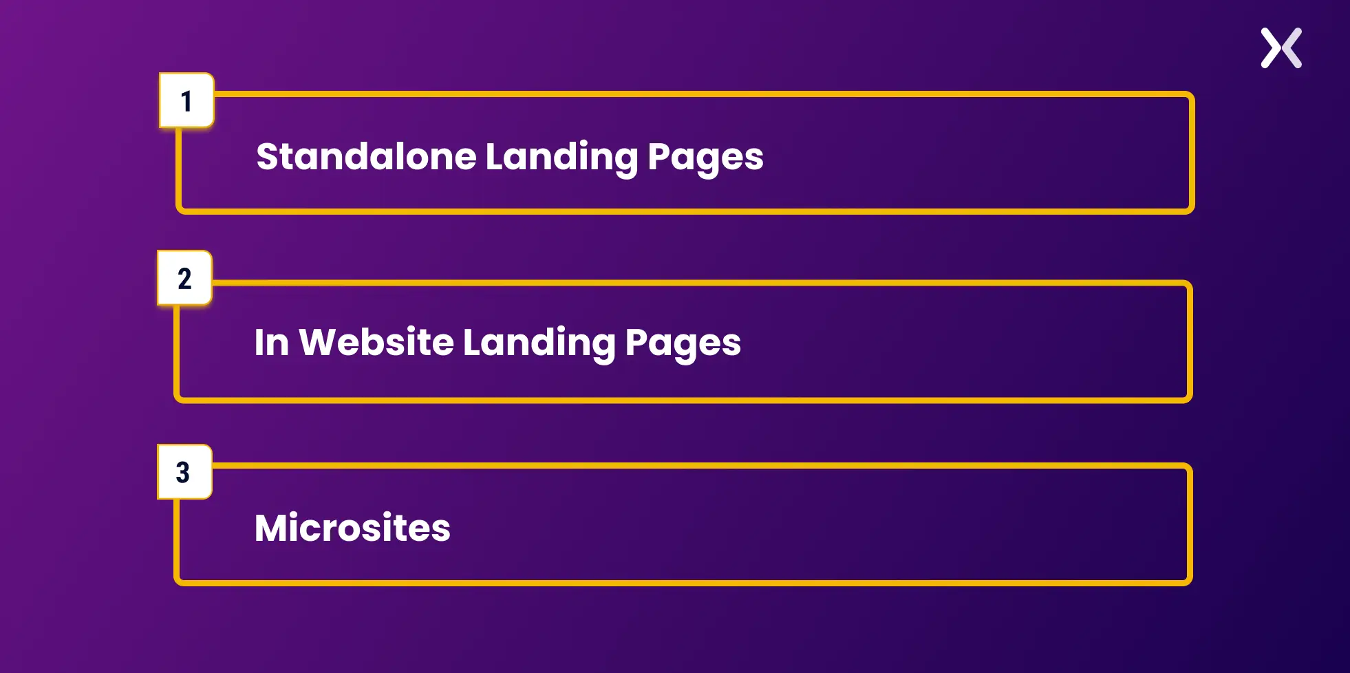
Standalone landing pages are mostly utilized for PPC ads. They are hosted separately from the main website on a subdomain. Such landing pages are conversion-focused and contain no external or internal links.
The hosting of standalone landing pages on subdomains makes it easier to track and analyze them for further optimization.
Some examples include: lead generation landing page, lead magnet landing page, payment landing page, etc.
Website landing pages are hosted on the main domain and perform functions such as handling errors (like a 404 landing page), managing unsubscribes, or quickly delivering critical information (through a splash landing page).
These pages have links going to various other website pages but do not have any incoming links.
Microsites are small, specialized websites typically focused on a single campaign, product, or event. They are hosted on a subdomain.
Let’s discuss different types of standalone and website landing pages.
Under the various categories of landing pages, we have some popular types that help us create more campaign-targeted landing pages.
How do you know which one to use and when? With that in mind, let’s go through different landing pages and see how you can use them to optimize your conversion rates.
Let’s start with the standalone landing pages.
Advertorial pages are ideal for warming up cold traffic since the content is incredibly close to the native channel. These types of landing pages are meant to educate the potential buyer by appealing to their interest and talking about their pain points.
As a result, the reader can derive value from the advertorial page and thus be encouraged to purchase even before arriving at the sales page.
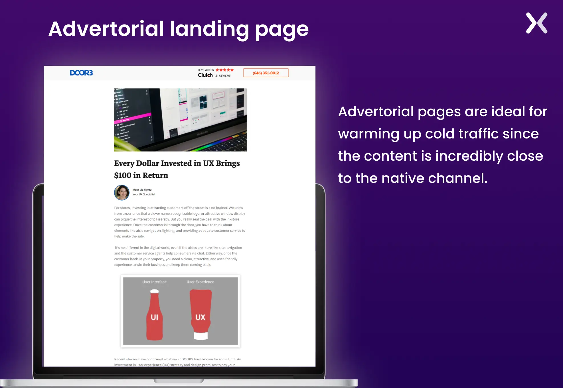
These pages are best used at the top of the funnel as they help educate the audience in-depth about a topic and prepare them for the offers you have for them ahead.
The goal of a squeeze page is to acquire the user’s email address. These pages provide gated content or special offers in exchange for your email address.
Squeeze pages are straightforward, with an enticing CTA and short copy encouraging visitors to provide their email addresses. These pages differ from lead generation landing pages as they offer significantly less information and follow a minimalistic design approach.
That’s because squeeze pages are designed to prioritize quick, low-commitment leads.
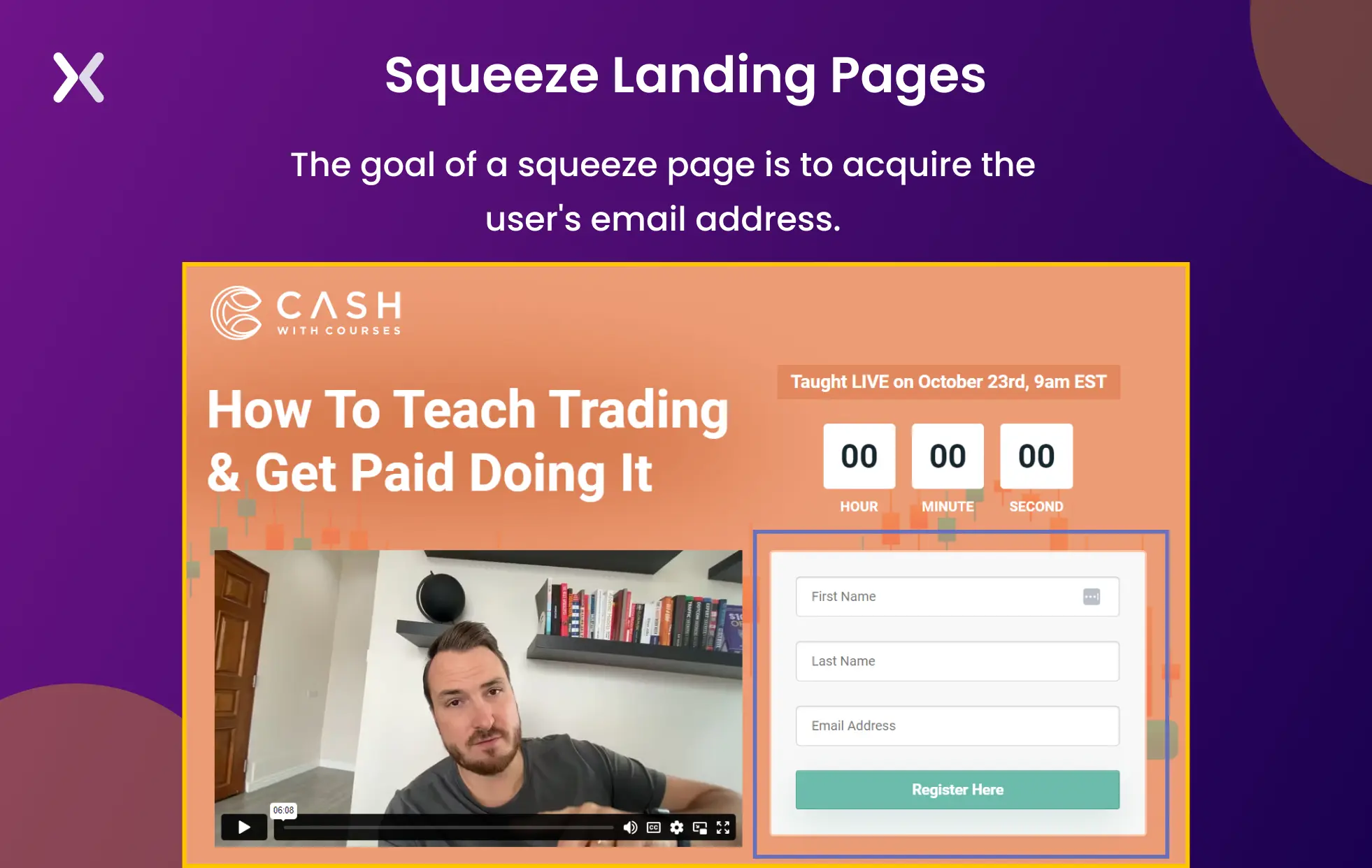
Squeeze pages, often featuring short forms, are primarily utilized at the top of the sales funnel for their directness and simplicity. Brands leverage these pages to gather email addresses swiftly and then nurture those leads into clients.
A lead generation or lead capture page is similar to a squeeze page, except it gathers even more data. These types of landing pages collect information such as the user’s name, email address, company name, job title, and industry. Normally, this is determined by the overall goals of your sales and marketing teams, as well as the customer’s position in the funnel.
When building a lead generation landing page, remember to incorporate compelling headlines that illustrate the benefits of your service.
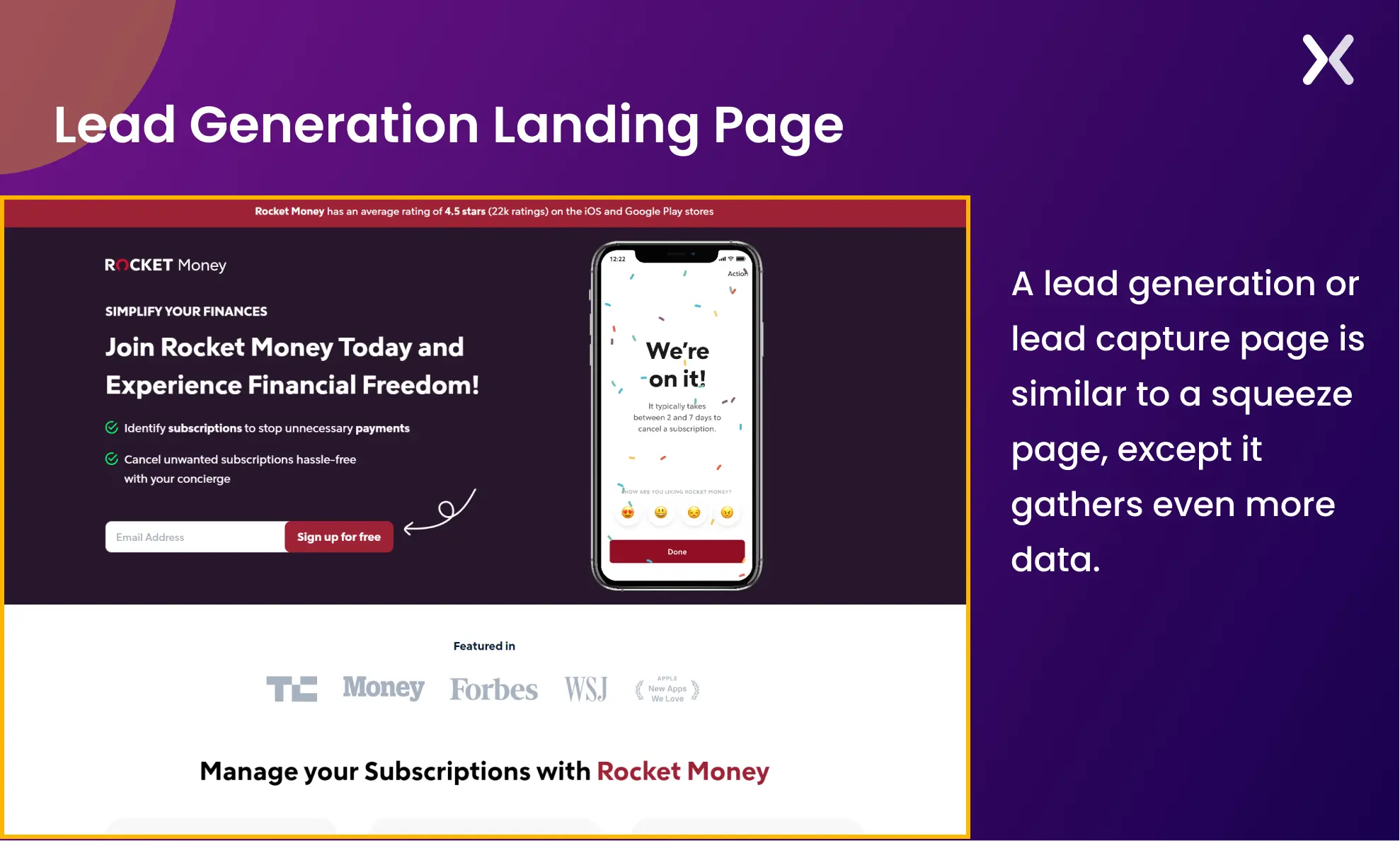
While lead generation pages generate top-of-the-sales funnel leads, they can also be used to target a solution-aware audience that can enter your middle of the funnel directly.
Are you about to launch a stellar new product but aren’t ready to unveil the entire offer yet? That’s where the pre-launch landing page comes into play. Popular in the SaaS industry, pre-launch or so-called “Coming Soon” landing pages are helpful in getting early sign-ups or developing a targeted demographic to follow later down the line.
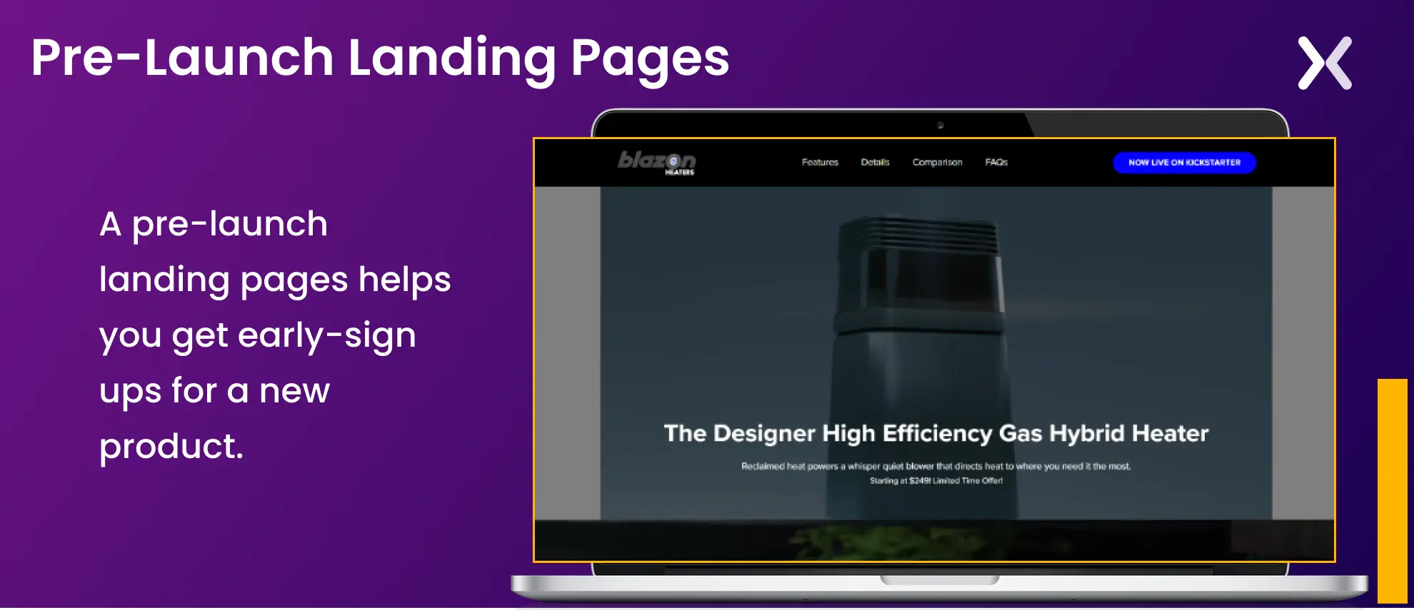
Such pages allow any interested customer to leave their email address and be notified when the product hits the shelves—having an email list in place before your business launches can help your future marketing activities succeed.
Coming soon landing pages are positioned at the top of the funnel as they generate initial excitement for a product or service. These pre-launch pages provide key information about the new product, highlighting its unique selling points to maintain visitor interest.
Payment landing pages are web pages dedicated to facilitating the payment process for a product or service. They play a crucial role in converting leads into customers by making the payment process simple and trustworthy.
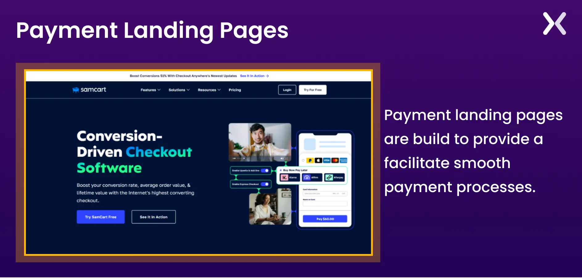
Landing pages for payments have a brief description of the product being bought, pricing details, security assurance, and a small presence of social proof. The main focus of this page is to make the payment process as easy as possible for the high potential customers.
For B2C brands, payment landing pages may appear at the beginning of the sales cycle, but for B2B, they are typically utilized at the bottom of the funnel.
Click-through landing pages direct visitors to click on a specific call-to-action (CTA) button or link, guiding them to the next stage of the conversion process. They feature focused content, minimal distractions, and relevant information to encourage clicks.
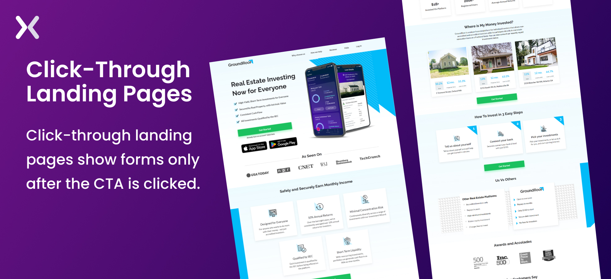
Landing pages with click-through CTAs relieve the pressure of directly selling services to visitors. They provide space to educate and inform visitors, only presenting the purchase offer when they click on the CTA. Such pages do not feature any forms and only a CTA.
Click-through landing pages are effective in the middle of the sales funnel. They nurture leads while swiftly guiding them toward the bottom.
Long-form sales pages are web pages designed to provide detailed information about a product or service in a structured and persuasive manner. These pages are typically longer than traditional landing pages and aim to educate and convince visitors to make a purchase thoroughly.
Such landing pages provide crucial information such as use cases, USPS, social proof, features, benefits, video explanations, etc., all on the same page, as it helps strengthen your offer to the visitors.
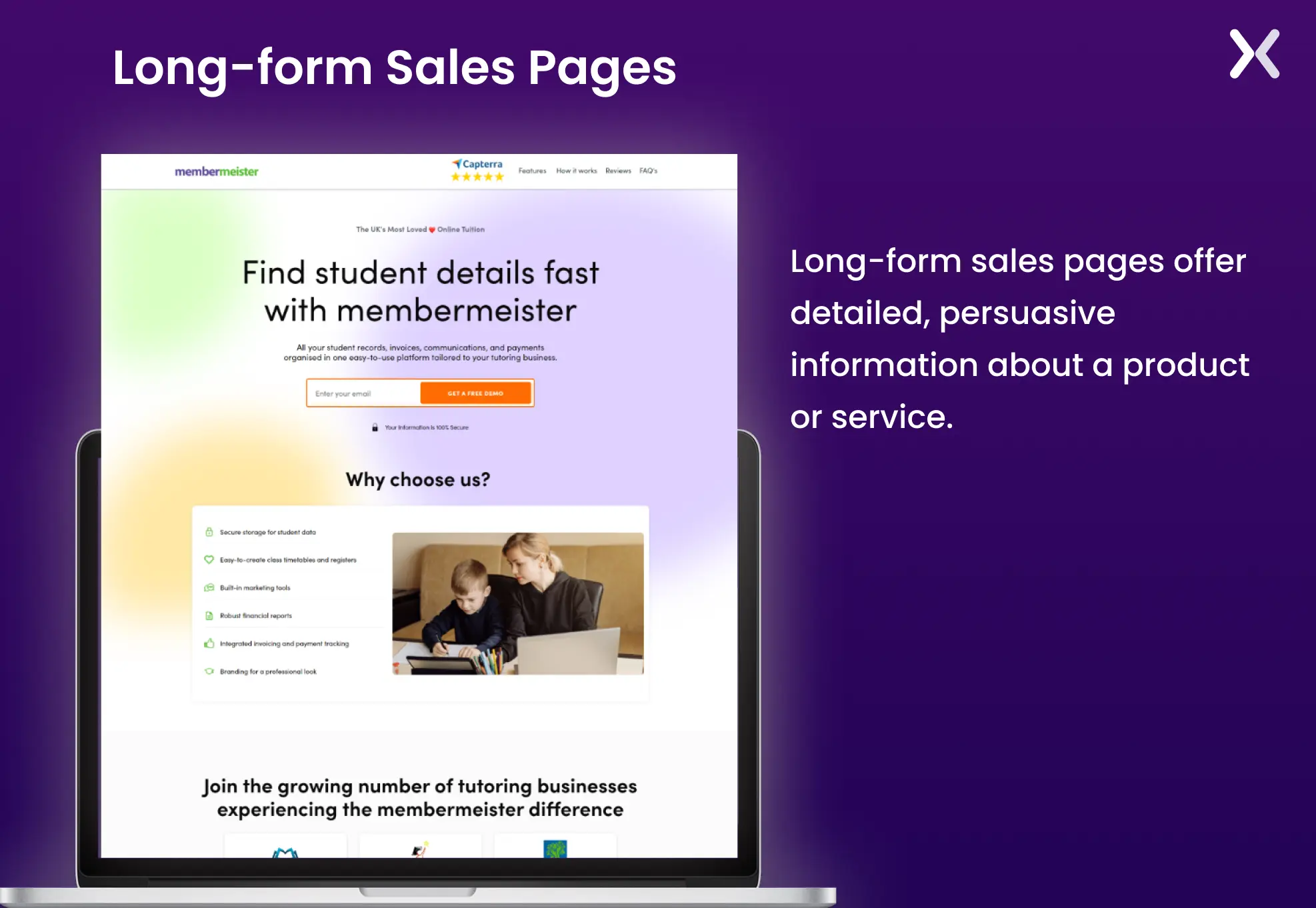
Long-form sales pages are commonly used for products or services that require more explanation or have a higher price point. They allow marketers to address potential objections, answer questions, and build trust with prospects before asking for a commitment.
Product landing pages are web pages specifically designed to showcase and promote a particular product or service.
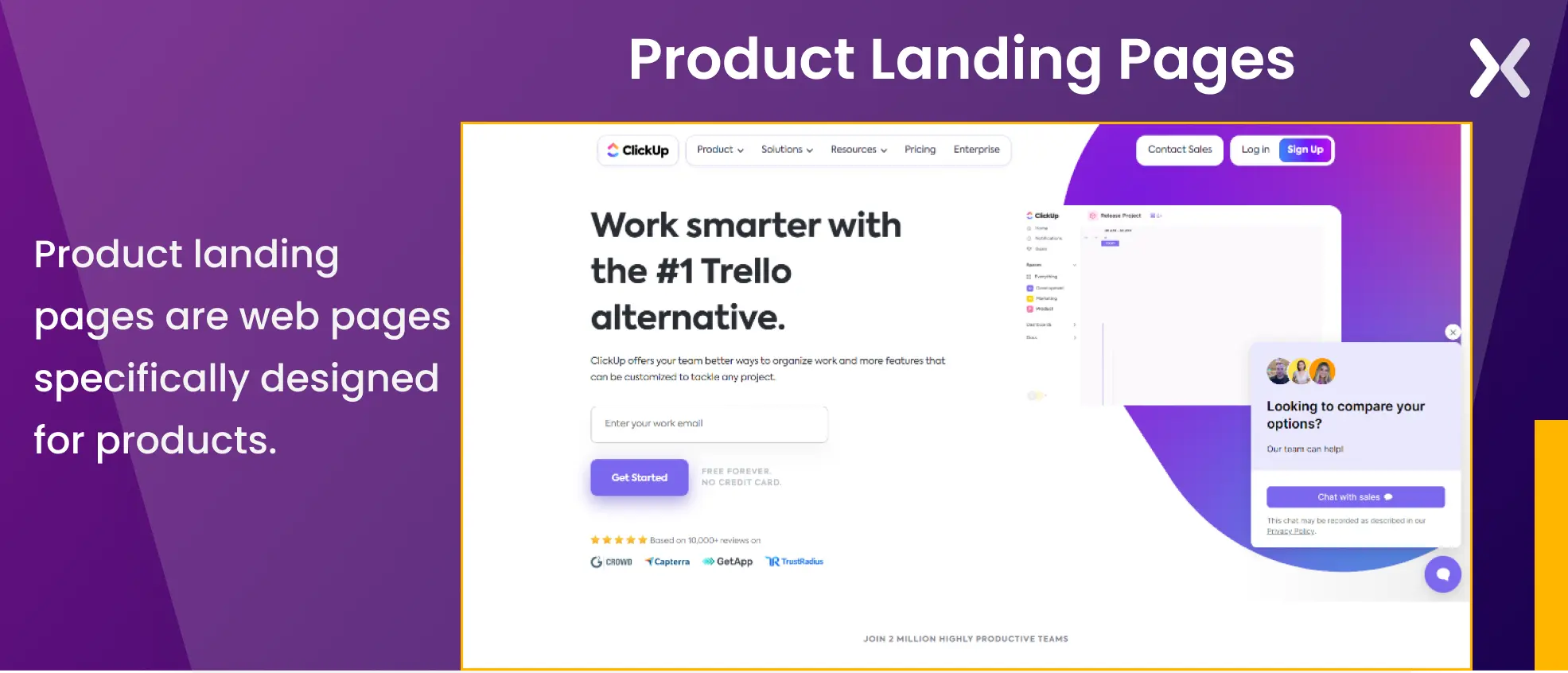
These pages are focused on driving conversions by providing detailed information about the product and encouraging visitors to take action, such as making a purchase or signing up for a trial.

“A product sales page is usually the hardest to build because it requires a clear understanding of your personas, their pain points, and the unique selling points (USPs) of your product or services. However, it is also the most rewarding.”
Product landing pages are positioned in the middle of the funnel, targeting individuals who understand their pain points well and actively seek the right solution.
Comparison pages present a comparison between two or more products or services. These pages are designed to help users make informed decisions by highlighting the differences and similarities between options.
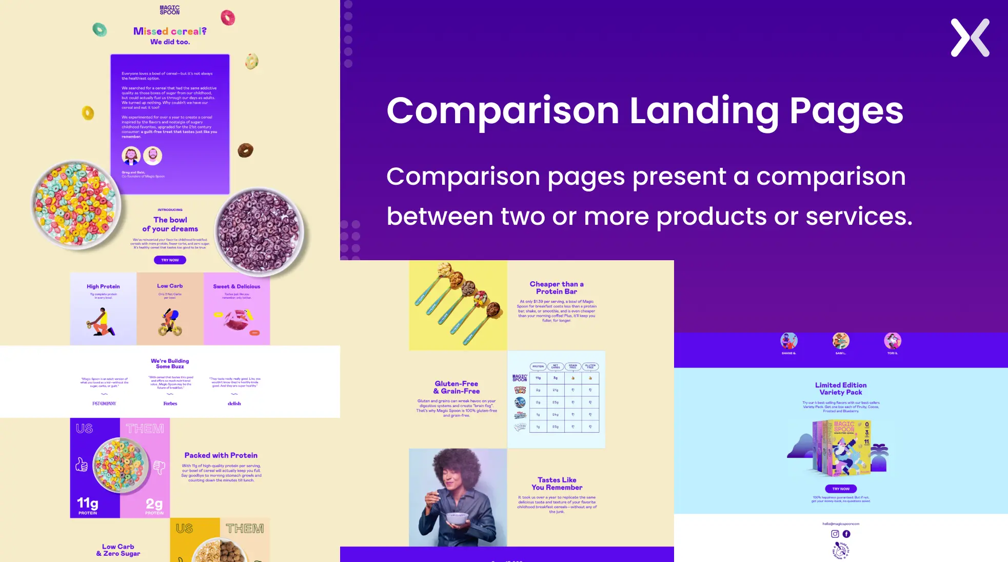
The purpose of this landing page is to showcase the USPs of your services from a bigger perspective and help users analyze their options better.
Comparison landing pages are most effective in the middle and bottom of the funnel, where potential customers are familiar with your brand but may be comparing your offerings with those of competitors. It nudges the consumer that they are making the right decision by choosing your product.
Let’s analyze some in website landing pages.
While “404” is an error page, it can still prove to be useful. A solid 404 landing page is a platform for further establishing your brand. You can have fun with it and include jokes, an interactive aspect, or just some interesting visuals.
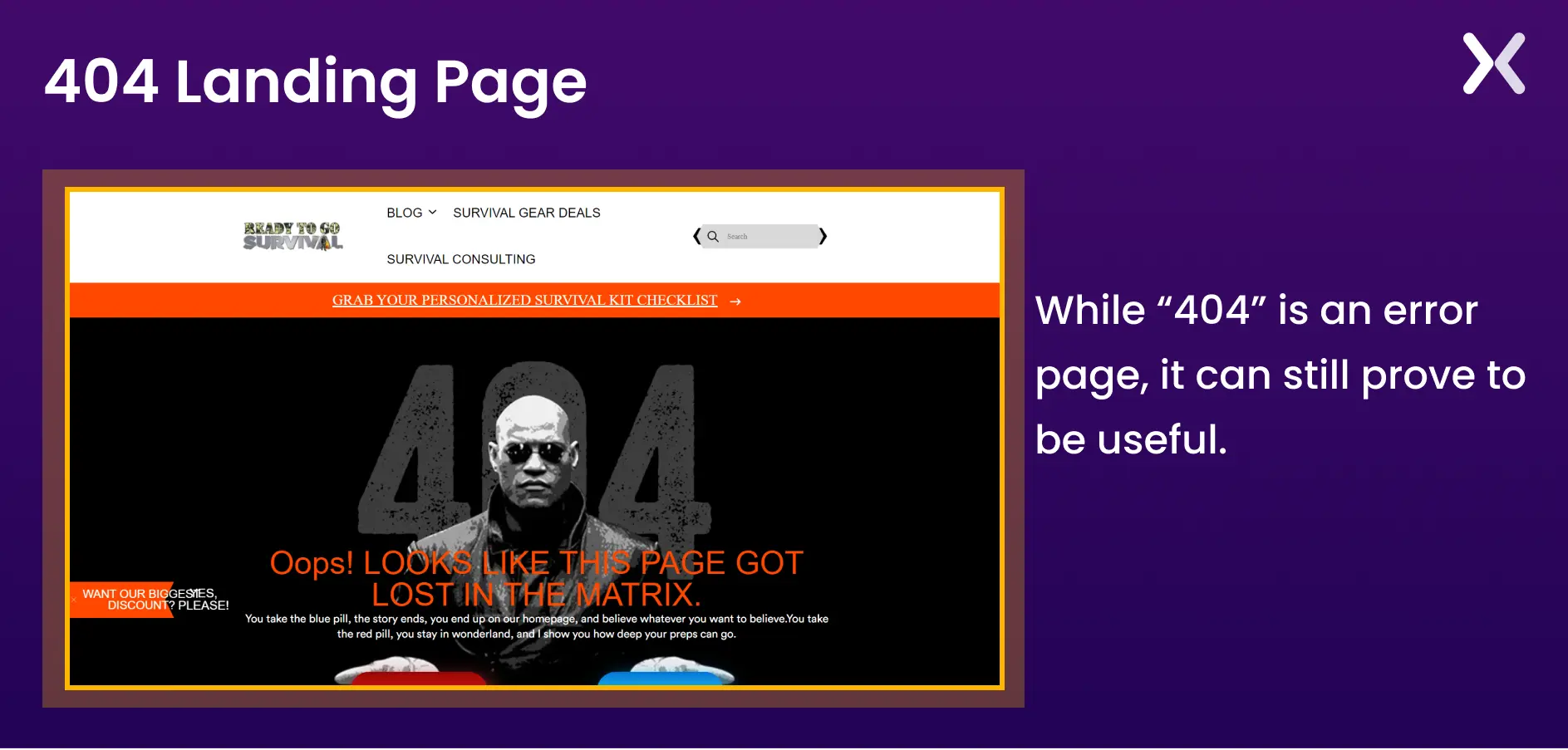
This page is all about distracting the user from the annoying error and getting them to explore the website further.
While you won’t center your campaign around this type of landing page, it’s still an important part of email marketing. The page needs to work seamlessly, allowing customers to unsubscribe with ease.
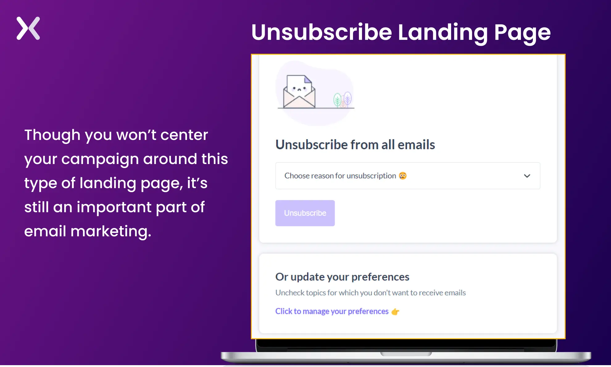
Of course, there are ways to try to convince them to stay. For example, you can enable them to adjust their settings to receive newsletters and similar content at a lesser capacity.
Thank you pages are a terrific way to establish relationships with new leads. It’s the page to which a customer is forwarded after completing a form or making a transaction. Since they’re already interested in your product or service, don’t miss out on the chance to secure additional interaction.
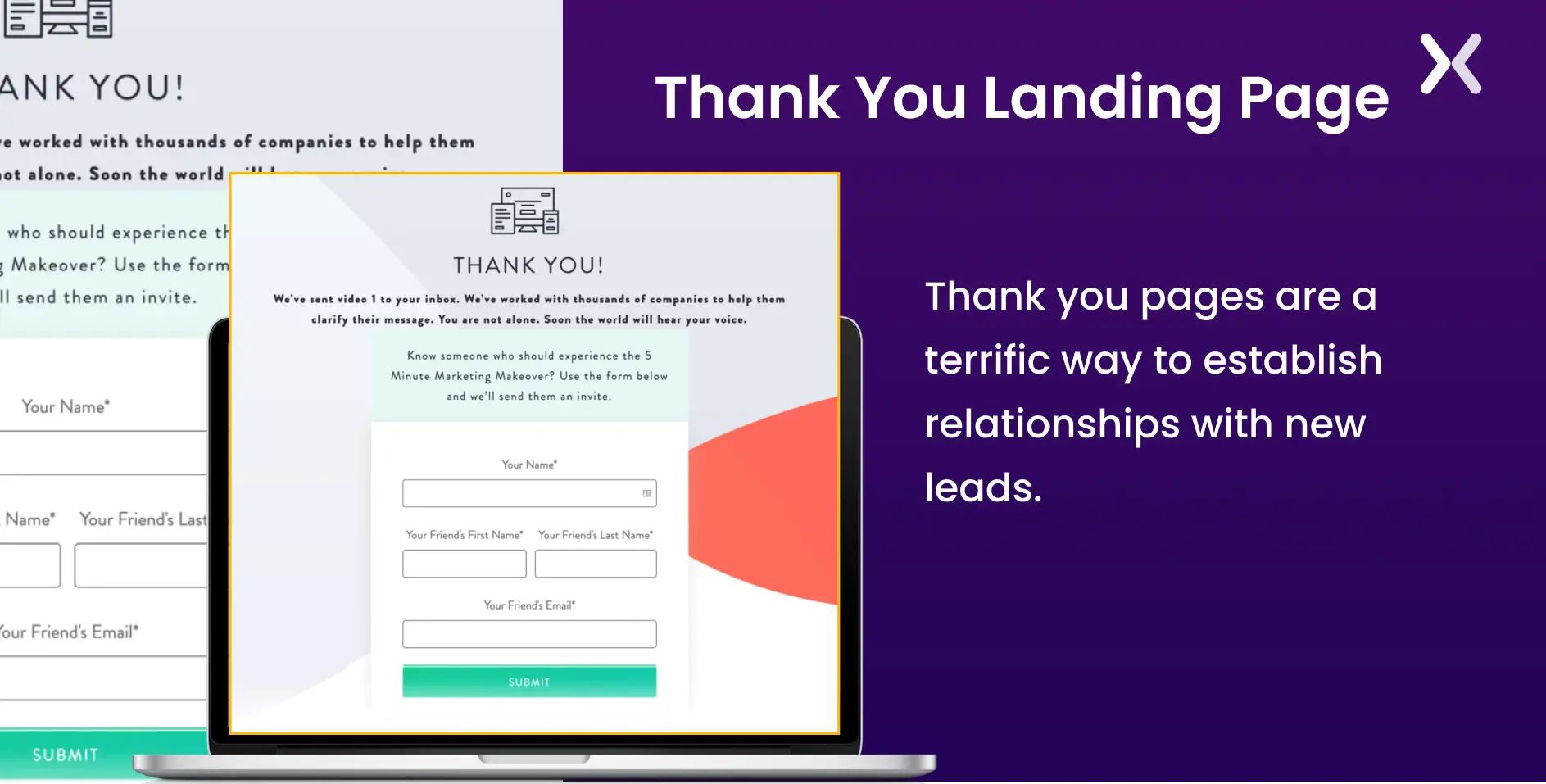
Consider including extra offers or prizes on your “Thank You” page to make it more than a bland statement. The thank you page has the potential to either send a lead farther down the funnel or establish a relationship.
Splash landing pages, also known as splash screens or splash pages, are introductory pages displayed briefly before users reach the main content of a website.
Typically, these types of landing pages feature a simple backdrop and a little text, without asking for much information. Instead, they offer something to encourage conversions.
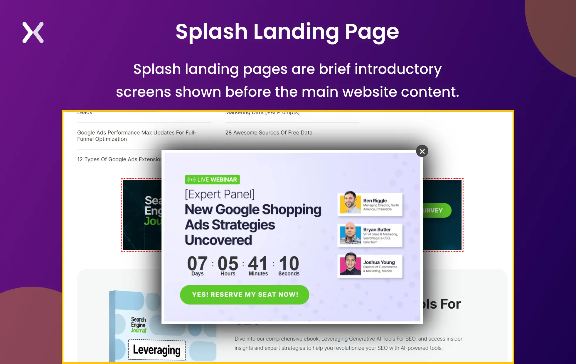
These pages are commonly used to publicize a conference, promotion, or other event. They can also be used to inquire about a visitor’s age or preferred language before allowing them to access the site.
Splash pages can be click-through or have a small form present on them.
Now that you’re familiar with the subject, the question remains: how do I choose the best type of landing page for my campaign?
The answer depends on many factors, but for starters, ask yourself the following:
What are the business goals I’m aiming to achieve with this landing page?
How are my rivals accomplishing these objectives?
What are the objectives of my audience when they arrive on this page?
What attracted my audience to this page first (i.e., what activity or motive drew them here)?
What do I want my visitors to do after reading this page?
Also, consider whether the page should be a short-form or long-form landing page.
Ultimately, you’re not limited to one landing page per website. It’s always more lucrative to include different types of landing pages in your marketing campaign. That way, you’ll have a better chance of boosting the conversion rates.

“At Ling, we align our landing pages with each stage of our sales funnel to ensure that each visitor receives the most relevant information and call to action, guiding them smoothly from awareness to decision. We focus on the educational and engaging aspects of language learning through gamification, which resonates well with our target audience.”
Various types of landing pages can deliver excellent results when paired with the right marketing campaign. While microsites have become less popular, standalone and in-website landing pages still play a critical role for businesses.
Understanding the intent behind popular user queries in your industry can help you create more targeted landing pages. You don’t have to create every type of landing page to capture leads; you only need to analyze which landing page will suit your business funnel and drive conversions.
After choosing a landing page, learn to build it for high conversions. Apexure provides over 100 blog posts on optimizing various types of landing pages. Check them out.
So many landing pages to choose from can be confusing. Take help from one of our landing page experts and take your sales funnel to the next level. Book a call!
Explore our landing page portfolio to find landing page design inspirations. Find out conversion-friendly elements for your campaigns. Filter by industry to see trending designs.
The primary goal of a landing page is to prompt visitors to take a desired action, such as signing up for a newsletter, booking an appointment, downloading a lead magnet, etc.
Related Articles:
Drive More Sales or Leads With Conversion Focused Websites and Landing Pages
Get Started.png)
Key Takeaways CRO is the highest-ROI marketing activity — it increases leads and revenue without increasing ad spend....
Most landing pages we audit have video in the wrong place. Either it autoplays and annoys people, it...
Get quality posts covering insights into Conversion Rate Optimisation, Landing Pages and great design