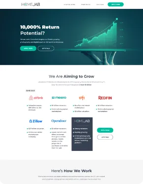
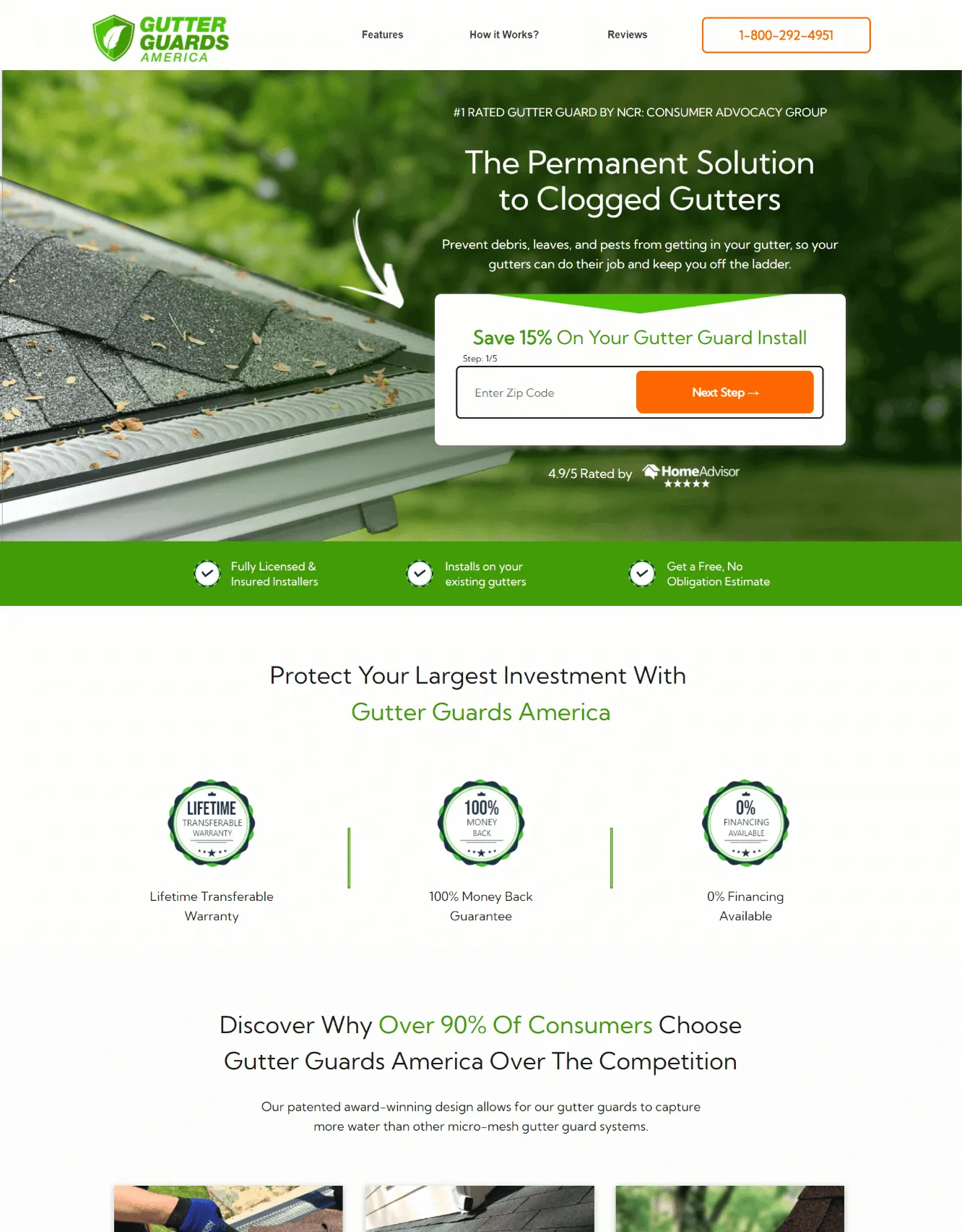
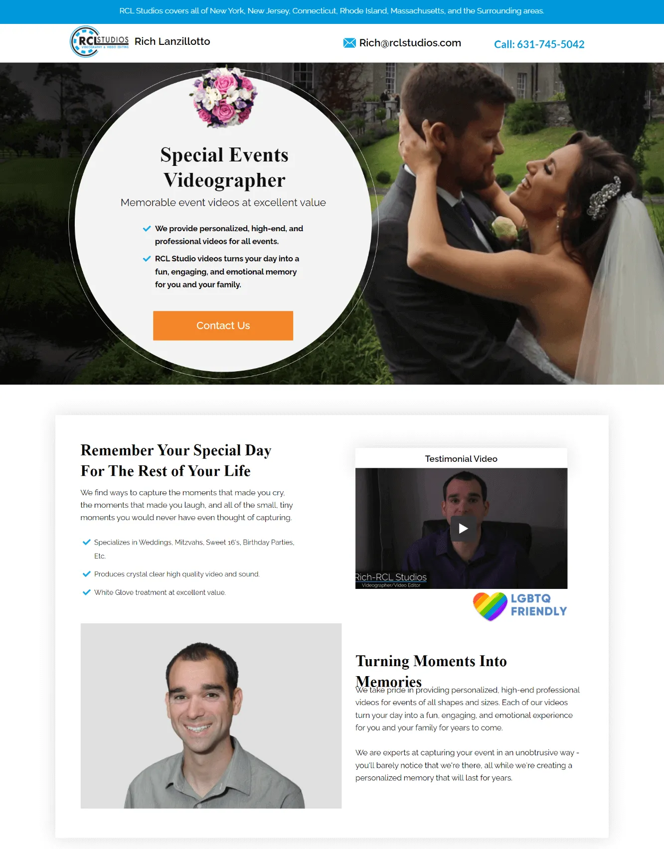
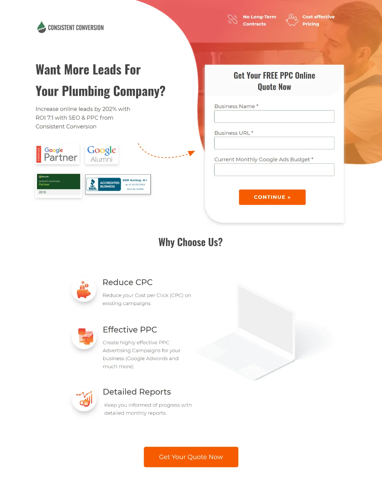
Get more inspiration from our recent QR Code Landing Page Examples
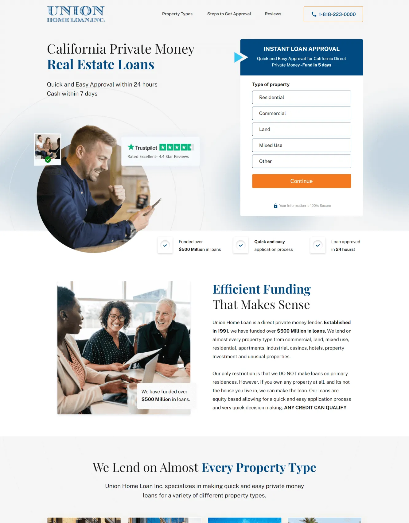
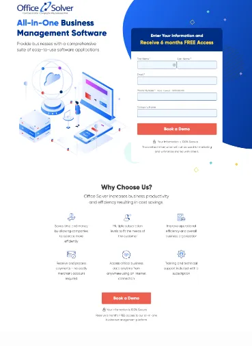
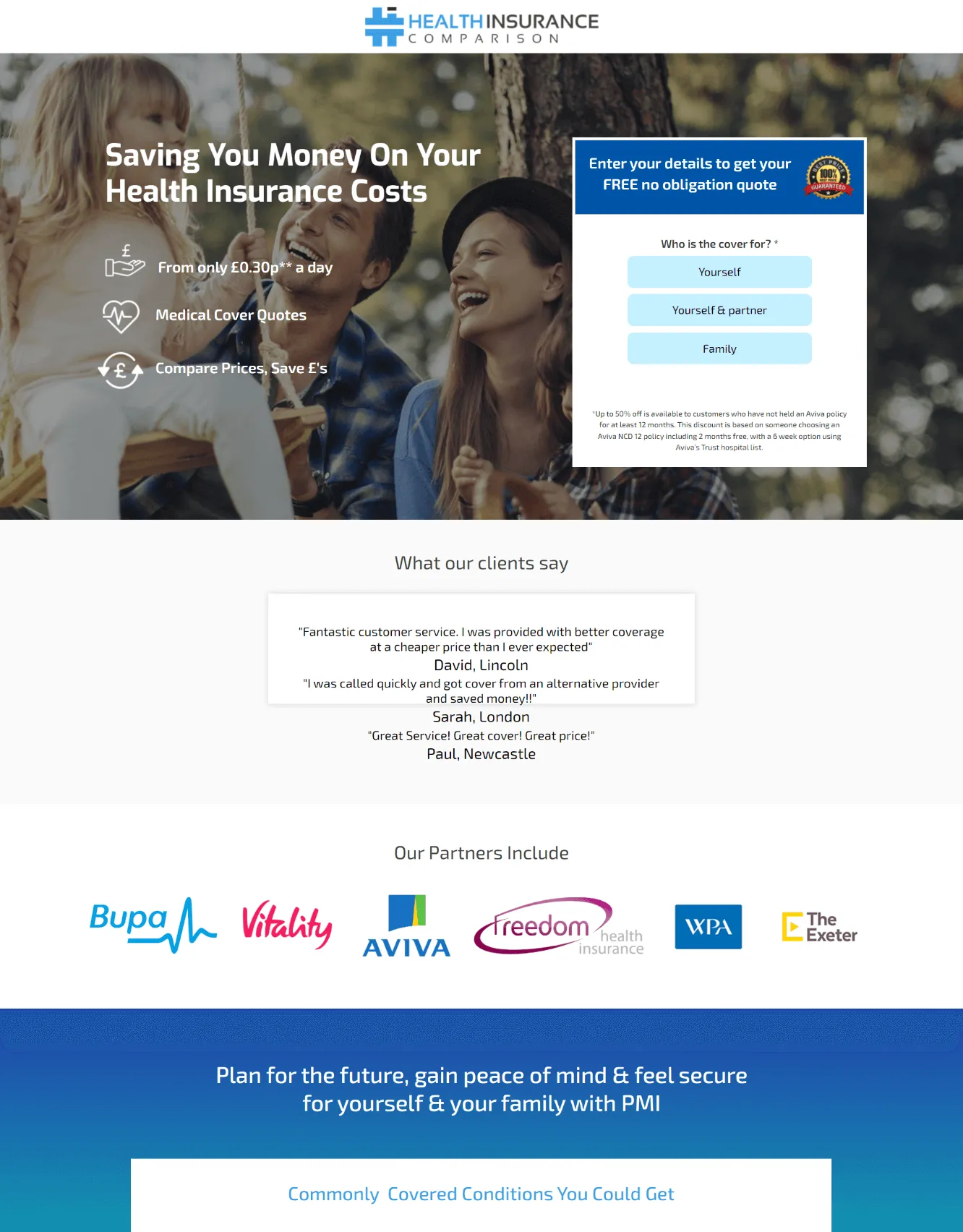
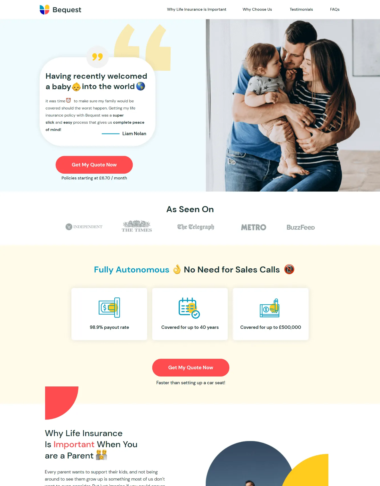

Features That Are Included In Every QR Code Landing Page
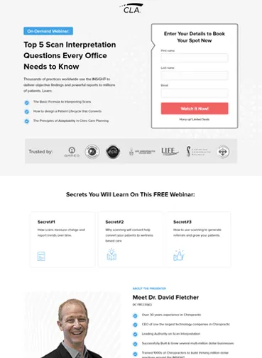
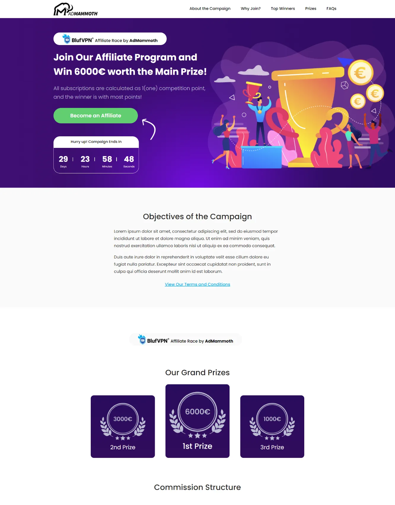
Focused on CTA
We set off strong words on the CTA to notify your potential customers what action should be taken, which in turn leads to better response and conversion rates.
We use larger fonts, appealing graphics and make sure it’s placed prominently to get noticed.

Clear-Cut Headings
We choose headlines that convey an easy-to-understand benefit of your services/products. We ensure the headlines address visitor pain points and answer their objections.
Social Proof
We design QR code landing pages that look professional and trustworthy. We employ social evidence, such as trust badges and testimonials, to make your offering more realistic, so visitors are more likely to trust you and convert at a higher rate.

Cover Desktop and Mobile
We design QR code landing pages differently based on whether your target audience is using mobile, desktop devices or both.
We ensure that your landing page is fully optimized for all devices so that no potential consumers are turned away.

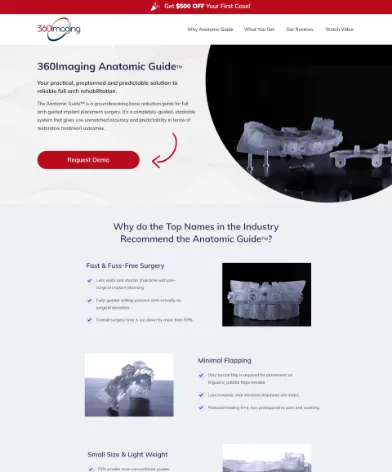
High-Quality Visuals
We use images on a QR code landing page that reflects the quality of your brand and also assist visitors in associating a specific message with your brand.
We design high-quality visuals that resonate with your audience and support the copy and the overall tone.
300+ Happy Customers


