Mobile Landing Pages Gallery
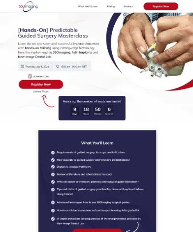
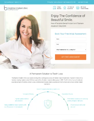
Factors which you can use to increase clicks on your Mobile Landing Pages.
Different Landing Page Variations
Your landing page will essentially build on two different versions. Nowadays, web design always needs two bespoke variations for the site - One for web and one for mobile. We ensure that users have the best experience on mobile and build all pages around conversion rate optimisation.
USP Display
The Unique Selling Proposition should be concise, clear and persuasive. Talk to your target audience in their language. Have you built a kick-ass game, get nerdy and use the same lingo. On Mobile devices, the USP needs to conveyed even quicker than usual. The attention span of people on mobile devices is very low which creates a need for clear and concise language.
Call to Action Button
Although a mobile version of a landing page could have multiple buttons across the page: the primary action on the page or the page goal should be consistent. On Your Smartphone, the Call-to-action button should stand out clear enough to get users to convert to the next step in the best possible way.
Demo Video or Animated Screens
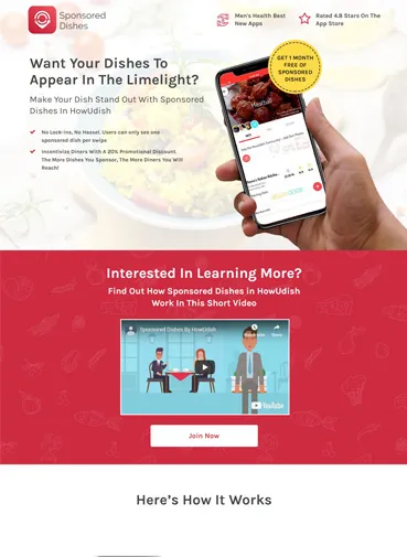
A great way to drive engagement is to include a video which can engage users on mobile devices. You can also get cool animated screens and showcase them on your landing page.
Product Benefits
Another important requirement that you need to look at in mobile landing page design is to present a clear product or service outlined on the page. This becomes even more challenging because on mobile displays you have less text space available. Consider using a bulleted list of product benefits on the landing page to nourish visitors.
300+ Happy Customers


