
“Like a good opening act, your click-through page’s job is to warm up your customer before you convert them.”
Oli Gardner, Unbounce

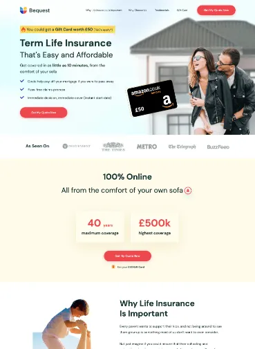
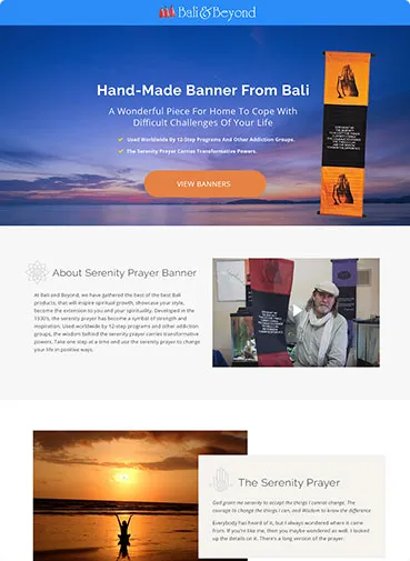
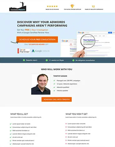
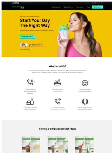
Here Are Some of Our Examples of Click-Through Landing Pages
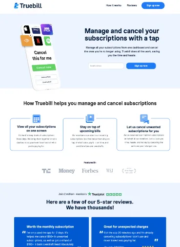
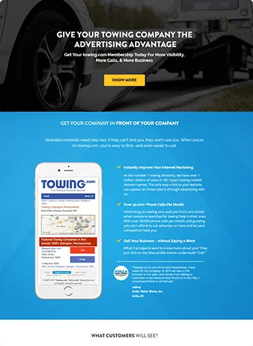
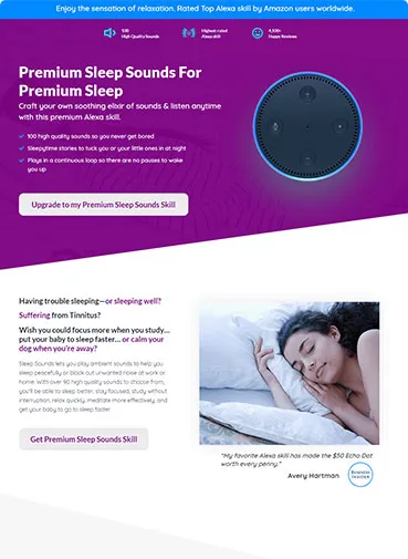
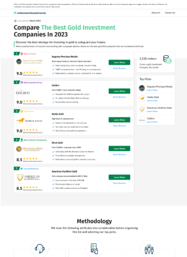
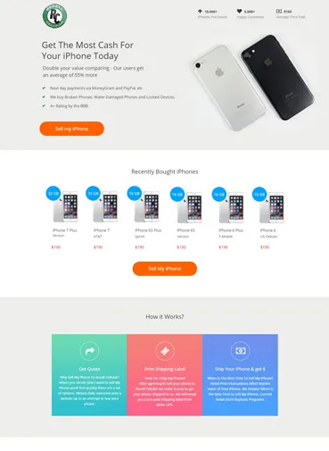
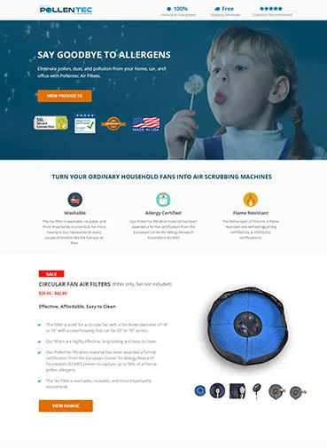
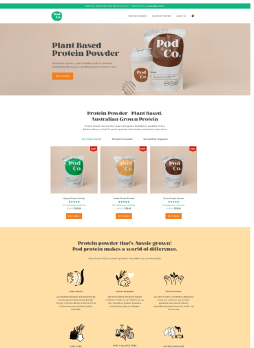
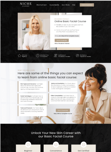
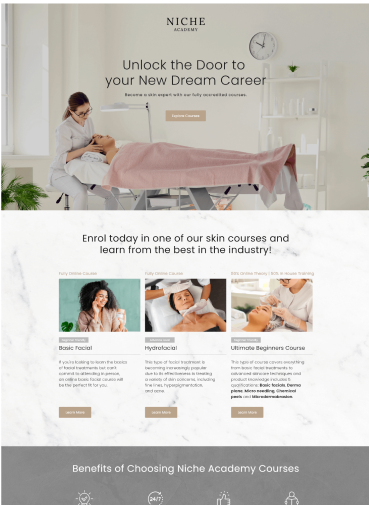
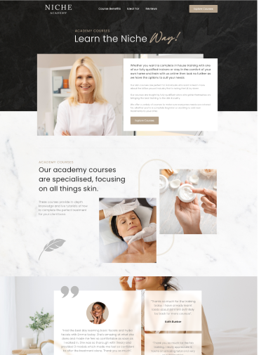
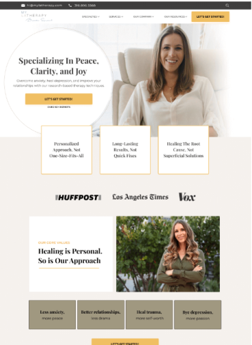
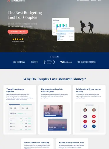
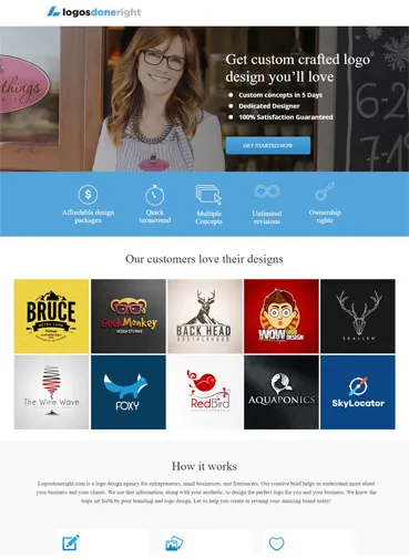

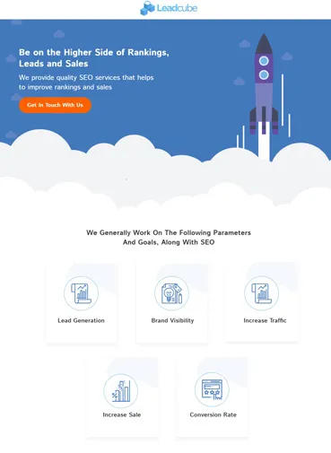
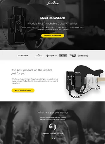
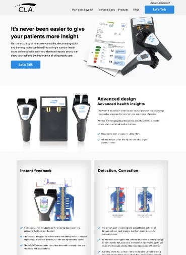
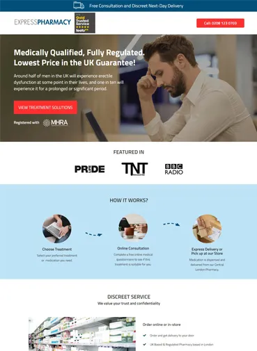
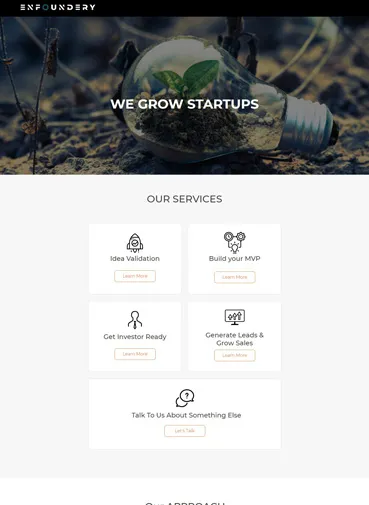
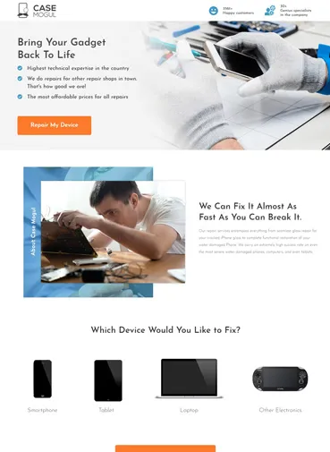
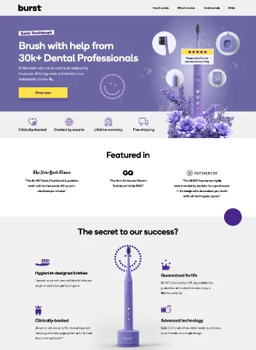
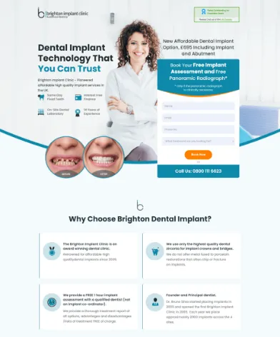
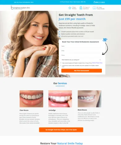
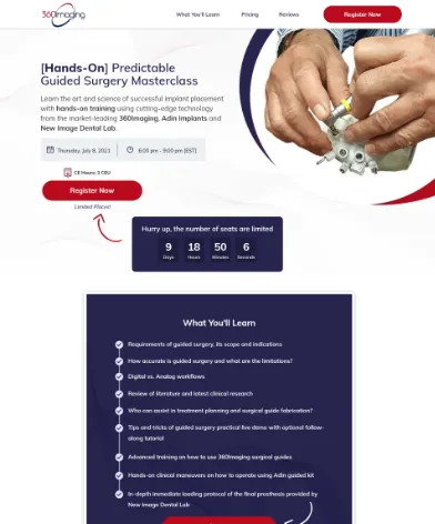
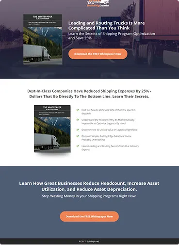
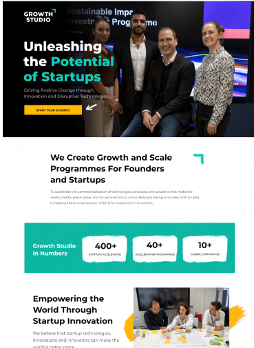
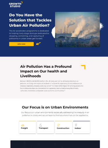
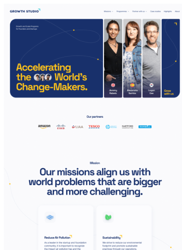
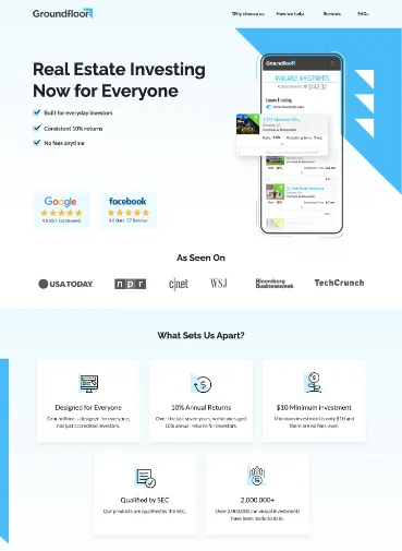
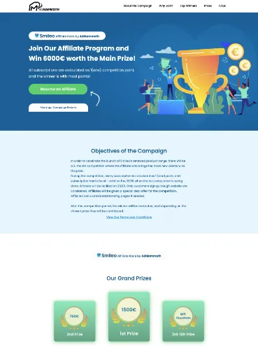
Some of the Elements We Consider When Creating Click-Through Landing Pages
No Distractions
Click-through pages are implemented into sales funnels to convey information and establish trust. The last thing you want to do is to distract users. We aim to remove any distractions on the page and focus users’ attention on the big old Call to Action button.
Attention Grabbing Headline
We ensure the first text users read has the punch to attract them and grab their attention. After all, it is all about getting page visitors to take action to convert.
Social Proof
Social Proof is immensely powerful and increases your prospects of establishing an emotional bond to your page visitors. A reinforcing customer quote or testimonial with real photos can provide that last piece of information that will create the trust to help users click the call-to-action button.
A Hero Image/Video
Most people are neurophysiologically influenced by sight as their dominant sense (visual sense). One of the highlights of a click-through page is to include a high-quality product image or screenshot, or an embedded video.
Product Features
Another important factor to achieve high click-through rates is to include is a bulleted list of product features. The idea is to nourish visitors at this step so they get enough information to take the next step.
300+ Happy Customers


