Get more inspiration from our recent Chiropractic Landing Page Examples





Features That Are Included In Every Chiropractic Landing Page
Patient Testimonials
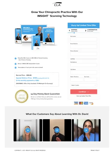
We feature customer testimonials on your chiropractic landing page making it easier for your business to establish credibility and increase trust in your landing page offer.
Strong Call To Action
We include an action-specific CTA button that compels the visitor to take action and increase positive leads for your chiropractic service.
We even program the CTA to appear as a pop-up window if the visitor attempts to leave your landing page, offering a more enticing discount or a package deal.

Trust Signals
We boost your reputation as a credible chiropractic provider by adding trust signals.
We display affiliations, awards, or recognition on your chiropractic landing page as a source of reliability. All of these trust cues contribute to higher conversion rates.

Click - To- Call Button
We include your clinic’s phone number as a click-to-call button for mobile pages, making it simple for visitors to get answers to their inquiries and schedule future appointments.
With these small tweaks, your landing page will outperform your competitors

Appointment Booking Form
The booking form is designed with the user in mind. It’s simple, intuitive and allows you to capture all of the information needed to create an appointment.

High-Quality Visuals
We provide before-and-after photos of real patients who have improved flexibility to resonate with your target audience and get more leads.
We use a specific colour scheme that stands best for a chiropractic landing page.
300+ Happy Customers


