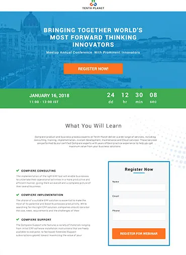
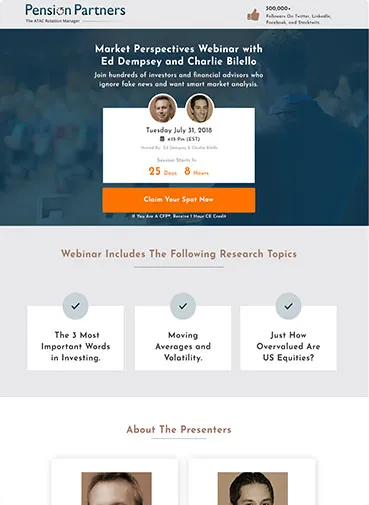
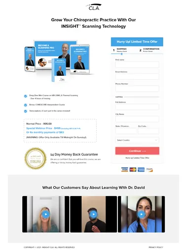
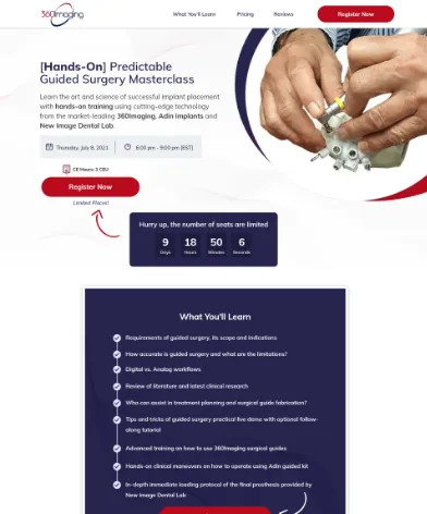
We have worked with SaaS, B2B and startups. Here are some most recent examples of our Webinar Landing Pages
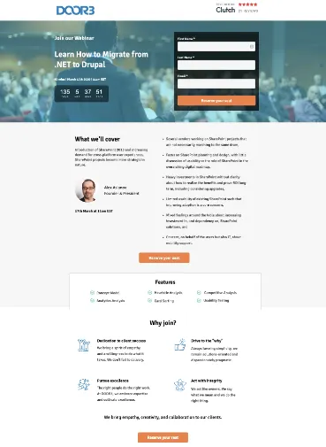
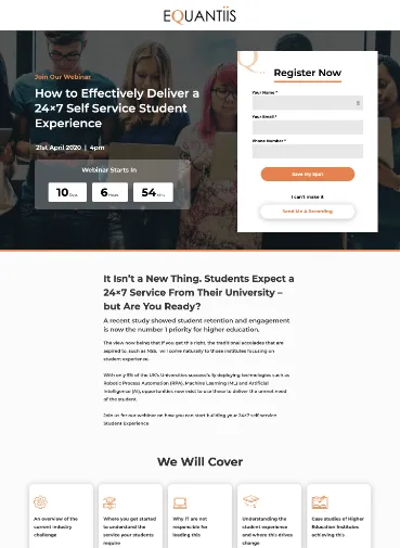
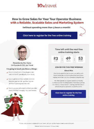
To Increase sign-ups, we use the following techniques:

Existing Webinars
Have you hosted webinars in the past? If yes, we can use your recordings and list them on the landing page so visitors can have a feel of what they should expect.
'The One Thing'
The ‘One Thing’ why somebody should attend. We share useful stuff like checklists, playbooks to point you in the right direction.
Urgency and Scarcity
Using urgency and scarcity are effective psychological factors that can influence visitors to sign up. E.g if your webinar is starting on the 1st of July. We can have a countdown which shows days/time left. We can also include a ‘Seats available’ number to showcase scarcity.
Speakers
One of the strong and powerful images we can use for your Webinar Landing pages are with the host and audience.
For guest speakers, we add their short bio with their photos. We can also include LinkedIn profile icons (which can link to their LinkedIn profiles in a popup) to showcase their credibility.
Call to Action Button
A page could have various buttons across the landing page but the primary action on the page or the page goal should be consistent. Instead of the words like “submit” we can get creative and include terms like “Save my Spot”, “I want to see this”
Social Proof
A reinforcing customer quote or testimonial with real photos. People buy from people. Testimonials are a great choice to drive more conversions.
Social Media Counters
Another great way to add social proof is by adding social media count boxes. These boxes display the number of Facebook Likes or Twitter followers. Hard to fake this one.
300+ Happy Customers


