Top Squeeze Page Design Examples


The Factors for Improving Conversion Rates on Your Landing Pages
Attention Grabbing Headline
Ensure the first text users read has the punch to attract them and grab their attention. This becomes important to set the right atmosphere that supports a “squeeze”, the generation of leads through the Squeeze page.
Relevance
Make sure you are matching the offer with source on your squeeze pages. E.g. If you are expecting new visitors and want to offer them free delivery vs. existing customers offering them 10% discount, your page should be relevant to the right audience.
A Hero Image/Video
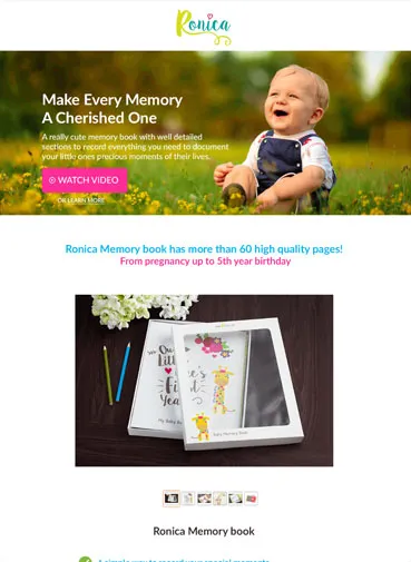
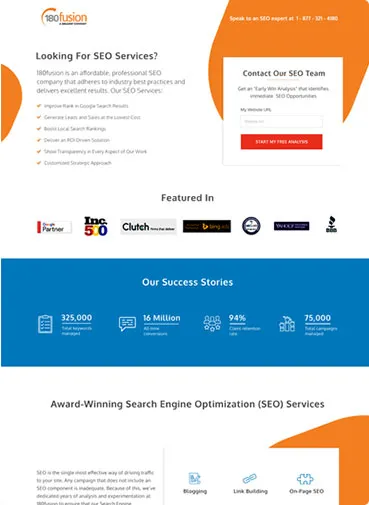
Keep in mind that most people are visually influenced (Sight as the most dominant sense).One very effective marketing technique of a squeeze landing page is to include a high quality product image or screenshot, or an embedded video. Images and media stand out on your pages and support the lead generation.
Use Splash Pages
Try using your squeeze page as a Splash page which appears the first time the user visits your website. Instead of having a close button in the top right corner you can add buttons e.g. “No thanks, take me to the website”, “No thanks, I don’t want to increase conversions” etc.
Call to Action Button
On a Squeeze Landing Page the commonly known Call-to-Action button is more important than anything else. You need to create certainty in the website visitor’s mind. This mean they need to be certain that your offer is the right one for them at this moment in time. Use a striking Call to Action which emphasises on the benefit of your offer.
300+ Happy Customers


