
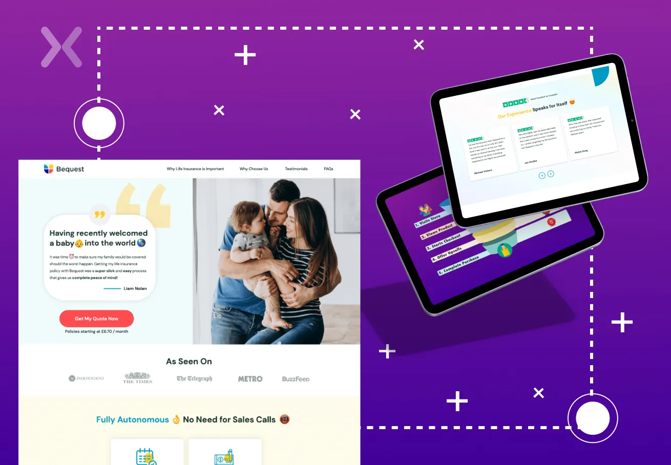
With any online business, the most crucial element to acquire is the trust of one’s users. It’s becoming more challenging to convince customers to trust you and your brand. Most digital marketing aims to carefully craft an image that allows users to understand that the brand is safe and trustworthy for business.
In such a scenario, first impressions are everything. Landing pages for websites have served as the vehicle for carrying out this all-encompassing task. While we are not saying it is easy to create a high-converting landing page to promote a product or a service, it is essential to keep asking yourself: is it conveying your message enough to boost conversion?
An increasing amount of online clutter may make any landing page appear spammy. Still, there are always quick tweaks to enhance conversion, especially for user experience. Read on to know how crafting the perfect landing page UX can lead you to more conversions.
The beauty of online business lies in its ease of access and feasibility. A vast majority of clients and future customers take their purchasing decisions in the comfort of their homes, workplace, or their nearest park (to each their own).
The point that we make is that your potential customers will scan through many websites simply because they have the means and the will to do so. In such a cutthroat online market, you can no longer rely on rusty methods to attract your users, and it becomes a top priority to make your landing page UX stand out.
We emphasise the practice of providing your customers with the best experience possible will help you gain that invaluable inch over your competitors. Explore the untapped potential that comes along with creating a solid landing page UX. Understand the user’s psyche and implement these valuable tips and tricks to execute the perfect landing page UX for your business.
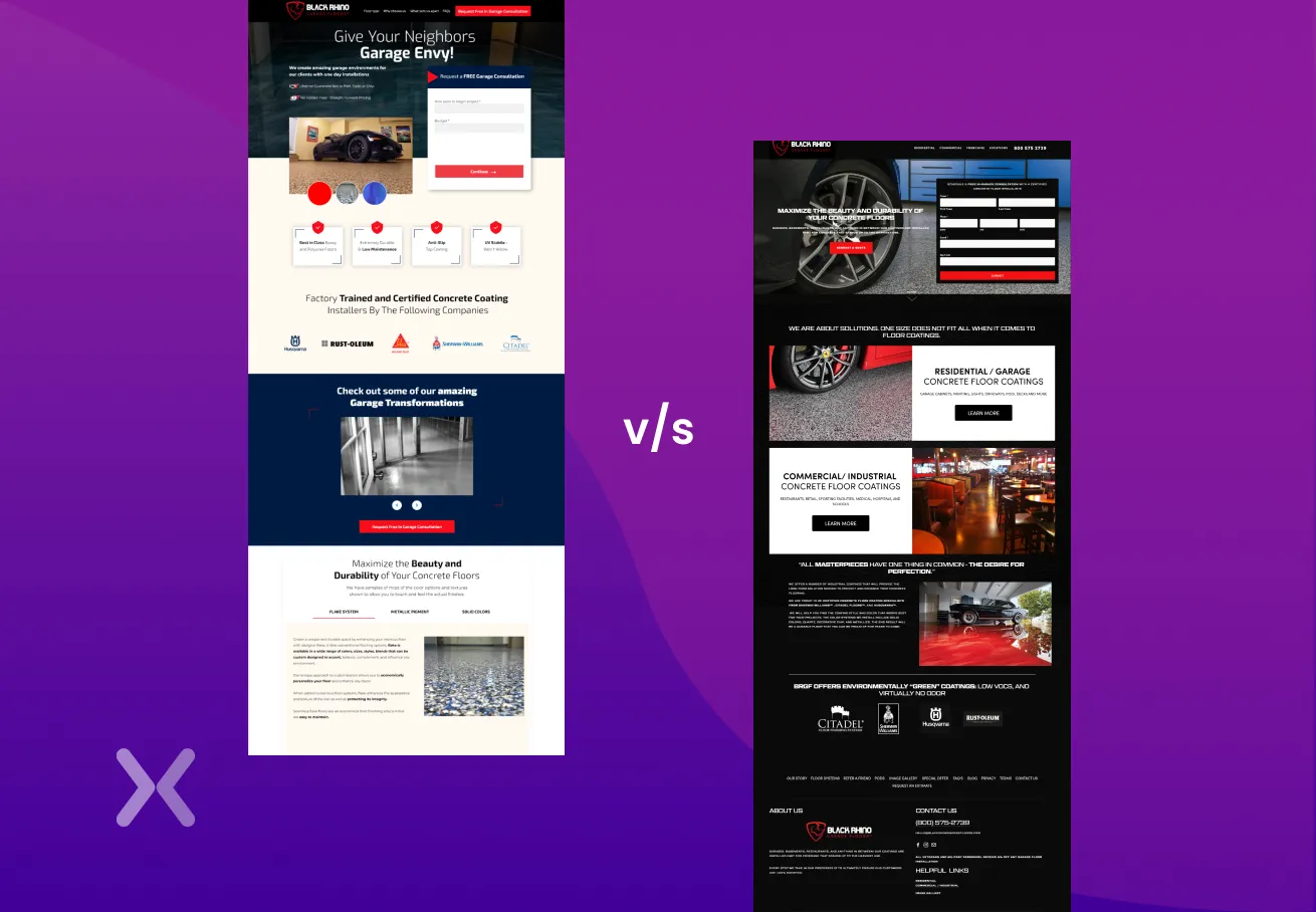
A crowded layout is the fastest way to drive users away from your landing page.
A chaotic barrage of images and dense blocks of text will do nothing but blur the essence of your website’s message. Textual and visual elements and their consequent placement make an incredible impact on the under and how they take in information.
Remove anything from your page that isn’t relevant to its goal. To avoid visitor misunderstanding, the design of a landing page should be straightforward. Always remember: an elegant and clean design may yield more spectacular results than an overloaded page. For better designing you can always start off with a landing page wireframe and then a mockup.
Your target audience should be the topmost priority while developing a new landing page UX. Before starting its design and formatting, your first step lies in understanding how your audience will interact with your landing page.
Answering questions like who is my primary target audience? How will my product benefit the audience? How can I increase my conversion etc., can help you understand your user’s needs on a more personal level. This will allow you to create the perfect landing page UX to suit your needs.
A user-friendly form is critical for a landing page’s success. Whether it’s a signup field or a contact form, the key to information collection is to keep the user interested for as long as possible. Increase the chance of making a tactfully impactful landing page UX by significantly reducing the number of details you ask your users.
With a quick and simple registration process, you can gain your user’s trust, so make sure you’re only asking for what’s necessary.
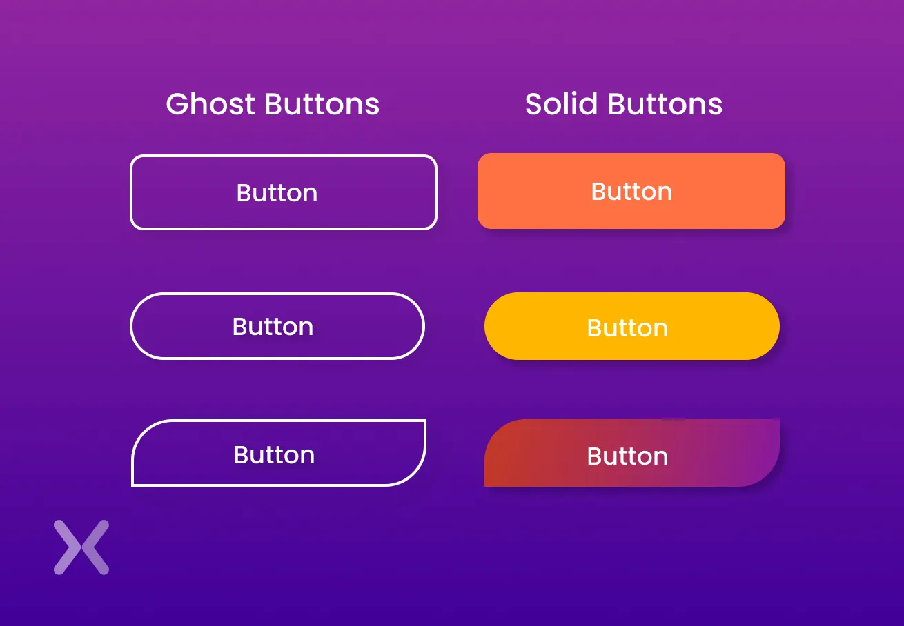
Creating an impactful call-to-action is no easy task. The best landing page UX has the strongest CTAs; they state your message most appealingly, both aesthetically and functionally.
Achieving the perfect Call To Action comes with a lot of testing and experimentation. Be open to trying out the psychological impact of colours, shapes, sizes, and fonts for your CTA.
Suggested Read: 15 Landing Page Call to Action Button Tips That Convert
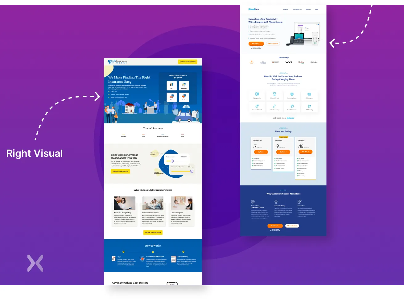
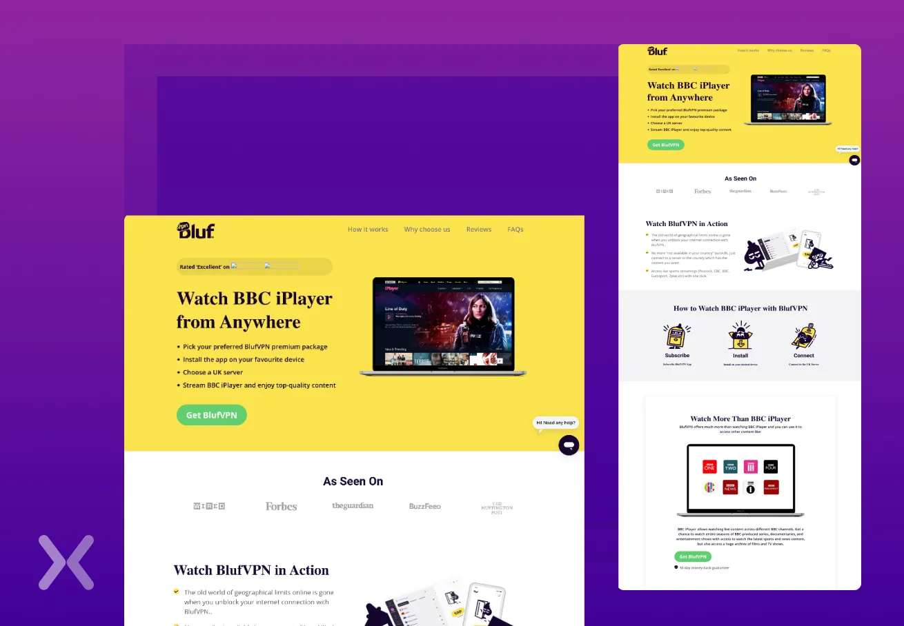
Visual content is an essential part of any landing page UX. This aspect can single-handedly enhance the appeal of a landing page, provided that it’s meaningful and the correct text supports it.
One tip that is sure to help is to remember customers appreciate that simplicity. There is no need to fill a landing page with stock images to make it more visual. Of course, for visual content to significantly impact the conversion rate, it has to explain the product or service most efficiently and build engagement by showcasing meaningful examples.
The copy on your landing page will describe what your company and product are all about to your visitors, and it should imply that you have something they desire. Here are some pretty helpful recommendations on how to write successful copy if you’re serious about establishing a solid landing page UX.
As the first thing users see when they land on your page, your headline should be clear, concise, and touch on the key benefit of your offer. It should also satisfy your users’ expectations: ensure the messaging is consistent if they arrive via an advertisement.
Informative subheads are a gold mine of information if used correctly. Take the following example, instead of saying “Our Process,” try incorporating a benefit: “Our Process Saves You X.” Watch how the impact of the sentence falls on the user!
The logic here is straight and simple: our brains are tuned to receiving a lot of information at one time. When we break this information down into bulleted lists, they become infinitely easier to consume and remember than paragraphs.
To maximize conversions on your landing page UX, use lists for critical benefits and features or other supporting information vital to the value prop.
Jargon, superlatives, colloquial language, and other similar phrases are meant for pillar pages but meaningless when making landing page UX designs. It is very simple; not only are they hard to understand, but they come across as tacky and unprofessional. The user should never feel left out. When in doubt, keep it direct & straightforward!
Recommended Read: How to Write Landing Page Copy That Gets You More Leads
The least you could do is make sure that your content does not look spammy and unprofessional. People are quick to judge and process visuals much quicker than content. There is only one chance to make a first impression; let’s make sure it is powerful and impactful.
It always helps when you take into consideration the psychology of the user. While developing your landing page UX, it is essential to answer the following questions: Is the most significant and most prominent thing on your page the most important? Does your call to action rank high in your visual hierarchy?
Size, colour, and position are everything when designing the best landing page UX.
There is no more enormous tragedy than a misinterpretation of landing page UX from the user’s end. False bottoms are the most common mistakes found on landing page designs, and these happen when there’s an illusion that the page is complete, despite more content below.
If you feel like a section of your website has the illusion of a logical end, add visual cues to ward off that impression. Why leave the scrolling to chance? Let’s keep our users motivated to continue scrolling through our lovely website!
Recommended Read: 28 Landing Page Mistakes That Make You Lose Revenue
A series of researches have revealed some fascinating statistical correlations between the loading time of a landing page UX and its consequent conversion rate. When pages load less than 1 second, the average conversion rate is almost 32%. The conversion rate lowers to 20% after a single second of loading time, and it leaves out at 12-13 per cent after 2 seconds, and it reaches its lowest point after 5 seconds.
One clever and economical way of circumventing this problem is to compress your images before uploading them on your landing page UX. Using Google’s Pagespeed Insights tool will offer tips on how to improve your landing page’s load time. Use these tools to build the best version of your current landing page UX.
If you think your landing page UX isn’t responsive, it is a sign that you must start making some large-scale changes soon. The necessity of having an efficient and responsive landing page is invaluable as more and more shopping is happening online. Users are often looking for content to be presented in the most easily understandable format to find what they are looking for. If your landing page is not capable of doing this, they will most likely move on to a website that has a good landing page UX, that is.
A tip that will help you tremendously is to make sure your responsive design layout is compatible with all relevant browsers.
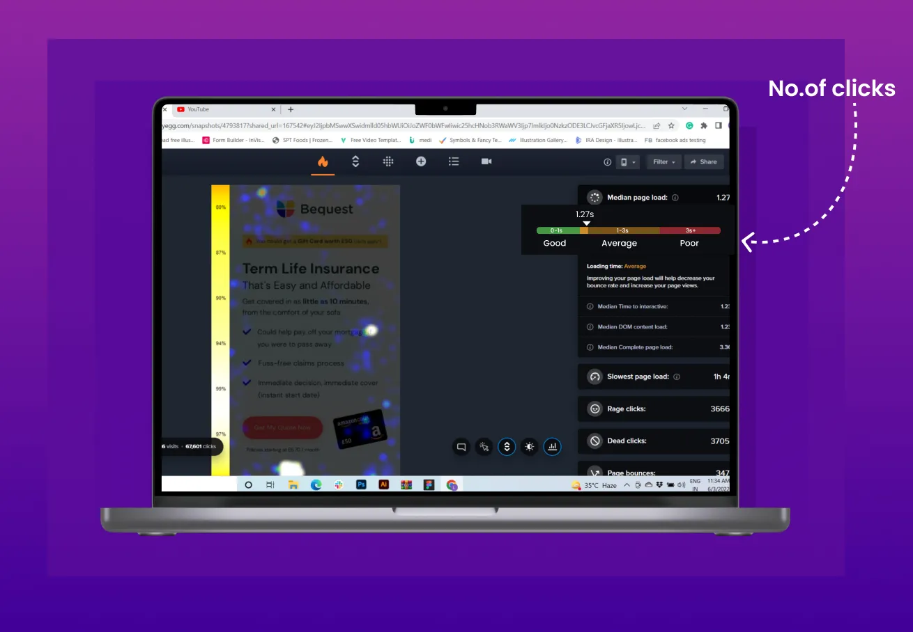
Information is the key to unlocking the best landing page UX. If you are looking to create the most user-friendly landing page UX, you must answer some simple questions like: Is your CTA receiving enough action? What is the first thing your users notice when they land on your website? Are they clicking on elements that are otherwise not meant to be clicked? Answers to these questions and a lot more can be found with the help of heatmaps.
A Heatmap is a neat tool that helps a developer see where your users click, how much they scroll down the page, or where they place the cursor. Many good third-party tools like HotJar provide Click, Scroll, Move, and Tap Heatmaps. Using this information to further develop your landing page UX is sure to give you the best results in the least amount of time!
It is only through trial and error that one can build the best landing page UX for their website. We can not stress this enough. Underestimating the importance of usability testing is like jumping into a sea full of sharks and hoping they will not eat you. A/B testing not only helps you to find out what brings in those valuable conversions, but it also helps you figure out what mistakes can be avoided in the long run.
If you’re looking to ensure you are doing the right kind of usability testing is by employing an unmoderated testing tool. Readily available online, these unmoderated testing tools provide you with a highly economical solution to test your website with potential customers and get invaluable insights and criticism to improve upon. Making the right kind of landing page UX becomes infinitely easier with unmoderated testing, and this gives you real-time feedback to work on and improve your sales and conversions in the best way possible.
Today’s consumers expect not only a service but a practical and pleasant experience. At Apexure, we implement UX and UI into your web and landing page to ensure your page thrives, and conversions increase. Begin a fruitful and incredible entrepreneurial journey with Apexure. Contact us today!
Related Articles:
Founder & CEO of Apexure, Waseem worked in London’s Financial Industry. He has worked on trading floors in BNP Paribas and Trafigura, developing complex business systems. Waseem loves working with Startups and combines data and design to create improved User Experiences.


Drive More Sales or Leads With Conversion Focused Websites and Landing Pages
Get Started.png)


A free trial landing page is essential for introducing your product to the right audience and bringing them...
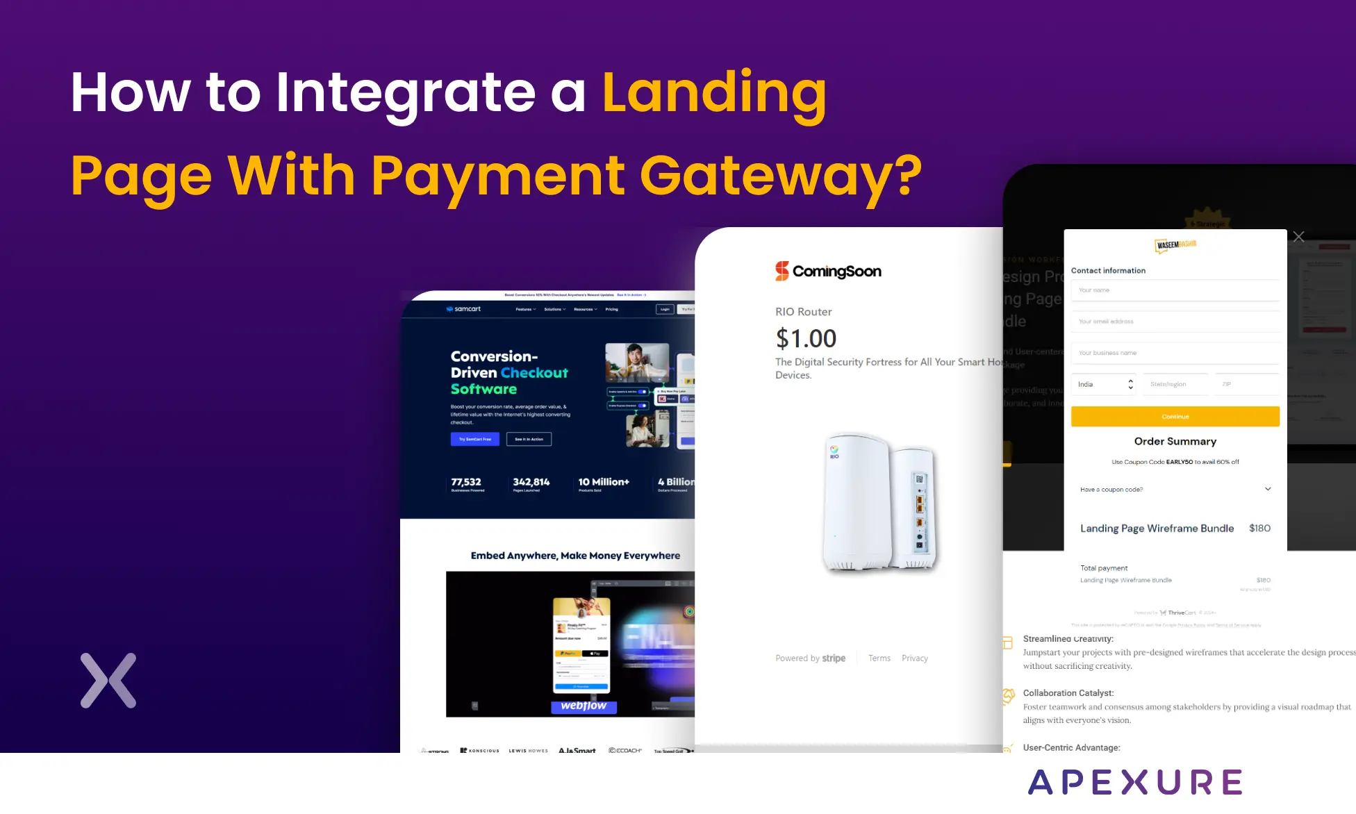
Landing pages with payment gateways can help you maximize your sales opportunities. Having a streamlined payment process is...
Get quality posts covering insights into Conversion Rate Optimisation, Landing Pages and great design
